




Which areas should we focus on? Getting acquainted and auditing what's in place
During the expert analysis, we identify the major issues of the experience on wwf.fr
We start the project with an analysis of what is in place as a whole. Many topics are identified during the expert analysis, particularly around the clarity of the user journeys, the information architecture of the main navigation, the site’s guidance and the understanding of the information displayed. We also cross-reference our findings with the Google Analytics and Hotjar insights for wwf.fr made available by WWF France’s internal team.
In parallel, we kick off a benchmark covering both other NGO sites and media platforms presenting content similar to that of the WWF site. This data is taken into account in the co-design workshop we run at the end of the research phase.
An essential analysis phase to prepare the user tests.


Assessing the understanding of the information through remote user tests
The macro objective of the user tests is to assess the understanding of the information as it is presented on WWF France's current site.
Among the users we met, the level of familiarity and knowledge of WWF France’s mission, work and latest news is varied. This condition guarantees us differentiated and unbiased feedback throughout the conversations.
The exchanges are structured in four steps: start-of-interview and end-of-interview questions, navigation scenarios, followed by a 5-second test, and finally a card-sorting exercise.
Half of the users first browse the site, then perform a “card sort” (categorising elements according to their own view and interpretation) of the site’s main navigation elements.
The other half does the card sort first, then the site navigation afterwards. This helps counterbalance the bias of knowing the WWF site that emerges when navigation is done first.


Once the navigation exercise on the home page is over, the users carry out a “5-second test”. After viewing the page for a few seconds, they redraw it via a dedicated tool, which gives us a view of both the understandability and the memorability of the information displayed. At the end of the conversation, users complete a standardised questionnaire (AttrakDiff) that helps us assess the hedonic and pragmatic qualities of the site. While analysing the data gathered, we produce recommendations. Some of these recommendations on the home page will feed the co-design workshop. The remaining recommendations can be integrated by the WWF team in the rest of the redesign project.
Co-designing the recommendations
Co-design workshop in Miro and consolidation
Once the research-phase debrief is done, we meet remotely with the WWF team and we facilitate a co-design workshop for the home-page recommendations. After going through the benchmark and the research-phase recommendations affecting the home page, we kick off the co-sketching session. Among all the ideas, those kept after a voting phase will form the basis for the wireframes.


The aim of the redesign is to improve what is in place.
The information architecture of the different information blocks is therefore reworked, taking into account the feedback from the research phase. The result is a more coherent display in relation to the very nature of the information.
So the different information cards are reworked by displaying an image, a title, a tag (expressing, for instance, a topic area), and a short piece of text.
Podcasts are differentiated from the other content in the “featured” block presenting articles or petitions.
The CTAs (calls to action) toward those are significantly foregrounded across the whole page.
The video block is restructured and now lets the different content offered be better appreciated.


UI design
Improving the design from the existing identity
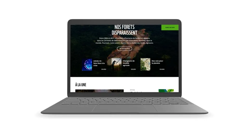
After designing the homepage wireframes of the home page, we carry out a light graphic redesign on the basis of the existing visual identity, by optimising the information hierarchy through typography and colour, and by giving more importance to imagery.

WWF home page

