



Express audit of the existing mockups
Challenging the envisaged screens and flows
The Keolis Bordeaux teams have already produced some screen sketches. They want to challenge them from a usability and user-experience point of view. An express audit of the ticket-purchase flow is then carried out. Different blockers are identified, which can be grouped into two categories:
- a lack of consistency in the components used compared with their existing Design System
- insufficient guidance for the user toward the main actions of the app

Meeting the users
Learning about their transport habits
To find out more about how people use public transport, we interview them directly at the station. This location, which brings together different modes of transport (train, tram, bus, etc.) isn’t chosen at random. It allows us to target several user types: business and leisure travellers, users taking the train and the bus to get to the city centre, occasional or frequent users, and so on. We also choose busy time slots to maximise the number of users. These interviews, run guerrilla-style (gathering the maximum amount of feedback in the minimum amount of time), need to address several objectives:
- spot the points of friction and the possible opportunities in public-transport use
- learn about how transport tickets are purchased
- gather information about the use of the apps that allow these tickets to be bought and used
In a few hours, the information gathered gives a good overview of usage and pinpoints some recurring feedback. For instance, we identify that many users use the Witick app (a ticket-management app, available in particular in the Bordeaux metropolis) as an occasional or recurring supplementary tool, or to buy tickets for travelling companions. On the other hand, we identify two main reasons for those who don’t use it:
- they don’t know the app exists
- they have a low appetite for, or are even apprehensive about, digital tools
Important feedback that highlights the need to communicate and to better support people in using M-ticket to purchase transport tickets. Communication that has to come with a simple flow: from buying the tickets, through validation and inspection. The aim is to give the user the right information at the right moment to make use easier in multiple contexts: buying a ticket at home or in the street, validating on the network, and so on.

Improving the existing mockups
Benchmark and co-design of flows and screens
We start the co-design workshop by presenting a benchmark to identify good ideas to keep for the design and the points to watch out for.
The ideation stage covered an onboarding that explains how buying a transport ticket works, along with the possibility of using or sharing tickets easily. The purchase history is easy to access and the contextualised help supports the user all along their purchase flow.
Among the watchpoints, we should be mindful of advanced interactions when they are the only option available; the choice of ticket types should be transparent; and it is essential to leave the user in control of their journey.
So, building on these recommendations, we work on adapting and aligning the flows, in particular regarding the navigation and the place it should take in the interface of the existing app. After that, we focus on the architecture and design of the “transport ticket”. Finally, we deal with the transition between the current app and the flows that will be integrated into it.

When consolidating this workshop, we produce wireframes by designing the full set of screens that will be used to validate the flows and structure before starting the visual-design part.

Visual identity and UI design
Designing the graphic side of the flow's screens within the existing app
The challenge is to ensure a coherent and consistent visual integration of the new ticket-purchase process within the TBM app.
We also take into account the behavioural habits of Witick users to make their transition to M-ticket easier without disorienting them.
To guarantee a consistent design across the whole app, the existing design kit and its consistency are reviewed in depth and new components are created to address all the functional needs.


A significant piece of work is carried out on the animations, which are integrated at the key steps of the flow. The goal was to offer extra support to the user, letting them easily understand the actions in progress and the ones expected. Each animation was created in After Effects and exported in .json format for integration into the app.
For instance, in the specific case of validating a transport ticket, it is essential that every user quickly understands the action to perform: bringing their smartphone close to the validator to validate their ticket.
So we created an animation that picks up the logo shown on the validator with a phone moving toward it. This animation, paired with the text “Bring your smartphone close to the validator”, makes the interaction accessible to as many people as possible.
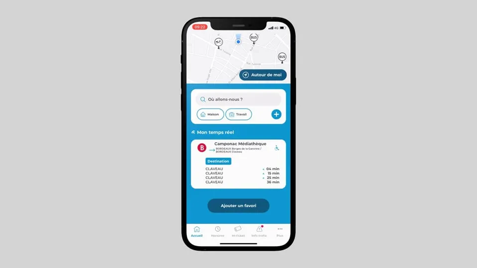
Validating a transport ticket on the validator
What we improved
Optimising the purchase and validation flow for users
We pick up the watchpoints raised during the audit to improve the effectiveness of the actions the user has to perform.
This results in particular in transforming certain components.
For instance, promo codes can be entered directly on the tickets tab; the format of the tickets is harmonised and differentiated from the format of the journey in progress.
Given the app’s usage context, the different screens are designed by prioritising the actions for each one, but also within a flow logic.
To organise your journeys around Bordeaux and the surrounding metropolis and manage your transport tickets on your smartphone, the TBM app is available on the App Store (opens in new window) and Google Play (opens in new window).
