




Expert audit of what's in place
An analysis of the website and of the online audit platform is carried out to identify the various blockers. These mainly concern user guidance and the workload imposed on the user. This preparatory work helps prioritise the points to address and anticipate how the content, numerous and scattered, should be distributed. For the key steps of an interface audit, feel free to check our glossary.

Redefining the user journeys
Identifying the key steps of the journeys
With the project team, we define the different steps that users will go through to reach their goals.
The point here is to identify the information blocks and the features needed for each step of the journey.
Mapping out these journeys helps us understand the content-distribution difficulties identified during the audit.
The outcome of this workshop leads to an information architecture that lets us formalise the first solution directions and step back to look at the structure of the site and the platform.

UX Design: SPI Online audit platform
Designing and validating the structure of the screens in wireframe format
Building on the user journeys and the information architecture defined earlier, a screen co-design workshop is organised with the project team. The goal is to define the structure of the main pages of the online platform. The aim of this collective work is to formalise the solution directions directly on the screens by prioritising the components, the information blocks and the features of each page. This makes it easy to address the following challenges:
- Simplify the use of the platform
- Better categorise the many pieces of information present in the tool
- Structure and simplify the steps for carrying out an audit
Following this workshop and once the selected solutions have been validated by the project team, the full set of screen templates is designed in wireframe form.


Art direction
Defining a new visual identity for Cerise and SPTF
Cerise and SPTF decided to join forces to help the inclusive finance organisations transform and assess their social and environmental performance.
To speak with a single voice, we supported the two entities in defining their new visual identity, its brand architecture and its visual identity guidelines.
Cerise+sptf gets a new logo to illustrate their coming together and simplify communication for the finance-sector actors.
A wheel, the symbol of the standards used, is paired with the range of services and tools to form the main symbol.
The bespoke typographic block was designed in harmony with the emblem.


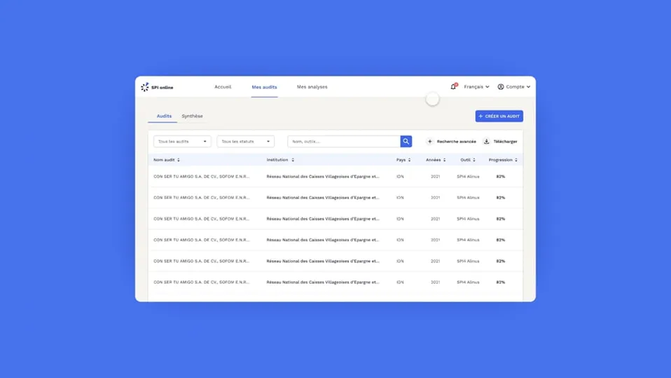
UI Design: SPI Online audit platform
Improving consistency and ease of use
A complete design system is put in place to share components across the different audit platforms and so to keep consistency across all of their tools.
The clean, uncluttered interface lets the user work comfortably and reduces their cognitive load.


Co-sketching workshop: marketing website
Improving and modernising the website presenting the audit solution
Following the mapping of the journeys and the information architecture, a co-sketching workshop is organised with the Cerise project team.
The goal is to make the website easier to digest and understand for users. This portal is an important entry point for discovering the audit platform.
Participants build on the results of a benchmark carried out beforehand as well as the information architecture and the journeys produced. The proposed solutions are sketched directly during the workshop.

UI Design: marketing website
For the design of the site, the focus was on simplicity and clarity:
- Easily and quickly understand the services offered by the SPI Online audit platform
- Gain in visual consistency to let users understand at a glance where they are
As mentioned during the visual-identity creation phase, the idea is to harmonise the visual identity so as to build bridges between the web portal and the online platform.


What we improved
Addressing users' needs and the project team's needs
Mapping out the user journeys again and the work carried out on the platform’s screens improve its use:
- simplify the steps for carrying out an audit
- gain in information clarity
- a more modern and consistent visual identity that genuinely makes use more comfortable
A redesign that comes with a new web portal making it easier to understand the services on offer and how the tools work.


