After the detailed article on the talks, it’s time for the hands-on part. For this second day, we again managed to cover all the workshops, to tell you what went on in them and, above all, what we took away. Once again, an article written by many hands, with varying styles and angles (but that’s part of the charm of working as a team).
The Designer’s Trial – An immersive workshop on the designer’s identity in the age of AI
Valérie KOPLEWICZ & Marie-Constance MENDES
Summary
There are workshops where you get a little bored. Not this one.
The concept is simple but effective: as soon as you arrive, everyone picks their role for the next hour and a half. Prosecutor, jury, journalist, defendants. By a stroke of luck, I do well: here I am, a juror. So I have to listen carefully to the trial of the century.
The case of the day? A project delivered to a client that went badly wrong. The culprit: a marketing team that, armed with AI tools, produced, signed off and launched the product without involving the design team and without any checks beforehand.
How, why? Those are the questions.
Spending an hour and a half in a trial, listening to the defendant, the defence and the witnesses, is genuinely gripping. Lively and sometimes funny, the format pulls you in. But behind the staging sits a far bigger question: where does the designer fit in a world where AI seems to do the work for them? Is a designer’s expertise still worth anything if an AI can churn out mockups and prototypes in seconds? And if so, who’s to blame when things go wrong?
What this workshop brings out is a thought you feel without quite being able to name: AI obviously doesn’t replace a professional’s judgement, but it bypasses it more and more easily. And in that short circuit, it’s the rigour, the ethics and the intent behind the design that take the hit. So it falls to the whole team around a project to set clear limits and clear expectations for how AI gets used.
What we took away
AI is a tool, but it isn’t the answer to everything. It doesn’t work on its own and never will. It’s the designer’s job to make people see that their expertise isn’t obsolete, and never quite will be. Behind its light, playful trial, this workshop lays out the upsides and the pitfalls of using AI, and how much responsibility a designer carries for how that tool gets used. A subject we work on internally, in a group dedicated to AI in our line of work.
Designing the decision: where design really influences product choices
Antoine VOLAND-LOGERAIS
Summary
Antoine Voland-Logerais is calm and unflappable; he welcomes us into his workshop with a lot of warmth and a sincere approach, promising that, as early as Monday (yes, right after the UX Days), we’ll have improvements to roll out in our organisations and projects.
The designer’s role has shifted over the years, and the strategic side of the job has grown considerably. The designer is no longer a screen factory, but a guide through decision-making, and to play that part you have to be well equipped. So Antoine has us work in groups and put on the table every situation, every sticking point, that can come up at each stage of a product’s life:
- During the strategic phase
- During the emergence of needs
- During the discovery of solutions
- In the delivery phase
- In the improvement phase
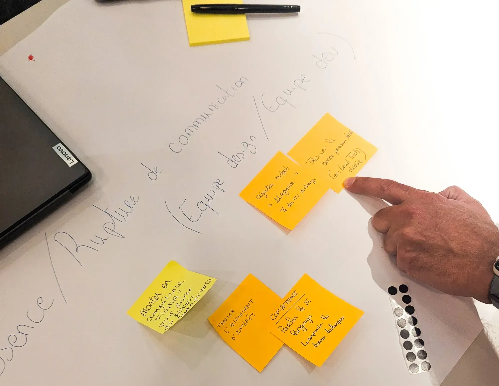
Our group zeroes in on one stage of delivery, the handover to the development team; we sharpen up the real situations we run into and think through what we can do to improve or fix them. And what works better than a table, some post-its and a few designers to come up with ways forward, when all’s said and done? Once all our post-its are covered in actions, we move them into a prioritisation matrix and look at the ones sitting in the Quick Wins area -> that’s what each of us takes away to put into practice as early as Monday, for example: “at the start of a project, require a dev representative (a lead) to be present, someone who’ll carry the dev knowledge throughout the project and be invited to every discussion.”
Each little building block of a solution sharpens our decision-making and helps us gauge the impact across a whole project or team.
What we took away
Antoine puts designers around the table and gets them talking to one another, and he even pulls off the feat of getting us to continue the exchanges after the UX Days. It was pleasant to have a framework for discussion between designers, to talk about cases we really come across; we weren’t on fictional cases. We did, all in all, apply to ourselves what we do with our clients, but it seems we need an event like the UX Days for that to happen.
Mastering data storytelling: from raw data to a conscious choice
Myriam JESSIER
Summary
Myriam is a colourful speaker who doesn’t hesitate to pull out all sorts of examples to back up her points. Impossible to nod off with her! To begin, Myriam lays out the definition of data storytelling: data, a narrative and visualisation. It sounds very simple put that way. But it isn’t quite so. The session therefore aims to share a few broad principles for increasing the impact of presenting results. Typically a big part of researchers’ work.
Myriam shares with the groups what she has learned over the course of her presentations to decision-makers. The basics: really keep in mind that someone else has to be able to talk to other people about what they’re going to see. Hence the value of keeping it simple and getting straight to the point. How? By reducing noise to a minimum, by relying on basic attributes that play on the effort of understanding (size, colour, shape, text orientation, etc.). She reminds us that we can rely on Gestalt theory to evaluate a chart. All of that is for what we display on the slide. But you still have to tell a story. Myriam draws on the storybranding framework and narrative arcs. She stresses the importance of setting a narrative frame oriented towards action. And no need to reinvent the wheel, there are narrative structures we can reuse (the carrot, the stick, the trailer, the film poster, etc.). The session is fairly interactive and that allows you to exchange with your tablemates. Myriam shared two example prompts to test with an LLM and see what comes out. The verdict was clearly mixed.
One reservation on the visualisation part. We expected to find recommendations on choosing data viz. While we perfectly understood that “if you have more than one pie chart in a presentation then you’ve failed”, we’d have liked to go back over the basics. You choose a visualisation according to what you want to show with the data. And there aren’t a thousand options, but four: comparison, distribution, composition or relationship. Type “chart chooser” online and you’ll see what we mean 🙂
What we took away
First of all, always take the context properly into account (for whom, how it might be reused, etc.). To maximise readability, strip data visualisations down as much as possible (e.g. a single figure, the one that matters, a key sentence). Give the keys to convince, by systematically including causes and effects along with a result. And then also small tips like “rhyme is the rhythm” (we’re already fans of that one): use rhymes in how you phrase insights so they hit harder.
It confronts us with the fact that year after year, we come back to wondering whether the UX Days are the right destination for us: explaining Gestalt to us, well, how to put it… especially with a questionnaire generated by an AI, and a fairly contentious one. And then storytelling: we’d have liked the storybranding model, since it was brought up, to be mentioned, or even its use detailed. In short, as we were able to raise with the organisers, during the call for speakers the level of the target audience is requested. We hope the information will be taken into account…
Design du Respect™: mapping the invisible to choose consciously
Carole LAIMAY
Summary
Four years ago, at the UX Days 2022, Jean-Marc Jancovici’s talk on “Designing the world of tomorrow” seriously shook up the room. We talked about it on our blog. The question of designers’ role in the face of systemic challenges plants a seed in many people. Carole Laimay is one of those in whom that seed grows. The workshop she offers at the UX Days 2026 is its direct fruit.
The starting observation is simple: you can design a product with the best intentions in the world and still produce harmful effects. Duolingo wants to teach languages, it creates addiction. Free-floating scooters aim for soft mobility, they clog up public space. Good intentions aren’t enough.
Design du Respect™ is the answer Carole built to this problem, a tooled method for mapping a project’s impacts across four dimensions: the individual, the collective, society and the living world, and for identifying blind spots before they become collateral damage. The method rests on a solid foundation, borrowed in particular from organisational robustness, systemic design and from the Economy of Functionality and Cooperation (EFC).
The workshop unfolds in four stages: discovery of a practical case, mapping intentions via an externalities matrix and intention cards, prioritisation with an intentions table, then a challenge of the blind spots with dedicated cards to force the questions we don’t think (or don’t dare) to ask (“who bears the impacts without being involved?”, “does the service create dependency, and on what?”).
What we took away
The approach resonates particularly strongly with us, we’re sensitive to these subjects, eco-design is one of them, all the agency’s designers are trained in it and we try to support our clients on these topics and apply it internally as well. We also know it isn’t always easy to get across, especially when you walk into a conversation where profitability and business are the main subjects. Having concrete tools to map impacts and name blind spots can prove useful for holding that line without coming across as idealists.
Carole stays consistent between her stance and what she teaches us. Not preachy, transparent about the fact that the method is still under construction. The limit of the exercise remains time; a discovery workshop opens a door, but you leave a little unsatisfied about real-world application in our project contexts. Carole says so herself, it’s intentional. We’ll test this approach on our side and keep a close eye on the next versions.
The matrices, cards and tables are downloadable for free on her site (opens in new window), under a Creative Commons licence.
Solve fast… or solve right?
Camille VANPEENE & Vincent FOURRIER
Summary
Camille VANPEENE, in charge of service design at the Banque de Luxembourg, and Vincent FOURRIER, UX Designer at Deneo, offer us a condensed version of a workshop that promises being able to slow down in order to go faster afterwards. It stems from the observation that we’re asked to go ever faster, which can lead to rushed choices, a drifting away from the context and a lack of questioning about the real impact.
To introduce it, we’re asked to select 3 values we’re not willing to sacrifice.
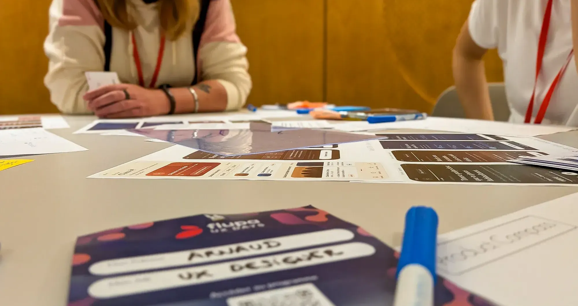
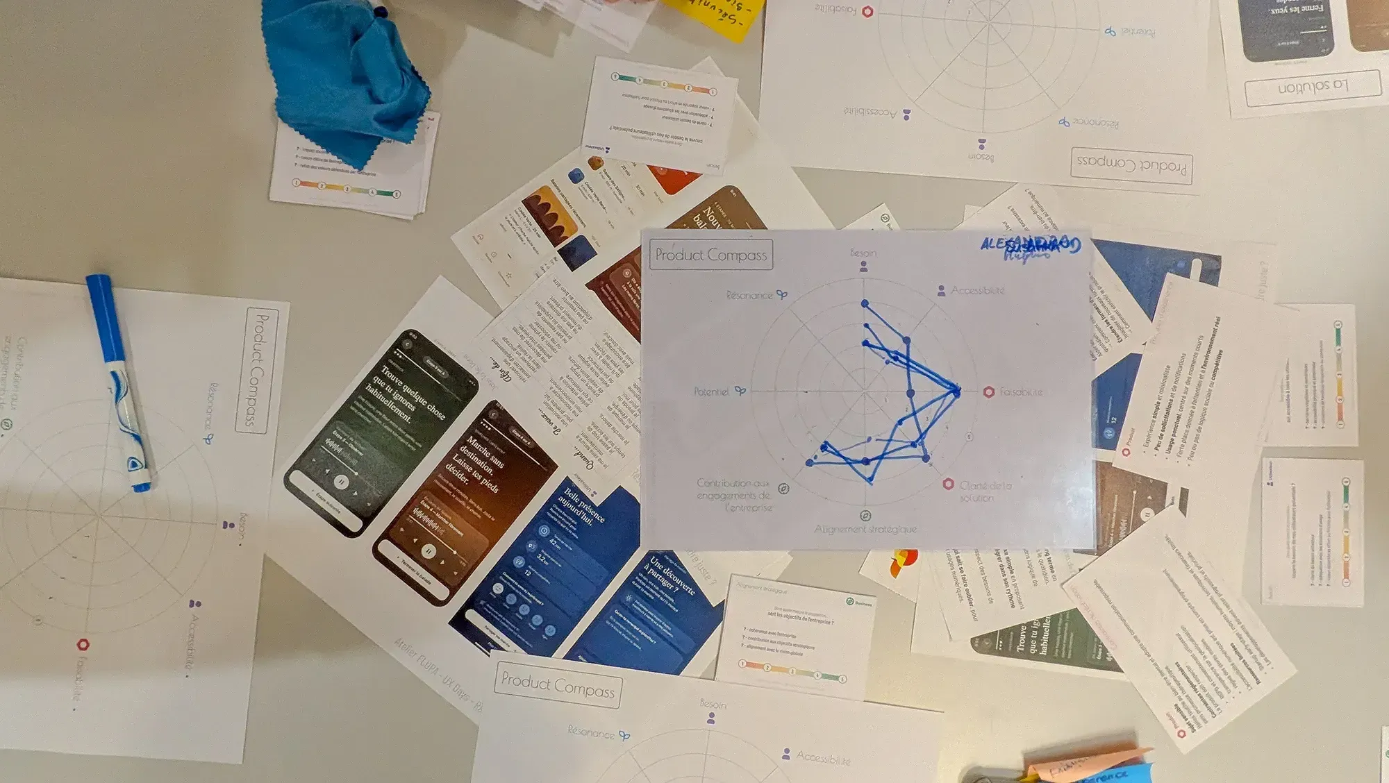
We then study our group project: an app that combines relaxation, guided walks and letting go.
On hand, we have:
- some first mockups,
- some reference cards, to help us immerse ourselves in the project,
- some reflection cards, to question ourselves on the various dimensions.
These “dimensions” are illustrated on the key tool, the “Product Compass”. This tool lets each participant evaluate the project across eight dimensions.
Thanks to a “radar” chart, each member of the group positions themselves on the dimensions on a scale of 1 to 5. We then overlay our diagrams, which lets us quickly and visually identify the alignments and the points of disagreement.
This forms a starting point for the next actions to take. The end goal being to have a Product Compass aligned with the whole group at the end of a future exchange.
With this methodology, the workshop aims to show how to align the various stakeholders at every stage of the project.
At Deneo, a small organisation, it’s used during team meetings to evaluate projects, ideas and to ensure follow-up. For the Banque du Luxembourg, it’s more a communication document that ensures consistency and structures the evaluation of complex products.
“It’s a tool that lets everyone express themselves on an equal footing and manage tensions, particularly around prioritisation.”
What we took away
The “Product Compass” is a great tool to get everyone on the same page and to let each person express themselves. The visual representation offers an interesting way to follow along and makes it possible to quickly spot differences of opinion.
That said, we can’t help asking ourselves questions about its real-world application.
The tool relies, in principle, on gut feeling. Aren’t we at risk of ending up with a lukewarm compromise, simply to wrap up the exercise and align the radars? The more assertive profiles, or those comfortable speaking up, can also end up steering the group’s answers.
Another point of caution: how time-consuming it is. Depending on the companies or projects, getting the stakeholders together can be a complicated exercise. If we keep in mind that the tool is a snapshot at a given moment and that it needs to be repeated to track how things evolve, managing it can quickly become complex on a day-to-day basis.
In short, our facilitators may have lacked giving us a framework for using the tool. We’ve got the car, but we’re missing the highway code.
Designer… but who really decides? Reclaiming your place in product decisions
Emmanuelle SECA
Summary
We’ve all known projects where the decisions seem made in advance. The pressure of delivery, organisational constraints or the weight of a sponsor sometimes relegate designers to a mere executant’s role. Emmanuelle Seca, a designer turned professional coach, suggests exploring our stance in the face of these trade-offs. Through lived situations, the goal is to learn to identify the invisible dynamics that influence collective choices.
What we took away
We won’t kid ourselves, the approach, very much centred on individual coaching, rather went over our heads. We struggled (and that’s often the case) to match the method presented with our agency reality. We also had the feeling of attending a pitch to sell a method that would help us feel more aligned with our values as designers.
But where the exercise becomes interesting is when it comes to dissecting a concrete case that was causing problems. When you walk into a client’s, you land in the middle of a system. There’s a history, teams in place, objectives, constraints and sometimes (even often) quite a few unspoken things. This little reminder about the systemic approach and our ability to dig in order to read between the lines is essential to position ourselves at the right place and the right time as an expert. In the end, the best solution to unblock the situation is quite simply to realign the right people around the table as early as possible.
What if we built your brand’s AI writing assistant together?
Yohann ELMALEH
Summary
Yohann Elmaleh is a senior UX writer for Bouygues Telecom. He loves words a lot (he even writes books). And above all, he managed to set up an AI writing assistant that draws directly from Bouygues Telecom’s content system. The goal is to help anyone in the company (salespeople, customer advisers, marketing, designers…) produce content that’s consistent, personalised, and in keeping with the company’s tone. To explain how it works, he didn’t stop at theory: he had us roll up our sleeves and build our own AI assistant.
What we took away
More than the workshop itself, it’s Yohann’s experience report that is particularly interesting. He first explained to us the work done with his teams to set up this content system at Bouygues Telecom. Setting up this reference framework is quite a challenge; supporting the teams in making it their own is another. So how do you capitalise on this internal bible to make writing content easier? At Bouygues Telecom, you find words everywhere: from customer information to button labels in the app, all the way to the pitches for selling a plan. These words are written by a lot of people, and the trouble is that Yohann only has two hands at his disposal. The idea, then, is this AI writing assistant with a clear positioning: phrasing what the user wants to write based specifically on the content system’s guidelines. Another safeguard that really resonated with us is the requirement for the assistant to justify its choices by pointing back to the information held in the content system. We liked the angle of an assistant set up to support people, not to do the work for them. Even if it raises certain questions: how is the tool used on the ground? Do users less used to writing place blind trust in the AI? What will be the place of the (many) writers at Bouygues in the future, when everyone can write?
That said, the format suffered from a gap in level between participants. Having to lay out the basics of what a content system is, or recall the fundamentals of UX writing, can be perceived, in our view, as wasted time when the workshop’s promise, building an AI writing assistant anchored in a real content system, is so concrete and exciting. We weren’t able to see the process through, and that’s our main regret.
It’s not so much a criticism of Yohann as a remark for the UX Days organisers; offering clear prerequisites or audience levels up front would make it possible to go much further in the workshops, and to avoid staying on the surface of subjects that deserve better. All the same, a well-run workshop, on a concrete case and generous in sharing experience. We come out of it with ideas, and the urge to go dig into the subject.
Why Content Design is becoming strategic in the age of AI
Nathalie RILCY & Axel VIERSAC
Summary
Content design, UX writing, these are subjects we’re into. It’s so complementary to our daily practice, almost within arm’s reach, and yet we’ve trained for it, we fully grasp the know-how it takes.
When a content workshop is offered, we always sort of pounce on it. And here, it was a bit of a cold shower. The workshop’s goal, not very well defined for that matter, was to build the organisational part of designing an AI agent, which was supposed to fill in dashboards, or maybe it was sending newsletters, we never quite understood. Then to ask the question of the stakeholders before/during/after the design. And the takeaway is that, well, no luck, content designers are never involved the way they should be when they should be. We’re tempted to say a bit like all designers, but everyone sees it from where they stand, as the saying goes.
It must be 10 years or more that we’ve been coming to the UX Days. We’re getting older, of course. We’re getting jaded. We have indecent expectations of comfort and luxury. For instance, a clear workshop subject. For instance, takeaways that don’t boil down to pushing on doors so wide open you wonder whether there was even a door there at all. For instance, workshop materials that aren’t torn flipchart sheets stuck up with orange DIY tape (and we have absolutely nothing against DIY). For instance, facilitation whose added value isn’t simply writing on said flipcharts with sharpies. A dynamic exchange about the collaboration between UX designers and content designers, the means, tools, tricks, for cobbling together some content thinking when you’re not an expert but you want to raise the subject to a strategic level. Something of that kind, perhaps. Something that measures up to the investment in time and money of the people who came to the workshop. But then again, it’s very probably just that we’re getting old… Though not so old yet.
What we took away
This workshop turns out to be more an interactive demonstration than a real workshop. That, as experts, bothers us. Already convinced that content design matters just as much as every other branch, we expected to be able to gain things to better put content design strategies in place in the age of AI, and we come out rather disappointed, with the answer being an invitation to take part in a complementary workshop. Even if the title might have hinted at it, we come out with only very few concrete elements to argue the value of content design, but maybe that’s because we weren’t the target.
Prototyping a mini-game with Figma Make
Romain DAO
Summary
Romain DAO has quite a reputation on LinkedIn. Like any designer we are, that raises our suspicion (it’s a bit of a joke, but let’s not kid ourselves, LinkedIn has still become a vast swingers’ club… professionally speaking, of course). Anyway, we were still very curious to discover what he had to say about Figma Make, all the more so since, while we use AI a lot day-to-day, Figma Make is something we hadn’t really touched much, and on top of that it doesn’t quite go in the direction we envisage for a designer augmented by AI (see the article on the talks), and for now our experiments have mostly been with the Figma MCP (which lets us do some nice things, but that’s not today’s subject). So we go in with the urge to discover the tool by getting our hands dirty right away, with the prototyping of a mini-game as the proposed common thread.
The first point, and credit where credit’s due, Romain has perfect command of his subject, absolutely no doubt about that. The work he puts in to get there is beyond doubt, and it’s still very pleasant to see someone who has decided to roll up their sleeves to become more skilled by equipping themselves, rather than by watching the AI produce in their place while eating Cheetos (or anything else).
Beyond the simple technical demo, Romain took the opportunity to share with us his own working method, the tool’s possibilities, and above all his vision of using AI agents as genuine assistants at the designer’s service.
What we took away
The message of this session is that AI is only really relevant if you prepare the ground for it beforehand. No secret to it, that requires being precise, methodical and organised. Concretely, we got to verify this by building this mini-game together step by step. We started by laying out our workflows on FigJam to keep a real overview. Next, we tackled the creation of the graphic assets, backed up by AI agents, before diving into pure design and iterating on our design, all of it directly in Figma Make.
No revelation, clearly, we’re on perfectly familiar ground, that of generative AI, and we’d already realised it through our experiments with the MCP. But the workshop was well prepared, well structured, well run, by someone perfectly competent. And all in all, that’s exactly what we expected from every workshop.
The Duel – AI vs designer: who really understands the user?
Summary
Jérémie COHEN & Delphine SAJAT
Designer VS AI: The duel.
And what if, in the end, it wasn’t really one?
In any case, in this workshop, it’s presented to us as a duel.
Here, 2 teams and 4 situations to set these two radically different approaches against each other. Split in two, each group represents one of the sides: AI or human. And faced with each situation, each camp has to manage to defend itself, to prove its value and to minimise its weaknesses.
No winner, no loser. Just managing to find your strengths and your limits.
Because yes, very quickly, you realise that each situation has its constraints… and its very specific advantages. There’s no case where we said to ourselves “Ah, here it’s necessarily 100% AI, it’s much safer.”
For example: forty-eight hours to condense fifteen two-hour interviews? AI necessarily wins on speed. But analysing the non-verbal reactions, the silences, the micro-expressions captured in an interview? There, it’s the designer’s experience that takes back the lead.
In fact, this workshop highlights one very precise thing: there is no duel. AI is a tool that can only help us in our work, but that can’t function entirely on its own. On the other side, the human will never be as efficient as an AI in terms of execution speed. They complement each other through their strengths and weaknesses.
What we took away
What this workshop reveals is that the question “AI VS designer?” has no place. The right question is: “AI and/or designer, why and in what context?”
Some tasks call for speed, pure processing. Others call for what only a human can capture: the hesitation in the voice, the contradiction between what someone says and what they do, personal experience. This is in line with what we’re focusing on right now: delegating the tedious part to amplify the creative and expert part.
Accessibility User Journey Mapping: integrating accessibility right from the user journeys
Stéphanie WALTER
Summary
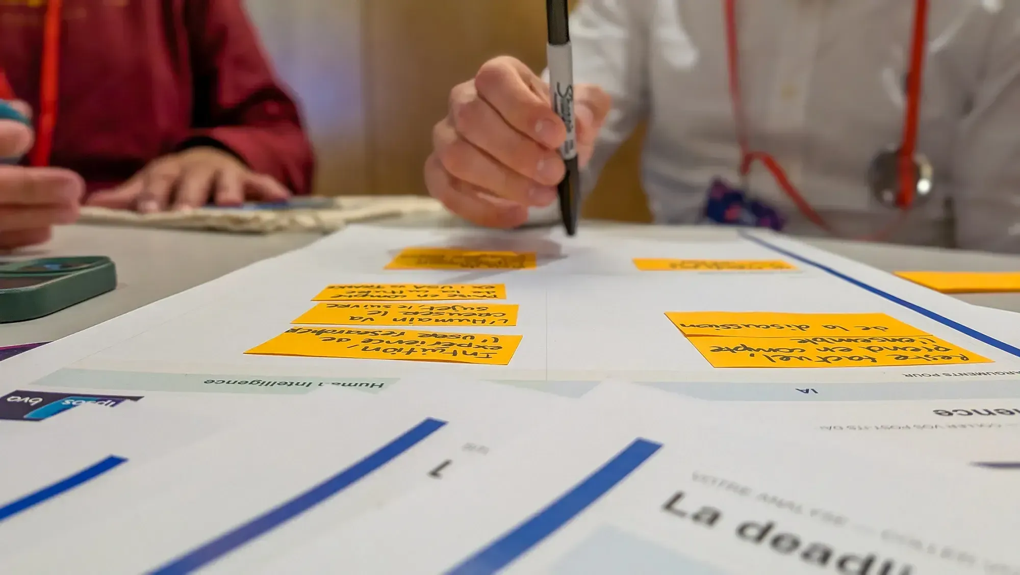
Stéphanie Walter, we’ve been following her widely shared work on social media and notably LinkedIn for a while. We appreciate the angle, which speaks to us well most of the time; it’s about accessibility, inclusivity and the ethics of work done right. Well, the workshop was the same. Basically, the idea is to use a card deck she created to integrate the question of the different types of disability into the modelling of user journeys (user journey / experience mapping). Each group has a scenario around a different domain. The card principle works relatively well in that it allows the thinking to be systematised, at the cost sometimes of content not always perfectly suited to the theme. That’s the risk of covering the scope of every physical and digital experience.
What we took away
Well prepared, well run, we have a good time, even if the conclusion, at our level, practising both modelling and accessibility questions daily, doesn’t seem to provide a tool that’s very operationalisable for us. Journey or experience modelling projects are rarely the ones that allow a focus on accessibility such that they tolerate using tools of this kind, with the time it requires (6 hours of workshop were mentioned). But maybe one day it will be the case. But that changes nothing about the educational virtues of the tool and the approach. A pleasant moment; not every workshop needs to be transformative!
Transformative design
David JEANNE
Summary
At the genesis of this workshop, David supports a company that sells design sprints to other companies. Their particularity is that the participants in these design sprints are profiles looking for work. For them, taking part in this type of experience has a fairly concrete impact. The commissioners, for their part, bring a brief and leave with leads towards solutions. They are much less affected by the experience. David’s mission is to find a method that makes it possible to “transform” the commissioners, through the experience offered to them. Several months of work and experimentation later, David offers us to test the condensed version of the method in this three-hour format. It’s the fruit of his professional thesis work with the ENSCI – Les Ateliers, which he compiled into a book (that we should receive before long); we’ll tell you what we took away, necessarily very summarised.
First, you have to define what we’re talking about. Transformative design is characterised by its intention, creating “a unique, extraordinary experience that leaves a positive and deep mark, by acting on one’s relationship to oneself and/or one’s relationship to others”. Quite a programme.
The workshop relies on a concrete use case to bring an “I’m not sporty” self towards a new “I’m transforming my body” self, imagining that we’re working on getting Strava (or its competitor) to support this transformation. We then go through the 3 main stages: diagnose, set the course and define what the transformative experience should look like.
We start from the persona, as we would have built it, from real observation and interview data. Then, we use a circular diagram cut into several zones (e.g. beliefs, motivations, context, etc.) with concentric circles. Each circle corresponds to one of the five levels of intervention to plan for: transform (disruption), dissolve, help, amplify, preserve.
Next, David tells us about the guidance archetypes. Our persona can either keep going on their current path, or head where we want to take them. To achieve that, you have to look at the means for deflecting their trajectory. They need a guide. This is the most sensory part of the session. These archetypes call on the symbolic level, with the idea of describing a character in the working group’s collective imagination who embodies this guide. The method suggests creating a symbolic moodboard, gathering elements that are either narrative, symbolic, emotional or metaphorical.
The last stage of the session, thinking about possible tipping points for our persona. With the help of another canvas, we describe a situation that should lead the user to concretely set their transformation in motion. The idea is then to work backwards to find how you get from the initial situation to that moment, then to consolidate what happens afterwards.
An interesting experience, a heavy theorisation that is perfectly mastered. We were able to discuss live the points we weren’t entirely aligned on. And for a three-hour workshop, we didn’t really feel like we’d spent double the usual time; that’s a KPI that doesn’t lie. We invite you to read in more detail what David shared on Medium on the subject. (opens in new window)
What we took away
First, we take away the 1999 book The Experience Economy, somewhat at the origin of the thinking. It traces the shift from value creation through the extraction of resources towards goods, services, then experiences, all the way to the current era of transformations. We’re making a note to go read it.
We also take away the transposition of initiation rites onto behaviour change, which serves as a common thread for the progression, and the sensory approach, interesting for getting participants to work on perceptions and frames of reference by calling on the senses (colour, material, etc.).
We also note the creation of a tagging plan to sift the raw data, ahead of the method. Finally, we take away the difficulty of applying this method in a “normal” project, like the ones we most often deal with, as well as certain phrasings meant to help participants that we found really complex.