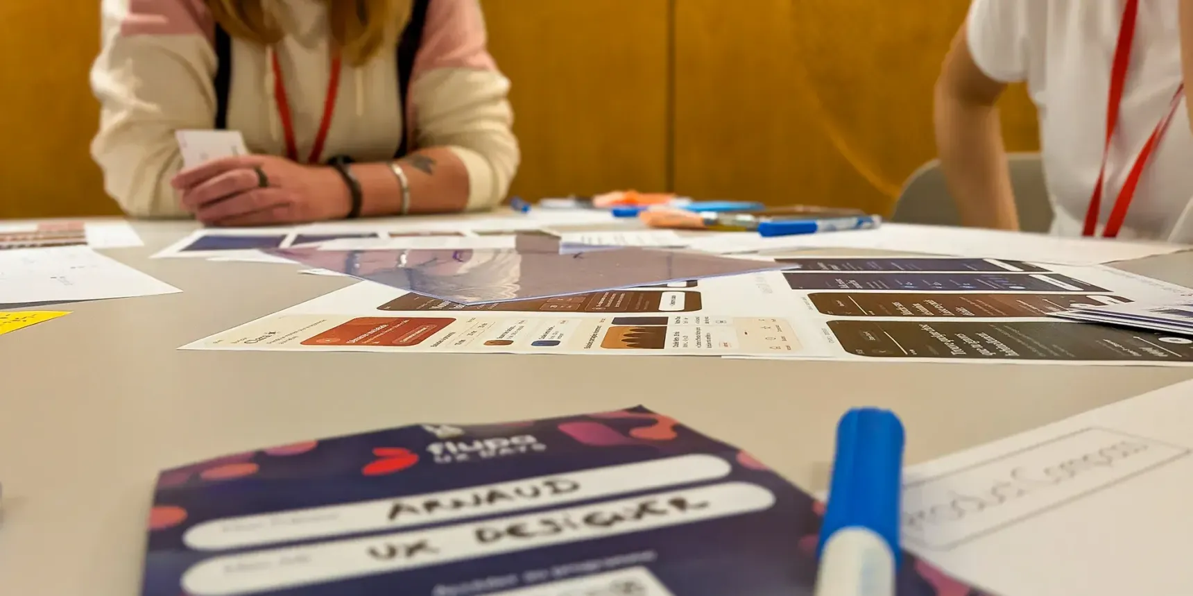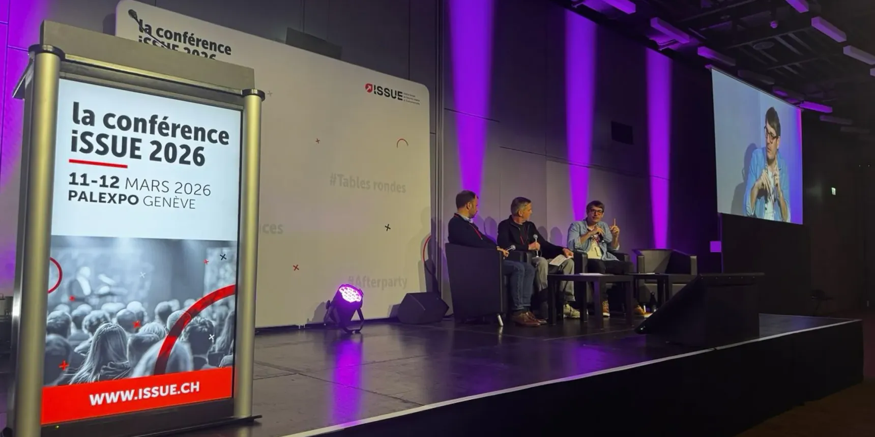
As we do every year (or almost), we went to the UX days with the whole team. The goal? To cover everything, see everything that’s presented, listen to everything that’s said, and share our questions whenever we have any.
Since we split the talks between us, the style and level of detail vary. That’s the price to pay for getting an overview of the event 😉
And for what comes next, we’re putting together a dedicated article on the second day of workshops.
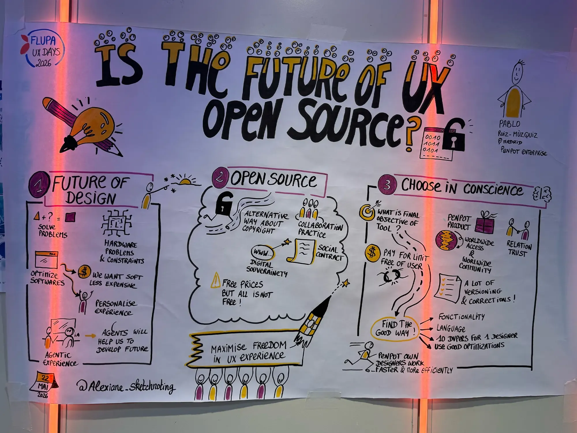
[Keynote] – Is the future of UX Design Open Source?
Pablo RUIZ-MÙZQUIZ
Summary
Pablo RUIZ-MÙZQUIZ, founder and CEO of Kaleidos, the company behind Penpot, the open-source alternative to Figma, came to share his vision of UX Design in the coming years, particularly as shaped by the arrival of AI.
He looks ahead to a world of hyper-personalised software, which chimes with discussions we’ve had internally at Akiani: that with AI, users may well be able to design their own applications, built to fit their needs exactly.
He observes that consumer applications are turning into creation tools and that design tools are turning into orchestration tools. A feeling that resonates with what’s happening today at Mistral, for instance, with their developers who are now AI orchestrators, and with the trend among the general public of creating more and more content, more and more easily, through applications like TikTok for example. Spotify also seems to be cleverly heading down this path by trying to negotiate partnerships with labels to let users create their own AI remixes. All of which makes designing experiences around agents, the Agent Experience (AX), look set to matter more and more.
Pablo also shares what he learned from building an open-source tool for designers: how, even with a hyper-active community, it stays hard to grow a tool coherently while keeping it true to the needs and to the vision.
What did give us pause, though, is his push to tie the tool ever more closely to developers and to the technical side, so that Penpot can speak to designers and developers alike with the same feel and the same philosophy.
We remain wary of the fact that this could constrain designers in their ability to imagine new solutions and thus limit their creative potential.
Nor that it limits developers’ potential to improve the technology in service of end users.
So we remain curious about the next versions of Penpot that have been announced, to see how all this will be translated into the design interfaces.
What we took away
This talk reinforces our sense that we’re not the only ones wondering about the way AI is reshaping what applications can do and what role tools play for different kinds of user.
We also agree that you have to actively dig into the Agent Experience and build up real, careful expertise to be able to produce experiences that are both high quality and accessible.
The vision for Penpot raises questions for us, but we’ll keep an eye on the doors the next versions open or close, and we’ll be glad to test them and give Figma some real competition.
How can AI complement (without replacing) a digital accessibility approach?
Mathieu FROIDURE
Summary
Mathieu FROIDURE, president of Urbilog, invites us to experience the arduous digital experience of a visually impaired person and how AI remains a tool that shouldn’t be seen as a miracle solution to accessibility.
He reminds us that accessibility isn’t just a matter of legislation; it has to go further. And to highlight this, he uses two very concrete and revealing examples.
We’re then dropped into a case involving geolocation and reading a map. And through this case, which may look simple, we quickly see that there’s no easy way to make something conceived as purely visual accessible.
The second example puts us in the situation of having a fairly simple data table read aloud. We realise straight away that even when the data is properly prioritised and structured, it’s still hard to follow. So making things accessible by following the standards is one thing; offering a real answer to the problems people with disabilities run into is another.
This is where the designer’s role needs to come in, to offer clever solutions.
It’s also here that AI can step in and offer an opportunity for compensation through its capacities for rephrasing, multimodality and flexibility.
But AI is fallible, with its own flaws and design biases, and it can’t give a meaningful answer in every scenario.
So we mustn’t reach for AI as the answer to everything; for now, it’s still essential to design interfaces that are accessible to all and whose form serves people and helps them understand.
AI does have a role to play in complex cases (reading plans, intricate charts, and so on) to aid understanding, and as a way of reaching as many people as possible without multiplying interfaces.
What we took away
This talk lays out clearly what’s really at stake in accessible design, and how important it is for designers not just to follow the rules, but to design for as many people as possible, whoever they are.
The examples that put you in the shoes of a visually impaired person are very effective, and we’ll happily reuse them to make the case for inclusive design.
It’s good to hear that behind the “wow” of AI there’s no single, universal answer to the problems design throws up.
Designing digital personalities: the questions raised by Model Design
Morane TOUATI
Summary
Morane Touati gets us thinking about our relationships with Artificial Intelligence (AI) and how we, as designers, can influence the way it’s perceived by the general public.
Through a few precise examples, she shows us that AI is built like a person, and often triggers empathy in users. A simple “I’m thinking” instead of “computing” gives a machine the illusion of consciousness. Designers no longer design static interfaces, but personalities, relationships, with, in some cases, a sense of attachment in the user. The responsibility for framing the creation of conversational AIs (or others in the future) falls to the designers and the companies that build them. The ethical challenge is to define which words the AI can use, which tone it can adopt, in order to have it as a partner and not as a master.
What we took away
The theme of “how do designers shape AI?” was rarely addressed during these UX Days. It’s interesting to be able to question our role in the design of these products and, above all, to bring the ethical dimension to the topic. The presentation is smooth, Morane has a command of her subject, it’s very pleasant to listen to. The philosopher’s background she reveals to us at the end makes you want to carry on the conversation with her.
From attention to addiction: when UX manufactures dependency
Fatima-Zahra HAMIL & Pascal MALOTTI
Summary
Fatima-Zahra Hamil and Pascal Malotti present their framework for bringing a bit of ethics back into the design of digital products. Some platforms use addictive structures to force their customers to consume, and some of them have even been convicted by the courts for manipulative practices. The consumer sees their experience through to the end when they feel confident; Fatima and Pascal had the idea of restoring that confidence by developing a new methodology to put the user back at the centre of business decisions. This framework, called PACTE, makes it possible to measure whether a product is sliding towards deceptive design and offers an audit, workshops and cards to work on user trust.
What we took away
Dark patterns are at the heart of our concerns as designers, we’ve even written an article on the subject, and it’s always nice to see that other designers are making tools available to help us make experiences less murky for users.
The choices we didn’t make: when a designer takes back control over code
Antoine PEZÉ
Summary
Can you turn yourself into a developer with the help of AI? Can I, a small designer off in my corner, with no development experience, create my own application? That’s what Antoine Pezé talks to us about through his personal experience.
For a long time, developer was that somewhat obscure and hard-to-access profession. You didn’t just turn yourself into a developer a few years ago. But today, with the help of AI, could you?
Antoine Pezé tells us how, thanks to Claude Code, he was able to build an application from scratch, from start to finish, with no knowledge of the subject whatsoever. So yes, AI lets us create, lets us venture into topics we don’t master, but should we settle for those outputs? What level of quality should we set for ourselves as professionals and specialists in the field? The truth is that this account mostly raised a whole bunch of questions. Because playing with AI and creating a more or less functional application is one thing. Doing it well is another. Creating for yourself leaves room for error, but what about offering this system to clients? That’s where our questions arise.
Lowering design and production standards in the sole name of speed, is that acceptable for a client? In any case, don’t you need to have the ability and the expertise to be able to question the work produced by AI?
In the end, what we’ll take away is that, broadly speaking, yes, AI lets you discover fields you’re not a specialist in. But beware: AI doesn’t always deliver quality, and it remains important to know how to spot the weaknesses in what it produces.
What we took away
The whole thing leaves you uneasy, so much does it feel like wholesale surrender to technology: he was a designer (but was he, really?), he becomes a developer (but is he, really?), seemingly dropping along the way everything that makes a designer a designer: consistent journeys and experiences, the information architecture of pages, graphic coherence, the experience as a whole. Everything is handed over to the machine, and the app on show (“offered” to us, we’re told) puts every one of its shortcomings on display, as does the talk’s own slide deck, whose look and wording alike clearly came out of the artificial neurons of Claude or one of its little AI friends.
Fascination, with a startling lack of perspective. All the more startling coming from a cognitive engineer, whose very job is to weigh technology against how it’s used. A kind of Stockholm syndrome for the digital age?
Designing discussion spaces: when UX influences who gets to speak
Rachel TORCHET
Summary
Rachel Torchet gets us questioning the real inclusivity within discussion spaces such as conferences. Rachel is a research engineer at the Institut Pasteur, and therefore familiar with the scientific sector. Every year, she takes part in the JOBIM conference (Journées Ouvertes en Biologie, Informatique et Mathématiques), and on the occasion of the 2021 session, she ran a study on inclusivity. Notably around the question-and-answer sessions.
She notes a striking phenomenon: it’s overwhelmingly senior men who take over the floor and dominate the exchanges.
An imbalance she confirms at other events, including the UX Days.
What Rachel points to isn’t the participants, but the rules of interaction. She encourages redesigning the protocols around the allocation of speaking time so that they’re more inclusive.
A few solutions mentioned:
- An explicit code of conduct so that participants are aligned on the same values.
- Active moderators, who are advised to balance speaking time across profiles (junior/senior, men/women, etc.).
- Adopting gender-sensitive language.
- Integrating childcare solutions (or online alternatives which, without replacing childcare, allow more women to take part according to Rachel)
- Finally, she suggests asking experts for their opinion and keeping statistical tracking of participation to measure real progress.
What we took away
The topic is obviously important. Parity must be more than just a value; it has to be a very concrete objective. The recommendations Rachel puts forward help us get a first handle on the subject in order to set up genuine tracking.
That said, what was perhaps missing was an experience report on the reality of putting these practices in place in a company tomorrow. In particular, given the rigour of the work Rachel uses to illustrate her point, you can quickly (and wrongly) reach the conclusion that this represents too big a project (and therefore too big a cost) for it to even be considered.
There was a lack of best practices to help everyone integrate this tracking, help their teams mature, and identify the first step, however small.
[Keynote] – Accessibility as Infrastructure in the Age of AI
Anna COOK
Summary
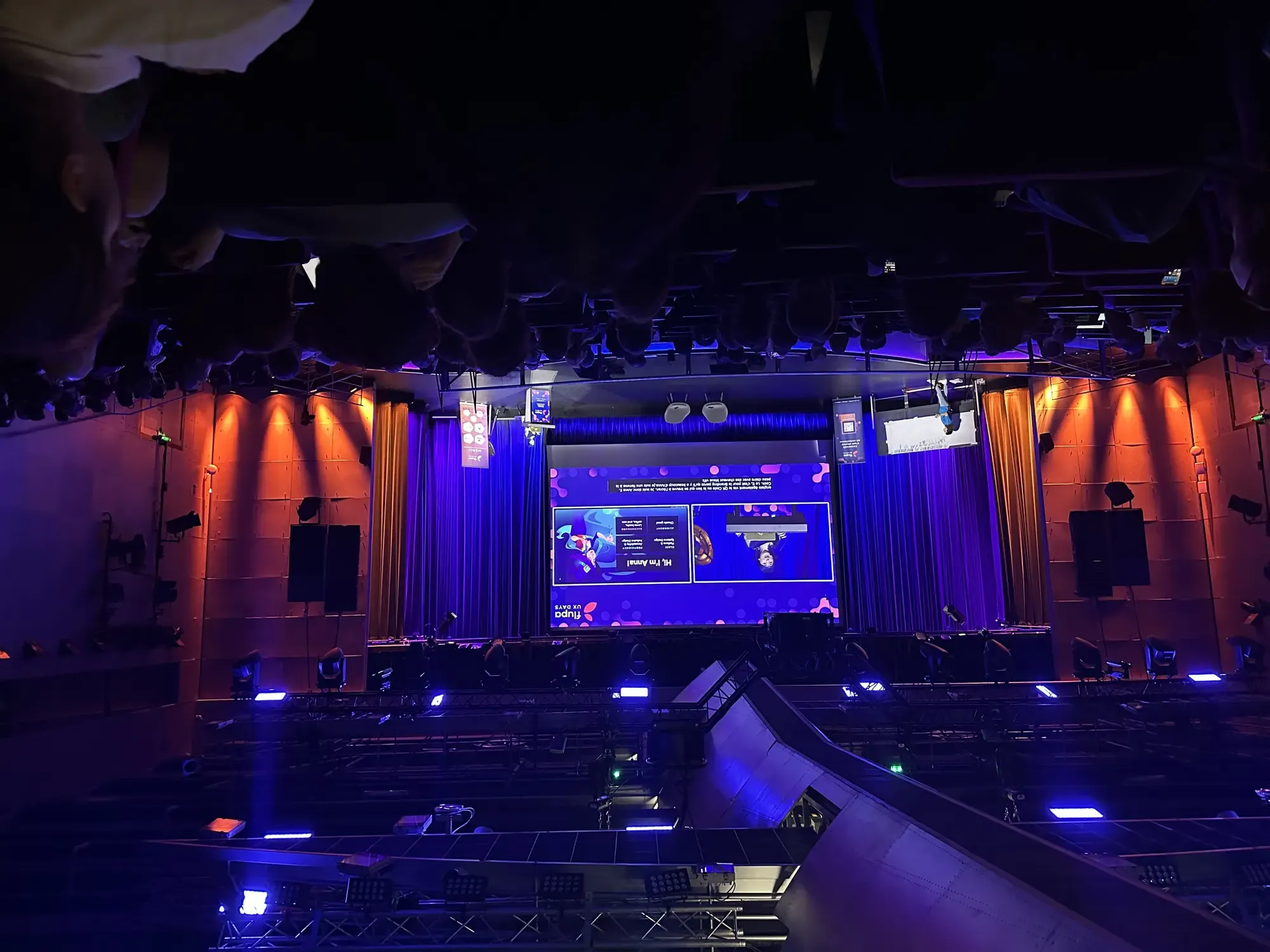
Anna E. Cook is American and a senior designer at Microsoft Azure, and like many Americans, she excels at the art of presenting topics. It’s not every day that the illustrations in a presentation match the colour of the speaker’s hair! Anna expresses herself very well, her personality is sparkling and her slides are beautiful. Okay, we have to admit it, she managed to capture our attention instantly. And that’s well played, because the topic she tackles deserves all our attention: accessibility in the age of AI.
Jakob Nielsen tells us that all it will take is making a diagnosis, for example: I’m blind, and poof, as if by magic, a new interface will materialise for my needs. Gone is deterministic design, the era of personalisation begins, AI understands every user! No more need to think about the structure, no more need to check whether the information is relevant and well organised, no more need to develop accessible code… AI will do it!
”But compelling stories are not the same as accurate ones.”
Anna isn’t as thrilled by AI’s promise; this effortless miracle solution isn’t on the agenda, we’re even very far off the mark. The current figures aren’t good and far too many users still find themselves excluded when consulting our interfaces, and that data gets worse with AI-generated interfaces.
So, how do we take back control over the story being told?
By destroying the myths:
- Myth number 1: Deterministic design is dead.
Design was never deterministic; the final, fixed state of an interface doesn’t exist, users have a wide variety of uses for our interfaces.
We have to design experiences that take into account the different interaction models. A system, if it’s well designed, lets everyone get what they need, when they need it, and be able to change their needs at any time. - Myth number 2: Diagnosis is a design strategy.
To base things on a diagnosis, the user still has to know about it. Anna shares her experience; she recently suffered vision problems, but before getting a diagnosis she’d already started changing the way she used digital products by zooming into interfaces. Once again, the interface has to adapt, whatever the profile. - Myth number 3: Personalisation replaces predictability.
Imagine AI being able to rewrite the mechanisms on the fly and personalise them for each user; consistency is no longer guaranteed. Assistive technologies need a predictable structure to interpret, announce and navigate interfaces. Without consistent navigation, a reliable hierarchy and predictable behaviour, personalisation descends into chaos. - Myth number 4: AI can repair damaged structures
In 2025 WebAIM’s “2025 Million” report flagged accessibility errors on 94.8% of home pages; in 2026 that figure rises by 10%. LLMs train on a system that’s poor in accessibility. AI can’t repair a faulty structure, it inherits it and reproduces it at scale.
You’ll have understood: AI isn’t magic and interfaces need to adapt to everyone and in every situation. Accessible systems are structured, structured systems are analysable, analysable systems are interpretable by AI. Accessibility isn’t a layer you add on top at the end of the project, it’s a constant to take into account in every design decision. Anna invites us all to put accessibility back at the centre of the story.
What we took away
With all her charm and her five-star presentation, Anna gives us a welcome reframing on the subject of accessibility. And we’ll be honest, it felt necessary, we’re all spellbound by AI right now and it would be a real shame to go back to the stone age of interfaces because we didn’t keep in mind the experience of our users, ALL our users. And seeing an American designer who stays enthusiastic about the battles to be fought for accessibility, even though she operates in a country where this subject isn’t a priority, that’s motivating!
Designers, AI is going to make us idiots… or better
Bastien HUGHES
Summary
“If the machine is made to adapt to humans, it sometimes happens that humans adapt to the machine” – François Le Lionnais, 1956.
Bastien Hughes is a former journalist. He speaks well. He never says “um” or “uuuuum”. It’s very pleasant. The beginning is INA archive videos, there’s some Georges Bernanos, he starts from the worries that technologies arouse and the impacts attributed to them on cognition. So now it’s us who’s starting to worry, because presenting a study on the cognitive atrophy linked to using ChatGPT, then following up with the fact that it isn’t verified, we won’t lie, it bothers us just a tad. Especially after telling us that this phenomenon had already occurred with nothing less than the calculator, Google searches and GPS. Then the famous MIT study on the 80 to 95% of AI projects that fail, even though it too is heavily criticised. And so worry about the impact on designers’ skills.
Well then.
But the next point, we quite like it: a logic of an “AI nutriscore”, between using AI to develop your own expertise, as a sparring partner, and there we’re already very convinced of the value internally, and at the other end of the spectrum using AI for low-value-added tasks, and that too we quite like!
And among the time-consuming, low-value-added tasks, there’s the analysis of verbatims. Once again, we’re a little put out.
To illustrate AI’s inability to produce value spontaneously, we’re shown screenshots of Claude conversations. Whose non-deterministic nature everyone in the room is perfectly aware of. Okay.
And then finally (though not everyone on the team agrees on this last point), the coup de grâce: “the real opportunity of AI is, for designers who know their users (so it’s handy, since we know them we save time?), to quickly prototype ideas that would never have come out of the drawer, using Figma Make, Lovable, Claude”. And then after that, we’re shown a process where personas, embodied by AI, can be interviewed, to allow for rapid prototyping, also carried out by AI.
Well, at that point, he lost me. We worry about brain rot, but we do rapid prototyping with AI, because apparently the tools designers used didn’t allow for rapid prototyping, contrary to what we’ve been selling our decision-makers for 15 years. And then we have AIs embody personas, because after all why not, eh, a persona is indeed a user, isn’t it?
In short, we come out of it feeling so-so. But to tell the truth, poor Bastien also takes the heat for the day and a half that preceded him, and even more for the months on LinkedIn, where we’re getting a bit saturated with this discourse from designers who say in the morning “AI is going to make us disappear” and in the afternoon “but look at the incredible design I had my AI make, I don’t open Figma any more”.
We’re going to go have a verbena tea, and we’ll talk again in a few months.
What we took away
The point was well brought across and the examples relevant. Bastien aims to be reassuring about the future of designers, provided we become aware of our values. We’d have liked more concrete examples of how things work at Bouygues Telecom regarding the proportion of tasks accomplished between humans and AI. The line seemed blurry and could lead you to think that designers no longer really design, but order a machine to do it, which contradicts the point of the talk.
Mirror, mirror on the wall, is AI going to replace me?
Quentin LEDOUX
Summary
Quentin LEDOUX, psychologist and product designer as well as co-founder of the Donut Panic network, tries to enlighten us and reassure us around the question that most designers ask themselves, “is AI going to replace us?”.
He opens the subject by taking stock of AI’s risks, progress and performance according to the latest studies. Spoiler, AI performs well in sectors where we thought we had the upper hand, but that’s nothing new, which he demonstrates through a retrospective of the various technological revolutions.
But AI, despite its performance, still can’t establish a climate of trust, because the empathic value lies in there being a human across from you. AI has a real ability to make each individual more productive, but not the collective.
The rest of the presentation aims to question where this fear comes from and what value we place on ourselves. Through various accounts, designers fear no longer being who they are in all their facets. AI reveals our fragilities.
Then comes the question of “What can we do?”. In the same way that we regularly consult benchmarks and test new tools, Quentin invites us to do what we do with our users, to question ourselves.
So through this work of introspection, we’ll be able to identify our fears, and that identification is the real “problem to crack” in order to find our place among these new tools and technologies.
Because once the problem is identified, we, designers, will find solutions to address it.
What we took away
This talk helps put into context the moment we’re living through as designers with the rise of AI, and shows that history has been here many times before. The questions it raises are useful for finding our footing across all the fields AI touches and its fast, relentless progress.
The way it pulls everything together is welcome: it reminds us we’re not alone in this, and that our skills as designers let us see our own value and put it to work in a world where AI can’t supply every answer or every bit of know-how.
Designing for those who make radio
Clara d’ARCO & David DUHAMEL
Summary
Clara d’ARCO, UX Designer, and David DUHAMEL, Lead UX Designer at Radio France, take us behind the scenes of how they redesigned their internal tools to keep up with new ways of working.
Digital used to be an extension of the broadcast production model, and the tools were built on that thinking. But the arrival of digital platforms upended what production needed and the way content gets made. Radio is no longer the only starting point, and that leaves these tools out of step, breeding friction and frustration for the people using them.
They decided to redesign use case by use case, to make sure they addressed concrete problems and offered tangible improvements. They named this project “Le chemin des sens”, which refers to the entire production journey, from the idea to a listener tuning in.
So they imagined a suite of tools interconnected in real time with a consistent UX to simplify the journeys and drastically reduce the production steps.
This way, by offering single sign-on, shared design principles and putting content at the centre, thereby no longer making it dependent on a broadcast date, they managed to make publishing simple, going from ten steps to three.
After laying out their methodology and their results, they presented their approach to integrating AI into their tools. AI is conceived as an assistant. It serves notably as editorial support, as a tool for detecting highlights or for extracting musical and editorial metadata.
They also stressed the position they’ve set for themselves in order to ensure the production of high-performing tools: they design for listeners even though their work concerns internal tools.
What we took away
This experience report, very well delivered, let us really understand their problem, their approach and the results they got in a complex environment where habits are deeply ingrained. Their very open sharing of the interfaces produced and the features developed is much appreciated and really helps illustrate their work.
They present a lot of work done with users that bore fruit, which is reassuring in an era where user research is being challenged by AI.
It would have been interesting to have a presentation of their macro roadmap to understand how they organised their projects, the redesign timelines for each tool and the problems encountered in delivering everything continuously.
Despite a slight lack of presentation time at the end, the format offered is very clear and well laid out, which really showcases their work.
Fiction and design: designing from what unsettles
Marine LOCHET
Summary
“Fiction and design: designing from what unsettles”, we won’t lie, on paper this catchy title is appealing. Marine Lochet starts by telling us a fictional story where children live happily in a dream society without knowing they’re being raised for their organs! Terrifying, isn’t it? She ends with the very real story of Aza Raskin, the inventor of the digital gesture for scrolling content, which now works in the opposite way to its original intention by vampirising users’ attention, the hell of our modern world.
So Marine tackles the subject of parasitic friction, you know, all those little obstacles that disrupt our navigation, which we designers seek to eliminate to make experiences smoother, and that’s rather a good thing… right? Well, according to Marine, not always. The design industry, in its quest to completely eradicate parasitic friction, can eliminate protective friction along the way. Yes, apparently there’s good friction and bad friction, that’s what Marine explains to us. Some obstacles are placed deliberately in user journeys, not to lose them, but to help them make a conscious choice. For example, inviting the user to type the word “delete” instead of clicking a button to help them grasp the criticality of the action. Being from the banking sector, Marine has more than once had to ask herself the question of “good” fluidity.
The absolute fluidity sought by designers anaesthetises users and can impair their judgment; who has never clicked “Next” without reading anything? So Marine invites us to reintroduce protective friction into our designs and protect users at the moment they have to make important decisions.
What we took away
While the subject is very interesting, the form of the talk a little less so. Marine tried to move us with her world and her references, you can sense she has a fine literary culture, but we’d have liked a more dynamic presentation. The talk took the form of a reading accompanied by static slides, it was very linear. Without questioning the act of reading a text on stage, it would surely have been more impactful to show a story or more dynamic elements on screen, and let Marine’s narration work as a voice-over.
Quality: a concrete compass to think, choose and design
Elie SLOÏM
Summary
If you follow us a bit, you know that we quite like Opquast (opens in new window), the team is 100% certified, and as it happens we’ve known Élie for a long time and we like him just as much. So we won’t be very objective of course, but well, that’s the whole point of this article, to give you our subjective impressions.
So the idea of the talk was to make the case for the value of a quality approach in the digital field. Not because doing quality assurance means aiming for excellence, but because it gives you the means to master the quality you produce. The VPTCS model that we quite like was presented, particularly for what it illustrates about the scopes to intercept during design:
- Visibility of the service, mainly in the SEO sense,
- Perception, in the cognitive-perceptual sense,
- Technical, what’s under the hood,
- Content, the editorial part,
- and finally Service, in the sense of complementary services, delivery, support, etc.,
The instantiation of the model in the UX/UI fields was also presented, which we’re less of a fan of, but well, to each their own after all.
What we took away
Beyond Opquast’s strict scope, we liked the focus on the Pareto principle, this idea of targeting the 20% of causes that produce 80% of the effects to improve the situation, all the more so in the age of AI and its annoying tendency to help us reach a decent result very quickly and to make us struggle incredibly to finalise it!
Finally, we’ll insist one last time on all the value we continue to find in Opquast in the practice of our trades, and we’ll insist on it all the more because Élie pulled off the feat of mentioning the product only once in his talk.
We’re taking the opportunity to come to the rescue of his excess of modesty. So, for the definition of a common, broad foundation, ranging obviously from usability and accessibility to graphic design, but above all covering questions of security, performance, editorialisation, SEO, etc. It hasn’t made anyone here an expert in these fields, of course, but it does let us, every day, support our clients by stressing the need to think early about “de-siloing”, the collaboration between every trade around the final product!
Designing for Privacy in an Increasingly Public World
Robert STRIBLEY
Summary
Designing for privacy, that’s the watchword of this talk. As designers, it seems obvious, yet it’s always useful to take stock of privacy in the digital world.
In this talk, Robert STRIBLEY reminds us of an essential fact: privacy has to be more than a simple box to tick at the end of a project. It’s a central design challenge, to be taken into account from the very start.
To clearly illustrate the extent of the lack of privacy we live with day to day, Robert STRIBLEY confronts us with cases we don’t always think about: connected cars, vacuum cleaners, everyday objects that, in the name of convenience, spy on us without our knowledge.
The truth is that privacy choices are a designer’s responsibility. It’s up to them to put in place the best practices to help the user make their own choices.
For that, he lists good practices to put in place: making privacy tools visible and accessible (rather than burying them in the settings), integrating privacy information from the onboarding stage, never changing the user’s preferences without notifying them, always setting privacy by default… It’s these actions, which Robert STRIBLEY lists for us, that make the difference and that we, as designers, have to take into account.
What we took away
A talk that, at first glance, almost states the obvious, and yet, we can never be too careful or too alert when it comes to privacy. It’s even a good reminder, since designers themselves sometimes deliberately use dark patterns to leave room for these security flaws (the little important messages hidden deep within a page that’s a bit too discreet…). In the end, what we’ll take away is that it’s the designer’s responsibility to offer the best possible product, while guaranteeing their users an experience that respects their privacy.
From Proof of Concept to Proof of Care: designing with vulnerabilities, not despite them
Nadège BIDE
Summary
We won’t lie, up to that point we’d heard a lot about AI and it was getting to be a bit of an overdose. So clearly, a talk like Nadège’s does some good. A field-based approach, on a societal subject. The reminder of a tool we use far too rarely, and above all a lot of humanity in the approach. Everything we love.
The work Nadège shares with us comes from a dissertation study carried out with several classmates from the CNAM’s DIU in Philosophy, Ethical Design & Care. The project looks at the town of Arcueil in the Paris region, with the aim of working on the vast subject of this territory’s vulnerabilities. By looking at both the good and the less good sides.
Used to fairly structured user research approaches, we had a rough idea of how this subject might be tackled. But here Nadège surprises us, mentioning as a “compass” the Verstohlen charter, which lists ten unranked principles that cannot be stolen: Perspective, Silence, Proof of care, Climate of care, Care for the dead, Stealth, Homeostasis, Inquiry, Companionship, Dwelling. That’s what will guide the working group’s approach.
To collect the material, Nadège and her classmates worked with sensitive mapping, drawing on the diversity of sensibilities within the group: a historical approach, a photo report of the neighbourhoods, a flow map, sketches and drawings based on observations, etc.
Alongside these wanderings, interviews were conducted with certain actors of the territory, such as the maison des solidarités, who were also familiar with the sensitive mapping approach. Enough to make crossing perspectives easier when you speak the same language.
In the second part, Nadège describes how her team brought out a problem statement in order to define the stances to develop. We won’t spoil it for you. In fact, we don’t want to distort the stances and the outcomes of the approach. So we recommend you go watch the replay!
What we took away
In a world where everyone wants to go faster, it’s important to take five minutes and question what we’re doing. Nadège addresses an important point about these choices we have to make during a design approach. Concretely, her presentation features no anecdote from the field. She made the choice not to make visible a small part of a very heterogeneous whole, from which a subset would have had to be extracted, arbitrarily or not.
Another remarkable point is the change of stance and perspective Nadège invites us to make. Moving from Proof of Concept to Proof of Care ❤️, by revisiting these criteria. Taking a sincere interest, with all your subjectivity, in vulnerabilities, rather than setting them aside. Going back to the essence of design in a way, with a genuine concern for the human. All of this really speaks to us.
How a user community can transform decision-making
Isabelle PREUD’HOMME & Claire FRANQUEVILLE
Summary
The CNED has an audience like few organisations know: learners following their courses on a boat, in a waiting room, or from the other side of the world. Classes of 3,000 or 4,000 people who have never crossed paths. Suffice it to say that the phrase “we can’t suit everyone” long served there as product policy.
Isabelle Preud’homme, director of innovation, and Claire Franqueville, designer within the innovation lab, are behind a UX approach that sought to change that, by giving learners a direct voice.
A community built on two platforms
It all starts with a POC on Discord, with 300 beta testers expected for the mobile application in development. The result: over 600 sign-ups. First lesson: users want to take part, provided you give them the means and a good reason.
What emerged went beyond what could be anticipated. Spontaneous audits of the application across around ten pages. Functional HTML/CSS prototypes created by learners who had decided to build themselves what the platform didn’t yet offer. Some were even looking for CNED’s APIs to rig up their own tools.
Version 2, on Discourse, is integrated directly into the learner journey. It doubled the community with less communication effort, and made it possible to structure engagement: long projects with bounded sessions, quick polls for one-off contributions.
Two visions, a productive tension
At CNED, instructional designers and UX designers start from opposite premises: where one wants to reduce friction, the other treats it as something that drives learning. Hard to settle that on a designer’s conviction alone.
The community changed the game. Walking into a product meeting with real verbatims means you stop defending an opinion and start reporting a reality. The two speakers cast themselves as advocates for the users, and that’s what clinched it, all the way up to senior management.
What we took away
This talk showed us once again just how important UX designers are for going to get user data and convincing decision-makers of the impact of design choices. The speakers introduced themselves as advocates for the users, and that’s a stance we have to hold on to more than ever. It was a talk that laid out a concrete case, and it was a pleasure to feel the speakers’ involvement and seriousness; this AI-free presentation was a welcome breath of fresh air.