Designing for seniors
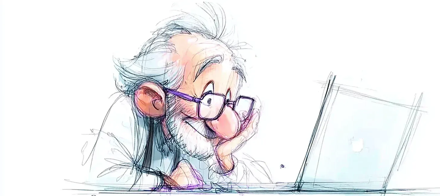
Websites and smartphone apps are a telling example. Eyesight fades with age, so sites aimed at seniors tend to default to a fairly large font. The intention is good, but it ends up labelling the site as a “product for old people”. Not very flattering, is it? The challenge is as much about meeting the need (making things easier to read) as about whether the fix is acceptable to the people it’s for.
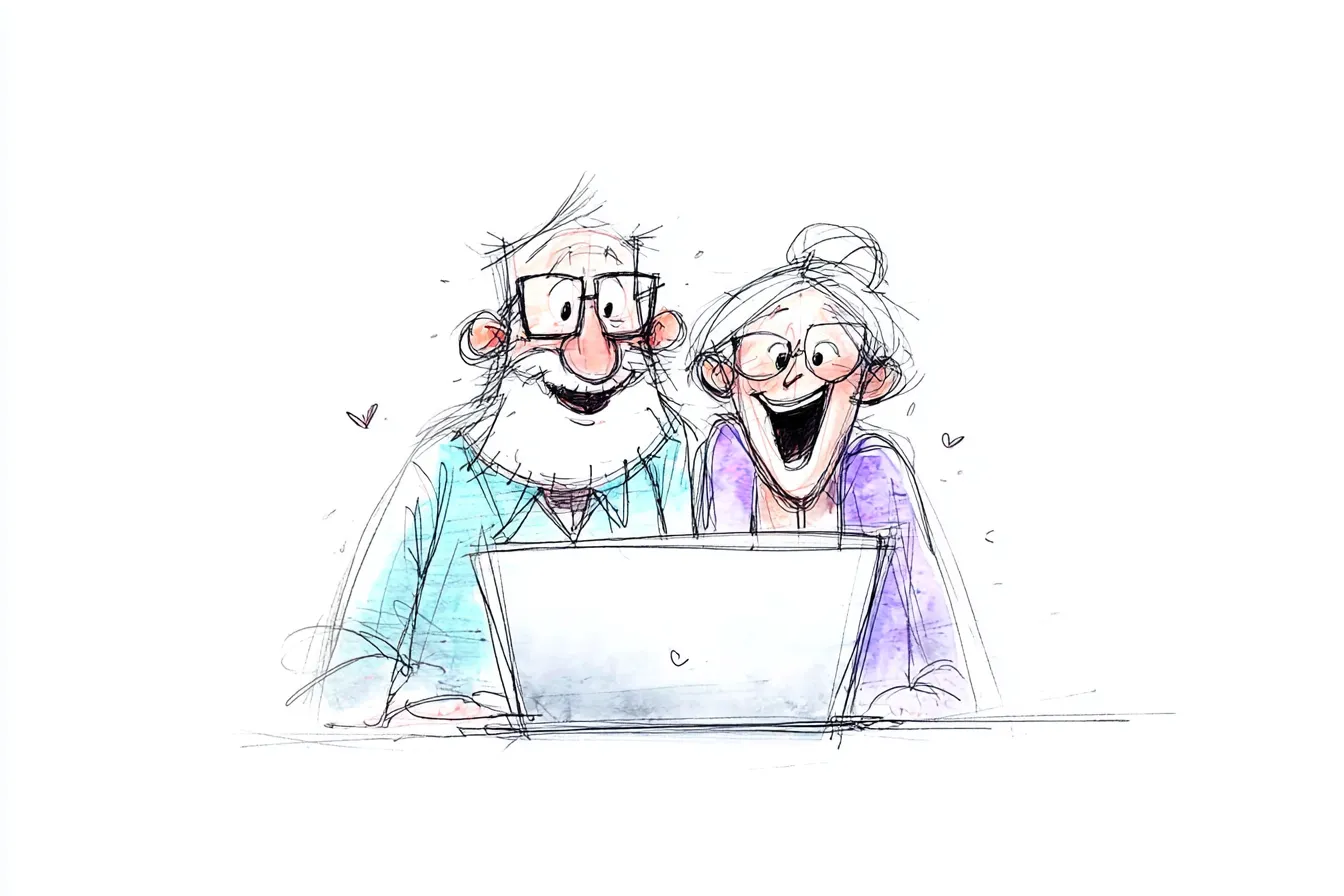
Here’s a newsflash: older people were young once, just as you’ll be old one day. They’re still themselves, with everything that makes them who they are, before they’re “a senior”. Some will want to use technology, some less so, just like anyone else. Whereas the urge to design specifically for older people tends to leave them feeling singled out. A better approach is to adapt existing products for an older audience, rather than build separate products that wall them off from everyone else. Seniors and user experience go hand in hand.
Designing with seniors
When it comes to reading on websites or mobile apps, one answer is to keep the usual font size as the default, but still let people increase the font or boost the contrast, and to make that option obvious. The same goes for button size.
The payoff is immediate: not only does the experience improve for seniors, but the customisation options can help other users too. The product can flex for anyone running into the same difficulties (worth remembering that ageing doesn’t land on us at 65, it starts well before), and for all sorts of settings with their own constraints, mild or harsh.
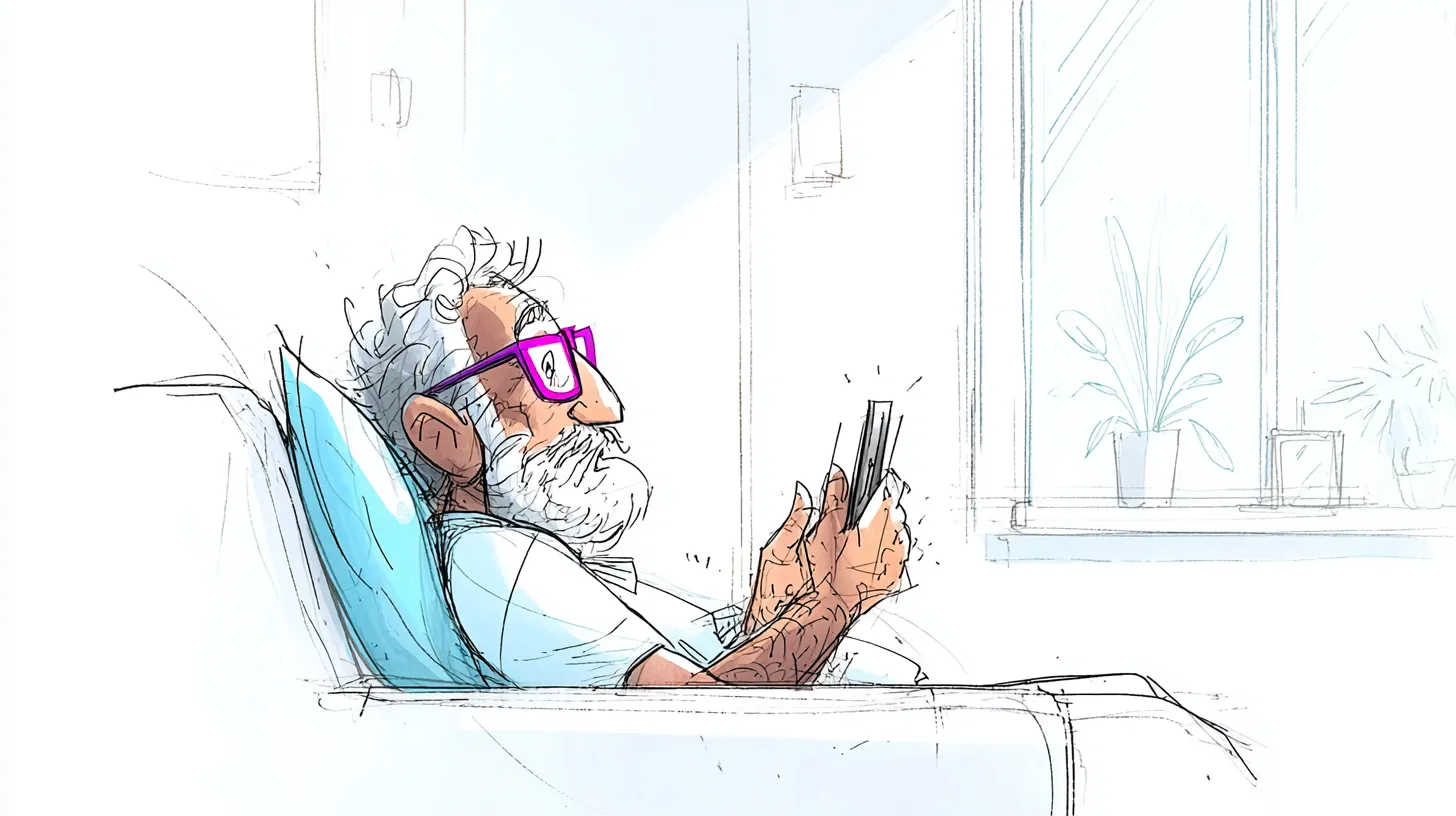
And helping them toward more independence
The senior population has certainly shifted over the past decade. Seniors ten years ago discovered computers when they retired. Today’s seniors had a chance, in their final working years, to get some IT training. Even so, one trait tends to stick: a shaky confidence around technology. When something goes wrong, they’re more likely to blame themselves than the tool.
While “senior-targeted” products can be a harder sell, training built specifically for them can be the opposite, a real help: it immerses learners in a context of their own, keeps everyone at a similar level, and does it in a reassuring setting. That matters for building their confidence. In the end, it lets them learn to use their phones, tablets and computers on their own, instead of leaning on someone else to do it.
So from a designer’s point of view, the smarter move is to build an interface that lets people feel sure of themselves. Designing a user experience isn’t just about making a product usable; it’s about taking the whole experience of using it, emotions and all. Seen that way, blaming the user with accusatory error messages, say, can do real harm to older users, given how little confidence they already have. Far better to reassure them and encourage them to use the site or app you’ve built.
Wrapping up on seniors and user experience
In the end, ignoring what users really need, and how layered those needs are, is a common reason things fail. The culprit is the gap between how the designer pictures their target audience and what that audience is actually like. With seniors it’s all the starker, because picturing yourself 20, 30 or 40 years from now is harder than picturing the next few months. We can’t say it often enough: putting your product in front of real users is a huge help when you’re designing, and it saves you a world of grief!
And user experience on the other side of the world, what does that look like? Take a look, too, at our approach to ecological and inclusive design.
References:
- Mika, M. (2015, March 23). The Paradox of Good UX Design for Seniors [Blog post]. Retrieved from http://www.techenhancedlife.com/articles/paradox-good-ux-design-seniors (opens in new window)
- Pin Sym, F. (2013, September 3). 3 tips for designing user experiences for the elderly [Blog post]. Retrieved from http://agelessvoice.net/623/3-tips-for-designing-user-experiences-for-the-elderly/ (opens in new window)
- Nielsen, J. (2013, May 28). Seniors as Web Users [Blog post]. Retrieved from http://www.nngroup.com/articles/usability-for-senior-citizens/ (opens in new window)