




Creating the Treebal visual identity
The eco-friendly messenger!
Treebal’s goals:
- Bring a human side to the service by giving it its own identity
- Remove the feeling of guilt by communicating clearly about environmental issues
- Offer a simple and tangible service by relying on a clean, pragmatic design
- Be an eco-responsible communication platform: offer a service that connects users with local stakeholders
- Plant trees: a goal of millions of trees planted thanks to the app
- Inspire other companies in their ecological efforts
- Contribute to the goals set by the UN
- Help consumers become more and more environmentally conscious without falling into the trap of greenwashing
- Fund partners working on biodiversity

A logo to symbolise belonging to an eco-aware community. The brand’s symbol is built around three essential elements: the tree for reforestation, the messaging bubble for local conversations, and the feather symbolising the eco-aware community or “tribe”. The logo simultaneously represents an arrow and a young tree shoot forming a crest. This crest becomes the emblem of a committed community.


App UI design
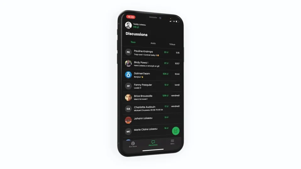
An eco-responsible app with a clean design conveying Treebal's values
In keeping with the eco-design approach, the app is designed in both dark mode and light mode. We also limited the use of images in favour of illustrations and pictograms. This minimalist design is built for intensive use.


Treebal marketing website
Presenting the app and making the app easy to download
The marketing website highlights the brand’s values:
-
a responsible and sustainable use of digital tools
-
a genuine alternative, both eco-responsible and ethical, to non-European messaging and social-media services
-
protecting the planet
-
protecting data
-
bringing as many stakeholders as possible into the ecological transition


