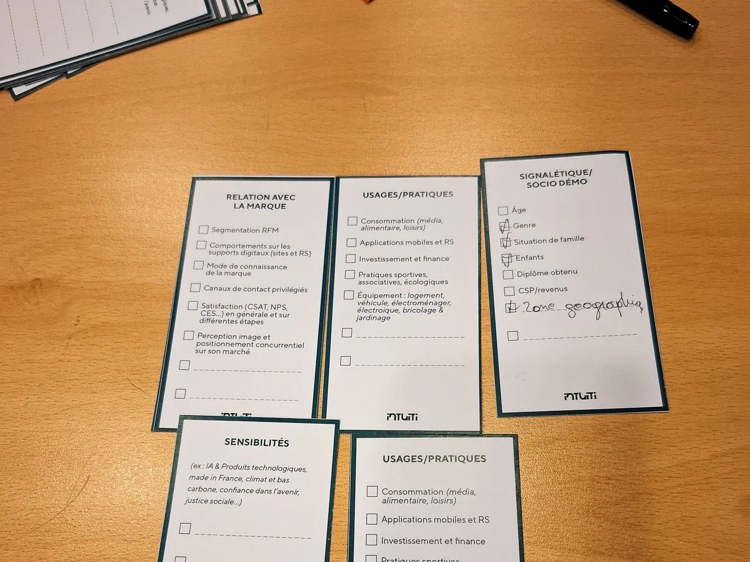
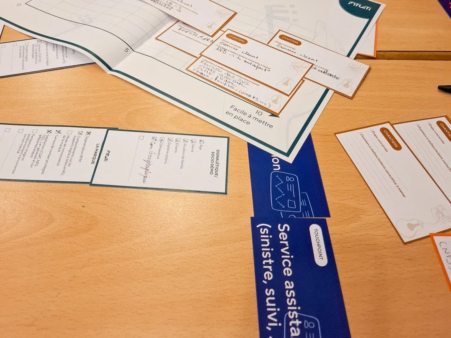
Customer knowledge fresco
Anaëlle LETRÉMY & Nabil THALMANN
At the crossroads of research and change management, the Customer Knowledge Canvas kicks off a healthy dynamic of sharing information around customer data. The workshop offers an approach that combines a customer knowledge audit with a roadmap of concrete actions.
Mapping the data
Participants take on different roles within a fictional company (insurance or fruit and vegetable wholesaler): customer relations, production, logistics, marketing, and so on. The aim is to map the available data to solve customer experience pain points and build a prioritised action plan.
The exercise runs over 5 steps with cards to handle:
- Touchpoint audit: order the contact points of the customer journey.
- Usable data: identify the data that can be collected and used at each stage of the journey.
- Blocking hypotheses: formulate the potential difficulties users may face and place them under the relevant contact points.
- Data-based solutions: for each identified hypothesis, participants define how to use data to improve the customer experience: measuring navigation errors, tracking support response times, evaluating satisfaction at specific stages, and so on.
- Prioritisation: the solution cards are placed on a matrix crossing “impact on the customer experience” and “ease of implementation” to set up a realistic action plan.
What we take away
The exercise, while not revolutionary in its process, puts the emphasis on collecting and using data to track the impact of UX work. It helps us realise that sometimes the solutions are more accessible than they look.
That said, it’s worth keeping in mind that access to data can be a challenge and that metrics never fully explain user behaviour.
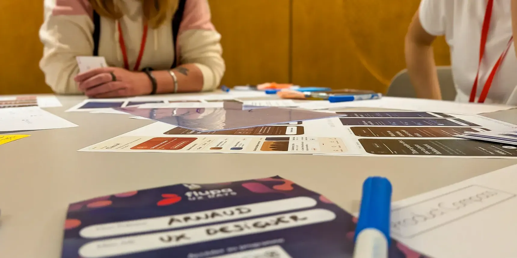
Impostor syndrome: keys to a calmer career
Marine AUBERT & Kamila GIEDROJC
An introspective workshop to rebuild self-confidence
Marine Aubert and Kamila Giedrojc, lead designers at Société Générale, run a workshop to help designers overcome impostor syndrome. Starting from the observation that a majority of designers lack confidence in themselves, they create a safe space to identify and dismantle the mechanisms that hold back professional growth.
A process structured in 10 steps
The workshop is built around questionnaires and interactive exercises. Participants start with a standing “game” where they sit down when a truth applies to them (“I’m afraid important people will discover I’m not as capable as they think”). They then fill in a simplified version of the Clance scale to assess their level of impostor syndrome.
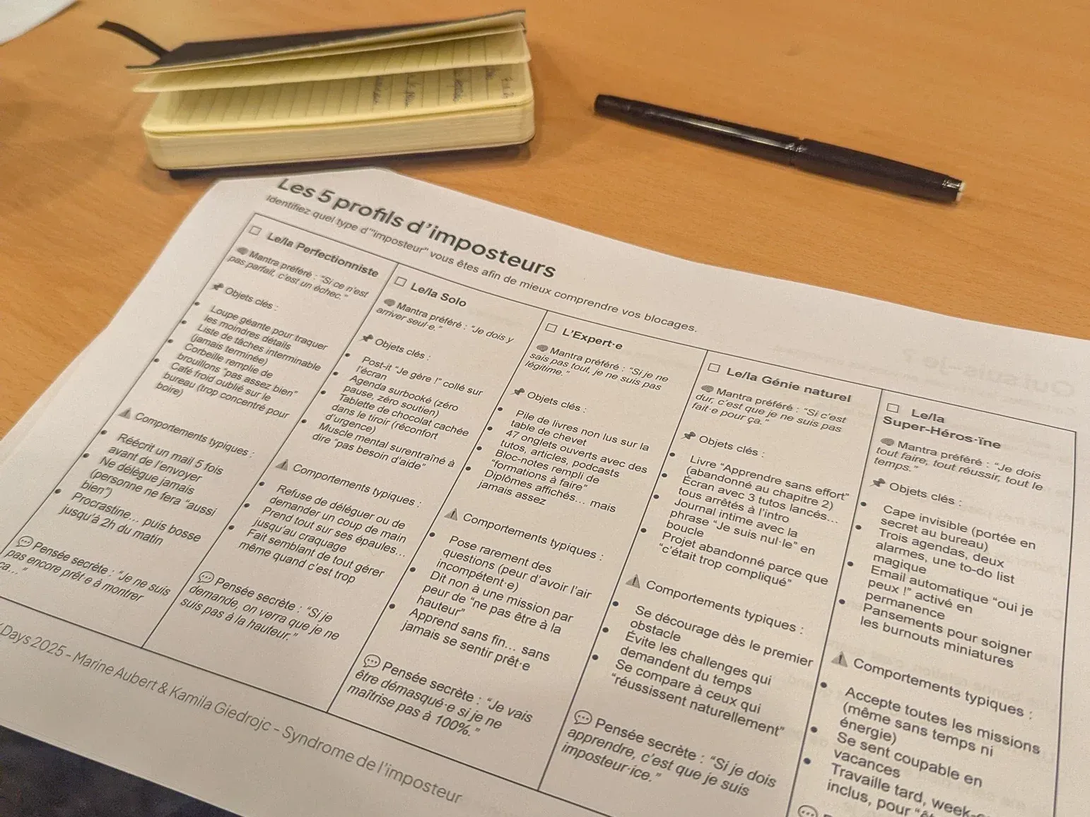
Five impostor profiles identified
- The perfectionist: “If it’s not perfect, it’s a failure”
- The soloist: “I have to do it on my own”
- The expert: “If I don’t know everything, I’m not legitimate”
- The natural genius: “If it’s not hard, then I’m not cut out for this”
- The superhero(ine): “I have to do everything, succeed at everything, all the time”
Focus on skills and growth
Participants explore six UX designer profiles (i-shaped designer, generalist, T-shaped designer, unicorn, hydra, X-shaped designer) and build a skills radar. The goal is to master your technical skills, your communication skills and your interpersonal skills to become a complete and confident designer.
Concrete tools for the future
The exercise ends with the definition of actions to put in place over the next six months to positively influence your career. As a bonus, a reminder of the key principles: don’t stay isolated, stop excessive comparisons, separate feelings from facts, and develop your communication skills.
This workshop offers a refreshing approach, different from the usual formats, letting designers leave with a personal toolbox to take their place calmly in their professional environment. Once again, the workshop’s timing means we would have liked to learn more on the topic (but that’s a good sign).
Everything you can do with 6 LEGO bricks
Mario ESPOSITO
Let participants live through all the stages of building a project while experiencing the power of collective intelligence. That’s what Mario Esposito offers in this workshop, leaning on a frugal and limited set of materials.
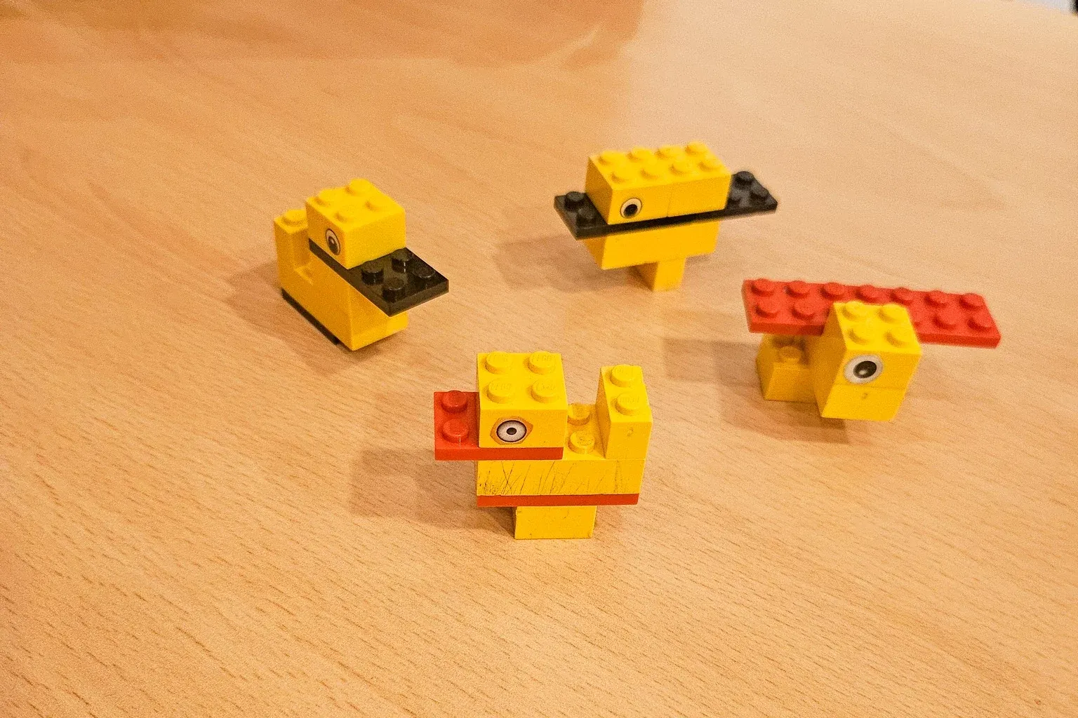
The goal? Create the best possible duck with these 6 LEGO bricks.
6 bricks, 8 steps, 1 duck
- Vision: you realise very quickly that with only 6 bricks, there are endless possible interpretations. Proof: out of around twenty people, not a single identical duck.
- Alignment: a functional constraint appears: the duck must float. This specification changes things and forces you to rethink the approach.
- Proposal: we go from a solo build to a pair by teaming up with another participant. This step reveals the richness of sharing ideas and lets us build a better duck (with now 12 bricks!).
- Constraints: new twist: after building a duck that matched what we wanted, we’re suddenly told about a budget restriction (only 8 bricks left). And the customer personas arrive with their specific needs.
- Convergence: we finally merge all the ducks into a single one. It matches what we want, meets the budget constraints and the client’s constraints.
- Solution: here we pool all the information and constraints we have gathered since the start of the workshop in order to propose the best possible duck.
- Pitch: time to present the final product.
- Test: and finally, the ultimate test. Does our duck float? (Spoiler: yes.)
When the initial goal slowly drowns
This workshop reveals a frequent reality in product or service development: the gradual drift away from the original objective. Despite a clear instruction (create a duck that floats), the team can lose sight of this fundamental requirement amid trade-offs, economic constraints and discussions about aesthetics.
What you mostly take away is that it’s important to keep the target vision in mind so you can better understand why it may evolve, to involve stakeholders from the earliest phases to anticipate obstacles, and to test with end users (after all, they’re the ones who really matter).
Model the system before manipulating pixels
Gladys DIANDOKI & Chrisz GLASZ
This workshop offers a methodical approach to mapping digital systems before designing interfaces. It draws on Eric Evans’s Domain-Driven Design, Sophia Prater’s Object-Oriented UX (OOUX) and systems thinking, to create living documentation usable by everyone involved in the project.
Think in objects rather than actions
OOUX favours nouns (objects) over verbs (actions), making collaboration easier between designers and developers, who already work in an object-oriented way.
A 5-step process
- Define the context: environment, goal, user level, emotional state and constraints
- Map the objects with the SIP test: Structure (properties), Instance (concrete examples), Purpose (real usefulness for users)
- Establish the relationships between objects: 1:1, 1:N, M:N, 0:N with verbs describing the interactions
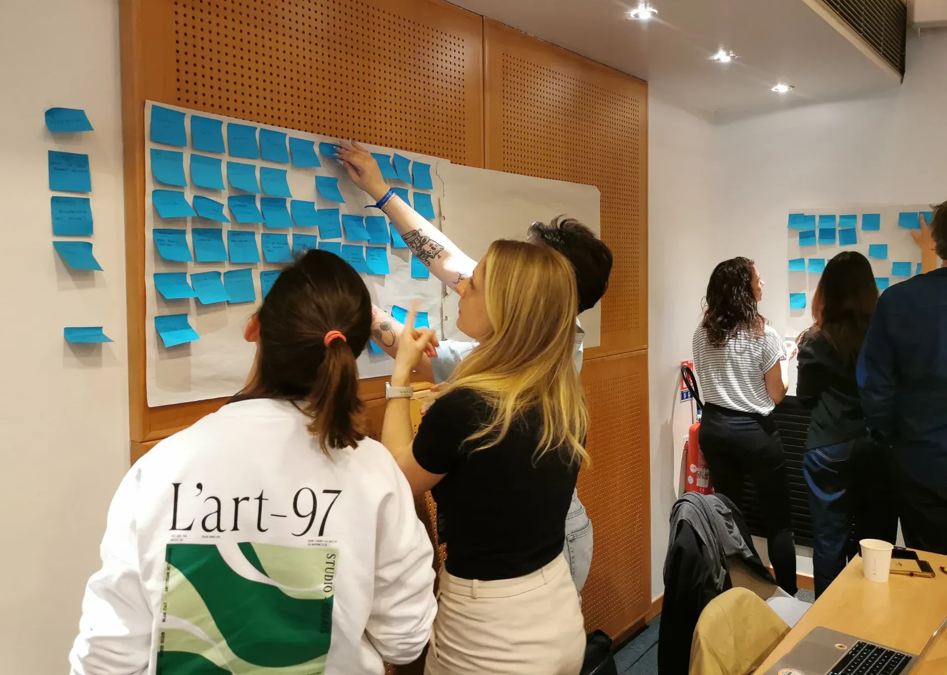
- Question and iterate with stakeholders to clarify, remove/merge or add missing objects
- Document to create a shared reference, an architectural base, a priorities guide and a communication tool
Mapping the system
This approach creates a common language, ensures system consistency, makes maintenance easier, and lets us move from complexity to clarity before designing interfaces.
Systems thinking as a given
What we take away from this workshop is an interesting practical exercise that highlights the necessary step back to map all the components of a system and their interconnections.
At Akiani, we have always been convinced that this systems thinking is essential to understand the stakes and the objectives of a project (digital or not) and to fit the solutions into a global context.
Plausible futures, durable interfaces: using design fiction to anticipate tomorrow’s UX
Michaël BUROW
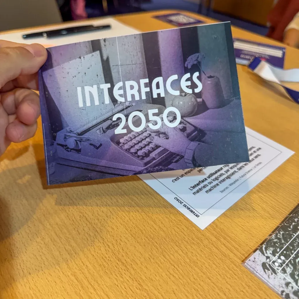
How do you design interfaces that withstand time and cross generations? Michaël Burow invites us to explore the future of user experience through design fiction.
What will be left of our interfaces in 10, 20 or 50 years?
To try and answer this question, participants are asked to develop their foresight thinking and to design experiences that withstand change through realistic scenarios and accessible methodologies.
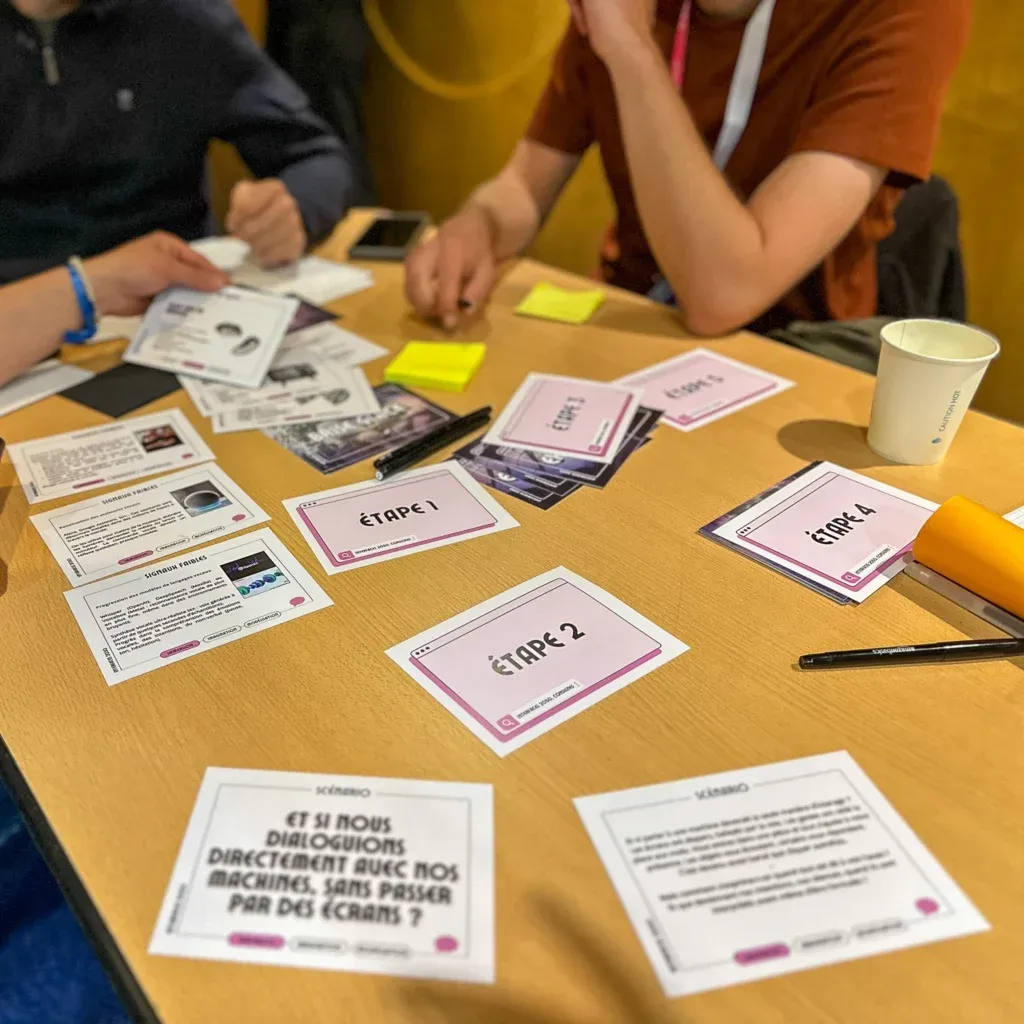
The goal is to prototype interfaces that respond to emerging uses: a world without screens, invisible commerce, predictive health, and so on. Each group designs a user experience that integrates challenges around transmission and durability.
An exercise that lets you:
- Learn a methodology to bring foresight into the UX workflow
- Walk away with concrete tools to assess interface durability
- Develop a new perspective on the transmission of user experience over time
What we take away
A workshop that stands out for the quality of its supporting materials, which make production and reflection easier, and for its projection-based approach which forces us to anticipate how design will evolve. The participative spirit of the format creates a stimulating group dynamic and produces usable deliverables.
That said, the duration of each phase turns out to be too short for the condensed format, which creates a certain frustration given that the workshop was originally designed for two days. Despite these time constraints, which make it hard to evaluate every step, the workshop remains accessible to all profiles and lets us design well-developed experiences based on real needs.
It effectively fulfils its role of questioning the impact and the long-term relevance of products in the face of future uses, while making collaboration easier through presentable, usable documents.
Profile your users and measure the UX of your products: UX questionnaires
Guillaume GRONIER
Guillaume Gronier guides us through the world of UX questionnaires with an approach that is both rigorous and pragmatic. An ergonomics psychologist and PhD in ergonomic psychology, he demystifies these tools by explaining that a good questionnaire rests on three fundamental pillars: reliability (do the questions actually measure the same thing?), validity (are we really measuring what we think we are measuring?) and sensitivity (can we detect the nuances?).
Two types of questionnaires are presented:
- Those that let you profile users by revealing their perceptions, their habits and their expectations of technology
- Those that evaluate user experience: usability, hedonic quality, satisfaction, emotional feeling, perception of “coolness”, and so on
Guillaume particularly insists on the importance of standardised questionnaires: while effective in avoiding biases, they cannot be modified at will. You should avoid removing questions or rewording them, at the risk of losing their scientific validity.
The challenge is to choose and use these many tools while always keeping an eye on methodological rigour, without being paralysed by it.
Guillaume offers a useful resource listing the different UX questionnaires on his site: https://guillaumegronier.com/evaluer-ux/ (opens in new window)
A workshop that skims a complex topic
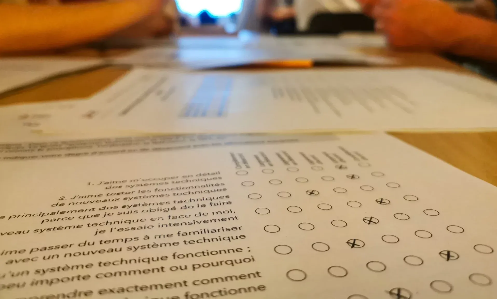
For the practical part, participants agree on a tool or service that will serve as the basis for the exercise and select a user profiling questionnaire and a user experience evaluation questionnaire. Each group steps into the shoes of participants by answering the neighbouring group’s questionnaires and analyses the collected responses for their own subject.
This introduction to the different types of questionnaires makes you want to explore the possibilities on offer, and above all leads to collective reflections on choosing questionnaires according to the type of project. Can we, for example, repurpose the Hexad questionnaire (which identifies player types) for a transport app or the tax authority website?
We come out of these two hours with the feeling of having skimmed over a mountain of tools without necessarily having the keys to use them and to select the right questionnaire for the right project (although, well, in 2 hours the exercise is complex).
Understanding and fighting rebound effects
Laetitia BORNES
The what? The rebound effect describes the indirect and sometimes invisible consequences of an innovation that can cancel out or reduce the expected beneficial effects, with an impact on the environment and society. This workshop offers an accessible, game-based method to anticipate and fight these effects.
Illustrating rebound effects
The historical example of the coal-powered train illustrates this phenomenon perfectly: although more efficient, this technology paradoxically accelerated the depletion of coal reserves, because cheaper tickets generated an explosion in demand.
Laetitia also presents another example everyone knows: Vinted. While the platform claims to encourage the circular economy by making second-hand sales easier, a systemic analysis reveals impacts that are rarely considered:
- 28% of products sold are new
- Affordable prices make impulse buying easier
- The earnings from sales encourage people to buy more, or to buy lower-quality items
- Negative impact on charities that receive fewer donations
The Rebound Archetypes method
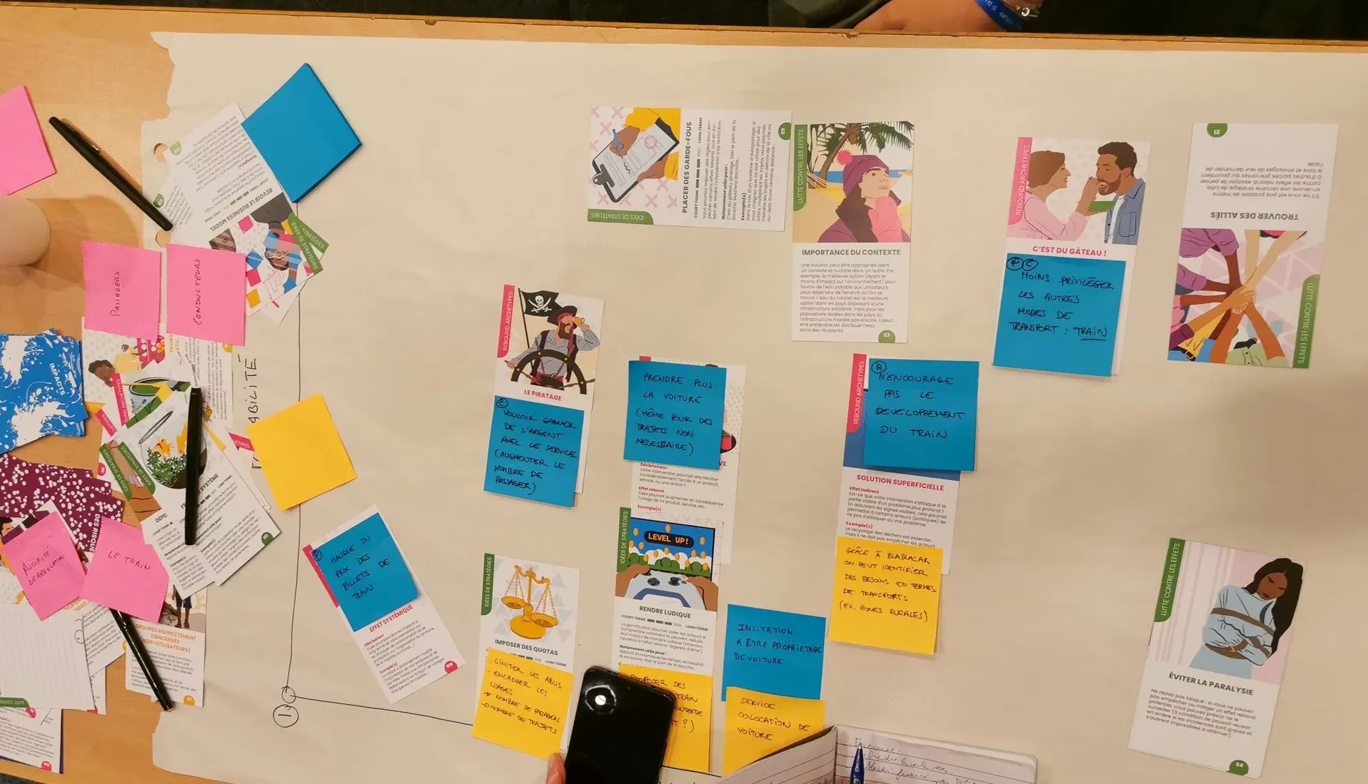
The workshop relies on a concrete tool: archetype cards that help to identify the various stakeholders (the actants), the categories of potential rebound effects and the strategic levers to fight these effects. (The environmental impact, social impact and risk assessment cards couldn’t be used during the workshop.)
To make the workshop easier to run, we take BlaBlaCar as an example, and each group:
- Identifies the stakeholders (drivers, passengers, regulators, etc.)
- Analyses the potential rebound effects (diverting the service to serve one’s interests, indirectly harming the development of other modes of transport, and so on)
- Drafts recommendations placed on a risk matrix crossing severity and probability (framing usage, identifying transport needs in rural areas by leaning on the data collected by the service, and so on)
An accessible and playful reflection tool
Once again, an exercise that preaches to the converted (that’s us), inviting us through systemic design to look beyond the direct impacts of digital and to focus on the behavioural changes induced by these new tools and services. While it doesn’t apply to every use case, this free and accessible method offers a precious basis for reflection to broaden one’s vision and make informed decisions.
If it sparks your curiosity and you want to try the method, everything is available for free on this page (opens in new window).
UX Divination: the scientific tarot game for predicting use
Justine NICOL & Yohan TEXIER
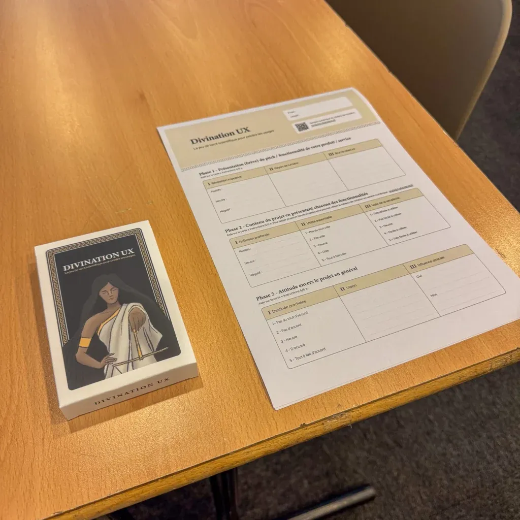
Justine Nicol and Yohan Texier from the LunaWeb agency present an innovative workshop that uses a tarot-inspired card game to help put the UTAUT model (Unified Theory of Acceptance and Use of Technology) into practice. A bold bet that aims to make the exploration of user behaviour tangible and playful.
A clear objective
The tool lets you predict the intention to use a product or a service through key factors: expected performance, perceived effort, social influence and facilitating conditions. It’s used upstream of a project to assess whether the idea matches user expectations, or during a redesign to validate the features being considered.
How it runs
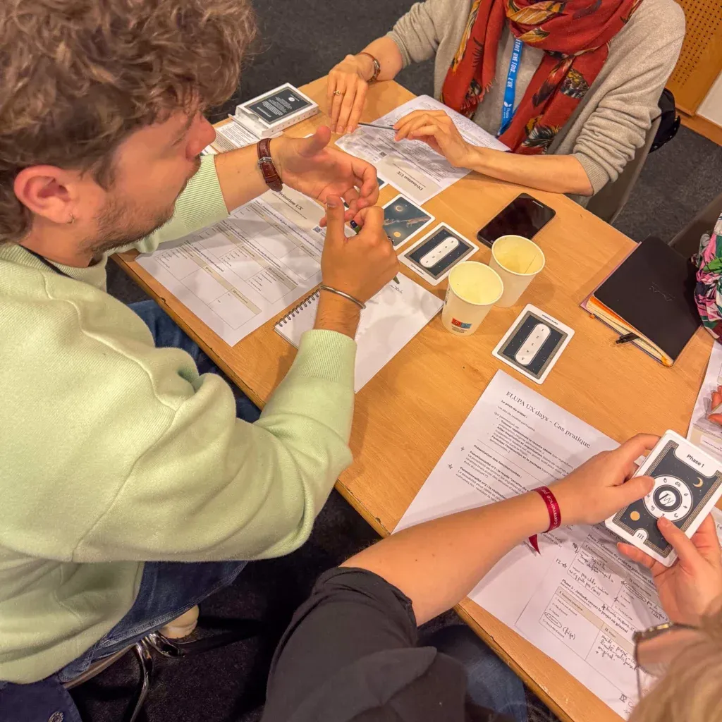
The workshop lets us concretely test this material on a fictitious practical case: a collaborative cooking recipe site. In pairs (one interviewer, one user), we apply the method through a role-play (often a funny one).
- Guided interview: three cards successively reveal questions inspired by UTAUT
- Analysis: categorisation of responses (positive/neutral/negative) and grouping by user profiles
- Visual synthesis: presentation as tables and charts to prioritise the features
What we liked
- The playful dimension makes adoption easier and breaks the codes of classic interviews (the esoteric tarot side catches the eye)
- The methodology is structured with clear supporting materials
- The explicit link between cards and UTAUT axes provides a reassuring framework while leaving room for interpretation
What can be challenged
- The symbolic projection of tarot can introduce biases and skew the answers
- The simplification of the UTAUT model needs to be used carefully depending on the project
- The approach remains less analytical than other methods such as Kano (which we like using)
What we take away
UX Divination is a promising tool (still a bit young) for exploring use cases upstream of a project. Particularly suited to junior designers or to profiles not very familiar with interview protocols, it offers a clear and reassuring frame. Without replacing a full research process, it offers an engaging and accessible approach to UX research.
The cherry on top: the game is available for free download under a Creative Commons licence on the LunaWeb (opens in new window) site.
Prototyping: stop the spaghetti prototypes!
Iris NAUDIN & Marie HOUSSIN
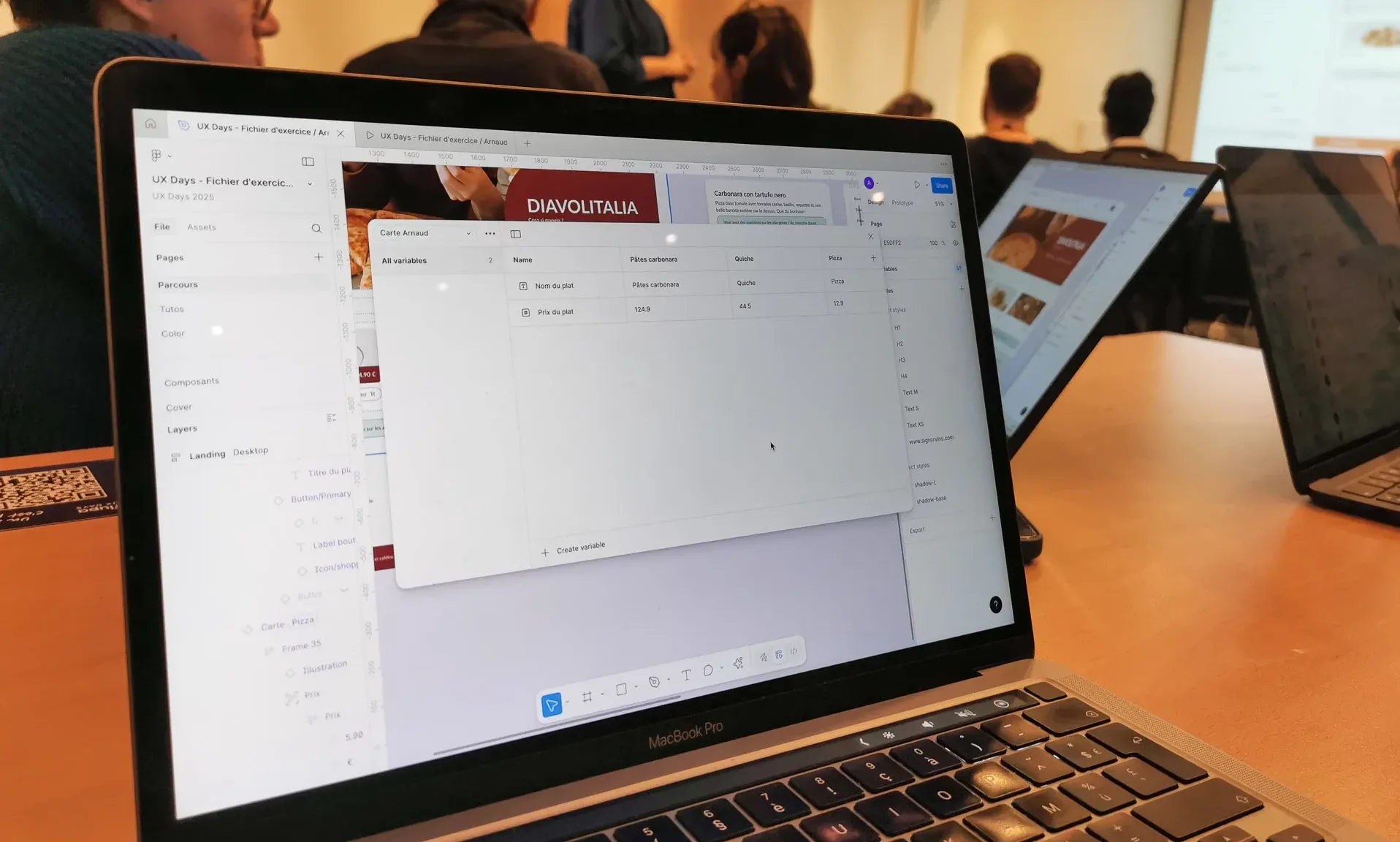
Complex prototypes can quickly become unmanageable without a structured approach. That is the starting point of the “Prototyping: stop the spaghetti prototypes!” workshop, which proposes to explore how to make full use of Figma variables to build more robust and realistic prototypes.
The challenge of complex prototypes
Multi-step forms, dynamic lists, interactive tables and so on. As prototypes grow more complex, managing them by hand becomes laborious. The challenge is real: how do you maintain consistency and functionality while staying as close as possible to the reality of the product?
A 100% hands-on workshop, letting all the participants try things, get it wrong, understand the errors and fix them, thanks to Iris and Marie’s tips and tricks. Starting from a simple example (the website of an Italian restaurant, perfect for getting hungry) we were able to prototype the dish selection and the dynamic display of the cart. All on 2 screens, thanks to the magic of variables.
Variables that look great but call for discipline
This methodical approach to prototyping offers several tangible benefits: lighter files by drastically reducing the number of screens, easier maintenance of complex prototypes, and above all, mockups that better reflect the final behaviour of the product.
On the other hand, it takes time to create the variables and develop the specific flows. And the slightest error can make you lose a lot of time identifying the source and fixing it (developer friends, we understand you).
Iris and Marie also rightly insist on the need to target what you want to test in a “very” realistic way on your prototype, to avoid a heavy design process for the entire journey.
Accessibility, play the right card
Tamara SREDOJEVIC
Only 1 to 3% of websites are accessible
Tamara confronts us with a reality we are starting to know well: despite legal obligations, the vast majority of sites remain inaccessible.
The classic excuses
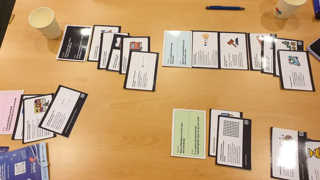
The workshop revolves around a clever card game that helps us respond to the 24 objections we most often hear on digital accessibility. Among the great classics:
- “It’s expensive and time-consuming”
- “We don’t have any users affected”
- “It’s too complicated, we’re not trained”
- “It’s going to spoil our design”
Arguments to handle with care
Tamara warns us against arguments that sound appealing but are problematic:
- “Accessibility improves the experience for everyone”: be careful not to forget that we do it first and foremost for the people who are discriminated against
- “It makes money”: defending accessibility only on a business basis misses the essential point
What to remember
A workshop that reminds us of several key points we already know: accessibility is a shared responsibility, not a bonus you add at the end. It concerns designers, developers, product managers and decision-makers. But Tamara’s session is mostly aimed at giving us keys to better master the arguments and dismantle preconceived ideas.
NeuroDesign: exploring the mysteries of the brain
Antoine DESPRAT & Mélissa MANGIN
The workshop offers an immersive dive into the workings of the creative brain. Run by Antoine Desprat and Mélissa Mangin, the session concretely explores how brain mechanisms influence our design practice.
A surprising experiential approach
The exercise is organised into two sub-workshops: Antoine guides us through the exploration of the senses and emotions, while Mélissa focuses on cognition and movement.
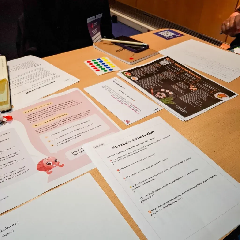
The cognition part is particularly striking for its destabilising approach. A role-play at the restaurant with deliberately disorganised documents and scattered protocols. This confusion is meant to let us feel the impact of cognitive overload on the user experience. Clever, but at times frustrating.
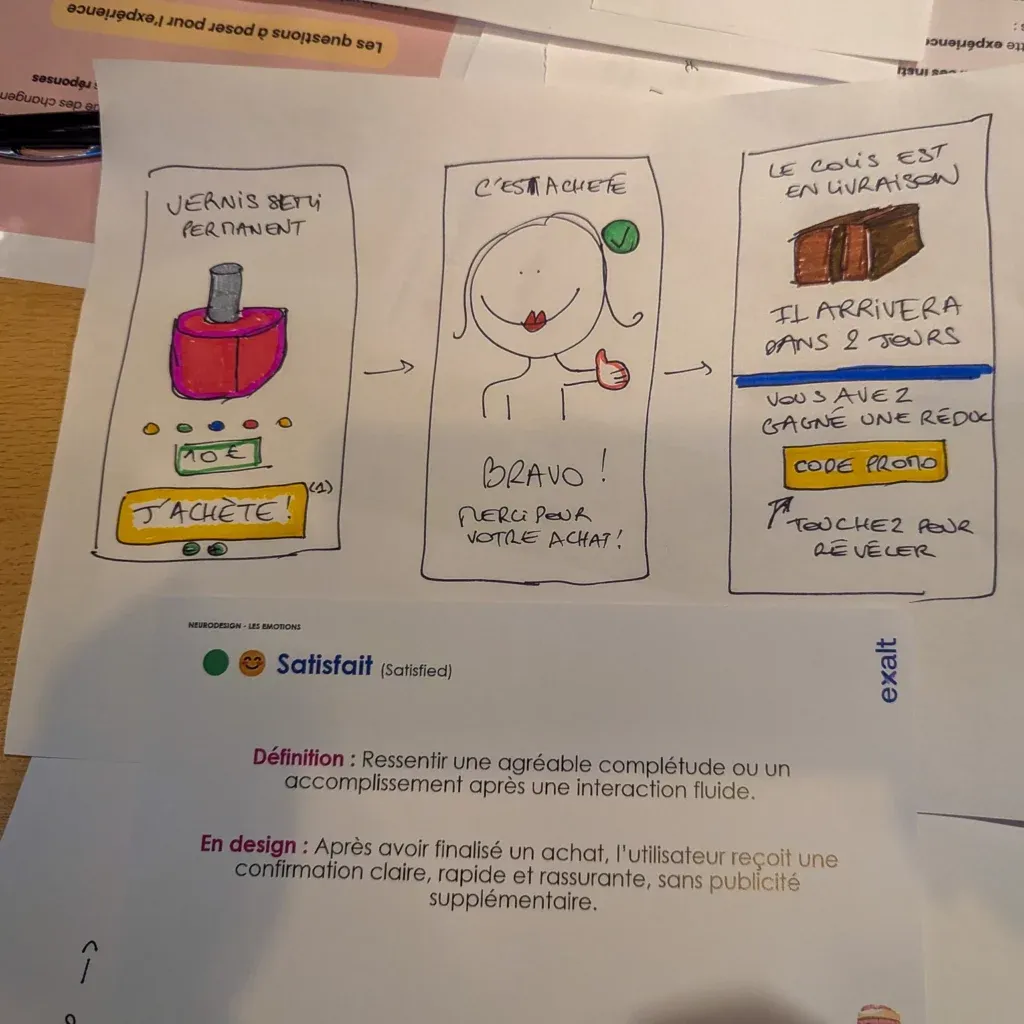
The exercise on emotions creates the most memorable moment. Guessing the word “pressure” by building a purchase interface where the price goes up every 10 seconds. Result? The group testing the interface starts bouncing on the spot, stressed at the idea of missing Lady Gaga. A vivid reminder that our interfaces produce brain reactions that ripple physically.
The verdict: playful but maybe too light?
This workshop shines through its interactive and warm side. The playful approach makes the concepts accessible and reminds us efficiently that the brain is in charge of every interaction.
That said, you come out with more lived experiences than structured knowledge. For UX professionals looking to deepen their practice, the workshop lacks theoretical depth. It remains an effective approach to discover neuroscience applied to UX, but it might leave those looking for immediately applicable tools wanting more.
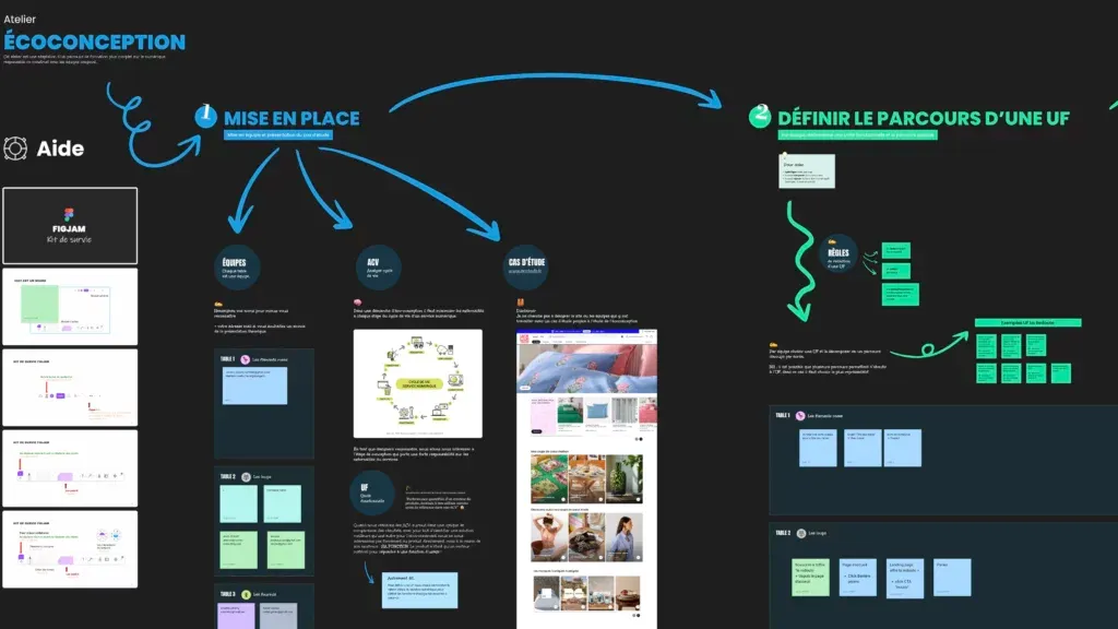
Eco-design audit 101: a concrete method to reduce your products’ impact
Jean Livera
Jean Livera offers a hands-on workshop to audit your user journeys and identify the most effective eco-design levers. With the La Redoute site as a case study, participants try out a complete four-step method.
A progressive flow
- Define the functional unit and its associated user journey,
- measure the environmental footprint thanks to specific KPIs set out in a ready-to-use spreadsheet,
- recommend improvements, drawing on the recognised eco-design frameworks (RGESN, GR491, Green IT, Designers Éthiques),
- prioritise these recommendations based on their implementation difficulty and their environmental gains.
Accessible tools to formalise a starting point
The interest of the workshop lies in the simplicity of access to the various tools: they are free and you don’t need any particular knowledge to use them. The FigJam file lets you quickly formalise an actionable report in a reasonable time.
This type of audit can serve as a basis for discussion but does not, of course, replace a full audit carried out by eco-design experts. It’s also worth noting that there is still a lack of feedback on the actual adoption of this methodology in companies, but the workshop remains quick to deploy and inexpensive.
In short: this express audit lets you bring in eco-design notions fairly quickly and easily into your projects. However, a deeper exploration of the various tools would have allowed for a better grasp of the strengths and weaknesses of each.
So, this first day?
A very dense day of workshops, with very smooth organisation. We didn’t always make the link between the topics addressed and the theme “UX & transmission: creating today, inspiring tomorrow”, 2 hours is overall fairly short for an efficient flow, and we didn’t necessarily come out telling ourselves we had learned incredible things.
But we have to admit it’s always pleasant to go through the looking glass and get hands-on, that we once again met truly lovely people, and that all the facilitators managed to make their topics interesting while keeping them accessible.
Next up? We’re preparing a slightly shorter article, in theory, for the second day devoted to the talks.