Each design is a manifesto for the future
By Thorsten Jonas
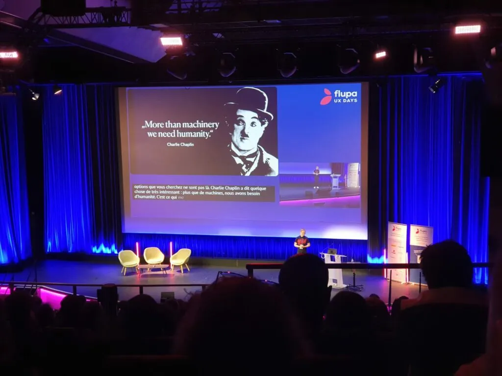
Design as an environmental lever
Thorsten Jonas’s argument is that every design choice shapes our future. He starts from the climate angle, warning about the digital sector’s heavy and often underestimated carbon footprint (up to 90% of digital data is never used, while 80% of emissions are locked in at the design stage). Designers and engineers therefore carry serious responsibility.
He brings concrete cases to back it up:
- At the University of Copenhagen, a decorative video produces 5g of CO2 per visit, a pointless but recurring impact.
- The German site Otto could reduce its impact by adjusting its design choices.
He highlights how design decisions also shape user behaviour, citing examples that range from cynical to virtuous: Amazon, which could make the more eco-friendly pickup point option the default for delivery, or Patagonia, which clearly displays filters for more sustainable options.
Design as a lever for inclusion
He also points out how design built around personas, as we usually conceive them, can be exclusionary. He cites Moia, Volkswagen’s electric ride-sharing service, which factors in user stereotypes but long ignored wheelchair users and visually impaired people. Thorsten invites us to rethink design from the point of view of those excluded, rather than typical users: a flip that is essential if we want to reach the goal of inclusivity.
Beyond simple “user-centered design”, he argues for a design centred on humanity as a whole and on the environment, keeping in mind that “the user is only one part of the system”. Among his concrete suggestions, he proposes adding “sustainability layers” to user journeys: the impacts on the workers behind the services (Uber Eats, Amazon, etc.), on local communities (Airbnb) or on the planet.
The drift of today’s digital landscape
Finally, he raises the paradoxes and excesses of today’s digital landscape. He reminds us that every AI request has a significant environmental cost that is often ignored (231 ChatGPT requests emit 1kg of CO2, and 1kg of CO2 costs 15kg of ice), and he dwells on the ethical question of cultural and artistic appropriation that is necessary to train AI models: how do we account for the consent of the artists whose works allow AI to train? In short, the designer always has a moral duty to ask at what cost they are solving the problems they tackle.
What we take away
We attended a talk that has the merit of taking on “THE” hot topic, and calling it “engaging and inspiring” feels reductive, especially compared with the rest of the day. Thorsten’s stage presence is magnetic and the cause he defends is essential.
The argument stays mostly within a slightly predictable, even moralising register. A few concrete examples come up, but as a whole the talk is short on truly fresh operational pointers: the diagnosis is striking, but the solutions remain largely vague, recycling a discourse on sustainable and inclusive design that we’ve heard before.
We were missing a bit more “how”: after a flight in the upper atmosphere, through striking concepts and principles, we’d have liked to come back down to earth with specific methodologies, tools or in-depth case studies.
On top of that, the swing at tech and AI rings a bit hollow, without constructive perspectives. We end up with the feeling of a well-intentioned but conventional speech, one that makes you shiver without really shaking you.
In other words, this talk raises essential questions but leaves the audience a bit frustrated when it comes to taking concrete, measurable action. In 2025, that’s starting to feel thin.
The Walt Disney legacy: design at the service of experience
By Laura Almeida
Reading the practice of experience design through the lens of Walt Disney’s vision, especially in the making of the Disney universe: that is the ambition of this talk. In front of an audience kitted out with pairs of Mickey ears handed out by the FLUPA team, the speaker covers broad themes around the culture of innovation in experience.
The talk sets out to show that, well before the terms “UX”, “product design” or even “interaction design” appeared, Disney’s approach was already laying the foundations of user-centred thinking. From animation to theme parks, his entire body of work is shot through with an integrated experience logic, aimed at sparking engagement, immersion and emotion.
Laura mentions, for example, the role of the Imagineers, those people with both creative and technical backgrounds who played an active part in building the rides in the theme parks, and therefore the visitor experiences attached to them (for those interested, a documentary series (opens in new window) dives into their world).
The principles of animation, and by extension motion design, designed to reproduce a credible and satisfying sense of physics for the viewer, also come up.
Bridges are drawn between the historical practice of reusing assets in traditional animation and contemporary approaches around frugal design or reusability (and therefore design patterns, components and design systems). Emotional storytelling is read as a form of design centred on viewer engagement, and the way parks function as full-scale experimental spaces is presented as iterative prototyping before its time.
The Disney model is held up in a largely enthusiastic light, without much critical distance on the more controversial aspects (we’ll come back to this): among other things, the environmental impact of theme parks and a global franchise, cultural standardisation, commercial optimisation strategies.
What we take away
The exercise, which won over a fair share of the audience, evidence of its quality, still leaves us with mixed feelings. It is hard to be too openly critical, the whole talk is well-paced and embodied, with Laura sharing her personal fondness for this universe going back to her childhood.
That said, the result is essentially a synthesis of the parallels we’ve been seeing on social media for years, between Disney and design in all its forms. The talk compiles ideas and comparisons that are already well known, without really questioning them or offering counterpoints. The examples mentioned (motion design, emotional design, transmedia strategy) stay on the surface, without deep analysis or critical tension. The compilation is not uninteresting, but it lacks a personal angle, a perspective we haven’t already read many times online.
Another reservation concerns the “ethical” reflection associated with the topic, and the Q&A session didn’t lift the slight feeling of unease. During this event, whose theme was transmission, and where the question of the values that designers can (should?) defend in their practice was central, sharply underlined by Thorsten Jonas just before, the framing and approach of this talk felt a little off. We do think it’s worth asking whether we can deliver memorable experiences without sacrificing environmental and ethical questions. But those are reflections that belong to us, not a moral lesson.
Will generative AI replace the training mentor?
By Jonathan Lalanne
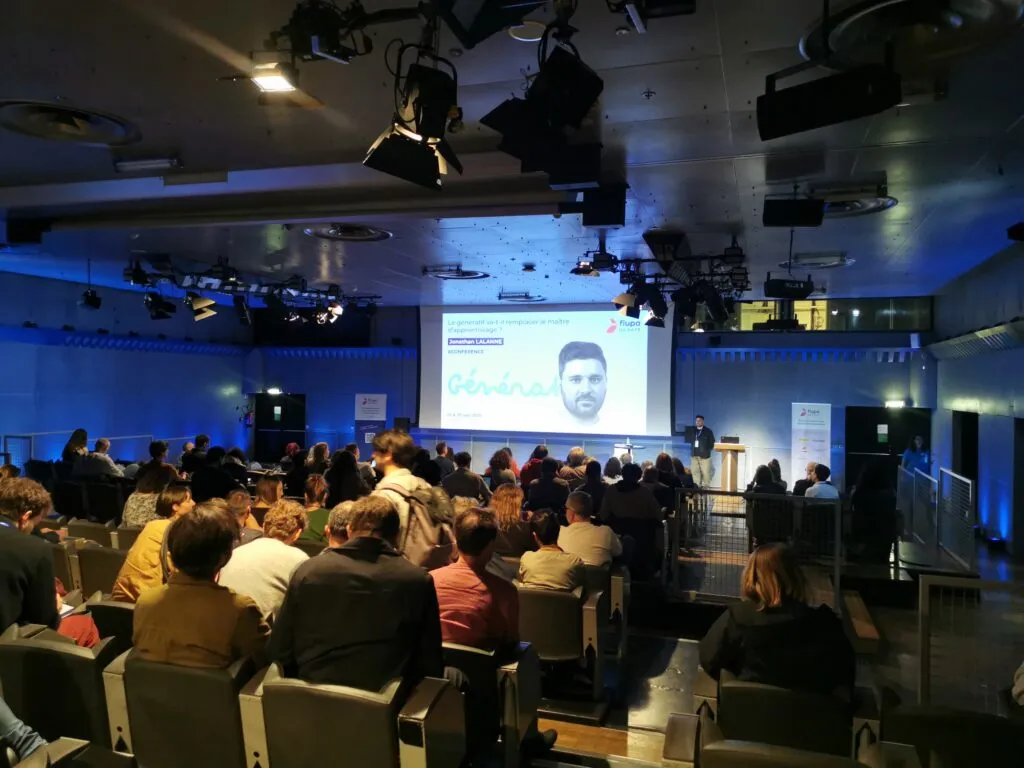
Through various reflections, experiments and analyses, Jonathan looks at generative AI and its impact on learning.
With an opening section on experimentation and art that is fairly hard to take in, you struggle to know where the talk is heading and what you’re supposed to take from it.
After that, the demonstration around the learning curve is very relevant and makes sense, with the introduction of three zones (“acceleration zone”, “critical zone” and “deep expertise zone”) and the comparison between “traditional” learning and “accelerated” learning.
Next comes the topic of the deep mutation of the transmission model. Through a comparison of traditional transmission and generative transmission, Jonathan describes how the senior’s role is being displaced by generative AI, and that this shift brings other changes with it. From slow time to fast time, from linear transmission to non-linear transmission.
He brings out the fact that AI generates without real understanding. As a consequence, the results it produces are:
- without creative intent,
- without cultural context,
- without emotional sensitivity.
So learning through generative AI gives a boost to the curve, but turns out to be superficial. Jonathan uses this quote to illustrate his point: “The more capable generative tools become, the more the risk of superficial understanding grows”.
He also points out that we are heading towards a homogenisation of outputs, through training biases, optimisation techniques, normalisation and convergence of models. And he describes the designer’s role as orbiting around three pillars, “human sensitivity”, “algorithm logic” and “algorithm complexity”.
What we take away
In short, Jonathan delivers interesting analyses on the place of generative AI in learning and on the role of the designer. He puts forward the limits of AI, the superficiality it brings despite an accelerated learning curve, and the normalisation of the outputs it produces. All these reflections would deserve more studies to measure the impact in a more scientific way, and a revisit of the learning curve diagram to better illustrate teaching quality. The talk is a useful warning on AI use and on how to train ourselves to keep the precious advantages that humans are still able to pass on, in order to preserve creativity and sensitivity.
Meeting in the middle of the bridge: what if design helped rethink inclusion at work?
By Zalihata Ahamada Lafeuille
During this interlude, far from product issues or “digital twins”, Zalihata invites us into a more intimate, societal reflection. She shares her personal experience as a neurodivergent woman from a modest background who, throughout her career, has had to adapt to a world that didn’t encourage her to be herself.
She opens her talk with a simple, hard-hitting question:
“Have you ever felt different?”
Whether it’s because of our origins, our gender, our social status, our income, or our cognitive functioning, our differences deeply shape how we are and how we act in a professional setting.
Zalihata insists on the fact that these differences, often invisible, are not always understood (let alone taken into account) in today’s work environments.
And what if, instead of always having to adapt, employees and companies each took a step towards one another?
A personal subject
To explore this broad topic, which can occasionally generate a certain unease or even disagreement, the speaker chooses to explain her point through her own story. Diagnosed late with attention deficit disorder (ADHD) and as gifted (HPI), and sometimes holding down two jobs to make ends meet, she talks about her difficulty in settling into the world of work. This gap, misread by her professional circle, has often called for constant adaptation on her part.
She questions the myth of meritocracy. For her, without recognising these differences, and without questioning power dynamics, the most vulnerable remain excluded. How do we change that? By promoting fairer integration programmes, designed with and for the people concerned.
Diversity at the service of design
Zalihata encourages us to surround ourselves with varied profiles, both to enrich our products and to limit biases and stereotypes. To back up her point, she uses a particularly telling example. Two visuals generated with Midjourney are shown to us.
- The first follows the prompt “generate a wedding image”. We see a happy couple coming out of the church. So far, nothing surprising.
- The second follows the prompt “generate a wedding image in the suburbs”. We then see a sad couple, walking with their heads down through a bleak scene.
“Welcoming a diversity of profiles into our teams means learning to shed these clichés. It also means opening up our perspectives, sharpening our eye on the product, and designing fairer, more representative and more inclusive solutions.”
What we take away
The talk hits home, as shown by the many participants who play along when the speaker runs a series of quick polls. Tackling the subject through a personal story is interesting (essential, even). The differences themselves can be debated, but no one can contest her lived experience.
That said, although the talk succeeds in raising awareness, we may have been missing practical solutions, concrete feedback on how to put this vision into practice. The speaker did briefly mention exercises, but in the end we walk away without real ideas on how to embed this new perspective.
Dwarves on the shoulders of giants: understanding yesterday to design our craft tomorrow
By Antoine Voland-Logerais
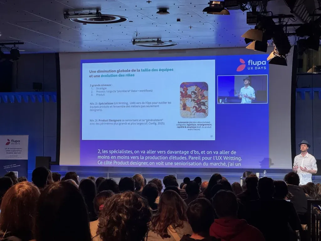
Through a journey across time, presenting several key moments in history and in design, Antoine draws parallels to talk about the impact of innovations on our professions and on the world of work. He then questions the place of AI and what behaviours to adopt to find your place in an environment where teams are getting smaller and roles keep evolving.
Four comparisons are drawn:
- Like the internet, AI is not a tool but a prosthesis, an augmentation of the designer, in line with the logic defended by the sociologist McLuhan. A demo of an AI-assisted design process at Accor is presented. It illustrates a connection between data sources (analytics and behavioural), Figma mockups and AI, with the aim of automating the screen optimisation process based on user feedback and the centralised design system. The challenge may be to escape the trap of technicality and to widen the scope to data, AI and strategy, rather than remaining “screen makers”.
- Like the French Army’s failed bet on tank engines during the Second World War, the advantage doesn’t lie in the technology itself, but in its integration into value chains. Considering that AI will simply allow us to go faster is missing the organisational impact it’s going to have: smaller teams, hybridisation of roles, new workflows.
- The Canut revolt is the illustration of a professional world trying to fight against an inevitable industrialisation. AI is going to push automation further, which will create a form of standardisation, even more than today with all the existing creation processes. Designers must lean on three strengths: creativity, cross-disciplinary culture, and the ability to collaborate to innovate.
- From Sumerian tablets to “alternative facts” and fake news, writing serves to shape reality more than to describe it. Lacking the ability to tell its own impact, design was dispossessed of “design thinking”, rebranded as “product discovery” and carried by PMs. The company ultimately listens to only two narratives: create value or cut costs. Without a clear business narrative, design ends up classified in the “costs” column, and the cuts follow.
What we take away
Time may have been a bit short and the links are tied together quickly, but the exercise is still interesting, as are the perspectives drawn. Which historical mistakes not to repeat, how to adopt a business posture to better make the case for the designer’s role, the importance of creativity and collaboration in the face of AI’s growing place in every process.
This pragmatic vision, a little less catastrophist than the usual LinkedIn version, of a possible future for our craft, with appealing storytelling drawing on multidisciplinary references (history, sociology and even poetry to close), did flatter the academic lobe of our brains. And we all like being flattered, of course.
FAMOUS: lessons learned from the most iconic (and maybe the most underrated) product of our time
By Michael Baeyens
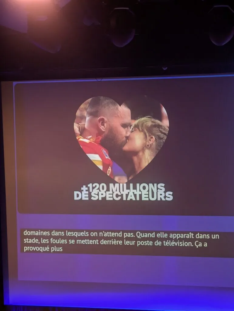
With a real talent for storytelling, staging and slide design, Michael takes us on his journey to discover Taylor Swift. The production matches that of a TV documentary, the delivery is sharp, it’s a show. The sequin jacket plays its part fully. We come out feeling we’ve learned a lot about Taylor Swift, which is great for chatting with the Swifties at the agency (there are some). In the moment, though, we genuinely wonder what it has to do with anything, and despite all the speaking talent on display (and there’s plenty), we can imagine plenty of lessons in marketing, maybe community management, so perhaps lessons for an overall product vision; when it comes to UX, however (since, as bold as it might sound, that is sort of the theme of UX Days), we didn’t really see them. But we probably had too much glitter in our eyes.
What we take away
On form, lots of things, we would love to be able to make something as beautiful, dynamic, colourful and captivating. On substance, we’re still looking. You can’t have it all, after all.
From strategy to execution: behind the scenes of La Redoute’s website redesign
By Renaud Dorizon and Justine Grave
An ambitious redesign serving a brand repositioning
With its new brand signature “vivre le beau” (live the beautiful), La Redoute repositions itself around the promise of making beauty accessible to families. The website redesign, rolled out in April 2024, sits within this dynamic.
Behind the scenes of the redesign, and what it teaches us
Justine Grave takes us behind the scenes of the redesign by breaking down the four key phases of the project. For each phase, we identify concrete, actionable lessons.
- Brief and framing
The initial brief, planned to last two weeks, ends up stretching over two months. It becomes a crucial step in the project, both to align all stakeholders and to set shared objectives through OKRs (S-OKR). The team runs many workshops with the business teams to co-build a clear vision.
Key lesson: alignment work must be progressive and iterative
- Process and validation
A “core team” is set up to drive the exploration phase, with a strong focus on trust and creative freedom. Justine insists on one key message addressed to stakeholders: “let us explore, so you don’t end up with the same thing you have now, just with different spacings and radii”. This well-placed line sums up a key posture: get stakeholders involved very early to share responsibility for the result.
Key lesson: in the exploration phase, you always have to think about protecting room for bold choices
- Design delivery
The handover phase is taken seriously and gets dedicated time equivalent to the design phase itself. Designers work alongside developers to ensure a proper understanding of the components, their use, and the intentions behind them. The goal: preserve the product’s consistency all the way to production.
Key lesson: handovers deserve as much care as the design phases themselves
- Implementation strategy
The implementation strategy rests on a plan shared by all the teams, with priority levels (must, should, could, won’t), KPIs, and a functional breakdown. To de-risk things, the approach builds in user testing, technical POCs and A/B tests. Every major version is systematically documented (with screenshots and annotations) to assess its added value compared with the target.
Key lesson: testing early, prioritising carefully and documenting always are the pillars of a well-managed roadmap
What we take away
A solid, well-structured talk that clearly shows the behind-the-scenes work of a major redesign project. It reminds us that the success of a redesign rests as much on method as on the final output. The session highlights the importance of the “invisible bricks” (strategic alignment, careful handover, collective involvement, and so on) and manages, in a short time, to share some enlightening insights into how the redesign was steered.
To go further, a few concrete trade-off examples or friction points encountered along the way would have fed our curiosity, in particular to better grasp how the choices played out in user experience. That said, given the very short talk format, the result is fully satisfying. A valuable session for any designer or product manager looking to better articulate strategy, organisation and execution.
From concept to impact: how design embeds AI in the product
By Gwendoline Sonzogni
Embedding AI, from concept to impact
The talk shares the experience of Gwendoline Sonzogni, design director at PayFit, on the creation of “PayFit Copilot”, a conversational AI assistant designed to improve customer service and refocus human involvement on where it adds the most value. Today, 70% of customers use it, with an escalation rate kept to 20%.
- Quick, an MVP
Gwendoline goes back to the very first stage of the project: in two days, a draft in the form of a modal is built to help the PayFit teams picture things concretely. Very quickly, a POC is developed by a hybrid team (design, tech, ops), in an experimental dynamic. She shares the assumed gap between the initial ambition (designing a custom, modular widget fully integrated with internal systems) and the reality of the MVP that ships. The MVP is deliberately simple, with no technical interdependencies, to allow a fast rollout.
- An AI that is both autonomous and framed
The team chooses transparency (telling the user they are talking to an AI), prioritises the AI’s autonomy, but keeps the option of a human handover when needed. Particular care is taken with the credibility of the AI assistant. To limit hallucinations, the team systematically includes the instruction “if you don’t know, say so, don’t invent the answer”.
On the UX side, the assistant fits into strategic points (search bar, dashboard, widget). On the UI side, the interface borrows familiar AI codes (purple, stars).
- Prototype, observe, feed the roadmap
The progressive rollout comes with fine-grained tracking. Escalations (tickets created because the user is not satisfied with the answer provided by the assistant) are categorised by topic (absences, payslips, etc.), reported and turned into product direction data. Today, a share of tickets is no longer created because the AI’s first answer is enough.
An internal “design week”, a collaborative playground between designers and business teams, then lets the team imagine future features and use cases at each step of the user journey.
- A retrospective look
The project reinforced the place of content design, which now sits at the heart of perceived value. It also stimulated innovation within the team: a comeback for creativity, a “Botox effect” in Gwendoline’s words, like a rejuvenation of working methods, a higher speed of execution, and a renewed energy across teams.
What we take away
A pedagogical, lively talk, carried by a clear speaker who is well connected to her subject. The narration is fluid, the through-line well held, and the perspective on display lets us move past the AI buzzword effect. The talk has the merit, rare in this format, of being rich in concrete visualisations of interfaces and internal tools, which makes the design trade-offs and choices easier to grasp.
Overall, this is a useful session for anyone looking to embed AI in a product while juggling time constraints, without losing sight of consistency and user experience.