Between artificial intelligence and responsible-design topics, where does design sit?
Artificial intelligence shows up at UX Days 2023
How do I use AI in my work as a UX designer?
By Alexandre Dehon
In what ways can you use artificial intelligence to optimise your work as a UX designer?
To get relevant results, you have to give the AI context and explain the expected goals. Artificial intelligence can be used to explore different options by quickly generating a large number of results. Watch out, though: don’t confuse quantity with quality.
During the workshop, the integration of technologies such as ChatGPT (with the beta web plugin) and Bing Chat are quickly presented. These tools produce more precise results thanks to their ability to generate text and their access to the knowledge available on the web.
And concretely, how do you use this tool in user-centred approaches?
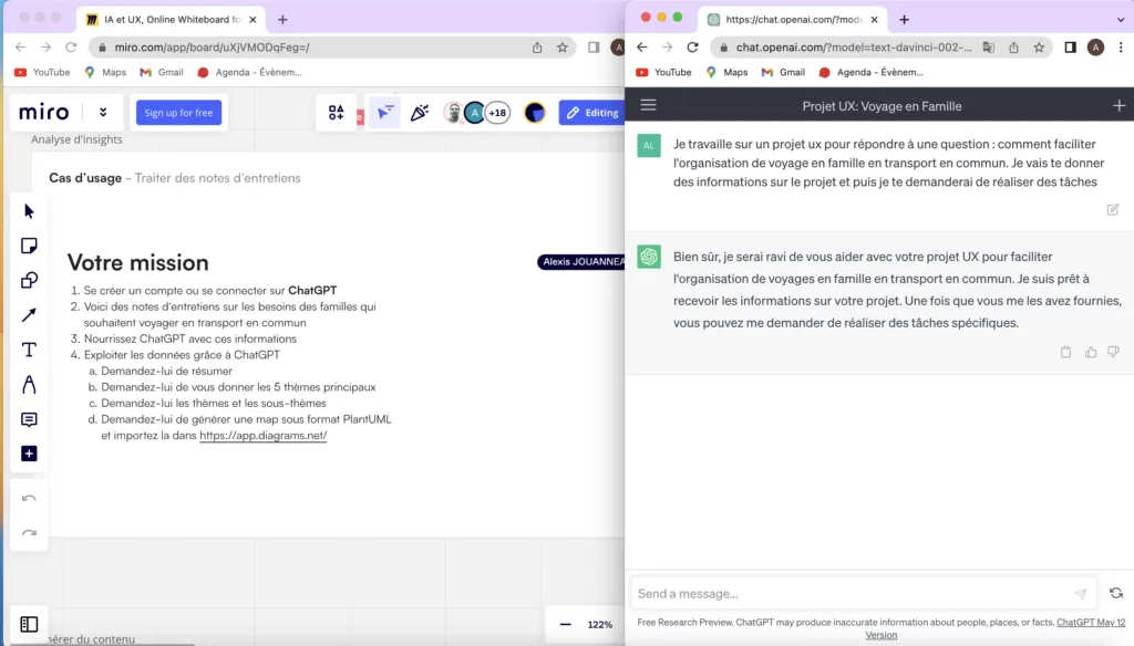
It is interesting to approach artificial intelligence as a design support tool. The facilitators offer a quick walkthrough of ChatGPT to suggest topics for us and rough out how to structure the themes of a questionnaire. We also mention using this tool to help analyse user feedback. Finally, we look at the possibilities of laying out information through visualisations such as cognitive maps or in the PlantUML format.
At the end of the workshop, we look at specialised AI-based tools, such as Attention Insight, which simulate the first impressions users have of an interface through a heatmap. The method is associated with eye-tracking studies, which would serve as a base to “simulate user perception” through an artificial intelligence. Having had the chance to run several studies with our eye tracker at Akiani, it’s hard to hide our doubts about this kind of tool. We’ll let you make up your own mind.
To close the workshop, the facilitators were careful to caveat their presentation extensively. That kind of caution is clearly required for a subject this recent, moving at top speed.
Design and eco-design
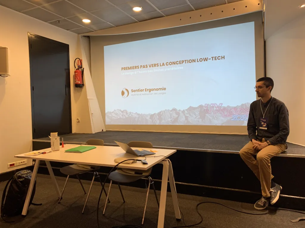
First steps towards low-tech design
By Clément Colin & Antoine Martin
What is “low-tech” design? Keep in mind that a product is low-tech if it is useful, accessible and durable. For example, the safety razor is, compared with the heated razor, more expensive and complex to repair and recycle for the same result. Low-tech favours reliability and safety.
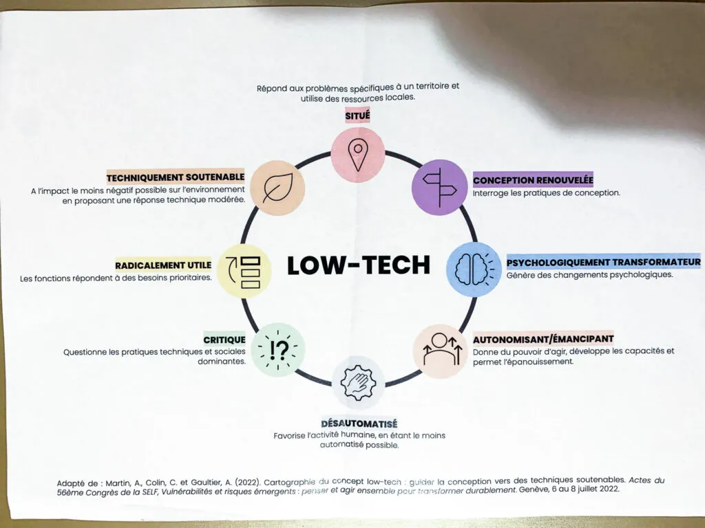
The map of low-tech design presented brings forward 8 main criteria:
- Situated: responds to problems specific to a territory and uses local resources;
- Renewed design: questions design practices;
- Psychologically transformative: triggers psychological changes;
- Empowering: gives the power to act, builds up capabilities and supports personal growth;
- De-automated: favours human activity, by being as little automated as possible;
- Critical: questions dominant technical and social practices;
- Radically useful: the functions respond to priority needs;
- Technically sustainable: with the least negative impact possible on the environment by offering a moderate technical response.
To design a low-tech product or service, it is therefore recommended to favour innovation by removing elements rather than adding any. Technical discernment is also essential. You have to take into account the technical effort required compared with users’ needs. You have to ask what is actually happening and which needs have to be met.
This workshop is the occasion to put this knowledge into practice with a concrete example: the technical brief of a solar bread oven.
We’re asked to improve it by adding new features… which goes against the frugality required in low-tech. The goal is then to group these features by need to finally look for less technical solutions.
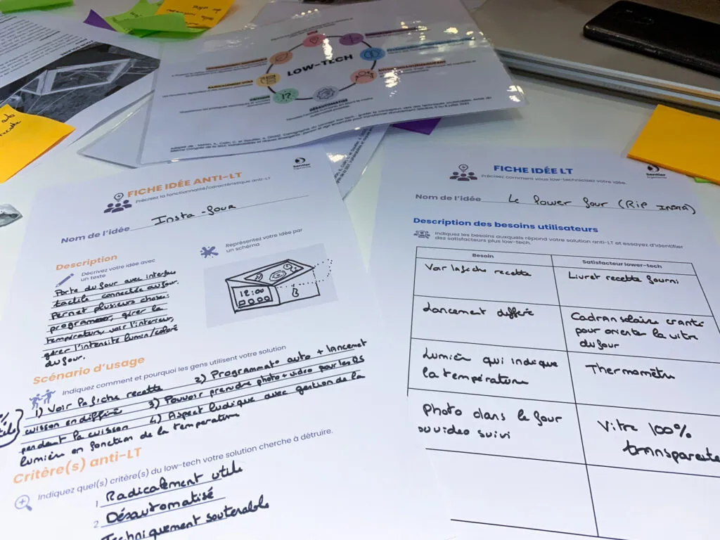
In the end, we realise that without constraints, it’s easy to design wildly over-the-top devices. However, we can lower the technical intensity while still meeting needs.
The distinction between users’ needs and the solutions offered is essential. By being guided by uses, we can adopt a stance of technical discernment.
When I was a UX… : a profession with future(s)?
By Sophie Doublet & Vincent Fourrier
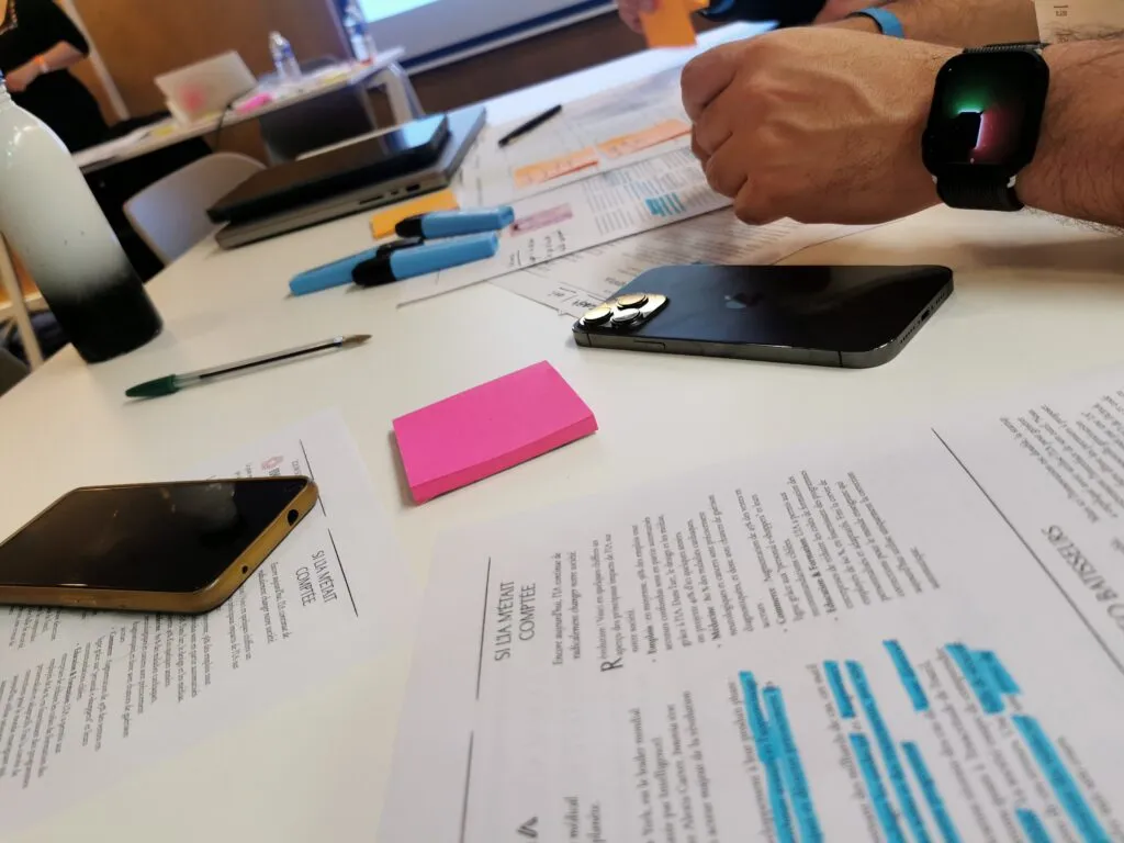
We get into the topic through a presentation of design fiction and prospective design methods, drawing on Elliott P. Montgomery’s diagram. These representations explain the place of this type of design in design, strategy and art, as well as the envisioned futures.
The approach requires artefacts (fictional elements) such as the miBEC by James Auger and Jimmy Loizeau, or the fictional Ikea catalogue from the Near Future Laboratory. These artefacts allow people to project themselves and encourage exchanges and discussion to imagine a shared and desirable future.
To better understand the usefulness of this approach, we are shown a page from a fictional magazine on artificial intelligence. The idea is to use this content to question the desirability and the probability of the topic (here, AI).
After the debate, we adopt the point of view of a company of the future, concerned by the topic put forward in this magazine. The goal is to identify points requiring attention and to think about potential paths for improvement.
An interesting flow that presents design fiction in an accessible way, while offering a quick exploration of the topic.
The Good, the Bad and the UX! Become the worst to imagine the best
By Mathieu Lombard & Nathanaël Cherrier
We won’t lie, when we saw the name of this workshop, we immediately thought of the UX Devil methodology. And on closer inspection, we did find some shared spirit in the mindset of “think the worst to create the best”. But that’s about it. In reality, you could perfectly well include UX Devil as a (playful and offbeat) tool to use alongside other methods discovered during this workshop.
Michael and Nathanaël have both worked in agencies for several years, before joining forces around a shared project. They have been focusing for several months on creating a service to help individuals and companies reduce their carbon footprint.
To set the roadmap for this new product/service, they quickly asked themselves how to de-risk as many critical points as possible. This workshop is offered to share their experience and to discuss with participants the logic on the one hand, and the tools they identified and tested on the other. It’s on this second part that we’ll focus.
The first framework is the one offered by Ethical OS. It describes 8 risk zones highlighted to project the impact of a new product. This model invites you to approach your idea through the glass-half-empty angle. Indeed, while technology is an interesting lever to move things along, it also regularly brings its share of constraints.
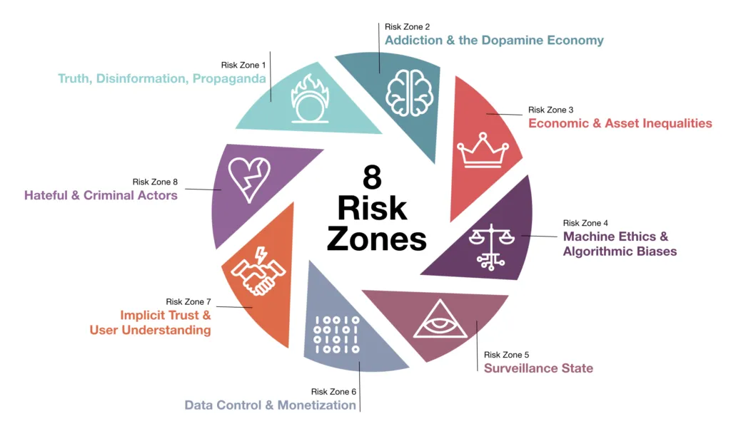
This model comes with a checklist that will help you self-assess the various dimensions of your product when it comes to its impact on users.
The second model presented is the “Responsables” framework offered by Fabrice des Mazery. This other framework is, as the name suggests, specifically focused on eco-design. It basically consists in running a personality test on the product, following several types of footprints. Here we get closer to the spirit of UX Devil, in which a card-based approach is offered, with cards matching types of devilish characters. By looking in turn at the footprint on the individual (Honesty, Openness, Reliability on the data side or Predictability), the footprint on the environment, the economy and on the design itself, this framework has the merit of being broad enough to help you frame your thinking.
Here again, the sources are available on request, and there is documentation on how to use the framework, such as an evaluation grid that lets you compute an aggregated score.
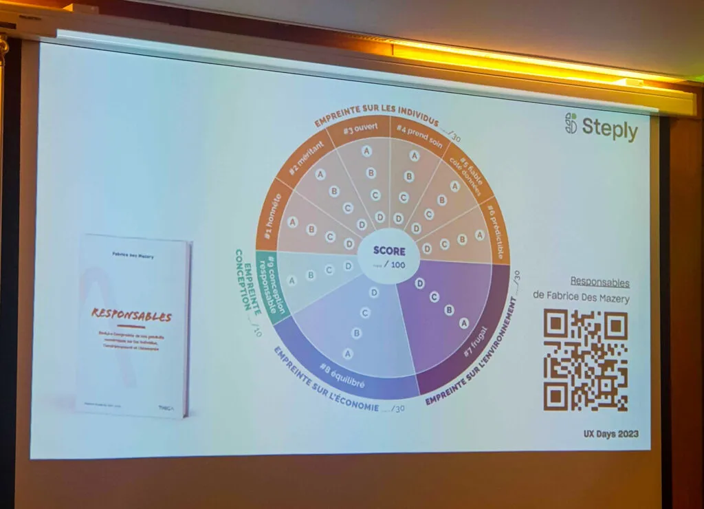
While these two initiatives are not necessarily revolutionary, they have the merit of bringing together several relevant elements that you can find in other, often more granular approaches. For us, it’s an interesting discovery.
An immersion into accessibility
A11y annotations and you, when?
By Patricia Loubet & Vincent Aniort
A few figures to start this workshop. 22.8% of the complaints received by the Défenseur des Droits (French human rights ombudsman) are about disability. That represents the majority of complaints received by the institution.
Services have to be accessible to everyone, everywhere, in an autonomous, confidential and secure way. The WCAG rests on four criteria:
- perceivable;
- operable;
- robust;
- and understandable.
Level A or AA is the minimum for accessibility. The Orange workshop aims to provide tools to bring accessibility into UX-UI mockups.
The idea is to use a system of annotations directly within the mockups and the design system. It takes the form of virtual labels placed next to components to annotate specific points.
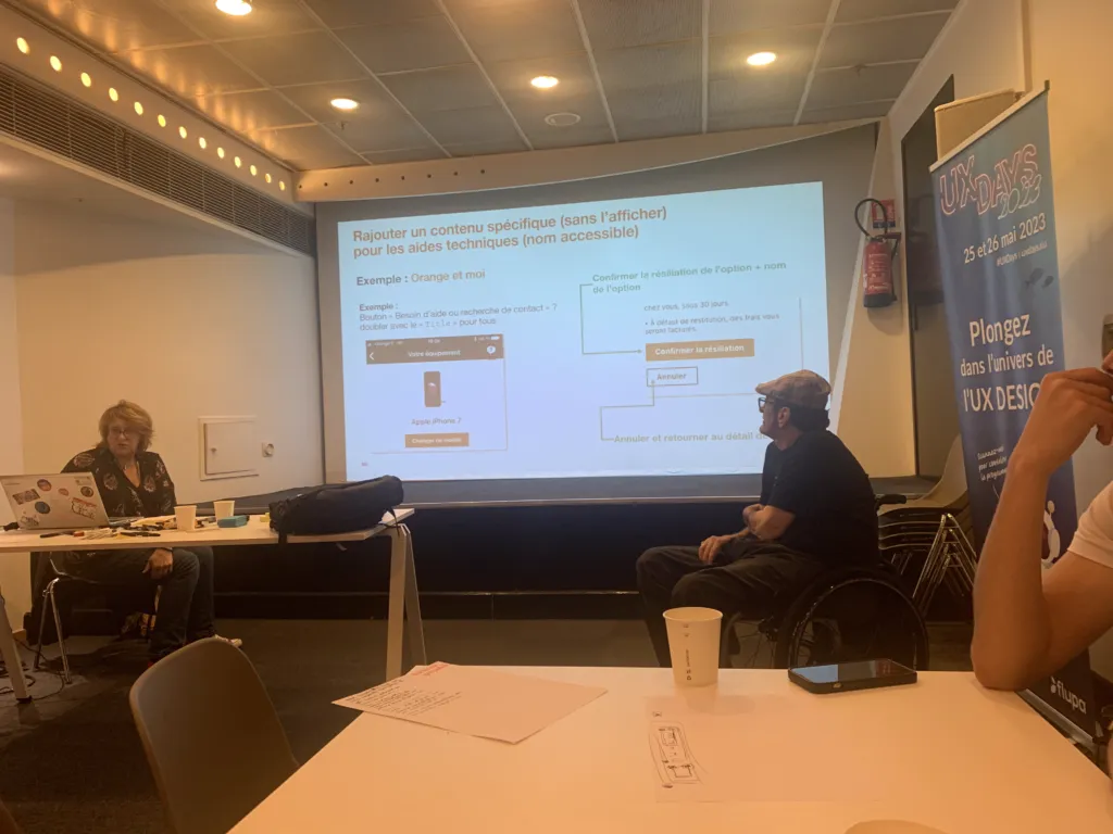
These accessibility annotations help build a bridge between UX-UI designers and developers. You can include various elements: alt text, tags, focus order, accessible name, and so on. Contrast and colour management is discussed. We then look at labels and error states in form fields. The annotations help to pass on the rules behind the behaviour.
We then talk about focus and keyboard reading order. The annotations indicate the focus order or reading order of texts. Although the UX-UI designer produces accessible mockups, some aspects sit with the developer, such as text alternatives and HTML semantics.
Finally, the closing exercise focuses on the accessible name, essential for assistive technologies. Every interactive element should have an appropriate accessible name. The A11y workshop (a numeronym for “accessibility”, with 11 letters between the a and the y) on accessibility annotations has changed our approach. The back-and-forth between theory and practice helps understand how the annotations work. It is essential to pass on good practices to developers. An interesting practice for ensuring a better handover between designers and developers.
How do you design accessible products?
By Benoît Rosier
The workshop covers the importance of designing accessible digital products and services for everyone. It is the ideal occasion for participants to try out tools and practices that help bring these notions in from the design phase.
In the introduction, Benoît stresses the difference between “being in a situation of disability” and “being disabled by a situation”. He also points out the importance of working with representatives of people with disabilities (the reference customers) to better understand the needs. Finally, he explains the need to adapt the environment in which tests with these users will take place.
To illustrate his point, we start the workshop with the goal of buying carrots on the Carrefour site. The only constraint, we have to use the keyboard only. With the focus often not moving where we want it to, the task isn’t easy. What comes next isn’t any more obvious.
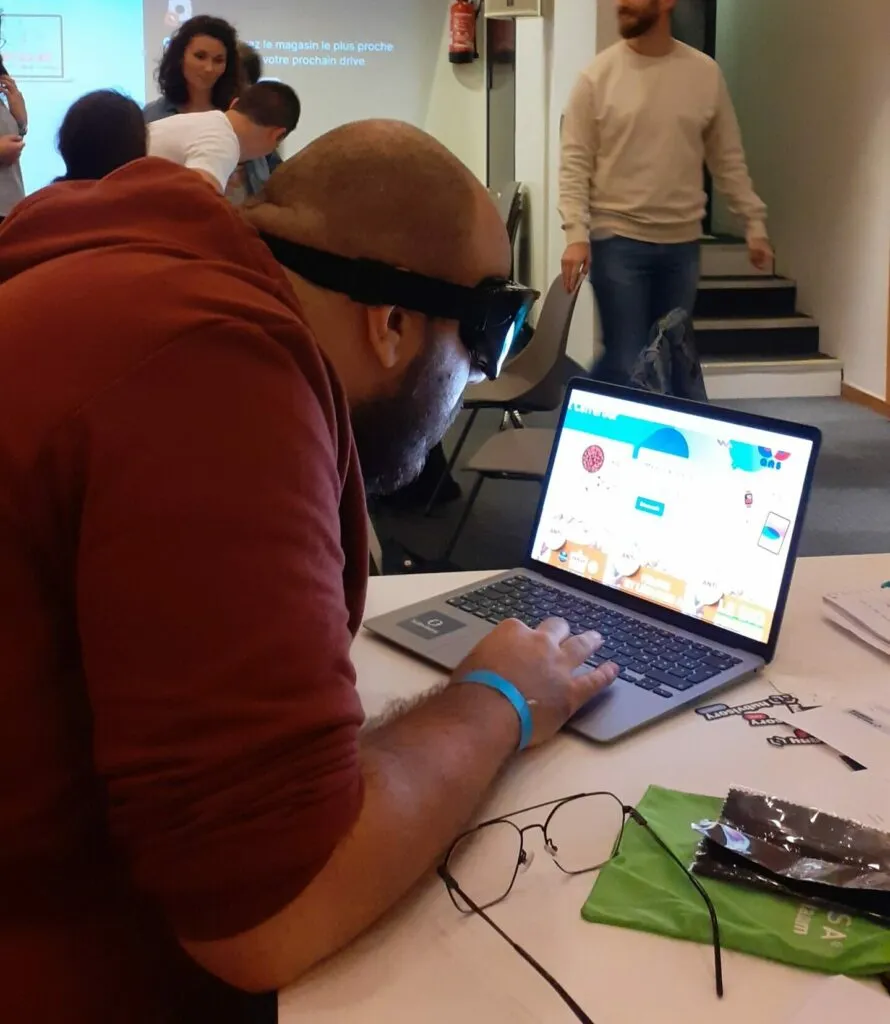
As a second task, we are asked to find the Carrefour shop closest to where we live. Here too, you can imagine that an extra twist was added to the search. We are invited to do it while putting ourselves in the shoes of a visually impaired person. So by wearing special masks, which makes the task more than difficult.
We close the workshop on the need to have an accessible design system from the start to guarantee an inclusive experience. Good practices are also shared, such as the FALC rules (easy to read and understand) or prioritising distinct fonts to guarantee a consistent experience for everyone.
Designing accessible products promotes digital inclusion, and as designers, we have a key role to play for a more inclusive digital world.
Writing, GDPR, gamification and UX research!
Which approach for writing?
UX Writing in practice: 2 concrete applications to interface design
By Claire Tourdot & Maxime Labed
UX Writing is a popular subject and that’s no surprise. Indeed, the digital world is awash with words: web portals, voice assistants, mobile apps, messaging, chat, and so on.
This skill is a real asset that helps guide users and offer a clear, effective experience. Micro-content like titles and the labels inside buttons and forms are crucial for making navigation easier and providing relevant information. A company’s “Tone of Voice” can also become a critical issue for unifying messages and standing out from the competition.
That said, it can be necessary to step away from the “Tone of Voice” in some specific situations. The goal of UX Writing is to convey clear, concise messages to smooth out user journeys. This differs from copywriting and SEO, because UX Writing aims at speaking the user’s language rather than selling or optimising for search engines.
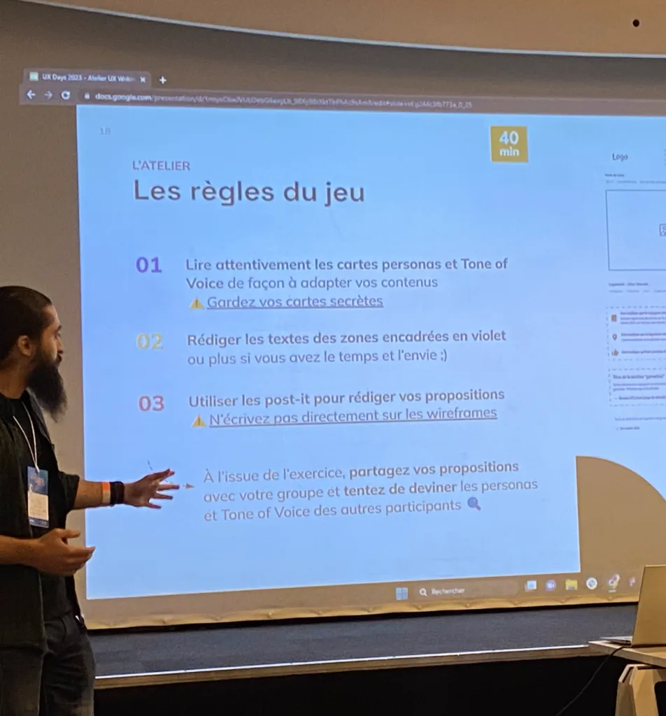
The workshop invites participants to step into the shoes of a UX Writer. The brief is the following: write the content of the mockups of a fictional website while respecting the imposed tone of voice (for example “serious but laid-back” or “respectful and enthusiastic”) and the personas provided (representing the platform’s potential targets).
A playful way to get to grips with this topic, but one that, in our view, would benefit from more concrete examples and more feedback on the participants’ work.
Storytelling for a product: from the arrow to the basket
By Julie Fontaine & Matthieu Vetter
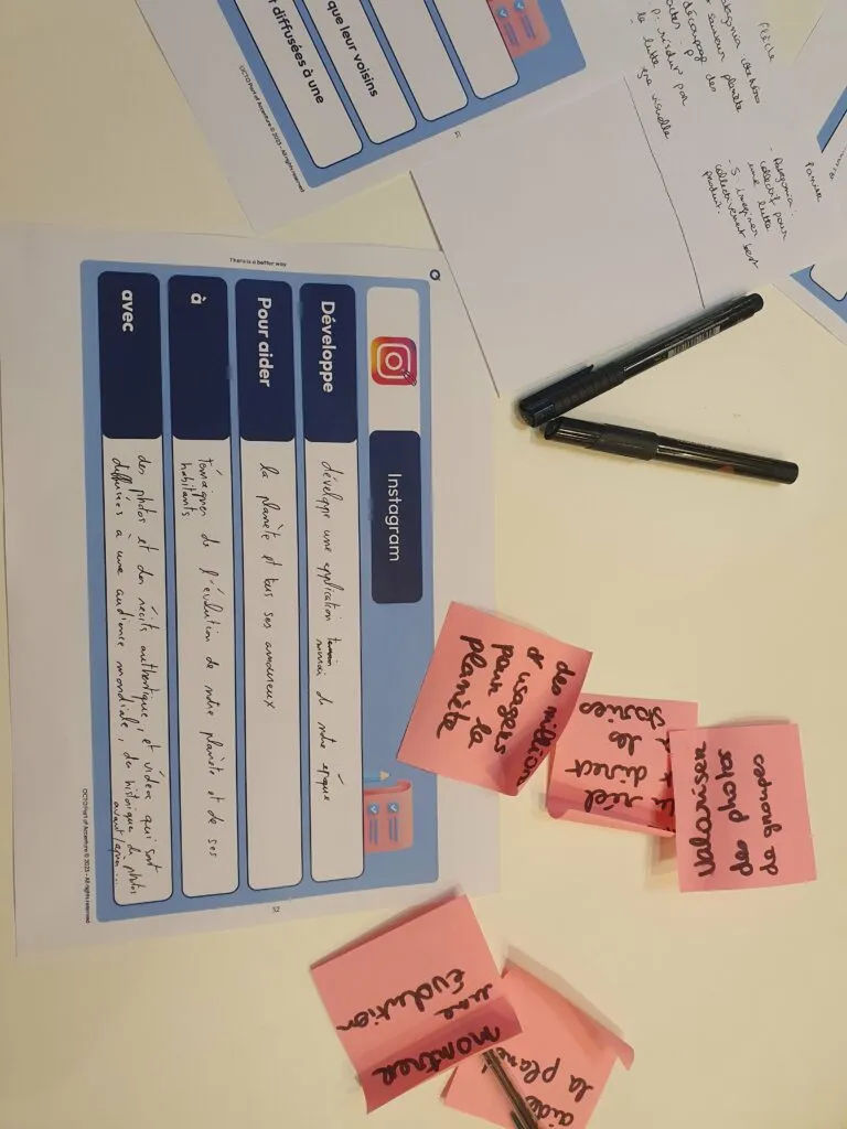
After looking at UX Writing, we continue with a writing-led approach by telling stories this time through storytelling. An extremely effective method for setting up that famous emotional connection with the audience.
To properly understand how storytelling is put into practice, two narrative structures are explored: the arrow narrative and the basket narrative.
The arrow narrative follows a linear progression in three acts and focuses on an individual protagonist, while the basket narrative emphasises inclusion, debate and collective resolution.
During the workshop, trailers are shown to us to better grasp the differences between these two narrative structures.
It’s worth noting that these two structures can coexist and complement each other depending on the needs and the context.
After this exercise, we are assigned brands each with either an arrow or a basket narrative. Our task is to transform the arrow approach into a basket approach and vice versa. In the last part of the workshop, each group explains its choices and the reasons that drove them.
In conclusion, storytelling is a powerful way to communicate a product’s values. The use of arrow and basket narratives lets you create captivating stories that build a deep connection with the target audience.
GDPR and personal data
Immersive “social credit” workshop: your personal data in exchange for your freedom
By Quentin Ledoux and Pierre Minelli
For this immersive workshop, Quentin and Pierre project us into 2033, with the country governed by the 5 biggest digital companies, which come together to put forward a large-scale political project.
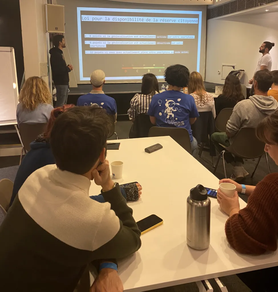
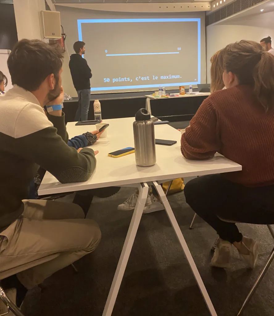
The first measure put in place is the creation of a social justice committee, in charge of analysing and evaluating citizens’ behaviour by giving them scores based on their social usefulness. To start, each citizen (so, us, the participants) is given the maximum “social credit” of 50 points. The number of points matches a citizen category:
- 0 to 12 = category D;
- 13 to 25 = category C;
- 26 to 38 = category B;
- 39 to 50 = category A.
A series of laws is then enforced, on real estate, on the management of accounts through banking apps, on geolocation, health, employment, cookie sharing, and so on; each law makes you gain or lose points. Every participant gets a calculator to answer the questions and compute their score for each answer (spoiler: we all ended up in category D).
The drop in social credit means losing certain privileges (no longer being able to travel, no longer being able to use transport, no longer being able to borrow money, and so on), and of course, to gain points, you have to have shared as much of your personal data as possible by using apps (food delivery, banks, transport, artificial intelligence), not be in too good health, be employed (and ideally a union member). In short, you have to fit into a very specific frame that lets this new government access all your personal data and rate you as a model citizen.
Reality or dystopia?
All this might seem crazy and ethically impossible to put in place, and yet…
Going back to each of the laws, Quentin and Pierre present us with current facts (with sources), not so far from this projection worthy of a Black Mirror episode: property adverts targeted by ethnic or religious origin, credit ratings changing based on how you manage your accounts, sharing of employees’ health data within a company, monetisation of location data, eating habits or movements.
A finding as fascinating as it is frightening, which raises an alarm on how we design certain digital products, on our role as designers, product owners, project managers, data analysts and so on.
It also helps step back on how we support our clients, in order to understand the real needs to collect this or that data and advise them on good practices, or on how to avoid the bad ones, which are often close to “dark patterns”.
It seems necessary to spread awareness of our practices and the many criteria available to protect personal data (GDPR, CNIL) while still ensuring a good user experience.
Gamifying our practices
Gamification Sprint: turn engagement challenges into a gamification strategy
By Michaël Burow & Alexandre Duarte
Gamification is about using playful elements to reach specific goals. It draws on video games, board games and mobile games by bringing in their design, their features and their reward systems. It can be applied to training, real-world projects, digital projects, and so on.
Gamification encourages creativity, challenge, competition and the exploration of new things.
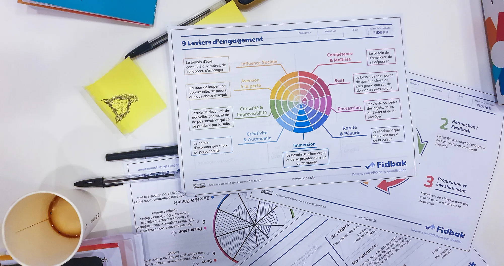
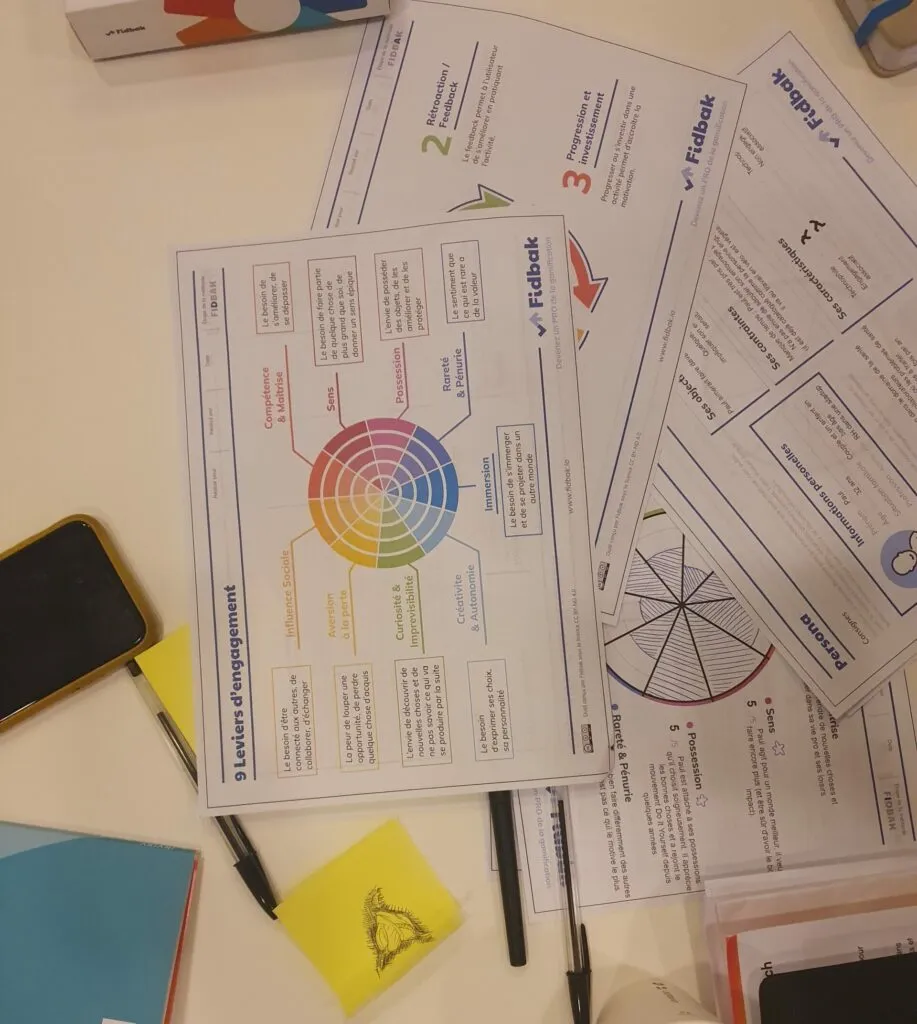
In this workshop, participants are invited to imagine the features of a mobile app for blood donation. The tools made available are personas, a list of engagement levers and a card set provided by the organiser. Each card represents a gamification idea: mysteries, narration, avoidance or soundscape.
The groups think about and propose features for their app, taking their persona into account and using these gamification cards. For example, one group suggests bringing in a “health bar” (inspired by video games) to represent the state of the blood supplies in France.
A playful methodology that lets participants explore different ways to engage users and motivate them to donate blood.
We also talked about user research!
How do you make the most of user research through atomic research?
By Florence Casonato
How do you produce a research summary from all the user insights you have gathered? How do you transcribe them in an objective way that the client can act on immediately? This workshop sets out to answer this broad question by presenting a method for synthesising data.
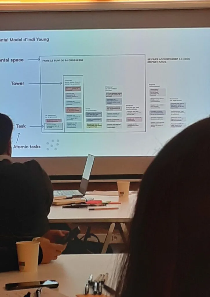
The technique presented is based on Indi Young’s “Mental Model Diagram” described in her book. How does it work in practice? Starting from data distributed as a list per group, we turn these insights into micro-tasks (atomic tasks), making sure to use verbs expressing the actions initiated by users. We then group these micro-tasks to create more global tasks.
From there, each group will discuss to identify the broad themes that come through. To do that, we create “towers” grouping the tasks that share similar ideas. In the same way, we assign these towers to a mental space.
The workshop’s approach encourages exploration and the discovery of new connections by creating towers without naming them beforehand. Participants learn to define mental models and link them to existing solutions for an actionable analysis. Overall, the workshop offers concrete strategies for maximising the value of user research in the UX design process.
Florence’s example of applying the method to a large project shows how much effort it takes. While it isn’t suited to every project, there are many similarities with our approach to analysis and modelling at the agency. There is an interesting middle ground that can draw on this method.
And what about jobs to be done?
By Isabelle Richard and Paul Michel
The secrets to properly formulating your Jobs-to-be-done and creating innovative products, by Paul Michel, pushed us to try out the method. A reading-notes article on Jim Kalbach’s book on the topic is coming very soon on the blog. You’ll find the Jobs-to-be-done method in detail, our take on this reading, and a side note on the UX Days 2023 workshop.
Wrap-up for this workshop day at UX Days 2023
This first workshop day this year was very rich in the topics covered. We were able to split between the different workshops to get an overall view of what was on offer. We also crossed paths with quite a few of our peers from the network.
As always, a big thank you to all the speakers who ran this first day. We also take this opportunity to thank the volunteers from the Flupa (opens in new window) association, who managed to organise all of this masterfully (while still listening in to the workshops when possible 😌).
It’s also worth noting that our wishes were granted, and that this edition was the chance to take part in the Thursday evening social event 🙌