If you use Midjourney, you probably already know style references, what Midjourney calls SREF: numbers that refer to a style, to an art direction. When you use them, you can be fairly sure of getting a consistent result: the same line, the same colour range, the same ways of drawing landscapes and faces. It’s the way to guarantee a consistent art direction.
In our view, SREFs are Midjourney’s huge added value, with no real competition on that front. It offers an almost infinite range of art directions, from vector drawing, comic book, manga, every kind of drawing, to photorealistic images, a mix of the two, montage, collage. This ability to offer visual styles opens up truly unheard-of creative prospects today.
Steering a very heavy ship from the shore
And there’s an extremely interesting module that isn’t easy to use, even though it opens up even more incredible prospects: the Style Creator.
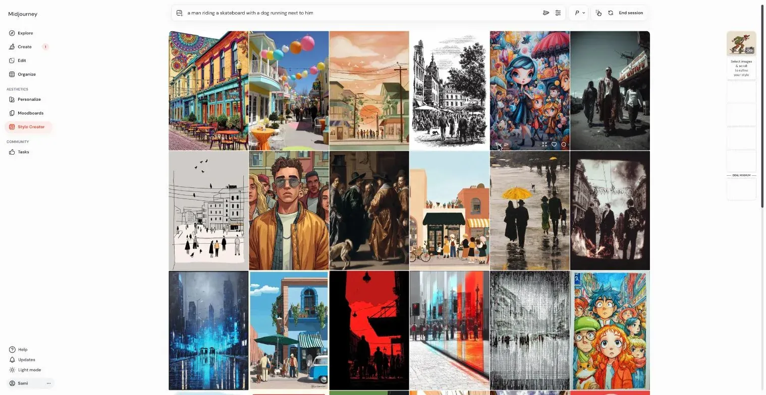
What is the Style Creator? If you haven’t opened it, the principle goes like this: starting from a prompt, you select visuals that head in the direction that seems interesting to you. It’s a bit like steering a very heavy ship from the shore with a megaphone: you have a rough idea of the heading, and no idea at all of how you’ll get there. Midjourney helps by presenting a matrix of visuals in extremely different styles, and you select the images that seem to head the right way. With each new image selected, a new SREF, or at least one you hadn’t seen until then, is created and applied to your initial prompt: you discover the result while you browse the thumbnails.
The virtues of serendipity
It’s a tool that isn’t easy to use, first because its usability isn’t very good. If you select one or more images, nothing happens. You have to scroll, and only after scrolling for a while does the generation of the new image kick in, with the styles you’ve just selected. This new creation is shown on the side: you see the result small, very small.
The usability isn’t great. But what’s certain is that the tool is phenomenally powerful for producing original, never-seen-before graphic styles, and for being surprised: Midjourney’s strength is its huge capacity to surprise its user.
The Style Creator is all about the virtues of serendipity. You’ll find something, but you don’t know what. You don’t know which graphic style you’ll end up with. You may have a rough idea, but what you’re after is being surprised. It’s a rather magical experience: as you refine the style by selecting more and more visuals, you converge on a style that most likely isn’t quite the one you had in mind, and most likely not at all, but that surprises you, wins you over, sometimes delights you, we have to be honest about that.
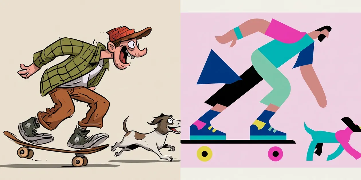
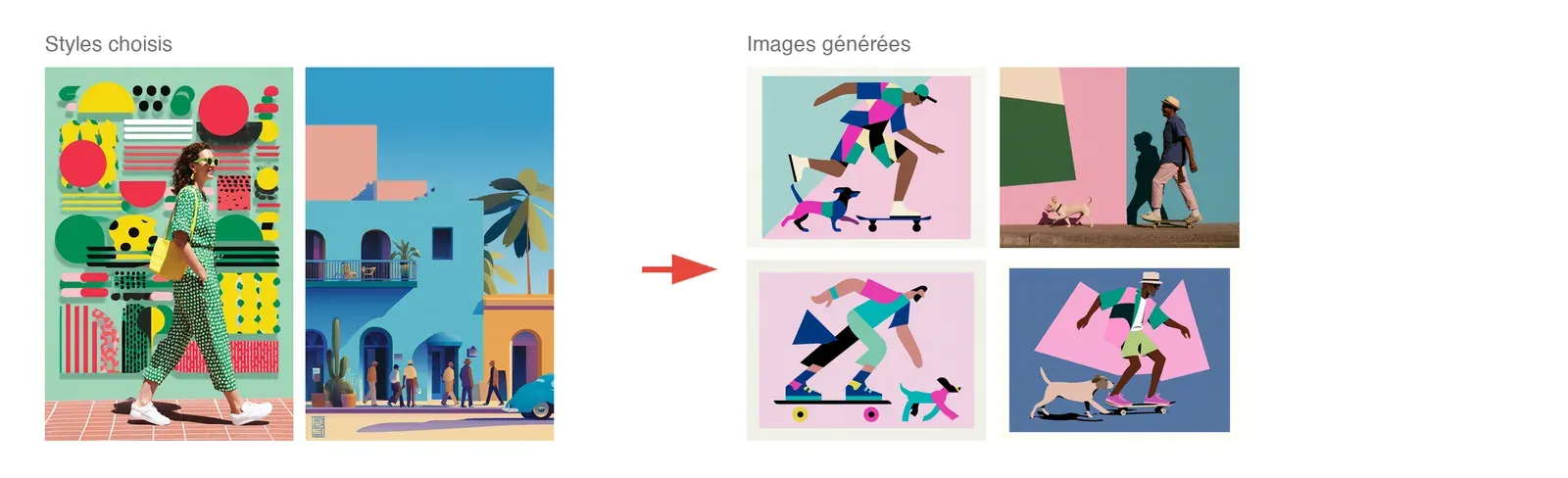
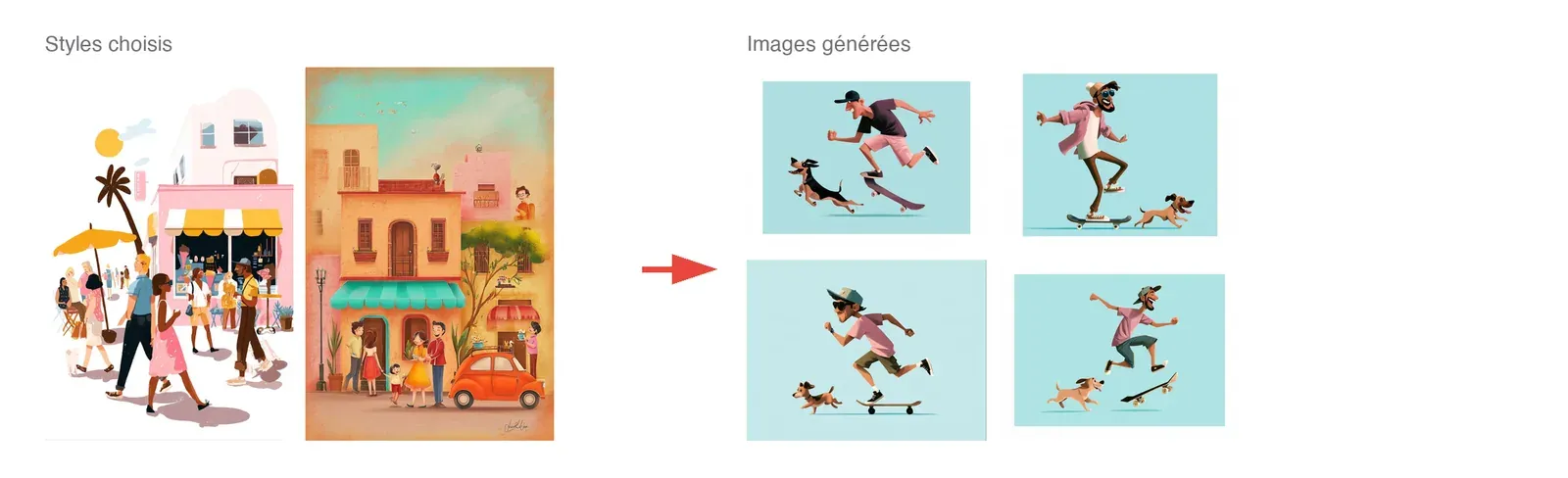
Slideshow: the starting point, then the fifteen steps. Each one shows on the left the style thumbnails selected at that step, when there are any, and on the right the four generated images, a man on a skateboard with a dog. The rendering moves from a generic cartoon to flat shapes, then to pink, turquoise and navy geometric shapes.
We wanted to use this article to give you what you need to reach relevant results, because the tool isn’t easy to use. Here are a few tips.
1. Don’t use the Style Creator on its own
You need one window with the Style Creator and a second window with Midjourney’s Create tab. The image generations appear in the Create tab, much bigger, and you can explore them, look at them. With the style that has just been created, you generate a few new images to see whether you like the result, what’s missing, what you’ll do next. One tab with the Style Creator and one Create tab to see full size and work with the styles you’re having it generate.
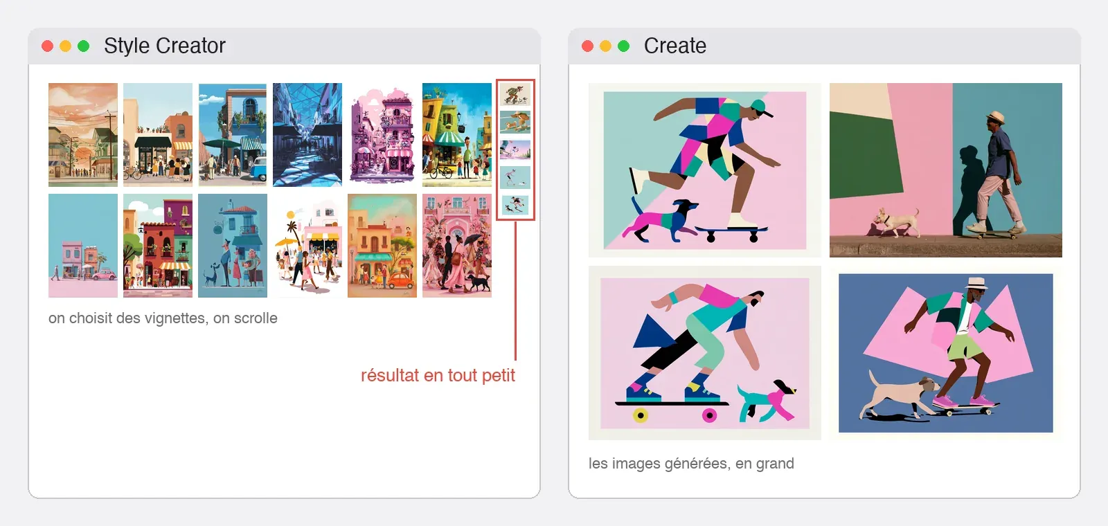
2. The style must be carried by the style reference
The test prompt, the one you use to generate new images with the new style, must be simple. Very simple. It should contain the elements that will matter for the images you’ll generate tomorrow, but above all no information about the graphic style. Don’t say you want illustrations, or flat design, nothing of the sort. What you need is what you want to depict. The style must be carried by the style reference, because that’s what will guarantee consistency and coherence across variations.
All the more so since every Midjourney user has probably noticed it already: the more a style is loaded with detail, in the lines, in complex details, the harder it finds it to handle complex prompts. So we start with a simple prompt. Either it manages to meet the level of detail we’re aiming for, or it doesn’t manage at all, and then you have to bring the style towards the details that matter to us.
A simple prompt, then. We want a guy on a skateboard and, next to him, a dog. It’s as simple as that. If colour matters to us, we can possibly say the guy is dressed colourfully, or that he’s wearing a blue t-shirt and red trousers, but not much more. For day or night, we can specify that it’s night or day. That kind of thing, yes, but nothing about the graphic style.
A really interesting point about the “implicit” side of the prompt: “wide shot” steers towards photography. On one of the styles from our session, same prompt: without “wide shot”, 4 Corporate Memphis images out of 4. With it, 4 almost photographic images out of 4. On another style, 8 out of 8 in Corporate Memphis in both cases: it depends on the style.
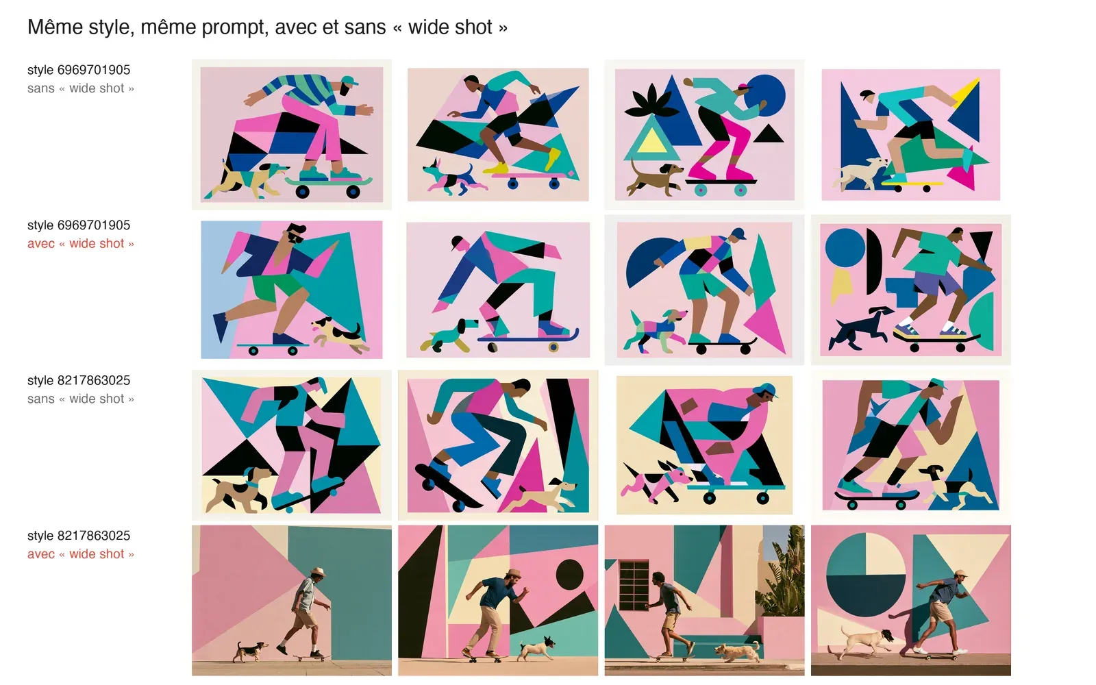
3. Rework the prompt so the first thumbnail shows the skateboard
Still on the question of the prompt. In Midjourney’s Explore tab, you can look at styles, and each style is represented there by 8 thumbnails. They’re always the same 8 prompts: a portrait, a landscape with a character, a still life, a cup, a tree, a building, animals and a busy street. Since these eight thumbnails are always the same, they let you compare: if you’re interested in portraits, you look at all the portraits generated by all the styles and you see the differences.
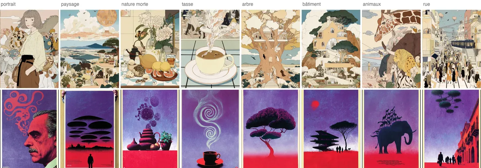
What is extremely poorly designed in the Style Creator is that, depending on your prompt, it picks one of the eight thumbnails to display large. If your prompt leans heavily towards portrait, it displays the portrait large. When maybe you wanted a portrait, but within a landscape.
Don’t hesitate: if, as soon as you launch the Style Creator with your prompt, you notice there are only portraits when another of the eight would interest you, rework your prompt and try again, so that from the very first display you get the composition closest to the type of visual you’re interested in, or the one you want to compare things on.
To come back to the example of the character on a skateboard with a dog: if you’re shown a close-up portrait and you can’t see the skateboard, it’s obviously of no use. You probably need a wider shot. And when you said a character and a dog, what interested you was perhaps depicting that character within a city. You’ll then need to spell things out to make sure the default choice Midjourney makes, without telling you how it makes it, is the right one.
Note: you can change the prompt during a session in the Style Creator.
4. A funnel strategy to converge
You need a strategy to converge. And that strategy starts with knowing which element matters most to you, the one you want to see carried by the style that will be generated. If you want illustration, you have to select illustrations straight away. Even if you see thumbnails with rather appealing renderings that aren’t illustration, now isn’t the time to select them. You may miss opportunities. Too bad.
At the start, you need a funnel strategy. First you define what matters: we want illustration. We pick a few illustrations, in the broad sense, that we really like.
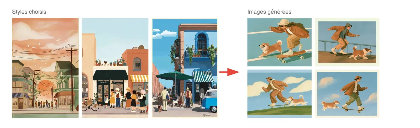
In a second phase, you start converging: we want this illustration to be vector-based, and we select vector-style images we really like. Next, we want vector, but more of the Corporate Memphis kind. We select a few nice images.
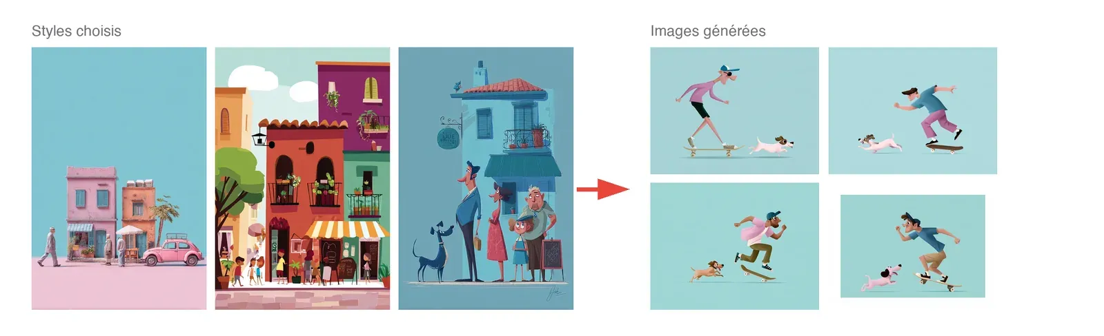
Then you start getting into the other details, because the styles offered along the way also converge in the direction that’s taking shape. You get more and more styles of the illustrative, vector, Corporate Memphis kind. Lots of things along those lines, set apart only by details: different colour ranges, a different line, small heads and big bodies, big heads and small bodies. A variety.
You can then get into the level of detail. Here again, funnel strategy: what matters most? The colour range? Then you have to go looking for elements in the colour range that interests you. The style of the characters, the landscapes, the details? You go looking for elements that reinforce that, still in a style you like, but focusing on those elements: it’s characters of that kind that we like. As you move forward, you proceed this way.
And after 10, 15, 20 iterations, 20 style choices, you can bring in small touches of whimsy. All of a sudden, you see something completely unrelated: you’re doing vector drawing and you’re offered street art. You can choose that element, and that’s when the magic happens. Will that street art element show up, transform your visual? Maybe not on the first try, but you may be offered other somewhat street art elements again, which will let you add that kind of element in small touches. That’s how you’ll converge on the style you’re after.
5. Look for an acceptable compromise rather than the perfect style
When selecting styles, don’t look for the perfect style, look instead for an acceptable compromise. If, for example, you’re trying to make a somewhat vintage, retro montage-type image, as soon as you see an image with a somewhat vintage, somewhat retro montage, don’t hesitate, whatever the details. At the start, you still need to be fairly demanding about the direction. But when you want to refine details, for example add that vintage-retro dimension to the montage, once again, as soon as you see that style appear in the gallery, you select it among the rest. When it appears, since it’s presumably a rather specific detail element, there’s a better chance that similar styles will appear further down and let you refine, take you where you want to go.
Same for a character style: as soon as you see one that comes even a little close, select it, you’ll refine later. Same for a colour range. The selection you made at the start takes you towards a range mostly in purples or turquoises, which, for a reason we can’t really explain, happens fairly often. And you want orange. As soon as you see an image with a bit of orange that goes a little in your direction, don’t hesitate to take it. Obviously, it mustn’t have orange plus an element you absolutely don’t want. But if the image broadly goes in the direction that suits you and has orange on top of that, take it: all of a sudden, you nudge the trajectory a hair towards a direction that interests you.
6. Go back when a choice derails the style
Another important point: if, after choosing a style in the gallery, the generation that follows doesn’t seem to be going the right way at all, it doesn’t matter. You can go back, scroll up the gallery, find the thumbnail you had selected and deselect it. This is again the part where the usability is really bad, but that’s how it is. When you scroll back down (and you have to scroll down a long way), a new generation runs without that thumbnail, close to the previous style, and you pick up the work where you left off.
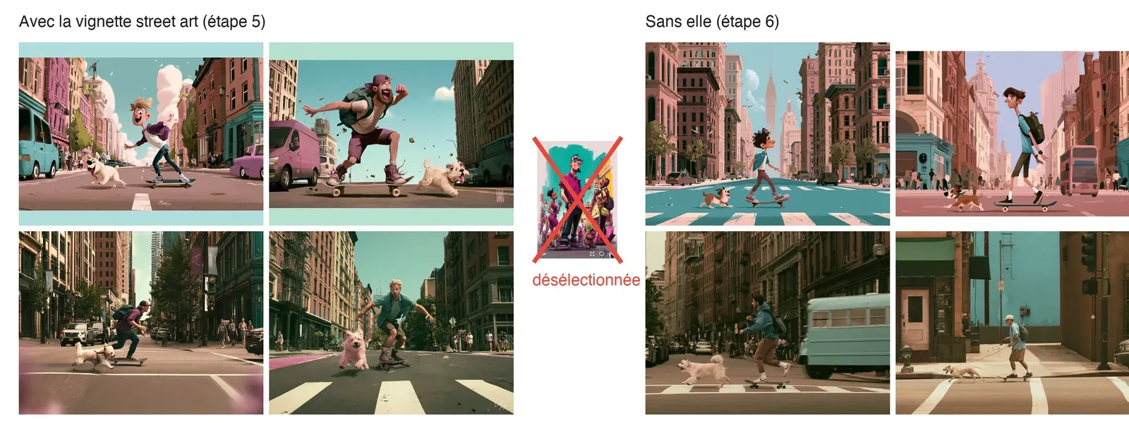
Don’t hesitate to look at the style’s rendering fairly quickly once you’ve selected a thumbnail. That’s why having two tabs is more practical: if the rendering doesn’t suit you, you haven’t scrolled down too far, and you scroll back up and find the image you had selected more easily, even if it’s sometimes a bit of a needle in a haystack.
On the other hand, it’s impossible to resume a session: watch out for accidental back navigation and page refreshes. The “reset” button does reset the whole session (here again, it’s a bit rubbish on the usability side).
That’s about it. Have fun.