
Dark mode and Light mode: what are they?
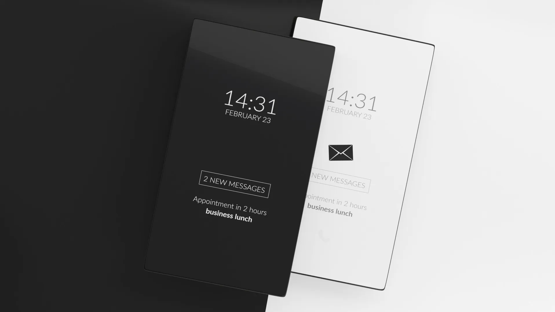
Following the definition given in the blog article by R. Budiu2 from the Norman and Nielsen Group, the terms “Dark mode” and “Light mode” will refer here to the contrast polarity between an object and the background.
“Light mode” will refer to a positive polarity: for example, dark text on a light background. By contrast, “Dark mode” will refer to a negative polarity: for example, light text on a dark background.
Is performance the central focus of the debate?
Let’s build on this nice blog article to get into the topic. We encourage you to read it to catch its nuances and subtleties. In the first part, the author draws on a series of studies reporting that:
- Light mode improves performance in people with normal or corrected vision (reading and visual acuity for short tasks);
- for these same short tasks and the same audience, there is no effect on the various markers of fatigue (although other studies suggest that Dark mode would be less tiring in virtual reality environments3);
- the performance advantage of Light mode grows as the font size decreases.
An effect of ambient lighting?
The above results are reported for bright-environment situations. What about a dark environment?
- The advantage of Light mode seems independent of the ambient lighting (dark environment vs office light) for a task of spotting errors in a text10.
- Also, for this same task, the objective and subjective markers of effort and constraint do not vary, whatever the crossing between polarity and ambient lighting.
- This Light mode advantage in a dark environment is also found for a very quick information-pickup task (1 or 2 words on a GPS or a smartwatch)11.
That said, when using LCD screens, the advantage of either polarity in a dark environment will depend on the type of task being carried out12. Users even report preferring, in general, the setting that is the least stimulating for the eyes. Namely, Dark mode.
So, all in for Light mode?
Well, no.
First, because too few studies have been carried out with audiences with visual impairments. On top of that, the few existing studies do not necessarily converge with the results in people without impairments. For example, the number of words read in a given time is higher in people with a clouding of the lens (such as cataracts). Since the causes of visual impairments differ, the impact of polarity is also specific to each impairment.
(Note: results from a study on the impact of Dark mode on people with astigmatism are circulating, citing the postdoctoral work of J. Harrison from the Sensory Perception and Interaction Research Group at the University of British Columbia. However, this source cannot be found on dedicated scientific search engines, nor on the page of his lab9. The information reported, suggesting that people with astigmatism see things even more blurred in Dark mode, can’t be verified, so we won’t discuss it here.)
Next, because the previous results were collected on short tasks. But for one-hour reading tasks, another concern appears: reading in Light mode brings about the development of factors generally associated with myopia. And by association, prolonged reading in Dark mode would be less harmful to eye health. So that’s two good points.

We’re no longer talking only about performance here, but also about accessibility, health and the long term. And the performance dimension ends up looking pretty relative. What other questions should be asked to round out the picture, beyond accessibility and health?
Affective bias in Dark mode
A further line of thinking emerges from research on the effect of interface colours on the emotional and semantic perception of words4.
In this work, the authors looked at messages on the chat of the Twitch platform, a leader in live streaming, particularly of esports. The 67 participants in the study had to annotate a series of 229 messages as positive, neutral or negative (leading to respective scores of +1, 0 and -1). Half of them were shown the messages in Light mode, the other half in Dark mode. The finding: showing the messages in Dark mode strengthened the sense of negativity in the messages shown. What explains this?

Is it because it’s harder to read white text on a black background (performance), and therefore its content is judged more negatively? The authors reject this hypothesis, thanks to a third experimental condition (black typeface on a grey background) which would have produced more negative results than Dark mode (the contrast polarity was more constraining in this third condition). Is it tied to a sense of reading familiarity in Light mode, which leads to judging its content less negatively? Again, the authors reject the hypothesis based on the comparison with the third experimental condition. The remaining hypothesis: the colour of the interface would influence the perception of a text’s content, particularly for ironic or sarcastic content.
A bad point for Dark mode? Not so sure, especially if the aim is to reinforce that feeling and create an experience that fits, as could be the case in a video game, for example.
Satisfaction in use
After performance, after health, accessibility, affective biases, what if we stepped back and talked about satisfaction in use?
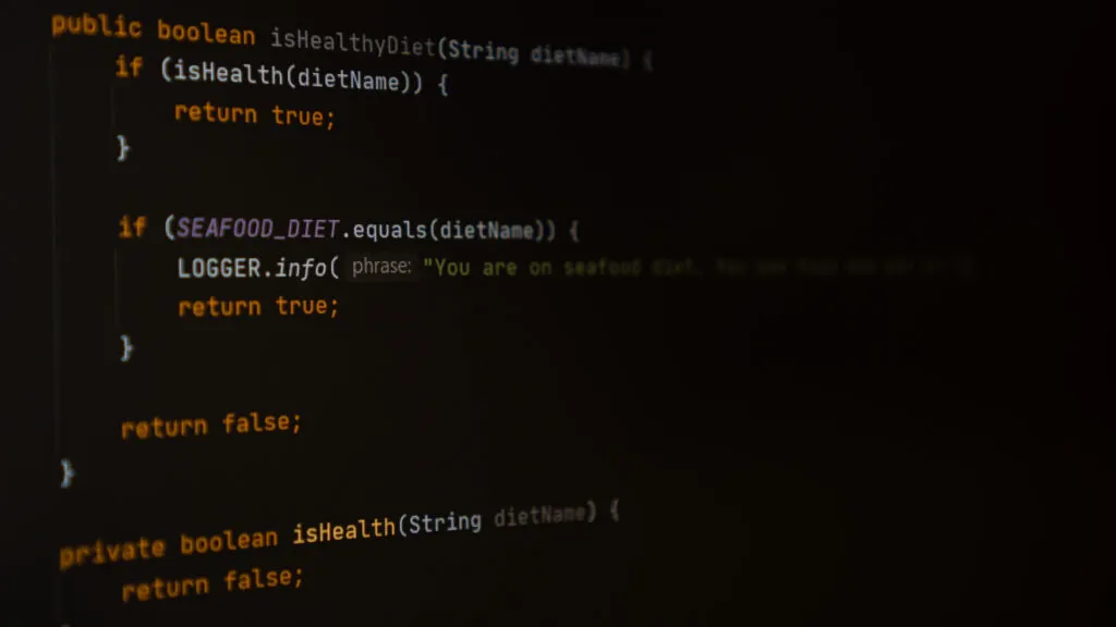
Because satisfaction is not made up only of performance and usability. It is tied to a more global, sometimes emotional, experience, of which aesthetics and the context of use are also part5-6. Users report preferring Dark mode because, in some contexts such as virtual reality, it seems to reduce visual fatigue compared with Light mode3. According to a very recent study by Eisfeld & Kristallovich7, it is even the crossing of the factors mentioned with social factors that would explain the appeal of Dark mode: retro / vintage fashion, the rise of OLED technologies and energy sobriety, and even job habits (coders, night security workers).
Indeed, the use of black also carries strategic importance in marketing and design8, neighbouring branches of UX design. The values of elegance, modernity, the formal and/or luxurious feel, the notion of innovation combined with modernity and simplicity, are for example conveyed by brands through this colour.
Closing thoughts
You’ll have understood, it’s hard to come down clearly on the use of Dark mode. In the end, the best advice we could give would be to ask the right questions:
- Which priority (or priorities) do I want to push for my user: accessibility, performance, comfort, aesthetics?
- What other use constraints can shape my choice: ambient lighting when my interface is used, long-term or short-term use, intended use of the interface and the related constraints?
- Finally, what will my client’s constraints be: saving battery (OLED screen), pushing a brand image carried by a dark or a light interface?
A generic, satisfying answer would be to develop both Light and Dark modes for the interface, and let the user choose. But do the budget and the time really allow it?
You’ll have understood, this article is open to discussion and points of view, all just as important as one another. Don’t hesitate to share your thoughts and experiences in the comments.
References
1 - Azimov, A. (2020). Dark Mode List. Retrieved 2020-04-12 from https://darkmodelist.com/
2 - https://www.nngroup.com/articles/dark-mode/ (opens in new window)
3 - Erickson A., Kim K., Bruder G., & Welch G**.** (2020). Effects of Dark Mode Graphics on Visual Acuity and Fatigue with Virtual Reality Head-Mounted Displays. 2020 IEEE Conference on Virtual Reality and 3D User Interfaces (VR), pp. 434-442.
4 - Löffler D., Lennart G., & Hurtienne J. (2018). Night Mode, Dark Thoughts: Background Color Influences the Perceived Sentiment of Chat Messages. https://hal.inria.fr/hal-01678512 (opens in new window)
5 - Overbeeke, K., Djajadiningrat, T., Hummels, C., Wensveen, S. (2000). Beauty In Usability: Forget About Ease Of Use!. 10.1201/9780203302279.sec1.
6 - Zarour, M., Alharbi, M. (2017). User Experience Aspects and Dimensions: Systematic Literature Review. International Journal of Knowledge Engineering. 3. 52-59. 10.18178/ijke.2017.3.2.087.
7 - Eisfeld H., & Kristallovich F. (2020). The rise of dark mode: a qualitative study of an emerging user interface design trend. http://hj.diva-portal.org/smash/get/diva2:1464394/FULLTEXT01.pdf
8 - https://www.impactplus.com/blog/the-psychology-of-design-black-in-marketing-design
9 - https://www.cs.ubc.ca/labs/spin/publications
10 - Buchner A., & Baumgartner M. (2007). Text - Background polarity affects performance irrespective of ambient illumination and colour contrast. Ergonomics 50(7):1036-63. DOI: 10.1080/00140130701306413 (opens in new window)
11 - Dobres J., Chahine N., & Reimer B. (2017). Effects of ambient illumination, contrast polarity, and letter size on text legibility under glance-like reading, Applied Ergonomics. DOI: 10.1016/j.apergo.2016.11.001 (opens in new window)
12 - Tai Y-C., Yang S-N., Larons K., Sheedy J. (2013). Interaction of Ambient Lighting and LCD Display Polarity on Text Processing and Viewing Comfort. Journal of Vision July 2013, Vol.13, 1157. doi:https://doi.org/10.1167/13.9.1157 (opens in new window)