
Using ChatGPT or Claude, like Codex or Claude Code, is conversational: we type text to explain what we need, it works, it asks us to refine, we refine by answering its questions, it presents its results. It’s real delegation: we delegate know-how, we delegate tasks. And for a huge number of tasks, working that way isn’t enough. We’re changing the way we think about interfaces, because we’re entering the era of the design of doubt.
The automatic yes
When an AI agent submits the result of its work to us, what’s the verification interface? If it’s just text, we know perfectly well what’s going to happen next. The agent simply tells us “Go open this HTML file yourself and compare it to your mockup, is it good, yes or no?”, and we’ll almost always say yes, without checking.
Almost always, if not always. Because it’s a pain. Because we don’t feel like going to find the subfolder, the file, opening it, waiting for it to load, putting the two side by side: that’s even more of a pain. So we say yes, because we’re lazy. No more, no less than anyone else, exactly like everyone else. But aware that we could do better. Especially given the number of times the agent then shows us the result and we think: hang on, we said yes to that?
Recently, just before sending out a proposal, one of the most important slides made us say: “What on earth is this?” The agent replied: “Two days ago, I told you to look at the file, I asked you whether it was OK or not."
"You show us the file”
No. “You don’t tell us to look at the file, you show us the file, you give us the exact text and only that text, and you ask for our approval on that text.” Because if the agent asks us to do that whole task, we’re not going to do it: we’ve got 14 other sessions running alongside.
This notion of a verification interface is almost as important as everything else, and it has to be mandatory in the interaction with the LLM, along with what constrains it: the harness, meaning everything we build around the model. The harness has to say: “if there’s a task to check, you make an artifact, this artifact is interactive, it lets us get the information back without having to do it by hand.”
The agent knows how to make artifacts. But if we don’t define the rules explicitly, namely that the artifact has to be interactive, well, sometimes it’ll end up as a plain static HTML file that just presents the information. So the rules have to spell out how the interaction works: “you have to show us what we’re making a decision on, you have to give us the context”. And, across the board, the agent has to have a “use” mindset around the artifact.
This question of how the artifact will be used is everything that makes the difference between digital noise and a usable tool. What AI can do today means we need to see the result, compare it to a reference, explore how it behaves, sometimes even listen to it. Everything that text and conversation can’t fully convey.
Conversation doesn’t replace interfaces, it is one

Let’s take an example we’ve all been through: our parents, or people close to us, call us for a hand because they have a problem with a purchase on an e-commerce site, with managing a subscription, or even just an email problem. They describe what’s in front of them, in their own words. Those aren’t your words. You ask questions. They’re convinced they’re answering the right way. They get annoyed, you get annoyed, they get annoyed that you’re getting annoyed. You end up saying “just take a picture!” (because if you’d started a video call, you’d have followed up with “No but Dad, we’re on video right now, and you’re filming your ear”). Over the phone, it’s not enough to understand their problem. They’re going to have to show us exactly which button they pressed, and what that produced. There comes a point where audio isn’t enough to communicate properly, to set the context, pin down the exact problem, and then make sure the goal has actually been reached.
Last year, there was a trend emerging around no UI, and in our view it’s a rather surprising trend, especially in the field of ergonomics and UX. Conversation doesn’t replace interfaces. It’s actually an interface in its own right, whether it’s voice-based or through chat.
ChatGPT on one side, Claude on the other, created the concept of the artifact, which makes it possible to give things a concrete form. It’s presented as a bonus, as the nice little extra, a frill. For us, in our day-to-day practice and with our “use” perspective on the subject, it’s on the contrary the linchpin of what has to enable interaction tomorrow, between AI’s capacity for inference and production and our ability to characterise a problem in order to try to solve it.
When the interface generates itself
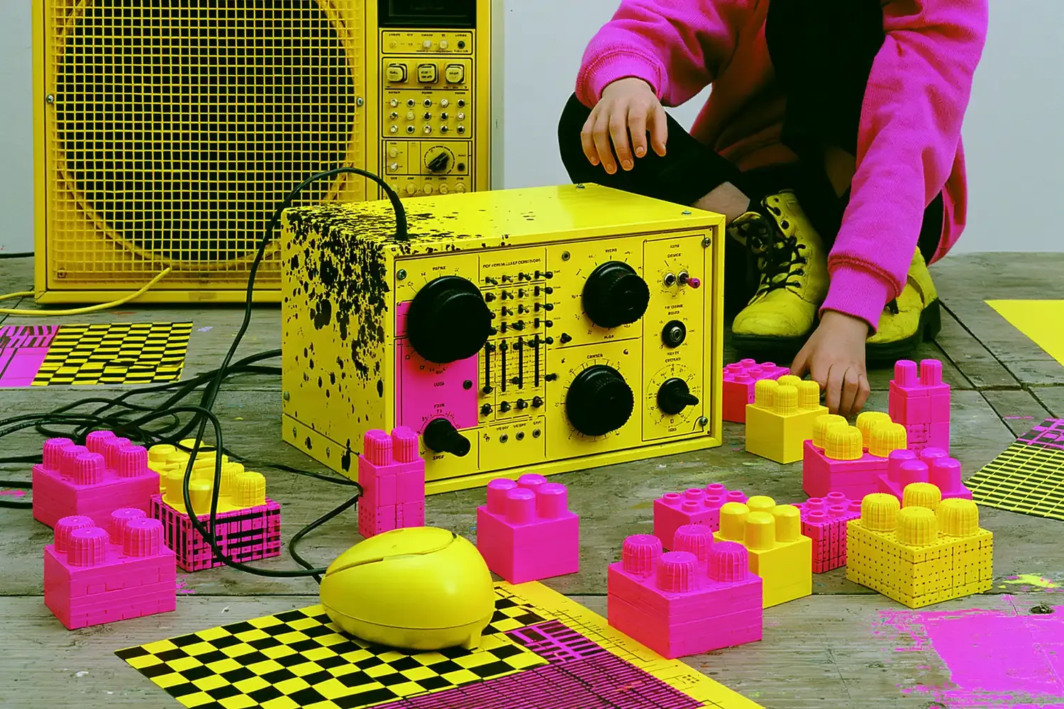
There’s a lot of talk about people who vibe code their own software to replace the software solution that cost them too much and didn’t fully meet their needs. For a whole bunch of reasons, from security to maintenance, it’ll be interesting to see whether this trend lasts. But it says something about the emerging feeling on the subject. The wish for hyper-personalised functionality (“I want that feature for my specific need”), for software interconnection (“get the data from over here, process it over there, show it to me somewhere else again”). That potentially sketches out two levels of interfaces in this era:
- the infinitely customizable interface, as needed and on demand by the user, within the software vendor’s ecosystem.
- perhaps even the disappearance of part of the interfaces carried by software vendors, in favour of services dedicated exclusively to generating personalised interfaces based on the services being used. A radical split between front-end services and back-end services.
That’s what OpenAI launched with GPT-6 and Intelligent UI (opens in new window): ChatGPT composes its answer with interactive components chosen according to the question. Its limit: it doesn’t work in voice mode. French brands had already taken a first step. Leboncoin (opens in new window) and Aramisauto (opens in new window) have had their app in ChatGPT since February 2026, SNCF Connect (opens in new window) since April, Meilleurtaux (opens in new window) since May. You ask for a used bike, a city car or a train, and the answer comes back as listing cards, car profiles or a list of journeys. These components were designed by the brand: ChatGPT only chooses when to display them.
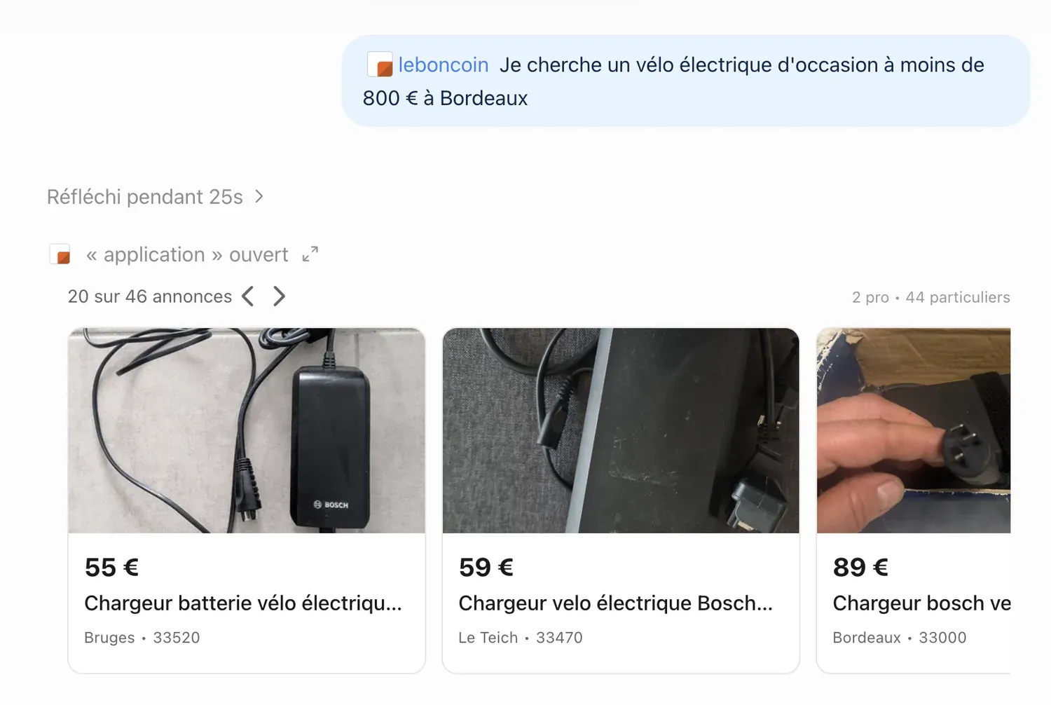
“I’m looking for a used e-bike under €800 in Bordeaux”: the Leboncoin app answers with a carousel of listings, here bike chargers. Akiani screenshot, November 17, 2026.
And research is starting to measure the preference. Same request, two answers, one in chat, one as a generated interface: which do you prefer? Across 100 test requests, against Claude 3.7’s chat, the generated interface wins 84% of the time. Across 380 real requests from 76 people, the gap narrows: 50.8% for the interface, 41.1% for the chat, 8.2% ties (Chen et al., ACL 2026 (opens in new window)).
Does an interface that looks serious do what it claims?
It’s convincing, even though the content may be wrong (Chen et al.). And it doesn’t deliver on everything: across 120 interfaces, around 25% of the displayed design rationales aren’t implemented, 34% for functional requirements (Design Theater, 2026 (opens in new window)).
In a design-of-doubt approach, we also have to doubt whether the answer is the right fit. The agent may have understood the request and chosen the wrong way to present it. So we need to design to let users say “this format doesn’t work for me because…”, which can feed a future set of rules. And of course, because AI will have to keep informing users about how reliable its information is, so that the dynamic nature of what it generates doesn’t hide the weaknesses of what it collected or the choices it made.
Who chooses the interface, and when?
Ten years ago, at Voyages-SNCF, we worked on the notion of the chrono-responsive e-ticket: the information to display and how it’s prioritised aren’t the same whether you’re 30 days before departure, the day before or 30 minutes before. For us, it’s a fairly similar idea, going infinitely further than just the question of timing. Information architecture and interaction design become dynamic and contextual: it’s about adapting to human activity in the context of the interaction.
Google tested it with Penny (opens in new window), a banking prototype that generates new features on demand or when it infers a need the user hasn’t expressed. Perceived usability: 53.96 out of 100 for the classic interface, 84.38 for the adaptive one, with 72 participants. And research has been working on context for more than twenty years: a “plastic” interface adapts to the context of use without losing its usability (Calvary, Coutaz, 2003 (opens in new window)).
Penny, Google’s banking prototype, reconstructed by Akiani from the Google Research paper: the interface generates a new feature when it infers a need.
How do we build the future?
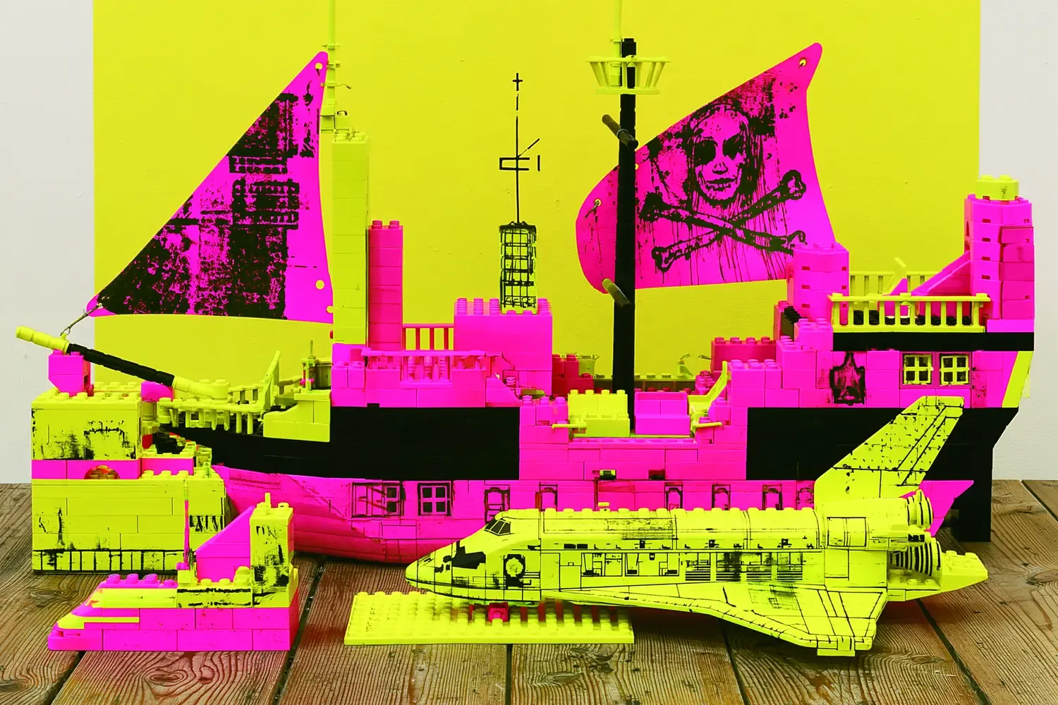
Of course, a trajectory like this gives pride of place to approaches that industrialise design, such as design systems. But plain augmented design systems, AI-compatible because they’re well documented, in formats that make things easier (Google proposed the DESIGN.md (opens in new window) format for that purpose), while they’ll settle the question of the what, won’t settle the question of the why and the how. To build a Lego pirate ship, you need a plan. And to reuse those pieces to build a Star Wars ship, you need a lot of practice or an experienced guide. So we’ll have to think about the grammar that will let us match components, design patterns and other templates against the diversity of uses in context. And it’s this “in context” that will make the number of combinations explode and will require creating rules and meta-rules suited to the business context of solution providers. A matter of research, UX design and UI design, all things considered.
Sources
- Chen et al., “Generative Interfaces for Language Models”, Findings of ACL 2026 (opens in new window), accessed November 17, 2026
- Imteyaz et al., “Design Theater: Evaluating the Gap Between User-Facing Design Reasoning and Implementation in Generative UI Tools”, arXiv 2607.22928, 2026 (opens in new window), accessed November 17, 2026
- OpenAI, “GPT-6 and Intelligent UI for everyone” (French page) (opens in new window), accessed November 17, 2026
- OpenAI, help article “Intelligent UI in ChatGPT” (opens in new window), accessed November 17, 2026
- Arora et al., “Self-Evolving Systems”, Google Research (Penny prototype) (opens in new window), accessed November 17, 2026
- Calvary, Coutaz, Thevenin, Limbourg, Bouillon, Vanderdonckt, “A Unifying Reference Framework for Multi-Target User Interfaces”, Interacting with Computers, 2003 (opens in new window)
- Google Labs, “DESIGN.md” (Stitch), April 21, 2026 (opens in new window), accessed November 17, 2026
- Ecommerce Nation, Leboncoin app in ChatGPT, February 10, 2026 (opens in new window), accessed November 17, 2026
- Aramisauto, “ChatGPT apps” press release, February 10, 2026 (opens in new window), accessed November 17, 2026
- Ecommerce Nation, SNCF Connect in ChatGPT, April 23, 2026 (opens in new window), accessed November 17, 2026
- Business Wire (via Yahoo Finance), Meilleurtaux, May 29, 2026 (opens in new window), accessed November 17, 2026