

Understanding the craze around Dark mode
While Dark mode, also called negative polarity, was originally adopted out of technical necessity (yes, before light mode imitating reading on a sheet of paper, bright text was displayed on a dark background), today its popularity comes down to several factors:
- the way it is seen as modern and sophisticated,
- users’ growing desire for personalisation,
- concerns over the sharp rise in time spent in front of screens.
Add to that the influence of the major players in the tech industry. Apple, for example, champions this mode for its positive effects on eye strain, battery life and sleep quality.
Yet despite this emerging popularity, the real effects of Dark mode are not the subject of a scientific consensus. Back in 2021, we were already exploring the roots of this debate in our article “Let’s talk Dark mode”. Five years later, it is time to update our knowledge with recent advances.
It quickly becomes clear that, to understand the optimal contexts for using Dark mode, you have to list the various contextual factors that influence the conclusions of the different studies. To frame the research on this subject, we used the SOR model (S for Stimulus, O for Organism and R for Response) put forward in 2024 in a literature review ( (opens in new window)Yang, Goh and Yi, 2024 (opens in new window)) (opens in new window).
What is the S-O-R model?
The S-O-R (Stimulus-Organism-Response) theoretical framework is a model used by researchers to structure and understand the effects of Dark Mode, since there is not yet a clear scientific consensus on the subject.
Here is how it breaks down to analyse the user experience:
-
Stimulus (S), or the trigger: This is the set of factors, internal or external, that will provoke a reaction in the user. In the context of Dark Mode, this includes:
- The environment: The ambient lighting (dark or bright).
- The hardware: The type of device (smartphone, computer, e-reader).
- The content: What is displayed on the screen.
- The user: Their own characteristics (age, eyesight, initial fatigue).
-
Organism (O), or the internal reaction: This is what happens “inside” the user in response to the stimulus. The sources classify these reactions into three categories:
- Perceptual: The emotions felt, the aesthetic appreciation.
- Physiological: Visual fatigue, eye comfort.
- Cognitive: Legibility, mental load, difficulty of comprehension.
-
Response (R), or the behavioural consequence: This is the visible result, the user’s final action or behaviour.
- Positive responses: Good comprehension, smooth task execution, a preference for use.
- Negative responses: Slowed performance, discomfort, or refusal to use the interface.
In short: This model serves to avoid looking only at performance (R) or design (S) in isolation, but to understand how the environment and design interact with the user’s internal state (O) to produce a result.
So we are going to try to use this framework to understand the various interactions between “stimulus”, “organism” and “response”, and to be able to provide recommendations for designing interfaces in Dark mode.
To that end, our article will try to give you the answers to the following questions:
- How does the eye work when faced with Dark mode and Light mode?
- What are the consequences of Dark mode on visual fatigue/comfort?
- What are the impacts of Dark mode on user performance?
- What factors should be taken into account when choosing between Dark mode and Light mode?
- In which contexts is the use of Dark mode optimal, and in which is it not?
- How is Dark mode perceived by users vs Light mode?
- How do you make a good Dark mode?
- What are the real impacts of Dark mode on energy consumption?
The mechanics of the eye: why do your pupils work harder in dark mode?
As we saw earlier, dark mode has grown in popularity and is often suggested to reduce eye strain, although the evidence on this is contradictory.
Let’s do a bit of physiology:
- In Light Mode (light background): The brightness forces your pupil to contract. A small pupil reduces optical aberrations and increases the depth of field. The result: the image is sharper and the eye strains less to focus (the accommodation effort).
- In Dark Mode (dark background): In darkness, the pupil dilates to capture light. This makes it more sensitive to spherical aberrations, which reduces the sharpness of vision. For people with astigmatism, this often creates a “halo effect” (a blur around white letters) that is very unpleasant.
“Light mode is said to offer better visual focus, whereas dark mode, by potentially causing the pupils to dilate to capture more light, makes them more sensitive to aberrations. Light mode is therefore supposed to be better for legibility, especially during prolonged reading in bright environments.”(Atsani, Mukaro (opens in new window)mah and Anugerah, 2025 (opens in new window)) (opens in new window)
The point in Dark Mode’s favour: it cuts down exposure to blue light, which can support better sleep by disrupting melatonin secretion less.
Visual fatigue: the great paradox
Does Dark Mode really rest the eyes? This is where it gets tricky.
Perception vs objective measurements
There is a gap between perception and the physiological effect on the body. In questionnaires, users often report feeling no difference in fatigue between the two modes. Yet measurements of CFF (Critical Flicker Fusion), an indicator of central nervous system fatigue, show another truth: Light Mode biologically generates more fatigue than dark mode (Sengso (opens in new window)on and Intaruk, 2025 (opens in new window)) (opens in new window)
The culprit? Dryness.
Faced with a bright screen (Light Mode), we tend to blink less. The result: the tear film evaporates, creating dryness and physiological fatigue, even if you have the impression of reading better.
Impact on eye conditions and individual dependence
Visual comfort hinges on any underlying eye conditions, so the impact of screens varies significantly from one person to the next:
- Team Dark Mode (Cataract & Photosensitivity): If you have a clouded lens (cataract), the dark background is beneficial for you. It reduces the scattering of light in the eye and clearly improves legibility.
- Team Light Mode (Astigmatism): If you have astigmatism (like a large part of the population), Dark Mode is your enemy. The dilation of the pupil in the dark creates a “halo effect” (the white text bleeds onto the black background). Your brain has to strain constantly to “clean up” the edges of the letters, quickly creating cognitive fatigue.
- The myopia risk: A word of caution, prolonged and intensive exposure to Light Mode (positive polarity) could be correlated with the development of myopia (Aleman, Wang and Schaeffel, 2018) (opens in new window)
The toxic combinations to avoid
Sometimes it is not the mode that tires you, but how you use it. Two scenarios are particularly destructive to your comfort:
- The “Red on Black” mistake is the worst possible combination: studies show that reading red text in dark mode generates a spike in visual fatigue, especially if the room is poorly lit. (Fan et al., 2024) (opens in new window)
- The “Total Darkness” myth: Never use Dark Mode in complete darkness (0 lux). The maximum dilation of the pupil combined with the reading effort is very bad for fatigue. You always need a little ambient light (around 10 lux) (Fan et al., 2024) (opens in new window)
The importance of the screen (LCD vs e-readers)
Fatigue often comes from the very technology of your screen.
- The dangers of LCD: On a smartphone or PC (LCD/OLED), the backlight bombards the retina. A cellular study showed that LCD screens induce up to 3 times more oxidative stress on retinal cells than the new electronic paper technologies (Wang et al., 2023) (opens in new window)
- The advantages of E-Ink screens: If you read on an e-reader (such as a Kindle), it is different. Electronic ink does not tire the eyes any more than paper. What is more, the new lighting systems (such as ComfortGaze) reduce blue light at the source, protecting your cells far better than a simple “night mode” on a conventional screen (Wang et al., 2023) (opens in new window)
In short: Although Dark Mode is an ally for visual comfort, the real miracle solution to protect your eyes is still to opt for an e-reader or a physical book, leaving aside your LCD screen.
Performance: are you more productive in Dark mode?
This is where the received wisdom falls apart. Are you more productive in the dark? The answer depends entirely on the task.
Reading and proofreading: advantage Light Mode
When it comes to visual performance, studies show that for people with normal or corrected vision, light mode offers, most of the time, better visual performance (visual acuity and proofreading). (Piepenbrock et al., 2013) (opens in new window)
It is worth noting that the advantage of light mode for proofreading and reading-speed performance is all the greater when the font size is small. One study even proves that legibility thresholds (that is, the time needed to read a word correctly) generally increase with smaller font sizes. In dark mode, this legibility threshold increases more, especially with the smallest text size tested (Piepenbrock, Mayr and Buchner, 2014 (opens in new window))
Logic and cognition: advantage Light Mode
For abstract reasoning tasks (IQ tests, logic, pattern recognition), users perform better in light mode, regardless of their age or sex (Gazit et al., 2025) (opens in new window)
Dashboards and accuracy: advantage Dark Mode
When carrying out tasks on a dashboard interface, in a dimly lit environment (at three different difficulty levels), a study proved that certain variables linked to effectiveness, such as accuracy, confidence and the number of fixations, were much better in dark mode, but only for moderately complex tasks. For the other 2 levels, there was no difference (Ettling et al., 2025) (opens in new window)
Note: This does not concern the speed of task completion!
Stress management: advantage Dark Mode
Under pressure, Dark Mode helps maintain productivity thanks to its “relaxing” effect. Light Mode, perceived as “energetic” and “alert”, ends up creating more fatigue over the long term (Andersson and Chan, 2025) (opens in new window)
So, when should you use Dark mode?
There is no universal winner, it all depends on the context (the ambient lighting is the key!).
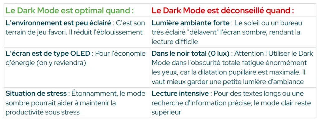
The war of perceptions: cool vs trust
The choice of mode also influences the user’s psychology and the brand image.
- Dark Mode is perceived as modern, sophisticated, “High-Tech” and mysterious: users associate it with personalisation and entertainment.
- Light Mode inspires trust and professionalism: one study showed that users were more hesitant to give personal or banking information on a dark interface. For sensitive tasks such as an online purchase or filling in a banking form, light mode is more reassuring (Hultman and Jiang, 2024 ) (opens in new window).
The eco argument for Dark mode: true or false?
It is a frequent marketing argument, but it needs to be strongly qualified.
- It works IF: You have an OLED or AMOLED screen. In that case, the black pixels are switched off, allowing a battery saving of 60 to 67% (Dash and Hu, 2021) (opens in new window).
- It does NOT work IF: You have an LCD screen (the majority of laptops and desktop monitors). The backlight stays on even on black (Dash and Hu, 2021) (opens in new window).
- The rebound effect: Be careful! 80% of users tend to increase their screen brightness when they switch to dark mode in order to see better, which often cancels out the potential energy savings (Datson, 2025) (opens in new window).
Designers: how do you make a “good” Dark Mode?
The Accessible Perceptual Contrast Algorithm (APCA) is a recent and scientifically robust method for measuring the perceived contrast between text and its background, taking into account human visual physiology and the particularities of screens (dark/light mode). Unlike the older models (such as WCAG 2), APCA takes into account:
- the absolute brightness (luminance) of the text AND the background
- the size and weight of the text (small or thin = more tiring)
- the colour space of the screen
- the contrast polarity (black on white ≠ white on black in terms of perception)
APCA expresses contrast as an Lc value (Lightness contrast). Here are APCA’s recommendations in dark mode:
- Never use pure black or pure white: Avoid the extreme contrast of #000000 on #FFFFFF. It creates an unpleasant shimmer (halation).
- Recommendation: Use a very dark grey (#181818 or #23272A) for the background and an off-white (#FAFAFA) for the text.
- Enlarge the text: Since sharpness drops in dark mode, you have to compensate. Recommended minimum size: 16px to 18px.
- Avoid thin fonts: The light “eats” the weight of the characters. Use Regular or Medium weights (≥ 500), never Light.
- Watch out for colours: Avoid red text on a dark background, that is what tires the eye most.
- Watch out for contrasts: Aim for a luminance contrast (Lc) ≥ 75 for body text.
- Leave the choice: that’s the ultimate rule. Preference is often linked to habit and to each person’s eyesight. Never force a mode by default without an option to switch. That is in fact the stance we chose when building an eco-friendly instant messenger.
What to remember about Dark mode?
If there is one lesson to draw from the various scientific studies, it is that Dark Mode is neither the universal saviour of our eyes nor a mere aesthetic trend, but, above all, a contextual option.
Wanting to impose a single mode is a major mistake, because the studies prove that forcing a user to use a mode they do not like (or that is not suited to their eyesight) not only generates frustration, but actually increases their stress and their perceived fatigue (Andersson and Chan, 2025) (opens in new window).
For users, favour the performance of Light Mode for intensive daytime work, and switch to the comfort of Dark Mode when the light fades or for your leisure time.
For designers, stop treating dark mode as a simple inverted “colour filter”. It is a design variant in its own right, one that requires rigorous checking of contrasts (APCA method) and legibility.
The real winner? It is neither the black background nor the white background. It is the “Toggle” button (the switch). The best feature you can offer is to leave full control to the user, so they can adapt their interface to their environment and their fatigue.
Sources
Andersson, L. and Chan, Y.T. (2025) “Mörkt Läge och Dess Inflytande på Psykologisk och Fysisk Avkoppling under Stress”.
Datson, Z. (2025) “The Dark Side of Dark Mode”. (opens in new window)
Hultman, L. and Jiang, Y. (2024) “Dark vs Light: A Study on Dark Mode’s Effects on User Trust and Brand Perception”.
Yang, A., Goh, C.H. and Yi, L.J. (2024) “The Research into Dark Mode: A Systematic Review Using Two-Stage Approach and S-O-R Framework”, International Journal of Communication Networks and Information Security (IJCNIS), 15(4).