



Creating the visual identity of a human-scaled property agency
An identity that carries the agency's values
Founded by two long-time friends, Sophie and Bruno, Mata positions itself as a local property agency close to its clients. This new visual identity rests above all on the image and the values carried by its two founders: warmth, accessibility and authenticity. The aim is to have a unique positioning and stand out from other agencies. At first glance, users have to understand that they are dealing with a human-scaled structure, expert in its field and driven by a duo who will support and advise them in their property project. To start, we designed the logo around custom lettering with curves and a ligature evoking closeness, support and personalised advice. The colour palette selected is warm while staying sober. The feeling it evokes is reminiscent of cocooning, of comfort, of the cosy nest where you feel good. (We regularly carry out this kind of project work. For example here 👉 for a bespoke furniture maker)


Art direction and UI design of the agency's site
Putting the people behind the agency in the spotlight
The founders want to convey values of authenticity and warmth.
The ideal chance to feature them on their website to better welcome visitors.
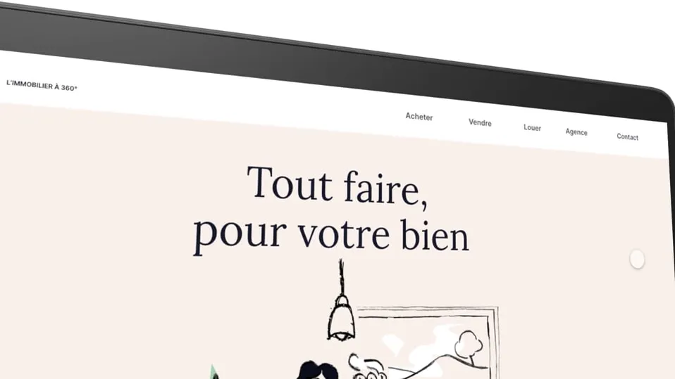
To do this, we produce illustrations in a simple, naive style inspired by editorial cartoons. Here we keep this warm and accessible feel that makes you want to learn more.
And more importantly, the illustrations let us personify the agency and bring to life the duo behind Mata immobilier.


The platform’s interface aims to be fairly minimalist. Visuals are given prominence to promote the properties for sale and rent.
The role of the illustrations is to punctuate the pages to support the messages and make them more impactful.


Responsive site for mobile use
The whole website is designed responsively for optimal use on desktop as well as on tablet and mobile.
We take all screen types into account when designing the visual identity. So the logo, the colours, the typography and the illustrations are adapted to the different devices while remaining accessible to the widest possible audience.

