
Getting acquainted and project kick-off
Understanding the project's stakes and context
By creating the “Nouvelle-Aquitaine Rénov” web portal, Région Nouvelle-Aquitaine aims to support Nouvelle-Aquitaine citizens in their energy-retrofit journey. The project is guided by two main challenges:
- a regional website that helps users understand what energy retrofit is
- redirect them to the right contact who can advise them in their journey
An initial familiarisation phase and benchmarking study are carried out to better grasp the project’s context and take stock of what is in place. A necessary step to understand and formalise the user journeys. This work serves as the basis for the workshop that will define the new information architecture.
Defining the user journeys
Categorising the content to address the user needs
The project team is brought together to think collectively about the best ways to address user needs as they browse the site. This workshop puts the different existing pieces of content (and those we want to add) into perspective. The benchmark carried out upstream feeds the thinking around entry points by user profile, content categorisation by topic and the steps needed to access the desired service… The pieces of content are then prioritised based on user needs and the actions users will take on the platform. The information architecture is designed by following the sequence of steps that address the goals users want to reach:
- discover this new web portal
- understand energy retrofit and discover what’s happening in the field
- learn about the different funding options for their project
- and access the services for retrofitting a property


Screen co-design workshop
Ranking the information and shaping the structure of the screens
The project team is brought together again to work on the information architecture and the structure of the platform’s main screens. The interface proposals produced upstream are modified, annotated or redrawn during the workshop to refine the structure of the pages. This ideation work helps address the main blockers identified:
- create templates that showcase the existing and additional content, making it easier for the user to gather information
- prioritise access to finding an adviser in order to complete the process

UX Design sprint
Designing the wireframes in desktop and mobile format
The UX sprint is launched to design the prioritised screens in desktop and mobile responsive format. Designing the different pages of the future portal gives us a step back to look at the layout of the components and the interaction between the screens. The different blocks structuring the pages address the needs and challenges defined upstream:
- introduce the categories before walking through the steps: for example “understand energy retrofit” then explain the different types of work: “audit”, “insulation”, “materials”…
- take an educational and transparent approach by featuring examples of successful retrofits
- make it easier to access the funding options for the project
- smooth the navigation by creating entry points by type of home

Art direction
A clean design accessible to everyone
The platform’s art direction is a skilful blend of the visual identity of Région Nouvelle-Aquitaine and France Rénov’. The different blocks of elements making up the platform are designed so that the user quickly identifies their function:
- primary and secondary information
- the steps involved in starting a property retrofit process
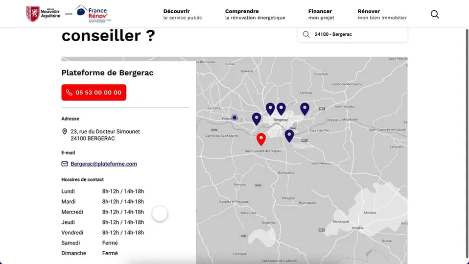
- the component for finding and contacting an advisor
- etc.
The aim is to create a design that is simple and understandable by everyone, in order to provide easy and quick access to the information on energy retrofit.


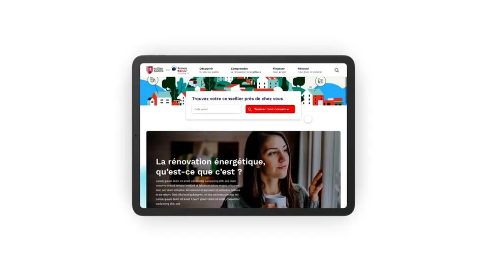
Platform home page
Desktop and mobile graphic mockups
A multi-device platform
With the visual identity validated, the screens are then carried over into desktop and mobile format.
A design system is put in place to gain in speed and consistency during design, and to make the developers’ work easier.
Internally, the creation of reusable component blocks brings greater flexibility when the editorial team creates new pages.
Designing the components in desktop and mobile (in responsive) ensures that we offer a platform accessible to everyone on as many devices as possible.