Defining touch devices
Steven Hoober traces the history of touch and how it has evolved. Knowing and understanding the device you are working on is critical before getting into any kind of thinking or design work.
Let’s start by comparing computer use with mobile phone use:
- The computer is used in an office setting, usually at a fixed workstation such as a desk that almost never moves. According to the author, when in use, the user’s full attention is focused on it.
- The mobile, on the other hand, is very often used in a moving context (public transport, walking down the street, and so on). Unlike computers, the user’s attention is not as focused on the mobile.
Features and operating systems that keep evolving
In the beginning, mobiles only had one feature: making phone calls 📞
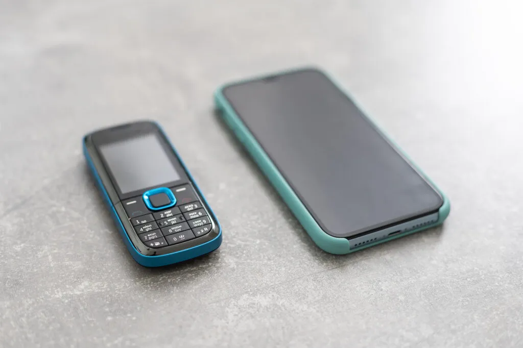
Bit by bit, new options arrived: sending an SMS, accessing the internet, taking photos, connecting a device by Bluetooth, and so on. All these features are available and used both on touchscreens and on feature phones (phones without a touchscreen). This type of phone is rarely taken into account by designers, by companies and even by governments when launching projects. And yet, the share of feature phones in the world is far from negligible.
Touch = mobile? It isn’t that simple…
To close this chapter, Steven Hoober raises another point: touch doesn’t necessarily mean mobile.
He reminds us of the importance of tablets, the use of which is constantly growing. Smaller and more practical than a PC, tablets appeal to many users. But be careful, more and more computers being sold also have touchscreens.
When we think “touch”, a wide range of devices and operating systems sit behind that label.
Apple and designers, a great love story
On the operating system side, our position as designers can very often be biased. Looking at the hardware in agencies, or scrolling through designers’ portfolios, we often have the impression that we only see products designed for iOS: MacBook, iPhone, iPad, and so on.
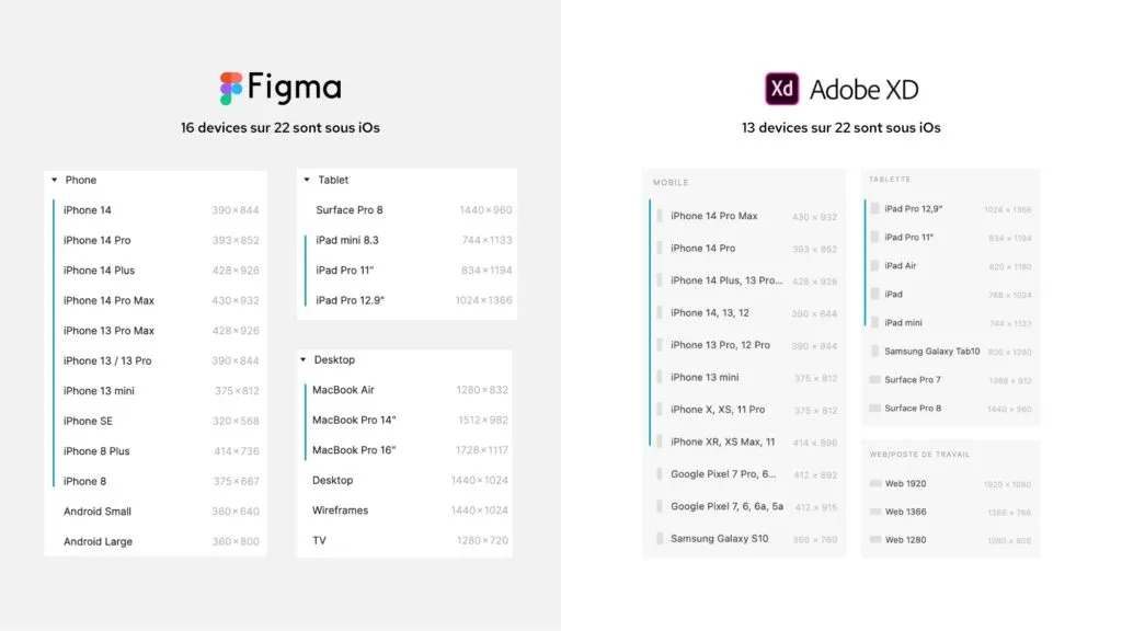
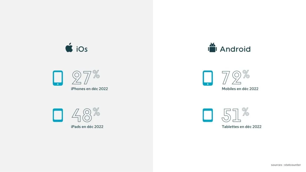
Pay attention and you quickly realise that even our design tools (XD, Figma, etc.) mostly offer iOS artboards, with fewer Android ones. And yet, as Steven Hoober reminds us, if we look at uses and habits, we quickly notice that 75% of operating systems in the world are Android.
Android does seem to have lost ground (-7%), but it remains the leader on the global market.
The author cites the example of the Indian government, which at the peak of Covid released Aarogya Setu (the equivalent of TousAntiCovid) on iOS and Android, making its use mandatory. Yet only 30% of people in the country have a touchscreen smartphone (and 2% on iOS). Can you imagine the number of users left aside? Bearing in mind that the country has 1.48 billion inhabitants, we’ll let you do the maths.
The trend is different on tablets: Apple remains the tablet leader, although in one year Android went from 27% (2019) to 41% (2020) of the market. The iPad curve is slowly going down while Android tablets are gaining ground. Sources: Dazeinfo (opens in new window)
We can then ask ourselves:
Is it really a good idea to imagine and design our products on iOS? Should we present a future product on an Apple device that is only used by 1/4 of the world’s population?
This obviously needs qualifying. Even though, on a global scale, this split is clearly marked, the figures can vary from one country to another. For example, in the United States in 2020, iOS accounted for almost 60% of phones.
Before making decisions for your project, do your homework and properly study your target group: habits, country of origin, most used operating system, and so on.
A history of touch
Now that the scope of touch is properly defined, Steven Hoober gets into the history of touch. In this chapter, he traces the evolution of “pointing”, which is over 70 years old.
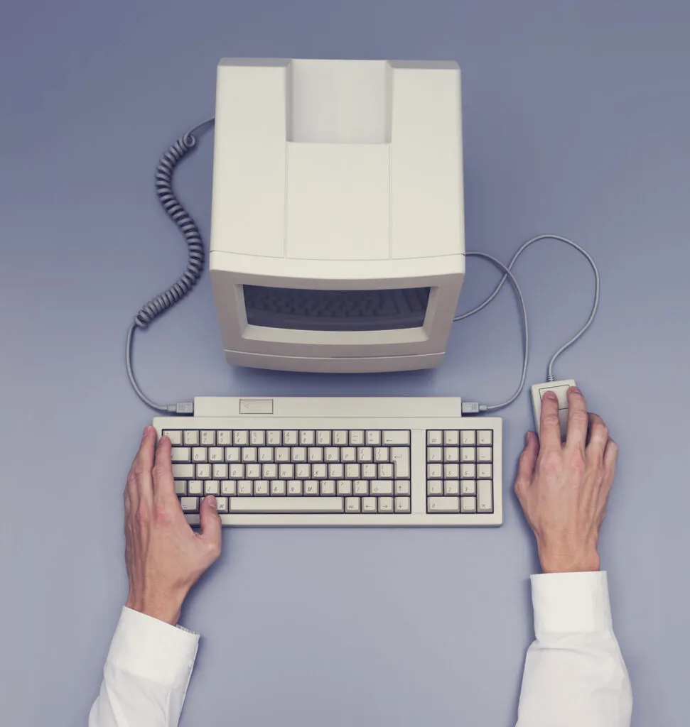
We won’t go through every stage of this evolution, but it’s worth knowing that it all starts during the Second World War, with radars called SAGE (opens in new window). They were used with an ancestor of the stylus, which allowed points to be placed on the screen. These tools evolved up to the appearance of the mouse, as we know it today, in 1984 with the first Macintosh (opens in new window).
How touch sensors work
What’s the difference between capacitive touch and touch recognition? Capacitive touch is when an object will detect a movement and then trigger the action. Unlike touch recognition, which only triggers the action after detecting a touch contact. On one side, touch recognition can be a hindrance in many situations: a user with gloves, very dry skin (older people), fingers with scars or damaged fingers (musicians, carpenters, etc.).
Other elements can interfere with the interaction: the pressure applied on the screen, the angle of contact, or the size of the contact area. For example, who has never missed a click on the edge of their screen because of a protective case?
The standards not to follow
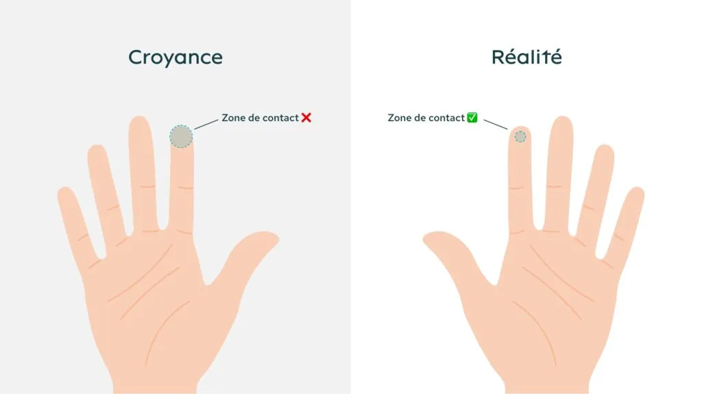
In the following chapters, the author draws our attention to the fact that some standards we thought were safe bets should be treated with caution. He mentions in particular a fairly widespread belief: people with large fingers struggle to click on buttons. Except that, as said earlier, the angle of the finger and the angle of the click play a very important role on the contact area with the screen. This contact area is much smaller than the finger, it only represents a small percentage of the finger’s width.
So children and adults, across all body types, have almost the same contact area on a touch surface.
Day-to-day mobile use
Steven Hoober reminds us that it is critical to know your target users before getting into design.
Which devices do they use, a feature phone or a smartphone? Which operating system? Which browser? Do the target users rely on 5G, 3G or even an H+ network?
Knowing, identifying and talking to YOUR users: that’s your starting point before thinking about any design rules and accessibility standards.
But what are the actual mobile use patterns?
Based on his many observations, Steven Hoober is categorical: there is no single answer.
One hand, two hands, one finger, thumb-only use, and so on. Overall there are 6 different ways of holding your phone, and they vary depending on context and the user’s environment. In reality, you can find many more, but Hoober gives us an “average” of these observations.
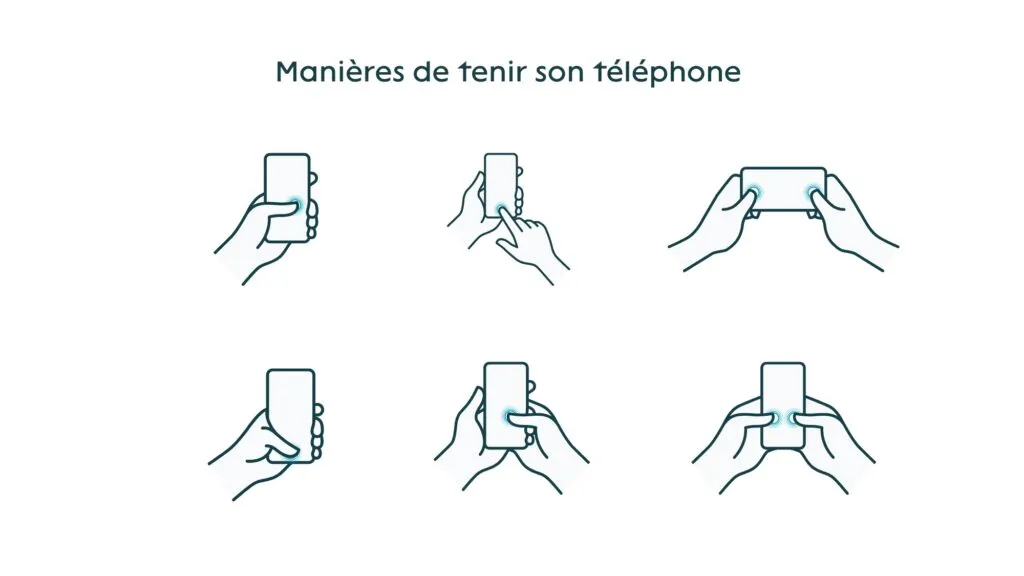
Indeed, the user’s mobility has a huge impact on the position of the hands on the phone, but also on the tap zone. The more static the user, the more easily they can reach the whole touch surface. And conversely, if they are moving, it can be tricky to reach some elements.
From all these observations, Steven Hoober concludes that there isn’t just one way of holding a phone. On top of that, he observes that age, region and gender have no impact on use. The variations only happen through screen size and the context and environment of use (we see you coming, no, not all older people use their phone with one finger).
Hoober shares a very simple tip to illustrate his point: watch the people around you when they use their phone, and do so in several different contexts: at the airport, on public transport, sitting in an armchair, walking down the street, and so on.
Interaction zones
Remember chapter 4, where we briefly mentioned the standards and beliefs not to follow? In this part, we are going to talk about the famous F-pattern and the thumb zone. If the names are not familiar, you will quickly understand what this is about by looking at the diagrams.
The F-pattern, or the F-shaped structure
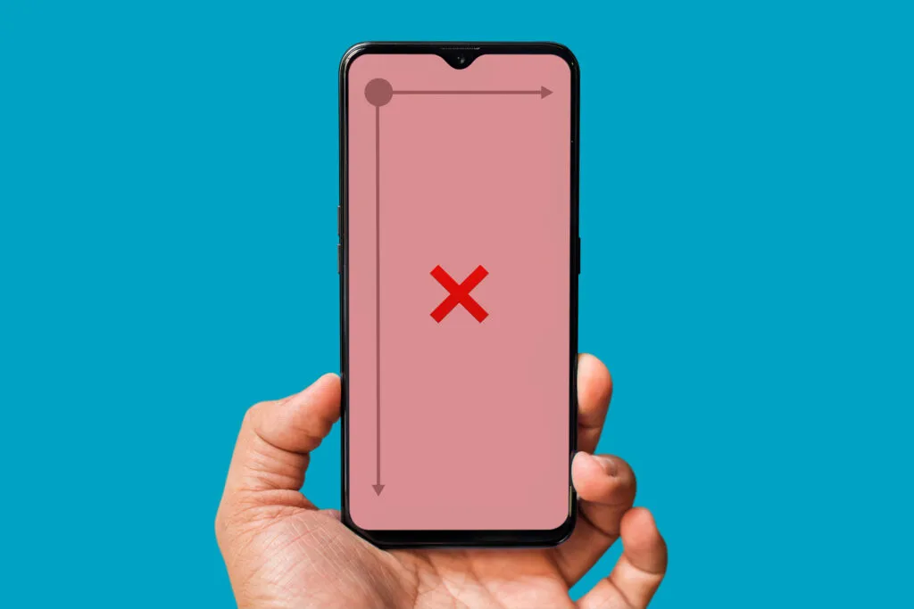
After many user tests, Hoober quickly realises that there are many ways to scan a page and that users are very far from the F-pattern. His conclusions are as follows:
- The elements at the very top and the very bottom of the screen have to be bigger to grab attention, otherwise they are completely overlooked (so we are very far from the F-shaped structure)
- The elements at the centre of the page are scanned first and can therefore be smaller (but still readable)
According to him, users don’t read top to bottom, they read through the middle. This zone is also more quickly and easily tappable, unlike the top and bottom corners, which are less visible.
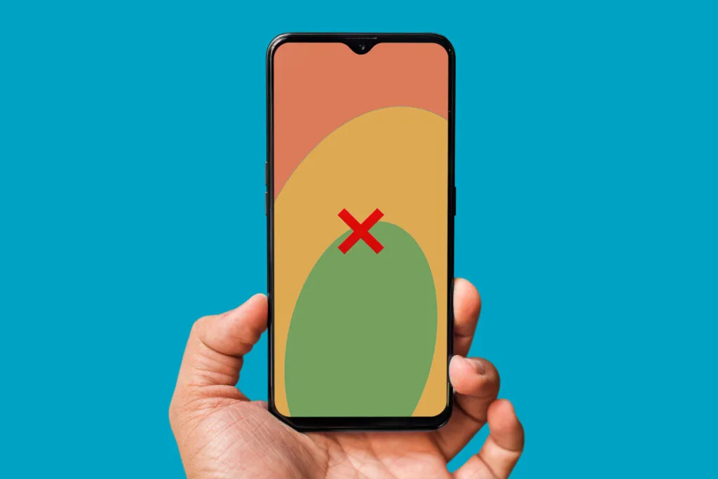
Thumb zone, or the comfort zone for the thumb
As we saw in chapter 5, there are lots of different ways of holding and using your phone. The tap zones vary according to the position of the hands, so we can’t rely solely on this method, which focuses on a single way of holding the mobile.
Solving visibility and interactivity issues
When you tap on a touch device, the finger covers the button (or icon) that is tapped. It’s important to put a few things in place to guide the user through their action:
- Indicate a state change on tap (a small animation to mark the transition between the default state and the tapped state)
- Add some text next to the button/icon, a title or any other text element that can clarify the action that is going to take place.
For example, the “like” icon on Twitter: it is small and when you tap it, you can’t really see whether the action has been registered. However, as Steven Hoober points out, the icon goes from a white outline to a filled icon with a colour change. The difference is clearly marked and visible.
Anticipating interaction errors
The author lists three main tips for avoiding tap errors:
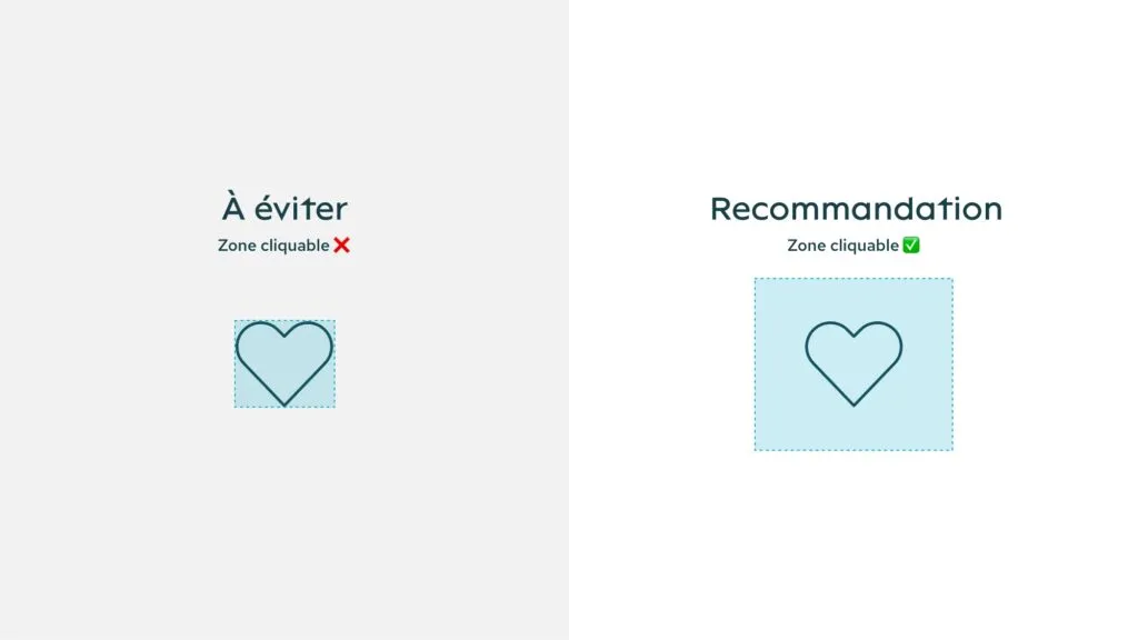
- On the development side: make sure the zone is fully tappable, not just your icon or your text, but with a safety margin all around. As if an invisible shape surrounded your icon, for example. This tappable zone should be about 20% larger than your element.
- Properly space the elements from one another and avoid sticking actions together
- Add “cancel” buttons following a critical action, for example sending an email or deleting an element. This button lets users quickly cancel the action without being too intrusive with a modal of the “are you sure?” type.
Phones aren’t flat
When you design, you have to keep in mind that, unlike a computer, the mobile is used in many different environments and that it has to adapt to the user. For example: opening a door, holding a bag of shopping, taking care of a child, walking down the street, getting out of a car, standing on public transport, walking in the rain, and so on.
When designers build a product, they have to take into account situational “impairments”, whether around attention, movement, and so on. These environments can cause double taps, slips or drops of the device that may be interpreted as actions.
The solutions? Use a single action button, move confirmation actions, make sure the important actions are reversible.
Since the user’s attention isn’t 100% focused on the screen, it is important not to put countdowns on features, or to let messages disappear.
Another element that can interfere with user actions: phone cases. They can get in the way between the finger and the screen surface. Indeed, if a button is too close to the edge, it is hard to tap. To avoid this kind of problem, plan a design grid (in a prototyping tool) with outer gutters that are wide enough.
The impact of UI design on mobile use
During the UI design phase, it is important to clearly show users what is tappable, through colour, underlining, an icon, and so on. These elements let users immediately tell what is tappable, which limits mistaps and the potential frustration that comes with them.
This step is also important for highlighting content, through colour, font weight or the size of your text.
⚠️ It can’t be said enough, anything to do with colour has to respect the WCAG (opens in new window) standards.
Organising the content
Organising and structuring the content properly on a small device, like a mobile, is critical.
Hoober points out that the most important thing concerns the position of your elements. According to him, you should go for a central position for the most important elements that you want to highlight: they will be exactly where the user’s gaze will land first. Then, make sure their size is big enough to be quickly perceived. Be careful not to make everything big: it’s all about balance.
Text hierarchy is also important. Unlike with a book, we don’t read top to bottom strictly following that method. On a digital format, we tend to read from biggest to smallest, regardless of the order of the elements.

You can organise your content into three big groups:
- The most important in the centre of your screen
- The secondary, like information or controls, at the top and at the bottom
- The tertiary, content hidden behind menus or expandable lists.
A closer look at standard mobile elements
In this second-to-last chapter, Steven Hoober comes back to key mobile elements and lays out their positive and negative sides. This is his personal opinion and his observations, not standards to follow.
Here is a brief recap:
- Pop-ups (or windows): they are easy and quick to bring in, even more on apps where they already have a predefined style. They are however very intrusive and too often used; users close them by reflex without reading the content.
- Hamburger or side menu: lets you add context and information, users are used to it. However, if there is no clear label alongside, this element can be completely overlooked.
- Accordion: makes content easier to read by reducing scroll length. But, if the content goes past the viewport once unfolded, users can get lost and no longer know where they are.
- Tabs: simple and easy to use as long as you don’t have too many (3 or 4 maximum) and have short, clear labels. Otherwise, this element will be unusable.
- Scroll: widespread use to space information out and show it bit by bit. However, if the navigation bar is not fixed, this can be a hurdle for the user, who has to scroll all the way back up to reach it.

Mobile usage: a recap
To wrap up and close this article, here is a recap of the elements to take into account when you design for a mobile format:
- Know your users: know what device they use, understand the environment around them, define who you are addressing (age range, habits, etc.)
- Understand the technology and the changes around us: follow the news on digital and mobile use, check which platform is used (app, browser), the quality of the network (wifi, 4G, 3G, etc.)
- Keep in mind that “standards” do not always reflect reality. Devices keep evolving, keep in mind that the same is true of uses: the standards from 5 years ago may no longer be relevant today, do your homework.
- Design for real life: anticipate mishaps and errors, think about your user’s environment
- Test and talk to users: meet your users, interview them, watch them use your product and constantly improve your solution.
Now that you’re comfortable with mobile use, don’t hesitate to also bring eco-design into your projects.