


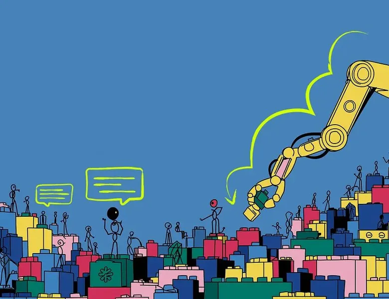


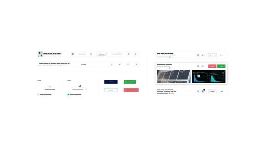
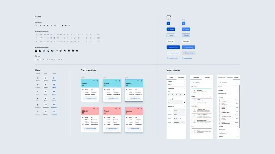
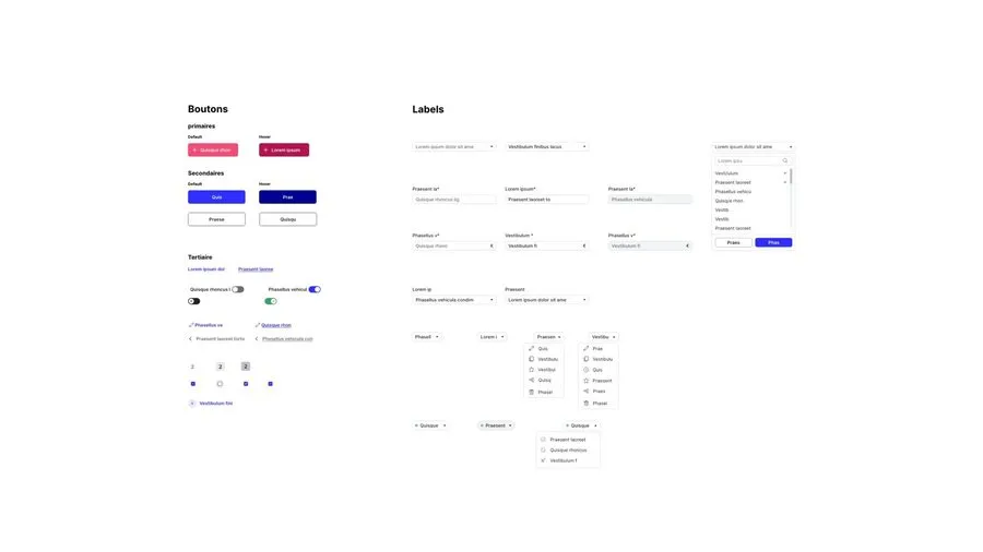
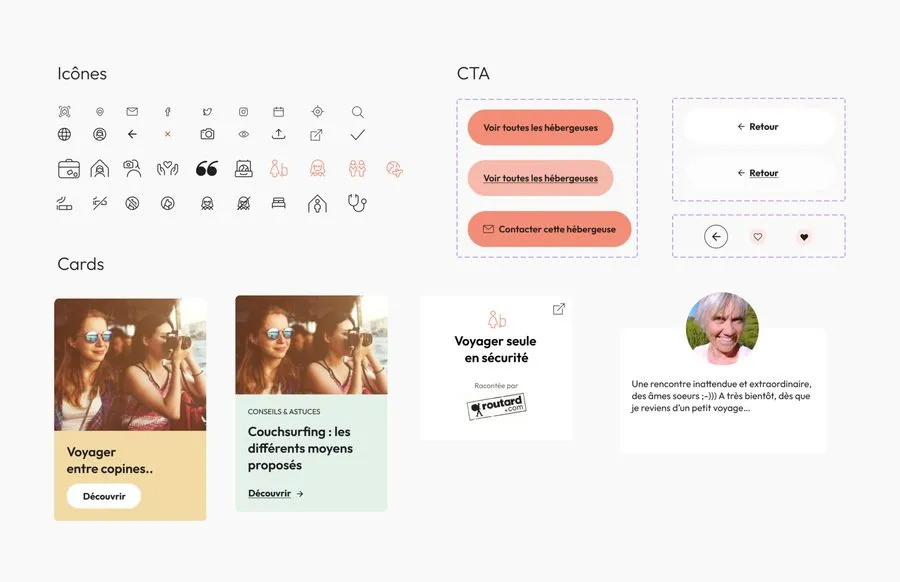
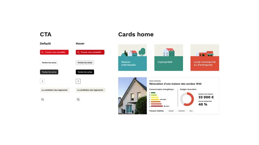
The design system exhaustively describes the visual components of the product being built (typography, colours, element sizes, element states such as hover, focus, clicked, and so on). It can be seen as a component library. This kit is meant to evolve as new needs and features come up. The design system makes the work between designers and developers smoother, since both teams share a common, shareable reference. From the user's perspective, this kit keeps your platform or service coherent overall, and that supports a better experience. Be careful though: the design system requires every existing component to be catalogued and properly organised. If it's done poorly, it can lead to duplicates and you'll quickly lose consistency.
A design system is a product, and a product without a team grinds to a halt. A dedicated team of designers and developers gathers technical feedback and user feedback. The design lead runs reviews where the addition of a component, or the reworking of an existing one, is decided.
The design system is the digital twin of the developed versions, which makes it possible to confirm that future products are feasible and to speed up releases. The requirement is a strict match between what is drawn and what is built. The slightest gap between the two is paid for in time and money at release, and it is that gap the team exists to watch.
Then comes adoption, which decides everything else. A design system nobody uses turns back into a library of throwaway components. The documentation has to be easy to find, and so does the library file, and tools such as Zeroheight or GitHub serve to present the system beyond the design file. The lead flags updates and sets up sessions to support the people who use it.
One more argument has been added recently. The more structured and documented a system is, the easier it is to implement, including by agents that read the documentation and generate code from it.
01
Lay the foundations as variables
Once the visual identity and the visual style guide are settled, the colours, the typography, the styles and the spacing become variables.
02
Define the tokens
Variables feed specific uses. A blue-primary colour supplies background-button-primary, background-icon-primary or border-card-hover. Changing the colour of the icons then comes down to reassigning a variable, and the change propagates to every mockup.
03
Agree on a naming convention
Variables work the same way on the development side. Design and development therefore align on the same names, matched as far as possible to the chosen framework.
04
Assemble following atomic design
The basic elements, buttons, lists, icons, image templates, combine into components, then into more complex blocks. A change at the base propagates across the whole.
05
Document and distribute
Usage rules, components, code snippets, editorial choices, tone of voice, what to do and what to avoid.
Your design system should also include a style guide. It picks up the visual style guide (colours, typefaces, logos and so on) along with the usage rules for each element. For instance, knowing when red should be used, when typeface #1 should be used, and so on. Before starting this work, prioritise the elements that recur most across your product, such as buttons or navigation elements (menu, footer). Once your base is solid and properly built, you can move on to variations and other elements. Remember to test your “parent components” (the main one, used as the model) before building “child components” (variations of the main one).
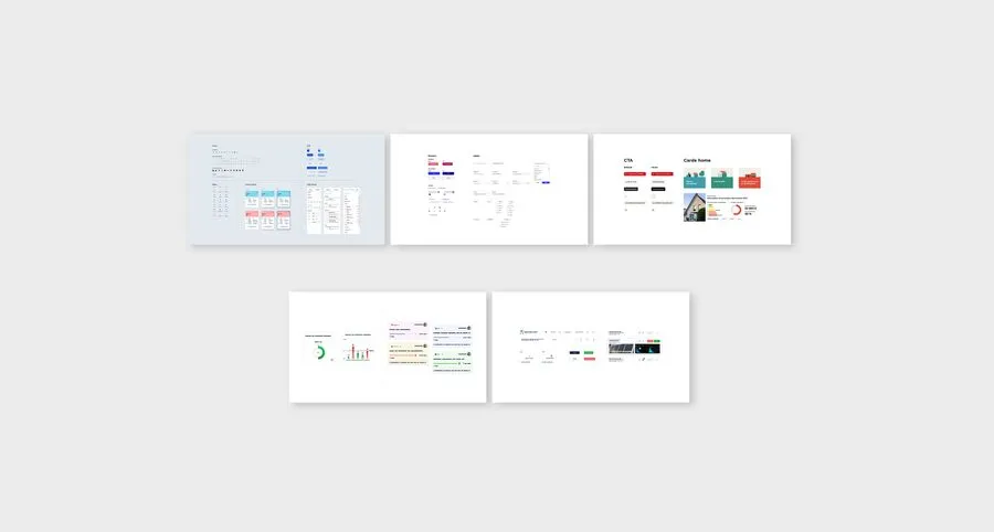
The design kit is a static component library, a snapshot that comes with a set of delivered screens. The design system is a living library that serves as the basis for everything designed afterwards. It's a product of the company, with its governance, its maintenance and the requirement of a strict match between what is designed and what is developed.
Design systems have become widespread, and many can now be consulted online. Some set the standard through their scale or their influence, such as Google's Material Design or Apple's Human Interface Guidelines, which frame design work on their respective platforms. In the French public sector, the State design system (DSFR) imposes a common base on all State websites, down to the components and the accessibility rules. To explore the variety of approaches, the Design Systems France association maintains a directory of design systems built in France, from large corporations to startups, each with its tools, its technology and its type of team. It's published at designsystems.fr.
It all depends on the context. For a brochure site, a design kit is enough. If that site sits within a wider ecosystem, several products from the same organisation, several teams contributing in parallel, then a design system becomes relevant to centralise components and rules, brochure site included. The criterion isn't the size of the organisation but the number of products to keep consistent and the number of people working on them. It does call for real investment though, both at the design stage and over time.
It's possible if the starting file is well structured. The move doesn't come down to the file but to what you put around it, a dedicated team, a contribution process and a review rhythm. Without that organisation, the kit stays a kit with a new label.
It's rather the opposite. A well structured, well documented system is what lets an agent generate code that is in line with the product rather than a generic interface. When code is churned out, results look alike, and differentiation comes from what you give the machine to read.
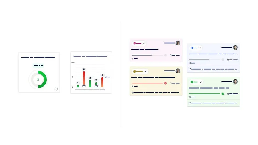




The visual style guide brings together a brand's visual rules: colours, typefaces and logo, along with the permitted or prohibited uses for each.
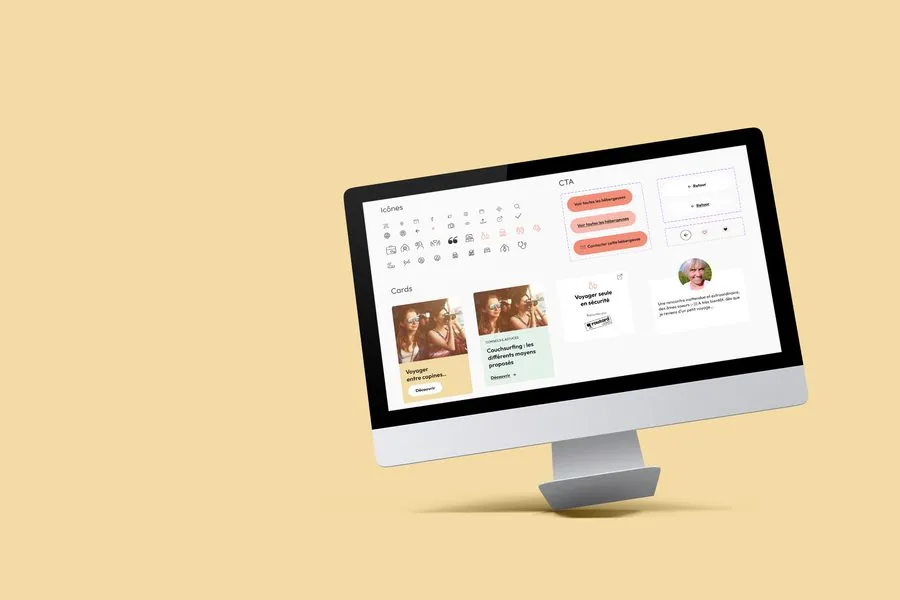
Read more about Visual style guideThe design kit, or UI kit, brings together a product's components in a design file: buttons, forms, cards, navigation, icons.
Read more about Design KitInformation architecture organises content and navigation so that users find what they're looking for. It guides interface design
Read more about Information architectureUI design shapes the visual layer of a product: layout, colours, typography, components. It turns the experience into tangible elements.
Read more about Interface designA design pattern is a proven solution to a recurring problem: breadcrumb, modal, accordion. These conventions exist because they work for users.
Read more about Design patternFigma is the leading collaborative design tool. Design, prototyping, design system and handoff in a SaaS that connects designers, developers and product managers.
Read more about FigmaDesign Ops optimises the practice of design: tools, processes, handoff, documentation. It lets designers focus on designing rather than on managing.
Read more about Design OpsThe layout grid structures the interface into columns, gutters and margins. It ensures visual consistency and eases responsive design.
Read more about Layout gridHigh-fidelity mockups give the future screens their final form, to hand over to the project teams for integration.
Read more about High-fidelity mockupsAtomic design breaks an interface down into 5 levels: atoms, molecules, organisms, templates, pages. It's one of the reference methods behind a design system.
Read more about Atomic designEveryone talks about user experience, service design, ergonomics...
It's not always clear, and you'd like to find out, or sharpen what you already know.