


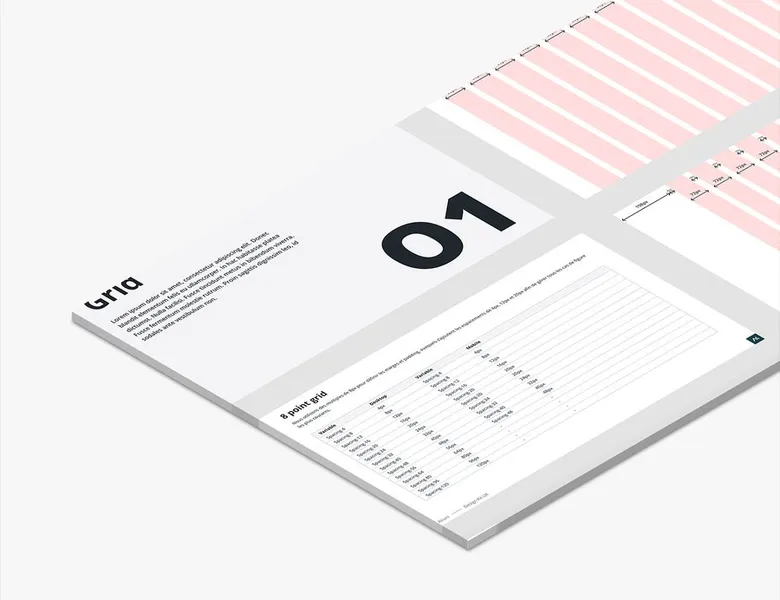


A layout grid (or design grid) is a system of columns, gutters and margins that structures the arrangement of a page's elements. The design grid overlays your graphic compositions to help you organise and align visual elements consistently.
01
Defining your base grid
We always recommend the 12-column grid as a reference. Easily divisible, it is used by the majority of CSS frameworks, which will greatly ease collaboration between design and development teams.
02
Adapting the grid to breakpoints
The 12-column grid eases responsive work, but it must adapt to other media: 8 columns for tablet and 4 for mobile. Defining these breakpoints upstream with your team will save you precious time during integration.
03
Alignment
The grid only matters if you use it. Make sure to align each of your elements (blocks, images, texts, buttons, etc.). This guarantees better readability of your page and will ease the developers' work.
A fixed grid has columns defined in pixels, which do not move with the size of the screen. A fluid grid uses relative units, its columns adapting to the available width. In responsive design, you generally combine a fluid grid with breakpoints, the structure changing at certain thresholds, from 12 columns to 4 on mobile for example.
12 is the most widespread standard, because it divides into 2, 3, 4 or 6 and covers almost all common layouts. For a simple interface, a landing page or an article, 4 or 6 columns are enough. For a complex interface with many variations, a dashboard or an editor, 16 or 24 columns give finer granularity.
Not necessarily. The grid adapts to the medium and to what you want to present on it. Print has no breakpoints and no variable width, which allows compositions that the screen does not. The principle stays the same: the way it is applied changes.
Design tools, Figma first among them, offer configurable grids that you apply to a template. On the development side, CSS frameworks such as Bootstrap or Tailwind come with their own grids and breakpoints, and CSS Grid lets you build custom ones. Desktop publishing software offers them too, with a similar logic.




Typography defines the fonts, the size scale, the weights and the spacing of an interface. How to choose it and guarantee its readability.
Read more about TypographyBrand palette or interface palette, the two are not to be confused. How to build a coherent, legible and accessible colour system.
Read more about Colour paletteAn interface's iconography is the style and consistency of its icons. Well chosen, they speed up reading; badly chosen, they create doubt.
Read more about IconographyUI design shapes the visual layer of a product: layout, colours, typography, components. It turns the experience into tangible elements.
Read more about Interface designZoning is the visual representation of an interface through the placement of its simple content blocks, without detail: no text, no images.
Read more about ZoningResponsive design means structuring an interface so the display adapts to different screen sizes depending on the device.
Read more about Responsive designEveryone talks about user experience, service design, ergonomics...
It's not always clear, and you'd like to find out, or sharpen what you already know.