




For a long time, designing an interface meant drawing pages based on the print model. Screens have multiplied, from watches to wall projections, and a fixed page no longer holds up. Interfaces are now conceived as assemblies of components.
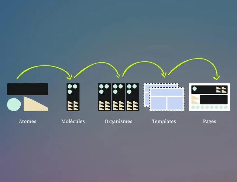
Brad Frost formalised this logic in 2013 under the name atomic design, borrowing its vocabulary from chemistry. An interface is broken down into 5 levels, from atoms to pages, each assembled from the previous one.
The value of the method lies less in the breakdown than in the shared vocabulary it creates. A designer and a developer who say "molecule" mean the same thing, and that thing exists on both sides, a component in Figma, a component in the codebase.
For a long time, designing an interface meant drawing pages based on the print model. Screens have multiplied, from watches to wall projections, and a fixed page no longer holds up: interfaces are now conceived as assemblies of components.
Brad Frost formalised this logic in 2013 under the name atomic design, borrowing its vocabulary from chemistry. An interface is broken down into five levels, from atoms to pages, each assembled from the previous one. The value of the method lies less in the breakdown than in the shared vocabulary it creates: a designer and a developer who say “molecule” mean the same thing, and that thing exists on both sides, a component in Figma, a component in the codebase.
Each level is assembled from the previous one:
01
Atoms
individual elements. For example: an image template, a button, an icon.
02
Molecules
made up of atoms that form a whole. For example: a navigation menu is a molecule, built from atoms like the logo, a button, the various links, and so on.
03
Organisms
formed from molecules. They correspond to groups of blocks
04
Templates
which represent the overall structure of the page (but without the final content). Then pages, holding all the final elements (along with text and images)
Still with a view to improving communication and work between developers and designers, it is important to name your components properly. Each element must be named in lowercase, with words separated by hyphens. This convention gives developers elements that are easy to implement. Start with the letter representing your atom (a for atom, m for molecule, o for organism, and so on); then the type of element and its variations.
Example for your primary button: a-btn-primary. Be careful to name components according to their function, not their form (colours, shapes, visual style). Don’t forget that your style guide will evolve. Example not to follow: a-btn-red
No. Atomic design is the construction methodology; the design system is often its result. Atomic design offers a grammar for organising components by level of complexity. The design system brings those components together with their usage rules, their documentation and the principles that guide design decisions. You can have a design system without following atomic design, and you can apply atomic design without having formalised a complete design system.
No, and Brad Frost himself acknowledges it. What counts is the composition logic: starting from the simplest elements to assemble towards complex structures. In practice, many teams work with 3 or 4 levels depending on the maturity of their product. The important thing is that everyone speaks the same language, not that the terminology matches the book.
Not necessarily. It becomes relevant as soon as a product is shared between several designers or several developers, or as soon as a project is meant to evolve over time. Setting up a clear architecture from the start often avoids months of design debt in the medium term. A small team that anticipates its growth has everything to gain from drawing on it, even partially.
That is the main contribution of the method. Atoms correspond to design tokens and to the most basic components on the development side, a React button, a CSS variable. Molecules become composed components. When designers and developers share the same naming scheme, the back-and-forth between Figma and the codebase becomes rarer.
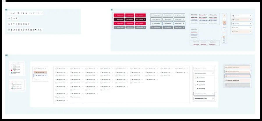




A design system is a component library and the governance that comes with it. What sets it apart from a design kit, and when it becomes necessary.
Read more about Design systemA design pattern is a proven solution to a recurring problem: breadcrumb, modal, accordion. These conventions exist because they work for users.
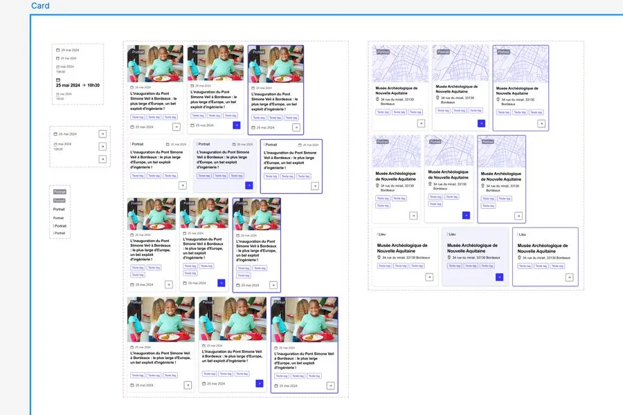
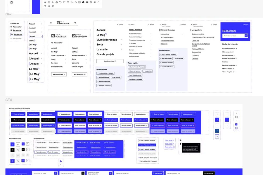
Read more about Design patternThe design kit, or UI kit, brings together a product's components in a design file: buttons, forms, cards, navigation, icons.
Read more about Design KitInformation architecture organises content and navigation so that users find what they're looking for. It guides interface design
Read more about Information architectureDesign Ops optimises the practice of design: tools, processes, handoff, documentation. It lets designers focus on designing rather than on managing.
Read more about Design OpsUI design shapes the visual layer of a product: layout, colours, typography, components. It turns the experience into tangible elements.
Read more about Interface designEveryone talks about user experience, service design, ergonomics...
It's not always clear, and you'd like to find out, or sharpen what you already know.