





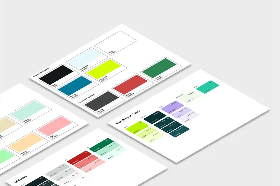
The colour palette holds a very particular place in creating a brand. On one hand, it represents the brand's identity, its values and the emotions it seeks to convey. On the other, a functional interface palette, stricter and more codified, lets you encode statuses (success, error, warning, etc.). More than a simple aesthetic choice, a brand's colour palette enables an information hierarchy and guides the user while guaranteeing accessibility.
It is important to think carefully about your colour palette. It is much more than a simple aesthetic choice: it structures your entire interface, guides the user and communicates essential information intuitively.
The usual approach is to pick colours, then apply them screen by screen. The brand blue on the buttons, the same blue on the links, a slightly darker variant on hover because it looked better that day. Six months later the interface uses four different blues and nobody knows which one does what.
The role-based approach turns that round. The question is not which colour to put on this button, but which role this button plays. Primary action, secondary action, disabled element, error message. Each role is given a name, and it is that name which carries the value.
In practice, a base colour feeds specific uses through variables. Changing the colour of the primary buttons comes down to reassigning a value, and the change runs through every mockup and all the code.
It is also what makes dark mode manageable. The roles do not change, only the values attached to them switch over. Without that structure, every screen has to be revisited.
By checking the contrast ratio between each text colour and the background it sits on. WCAG level AA requires 4.5:1 for body text and 3:1 for large text. These ratios can be checked directly from design tools or from online checkers. You also need to make sure that no information rests on colour alone, which would exclude colour-blind people.
The primary colour is the brand's main colour, used for the most important interactive elements, such as action buttons and links. The secondary complements it, for elements of lesser weight or for accents. Semantic colours carry a functional meaning: green for success, red for error, orange for warning, blue for information. These conventions must stay stable across the whole interface, otherwise they create confusion.
There's no strict rule, but a palette that is too rich becomes hard to hold together. A functional palette generally contains a primary colour with its shades, five or six light ones and as many dark ones, a range of neutrals from white to black, and four semantic colours. Secondary and accent colours are added according to the needs of the product.
By generating shades from the main colour, varying lightness and saturation, five or six values on each side. You then check that the intermediate values offer enough contrast with white and black, since those are the ones that will be used for text and backgrounds. Neutrals are chosen in harmony with the main colour rather than from a neutral grey.
No, not when it conflicts with the convention. A brand red that is very light or very saturated can make an error message unreadable or not alarming enough. Semantic colours answer expectations people already hold, and it is better to respect them, even if they depart from the brand guidelines. Brand consistency plays out elsewhere, on surfaces and interactive elements.


Typography defines the fonts, the size scale, the weights and the spacing of an interface. How to choose it and guarantee its readability.
Read more about TypographyAn interface's iconography is the style and consistency of its icons. Well chosen, they speed up reading; badly chosen, they create doubt.
Read more about IconographyThe layout grid structures the interface into columns, gutters and margins. It ensures visual consistency and eases responsive design.
Read more about Layout gridDigital accessibility makes products usable by everyone. In the digital field, the RGAA is the reference on the matter.
Read more about Digital accessibilityThe visual style guide brings together a brand's visual rules: colours, typefaces and logo, along with the permitted or prohibited uses for each.
Read more about Visual style guideGestalt theory explains how the eye groups the elements of an interface.
Read more about Gestalt theoryEveryone talks about user experience, service design, ergonomics...
It's not always clear, and you'd like to find out, or sharpen what you already know.