To build trust, improve the look and feel
As is so often the case in UX, the report’s first point is that looks play a decisive role in how users picture a service. A sloppy, unfinished, dated visual design, or one that ignores current conventions, reads as a lack of professionalism. A website is the first contact users have with the service on offer. And from the very first seconds, there is a lot riding on reassuring them that they are dealing with something serious (if not exactly honest…).
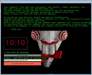

The services seen as professional, and inspiring some (very relative) trust, share a few traits:
- content that respects its alignments (an article on grids is coming soon!),
- a clear hierarchy (titles stand out from the body text),
- photos or illustrations,
- a clear identity. All of this comes together in a consistent style guide.
UX isn’t only about the digital
The report’s second point is about the service as a whole. Being able to try the service is a fundamental reassurance, especially when, once again, users start out assuming the worst.
The information on the website matters enormously here, since the website is the way in. So information that is thin or unclear feeds the distrust. The human side of the service is still an essential complement to a good user experience. Quick replies and flexibility in the exchanges go a long way toward how users feel. To learn more about our approach to ergonomics and UX research, visit our dedicated page.
A convincing design rather than a persuasive one
The report’s last lesson is about using time as a constraint to force the customer’s hand. Past a certain deadline, the ransom goes up. And even though most sites do allow some negotiation in practice, time hangs over the customer and their files like a sword of Damocles.
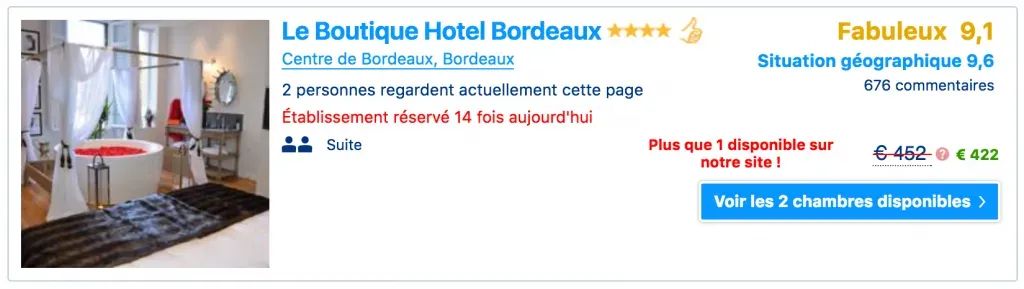
Every design sets out to have an effect on the people who use or watch it: to prompt them, motivate them, guide their decisions. For that last one, time pressure is a common trick. It belongs to persuasive design, and you’ll find it on hotel booking sites, for instance, telling us to hurry up and book because there’s barely a room left in the lovely hotel we’ve got our eye on. Or on e-commerce sites warning us that stock is nearly gone.
Distrust
And every now and then, we notice the number was false. The hotel that supposedly had a single room left when we booked turns out to be partly empty. Trust in the operator is broken, and the doubt sticks for good. The fallout can range from mild to severe: deadly, as in the Rio-Paris flight (see our article on the subject), or simply lost revenue, because some customers will go to competitors they find less suspicious. Running an ergonomic UX audit helps pinpoint these sticking points.
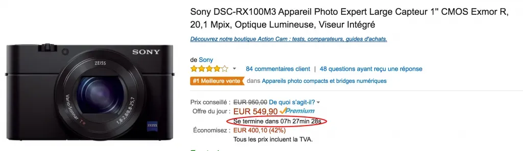
We’d rather use a countdown on an offer, a tactic that is widely used and accepted when applied sparingly. During the sales, for example, users accept it as part of the game: “the offer is tempting, but it won’t last forever”. From there, it’s the offer’s own merits that convince them to buy. Not the feeling that they have no choice.
Wrapping up on ransomware
Doesn’t a designer’s ethics point toward a convincing design rather than a persuasive one? It does suggest, at the very least, not using these UX lessons to design better viruses! To dig deeper into these ideas, discover our approach to design thinking.
Some of the illustrations in this article were generated by AI (see our AI use statement).