UX mapping

Design deliverable

Map complex systems to evolve them more effectively

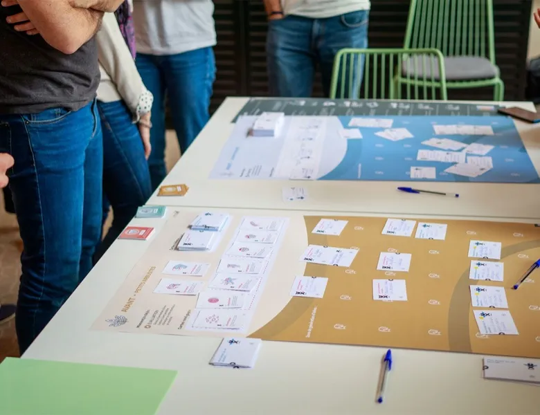
UX mapping consists of representing, in a visual format, the elements that are relevant to a subject of study, along with the links that exist between those elements.

The mapping technique is very widespread in UX. Depending on the issues encountered or the stages of the project, you'll turn to different mapping formats.

In an overall approach, mapping lets you highlight the main information in a concise way. It brings out relationships between actors or components of the whole ecosystem you're interested in.

What is it for?

  • identifying the actors of an ecosystem (ecosystem mapping)
  • grouping elements that are linked (affinity mapping)
  • positioning opportunities against the stages of the journey (opportunity mapping)
  • simplifying reality so you can work on evolving it
  • breaking down the levers to act on (e.g. human, digital, tangible, infrastructure-related or at the organisational level)

What's the need?

  • at the start of a project, to lay out a project's stakeholders
  • during a desk study, to record the links and relationships
  • in co-design workshops, to align participants on a shared representation
  • when analysing usage data, to group knowledge on the same theme
  • before a debrief, to synthesise the insights of a study in a more impactful format
  • to surface recommendations on an existing representation (journey, experience map, blueprint)
  • to represent the current state of a system or the projection of a future state of it

Tips for creating a UX map

There's no magic recipe for applying a mapping technique. Nonetheless there are a few questions to ask yourself that can help validate the value of a model and guide you towards the best option:

01

The message

A map serves to communicate a key idea to your audience. It's therefore essential to define the message you want to get across. The trap in this kind of exercise is wanting to represent too much information on a single support. It can be worthwhile to consider several levels of reading by complementing a comprehensive report with a concise view of the results. If that summary is visual, all the better.

02

The data

The type of data collected and the results obtained will also shape the choice of map. If it's an idea linked to user behaviours, you can for instance offer a scale to represent the principle of a gradient. For data linked to movement flows, an overlay on a plan of the location will be very telling. For recommendations linked to a complex process, you can offer an overlay on the steps materialised with post-its, and so on.

03

The audience

Adapting the level of detail to your audience's expectations is very useful. A successful mapping exercise will therefore aim to adapt the message and the medium to the audience. For complex maps (like experience maps), you'll make sure to offer different entry points to make quick reading easier depending on the reader's interests.

Frequently asked questions

Experience map

The experience map focuses on the visible part of the experience. It represents a user's overall experience with a service or product: before, during and after.

Read more about Experience map

Service blueprint

The service blueprint represents the back-office side of the experience. It describes the organisation of the touchpoints the user crosses to use a given service.

Read more about Service blueprint

Persona

Personas come out of work on user-profile modelling. They highlight behavioural archetypes that prove useful when designing.

Read more about Persona

Curious to learn more about us?

Everyone talks about user experience, service design, ergonomics...
It's not always clear, and you'd like to find out, or sharpen what you already know.

Let's talk