




A modern logo, full of history
To mark this new direction, La Coupe d'Or asked us to rethink the visual identity aimed at younger audiences, as well as the communication materials.


This contemporary symbol that goes with the logo’s typography evokes the venue’s historical roots as an Italian-style theatre and an inverted bell-shaped auditorium, with its curves. The three half-circles that make it up represent both the venue’s three balconies and the sails of a ship swelled by the wind. It also recalls that the Théâtre de la Coupe d’Or is rooted in Rochefort, an iconic site in maritime history, a former royal arsenal and the birthplace of the Hermione. You can even see in this logo the profile of a character resembling a roly-poly toy, evoking childhood. Finally, to round it out, the new logo was designed to harmonise with that of La Coursive in La Rochelle, underlining that from now on they are walking their path together. The visual identity we designed aims to give the venue a distinctive and singular identity, recognisable and able to carry the main values of the new project driven by the Théâtre de la Coupe d’Or.


The red in the primary colour palette has its origins in the 19th century, when theatre sets gained great importance. By contrast, it helped showcase the stage, since at that time the auditorium was fully lit. This shade also echoes the reconstruction period under Napoleon III, marked by the dominance of Pompeian red.
This choice also ensures optimal readability for a broad audience, in line with RGAA accessibility standards.


Colour plays a major role in this visual identity, reflecting the diversity of the artistic programme. Each shade can symbolically point to a category of events.
From the logo emblem we develop a vocabulary of shapes that completes the visual identity. These shapes make it possible to create abstract or figurative illustrations in a very playful way.
With a visual identity more faithful to its offer for young audiences, the Théâtre de la Coupe d’Or anchors its brand image in line with its goals.


For the headings we chose an imposing, condensed typeface, where the ‘O’s take centre stage to echo the logo and the dome inside the Italian-style theatre.

Season collateral
A new graphic world
For the next five years, the Théâtre de la Coupe d’Or has chosen to work with Vincent Munier (opens in new window), a recognised French wildlife and nature photographer, for each season’s visuals. Because, like him, the theatre’s team believes that raising the awareness of every generation to the beauty of nature, of humanity, of art, and so on, can open minds. We therefore chose to let the photography speak, accompanying it with as much restraint as possible.


The graphic system that’s been put together is designed to flex around the different forms of theatrical expression. It carries the venue’s communication, announces the upcoming events, the workshops and the performances, using a specific structure to guarantee that the message comes through clearly. The composition principles take on the role of showcasing the performances, companies and artists featured, along with their respective worlds.


Website redesign
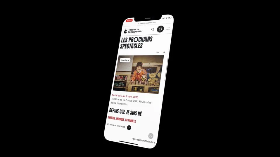
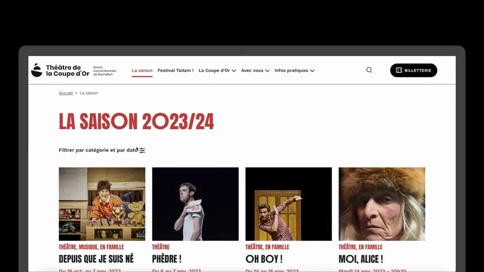
For the website’s design, the focus was on simplicity and smoothness: discover the events programme easily and quickly, and book tickets in the same flow. Gain in visual consistency to let the user understand at a glance where they are. As mentioned during the visual-identity creation phase, the idea is to harmonise the visual style across all the communication materials. To see the site live, head here (opens in new window).





Outcomes
Repositioning the theatre's brand image towards young audiences
The redesign of the visual identity and the full set of communication materials brings:
- A brand block in tune with the venue’s history and the stakes ahead
- A graphic toolbox that is playful and flexible to use
A redesign that comes with a new website making it easier to discover the venue, the artistic programme and to book.