Designing a logo in 6 steps
1 - Creative brief: starting and kicking off the project
2 - Benchmarking and moodboard: knowing the competitors and the existing environment of the project
3 - Sketches: first tests on paper
4 - Designing the directions in digital
5 - Presenting the directions and validation
6 - Delivering the logo and the overall visual identity
Step 1: Taking the creative brief for the logo
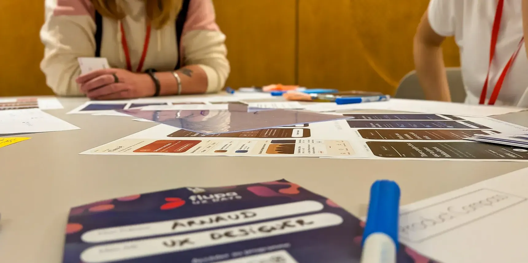
The project starts with a first meeting with the client. We meet the team we’ll be working with throughout the design phase. This first creative-brief step is essential to properly understand the concept, identify the brand’s challenges and define the client’s objectives and needs. A conversation that lets us gather precise, detailed information as well as the constraints that will frame our thinking during the logo design.
For example, for the design of an eco-responsible messaging app, the client has a very precise vision of the direction they want to take:
- A wish to use a plant-based symbol such as a leaf or a tree, along with the idea of a message bubble,
- The new identity must not be associated with the parent company,
- The design has to use green as the primary colour.
These specific requests fit into a global concept. The overall identity and its logo also carry the values and message the client wants to convey:
- Bring a human touch to the service by giving it its own identity,
- Offer a simple, tangible service by going for a clean, pragmatic design,
- Be an eco-responsible communication platform: offer a service that connects users with local players,
- The goal of one million trees planted thanks to the app.
Step 2: Looking for inspiration and analysing the competition
With the creative brief done, it’s time to move on to the inspiration phase by carrying out a competitive benchmark. This phase is important to get familiar with the field in which the client operates, understand the current market, develop ideas and have a basis for discussion throughout the project. We also create several boards on the Miro tool, which will be used later during the iterations. If you aren’t familiar with this tool, we’d recommend our article on the topic.
To better target our research, we define a list of keywords relevant to the project. For example, for the redesign of a website aimed at a carpenter-fitter client, the keywords that come up are:
- Local,
- Craftsperson,
- Carpenter,
- Fittings,
- Hands-on
- Wood
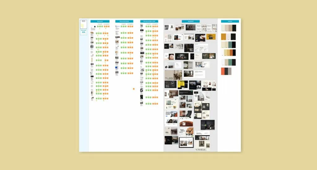
An iteration with the client validates the moodboard elements to keep and the ones to avoid. This helps better steer the future creative direction while answering the client’s expectations.
Step 3: Drawing the first directions
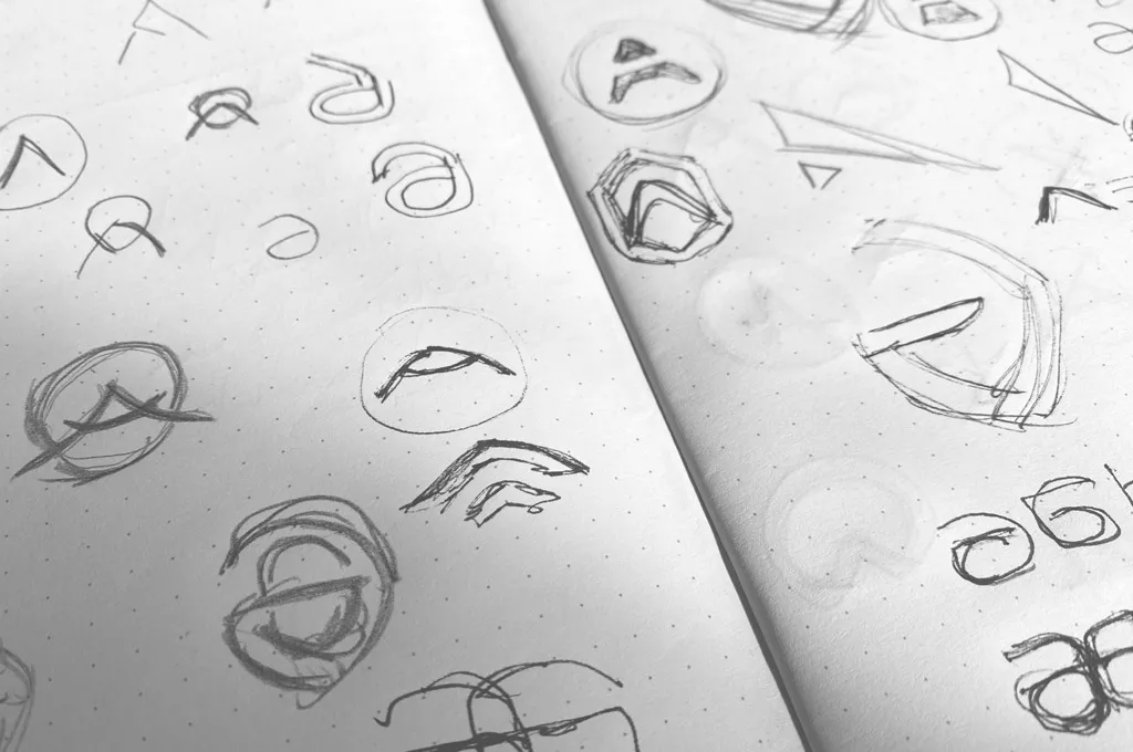
Before designing a logo on a computer, it’s important to first go through the pencil-and-paper step ✏️. Faster and easier to use, the sketching method lets you quickly put all your ideas down and dig deeper into the directions that look the most interesting.
We recommend sketching plenty of different logo ideas on paper, making variants, starting to mix and match ideas and interesting themes, in order to have a wide variety of directions to present:
- Symbolic logos with pictograms,
- Trying out typographic treatments (don’t hesitate to draw or modify the letters),
- Logotypes that combine a monogram and a typographic play.
Step 4: Designing the directions on a computer
Once the sketching phase is done, we select the directions that seem the most interesting to develop. These different sketches are then scanned and imported into Illustrator for a clean, vector version.
In this fourth step, focus on 3 or 4 concepts, no more, so you have distinct enough directions to present to the client. Avoid overloading the client with too many proposals (we’ve already talked about Hick’s law, right?).
But before moving on to the design phase, try to imagine how the selected logo directions will work across use cases. Are they viable on different media (desktop, mobile, print, etc.)? Can they easily be adapted? Do they meet the expectations raised during the creative brief? Are they actually distinct from one another?
At first, the various logo directions are designed in black and white: focus on the desired structure and overall shape.
Once the shape is validated, it’s time to add some colour 🎨
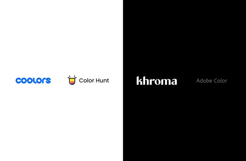
Here is a selection of tools we use to pick consistent and accessible colour palettes:
- Coolors (opens in new window): colour palette generator, with also the option to test your own palette and get an overall preview
- Adobe colour wheel (opens in new window): if you already have a colour code (HEX or RGB) and want to find its complementary colours, its composition, and so on
- Colorhunt (opens in new window): colour palette generator by theme
- Khroma (opens in new window): colour combination generator
- Colorable (opens in new window): contrast calculator for your colours
Step 5: Presenting the directions and validating
It’s time to present the directions and have the client validate them.
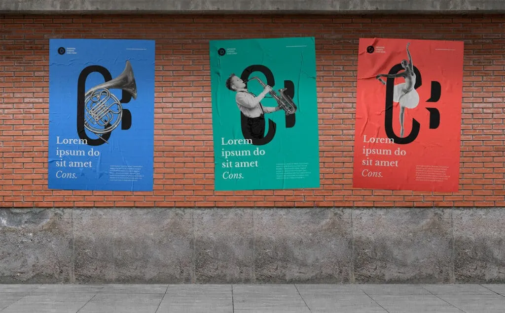
It is important to present the versions in a consistent way, so as not to bias your audience. For example, use the same mock-ups (poster, computer screen, mobile, stationery, etc.), lay the elements out in the same way and in the same order.
You can set up a voting system if needed. It is recommended to stay flexible and to adapt to the validations being made. If the client prefers the palette of version 2 and the logo of version 3, you can perfectly well try to mix these elements to find the best possible compromise.
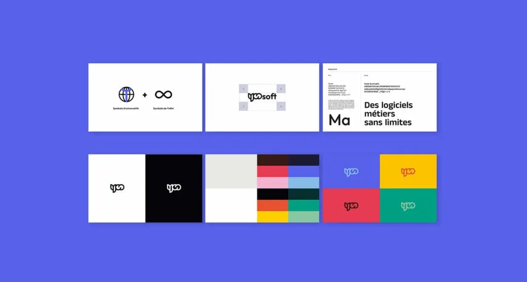
To explain your choices as clearly as possible, you can present your visual identity as follows:
- Logo concept (shapes that make up the logo)
- Logo construction grid
- Colour palette
- Typography(ies)
- Logo on a black background / on a white background
- Logo with the colour palette
- Variations of the identity on different media (print, mobile, etc.) to help the client visualise the identity
Step 6: final delivery
Last step: consolidation and delivery of the overall identity. We recommend duplicating your working document to keep the older versions, just to be safe (you can never be too careful). Clean up the new document of all the elements not retained, then consolidate the final version.
This step has two essential sub-steps:
The exports to produce
- The colour versions: in black, in white and in the brand palette
- The formats: .png, .jpg, .ai, .svg and .pdf
Remember to include the source files for the fonts used, even if you took a base one to modify or redraw it.
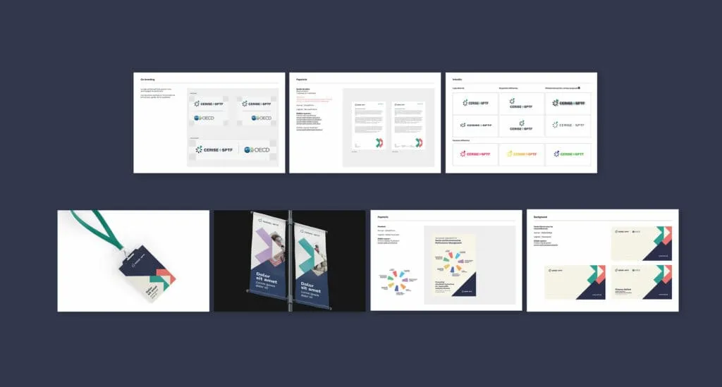
The “brand guidelines” or “style guide” document
This styleguide will let clients and future collaborators have a reference document presenting the brand’s visual identity, its variants and the rules of use. It should include:
- The elements mentioned above (logo grid, concept, fonts, colours)
- Photography style
- Icon and illustration style
- And finally, the variations of the identity on various media with the composition rules
Conclusion on creating a logo
Designing a logo sits within a wider process of creating a visual identity. A central element that grabs attention and sparks users’ curiosity. One of many reasons that explain the complex work and the number of steps needed to design a visual identity that meets the client’s expectations, stays memorable in the eyes of future users and customers, while respecting graphic and accessibility standards.
Again, these steps are specific to the way we work, but you can adapt them as you see fit.