


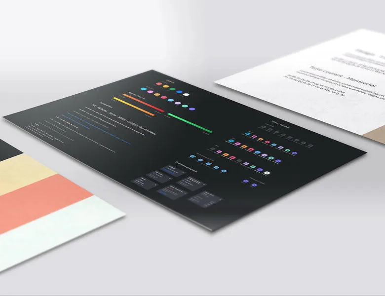


The visual style guide is the document that sets out the elements and rules used to build your brand's universe. It contains: the colour palette, the typography, the icons, the logos and the explanation of how they're used. This "good practice" guide centralises all the elements used to represent a brand, how they're organised and their usage rules. Having a visual style guide, and above all sharing it with the people inside and outside the company, keeps everything coherent and consistent. It's a significant time-saver when it comes to creating new materials and content. The visual style guide isn't just a guide to follow, it also lists the uses to avoid. For instance, if it forbids using your logo on a red background, then the users (designers, communications team members, etc.) will have to follow that rule.
01
Visual style guide and colour palette
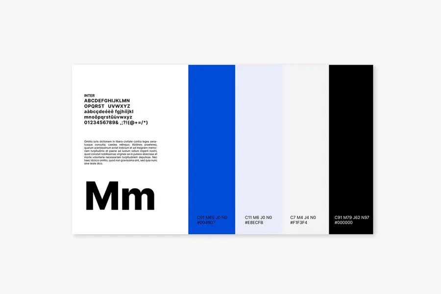
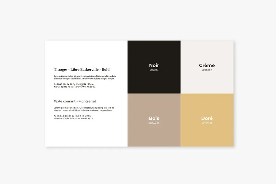
Be careful not to define too many colours in your palette, or you'll end up with a rainbow that doesn't let users or consumers identify you quickly. As a rule, we recommend between two and four colours. A primary one (e.g. action buttons), a secondary one (secondary buttons), and two others that can be used for icons or for photo colour-correction. In your visual style guide, remember to note the colour codes in RGB (web use) and CMYK (print use), so contributors get the exact shades. It's also important to note how each colour is used, by describing the combinations that are allowed or not. Example: blue, the primary colour, is to be used on the logo and the primary buttons.
02
Typefaces
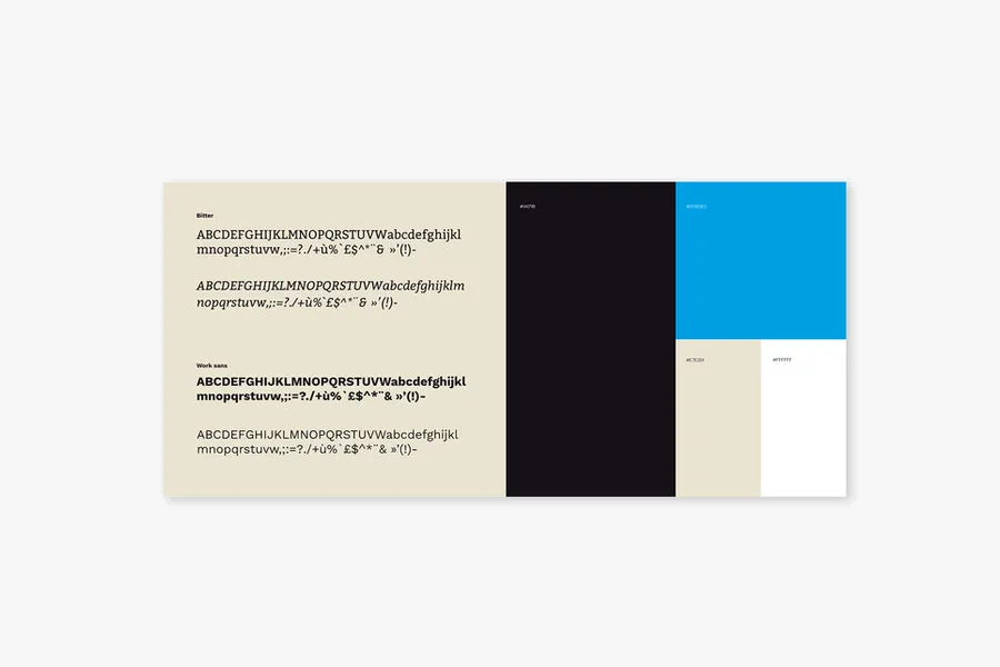
Typefaces are chosen based on the communication format. For web, it's essential to use simple, readable fonts: sans-serif typefaces. For print, where reading is easier, you can use more distinctive typefaces with serifs. For good readability and visual consistency, we recommend using two type families maximum (one for headings, one for body text). The visual style guide should be very clear about how those type families are used: for which format, for which kind of content (body paragraphs, headings, buttons, labels, and so on). To stay consistent across all touchpoints, it's also important to note the spacing, line-height and alignment to follow.
03
Graphic elements
Make sure to gather your icons, pictograms and illustrations in the guide. It's important to give as much detail as possible, like the size to use for icons, where to place them, what colour, and so on.
04
Images in a visual style guide
Like graphic elements, the dimensions and proportions to follow for images should be described in the visual style guide. To keep your brand image coherent, you also need to state what image style is expected and what colour treatment is recommended. Example: images should feature humans, avoid robotic or electronic elements, and be in black and white.
You can definitely add other elements to your visual style guide (which kinds of videos, how animations are used, the visual style for social media, and so on). The elements listed above are still a solid foundation to set up properly before going further. Keep in mind that the visual style guide will evolve and grow in scope as internal needs surface. It’s important to keep it up to date, every time a new need or format comes up. Lastly, making it easy to share and access for anyone producing content in line with your brand identity is the key to making it work.
A graphic charter is the reference document that formalises the visual rules of a brand or product: colour palette (hexadecimal codes, CMYK, Pantone), chosen typefaces (families, weights, sizes), logo usage rules (minimum sizes, protection zones, authorised versions), and iconographic and photographic conventions. It guarantees the visual consistency of all of an organisation's outputs.
The graphic charter documents the visual rules of a brand. The design system is more complete: it includes the graphic charter, but adds interface components (buttons, forms, cards), design tokens (CSS variables), interaction patterns and usage guidelines for teams. A graphic charter can exist independently of digital (for print materials); a design system is specific to digital products.
Usually a graphic designer or an art director, often in a communication or design agency. For large organisations, it is produced by internal brand design teams. The charter is built after the definition of the brand strategy (positioning, values, targets), of which it is the visual translation. It can also be produced in collaboration with product teams when it is designed from the outset for digital uses.
You precisely document the current state before any change. You identify the founding elements (logo, primary colour) that must not change, and the secondary elements that can evolve. You apply the changes progressively, making sure that all teams and all providers have the up-to-date version. For digital products, design tokens let you propagate a colour or typography change across the whole interface without modifying each component individually.
No, not on its own. A graphic charter sets the basic rules, but does not cover interface components, interactive states, navigation patterns or layout rules. For a digital product, the graphic charter is the starting point of a design system: it provides the visual foundations (colours, typography, iconography) that the design system builds into components and tokens usable by production teams.
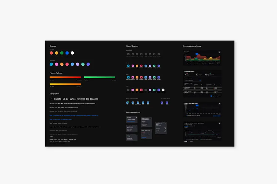


Designing the future screens with the visual layer added, to produce the final representation of the interface that gets handed over to the project teams for integration.
Read more about High-fidelity mockupsThe UI sprint turns wireframes into high-fidelity mockups in short, iterative cycles, usually over a week.
Read more about UI sprintEveryone talks about user experience, service design, ergonomics...
It's not always clear, and you'd like to find out, or sharpen what you already know.