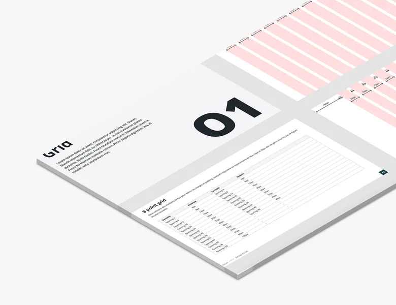
Layout grid

Deliverable

The interface's invisible structure

A layout grid (or design grid) is a system of columns, gutters and margins that structures the arrangement of a page's elements. The design grid overlays your graphic compositions to help you organise and align visual elements consistently.

What is it for?

  • Structuring the working page.
  • Visually aligning design elements.
  • Easing responsive design thanks to the number of columns.
  • Serving as a shared reference between designers and developers.

What's the need?

  • Having a working base that is already ready and validated.
  • Speeding up layout by working on grids that are already defined.
  • Reducing back-and-forth between design and development with a shared language of columns and breakpoints.
  • Saving time on responsive with logical, easily divisible grids.

A few recommendations for grids in your designs

01

Defining your base grid

We always recommend the 12-column grid as a reference. Easily divisible, it is used by the majority of CSS frameworks, which will greatly ease collaboration between design and development teams.

02

Adapting the grid to breakpoints

The 12-column grid eases responsive work, but it must adapt to other media: 8 columns for tablet and 4 for mobile. Defining these breakpoints upstream with your team will save you precious time during integration.

03

Alignment

The grid only matters if you use it. Make sure to align each of your elements (blocks, images, texts, buttons, etc.). This guarantees better readability of your page and will ease the developers' work.

Frequently asked questions

Typography

Typography defines fonts, scales, weights and spacing. It drives readability and visual identity. It's an impactful element that is often underestimated.

Read more about Typography

Colour palette

A digital product's colour palette encodes statuses, hierarchy and accessibility. A well-defined palette is a coherent system, not just a collection of shades.

Read more about Colour palette

Iconography

Iconography defines a product's icons, their style and their consistency. Well chosen, it speeds up understanding; misused, it creates ambiguity.

Read more about Iconography

Interface design

UI design shapes the visual layer of a product: layout, colours, typography, components. It turns the experience into tangible, interactive elements.

Read more about Interface design

Zoning

The visual representation of an interface through the placement of various content blocks, kept simple and without details such as text or images.

Read more about Zoning

Curious to learn more about us?

Everyone talks about user experience, service design, ergonomics...
It's not always clear, and you'd like to find out, or sharpen what you already know.

Let's talk