



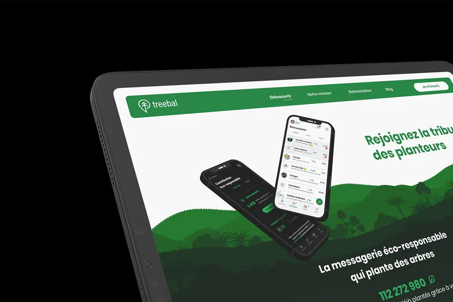
Eco-design is a new way of shaping interfaces. Sustainable design brings a wider view of the life cycle of the product or service you're offering, with a focus on energy impact. It's no longer a secret: digital pollutes. Energy-hungry servers, digital hardware tossed and replaced too often, video and streaming on a steep rise, and so on. The eco-design approach aims to reduce the digital impact of your site or service. Several routes are open to limit the impact or to make the website as "green" as possible.
Here is a non-exhaustive list of elements you can change or include:
01
Limit heavy content
Avoid carousels or sliders (or use them sparingly). Avoid videos as much as possible, and ban autoplay. Avoid infinite scroll, which is very resource-hungry.
02
Optimise visuals
Reuse the same images across the site as much as possible, to avoid overloading the server with too many visuals. Limit the use of photos by favouring icons; the .svg format is far lighter.
03
Design lightweight, responsive interfaces
Build mobile-friendly, responsive interfaces. Avoid autocomplete in text fields. Limit plugins and third-party services (and if you need to include any, offer users an on/off toggle).
04
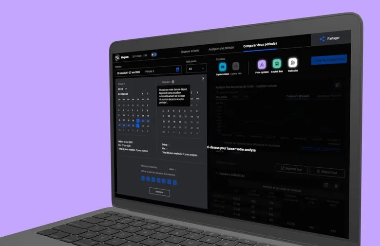
Eco-friendly dark mode
Don't use absolute black #000000, which is very energy-hungry; favour a dark grey instead.
Committing to digital sobriety leads you to weigh complementary aspects of your products and services. You can go deeper on the topic by reading our blog article on digital eco-design and by downloading our eco-design checklist.
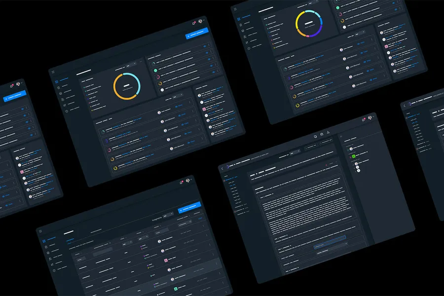
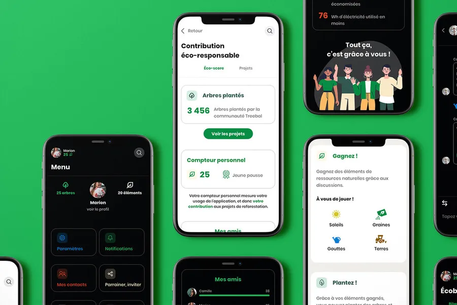
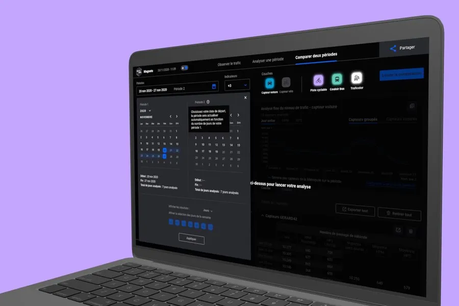
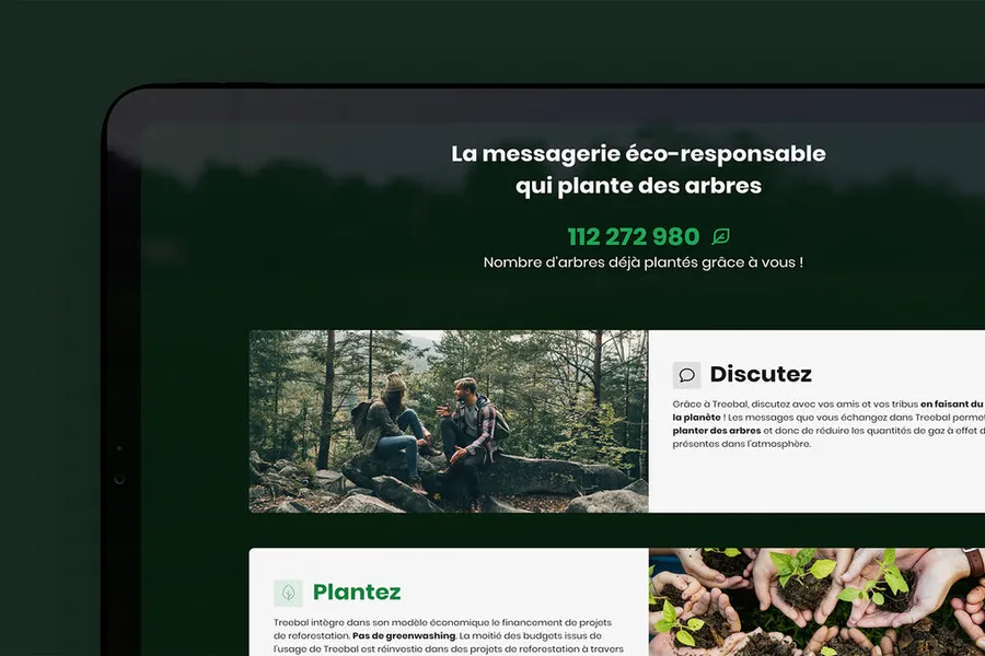
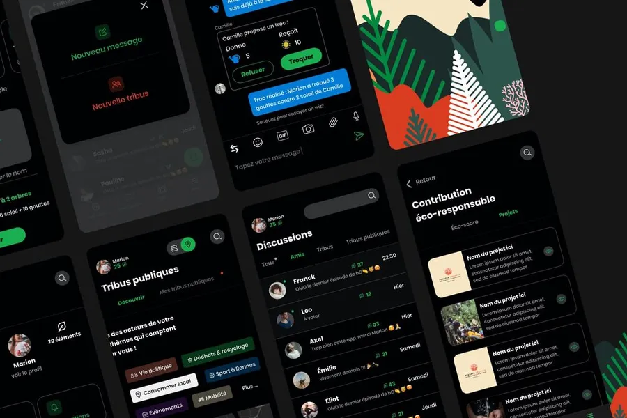
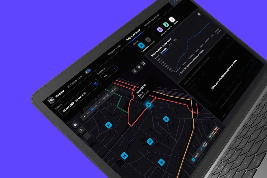
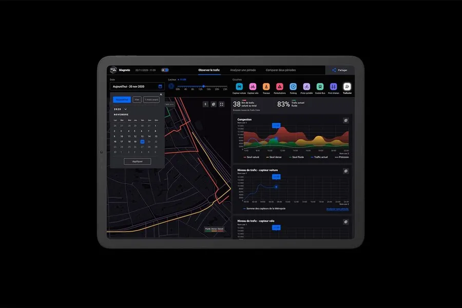
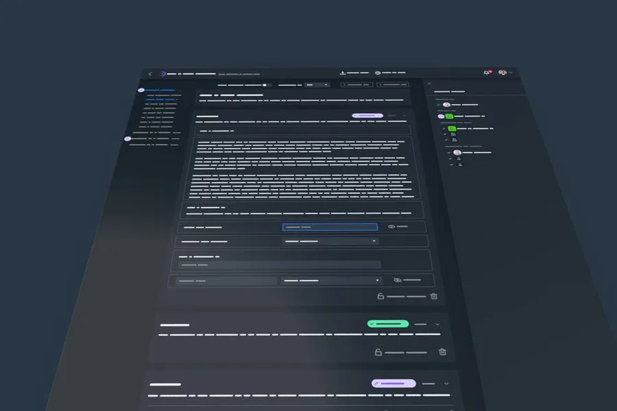


Designing the future screens with the visual layer added, to produce the final representation of the interface that gets handed over to the project teams for integration.
Read more about High-fidelity mockupsThe first element your users perceive, the visual identity is what conveys your industry and lets users or future customers identify you easily.
Read more about Visual identityA wireframe is a mockup describing the zones and essential components an interface should contain.
Read more about WireframesEveryone talks about user experience, service design, ergonomics...
It's not always clear, and you'd like to find out, or sharpen what you already know.