


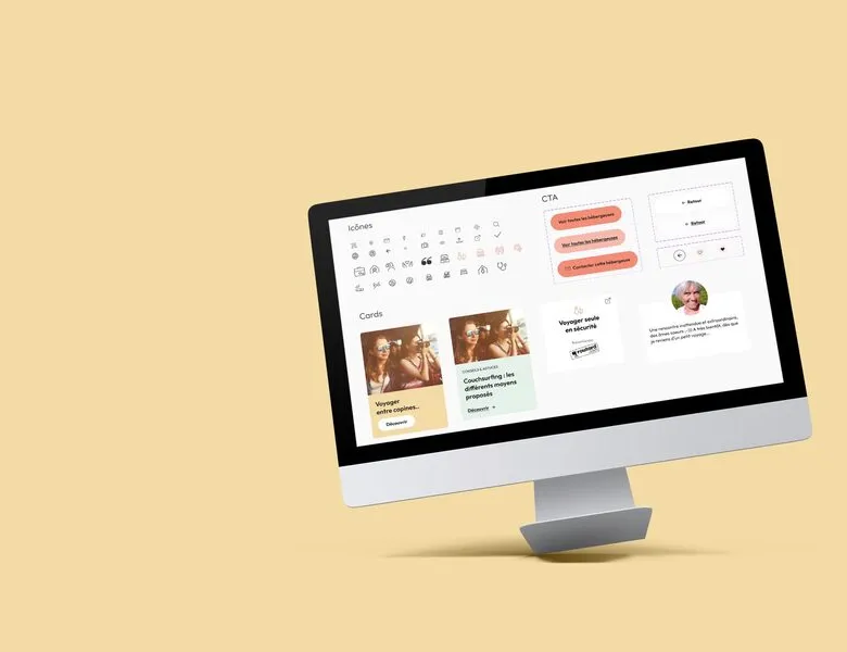


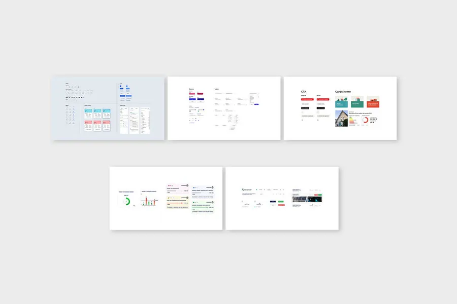
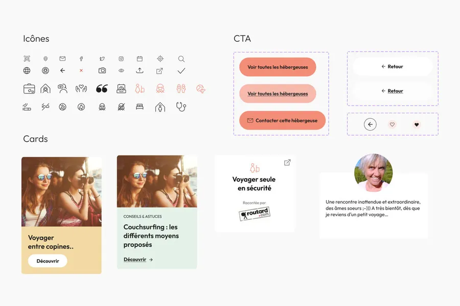
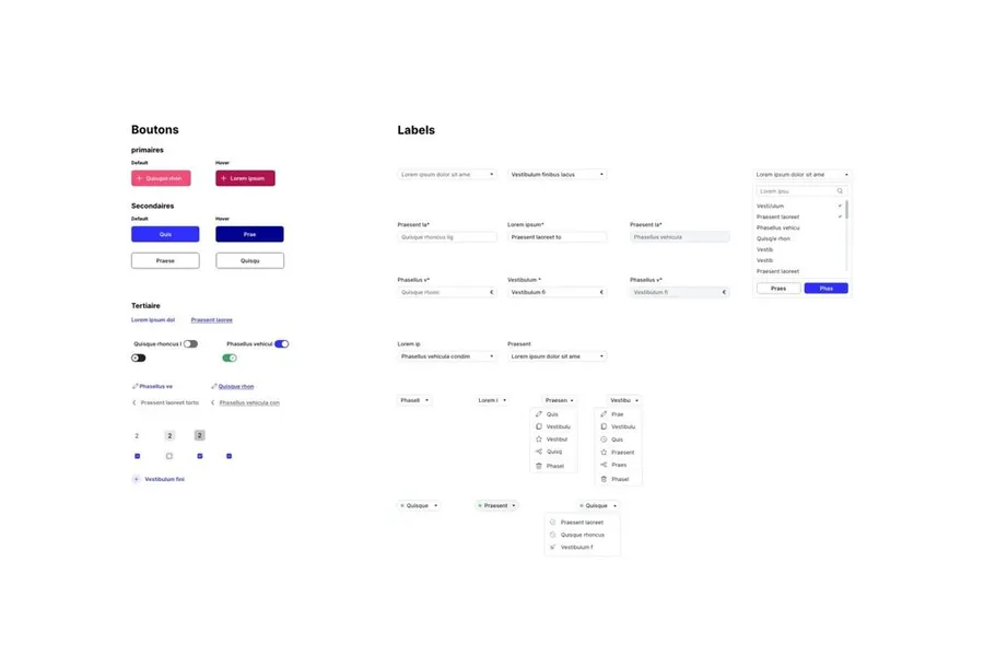
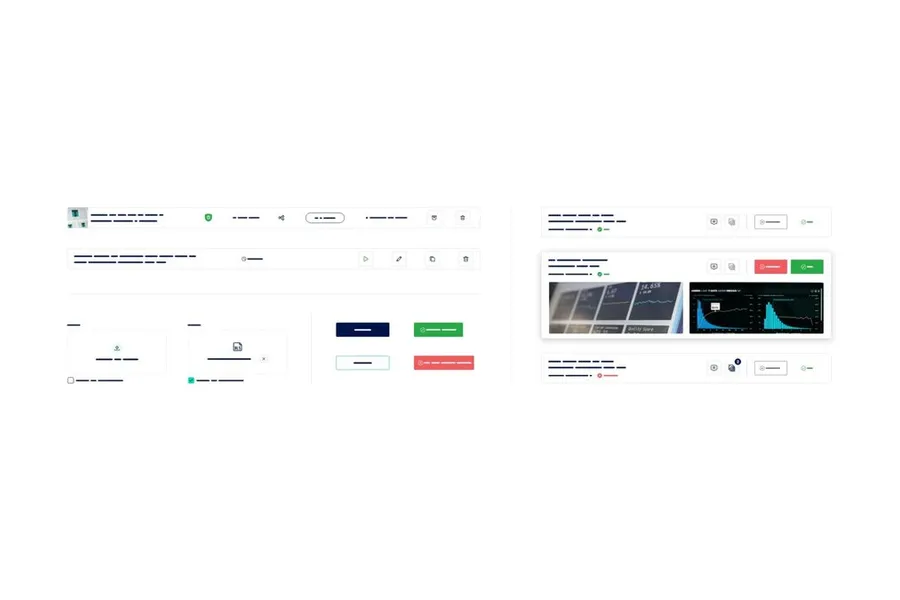
The design system exhaustively describes the visual components of the product being built (typography, colours, element sizes, element states such as hover, focus, clicked, and so on). It can be seen as a component library. This kit is meant to evolve as new needs and features come up. The design system makes the work between designers and developers smoother, since both teams share a common, shareable reference. From the user's perspective, this kit keeps your platform or service coherent overall, and that supports a better experience. Be careful though: the design system requires every existing component to be catalogued and properly organised. If it's done poorly, it can lead to duplicates and you'll quickly lose consistency.
From an atomic-design perspective, the kit is made up of several levels:
01
Atoms
individual elements. For example: an image template, a button, an icon.
02
Molecules
made up of atoms that form a whole. For example: a navigation menu is a molecule, built from atoms like the logo, a button, the various links, and so on.
03
Organisms
made up of molecules. They correspond to groups of blocks.
04
Templates
templates that represent the overall structure of the page (but without the final content). Then pages, holding all the final elements (along with text and images).
Your design system should also include a style guide. It picks up the visual style guide (colours, typefaces, logos and so on) along with the usage rules for each element. For instance, knowing when red should be used, when typeface #1 should be used, and so on. Before starting this work, prioritise the elements that recur most across your product, such as buttons or navigation elements (menu, footer). Once your base is solid and properly built, you can move on to variations and other elements. Remember to test your “parent components” (the main one, used as the model) before building “child components” (variations of the main one).
Still with a view to improving communication and work between developers and designers, it’s important to name your components properly. Each element should be named in lowercase, with words separated by hyphens. This convention gives developers elements that are easy to implement. Start with the letter representing the atomic-design level (a for atom, m for molecule, o for organism, and so on), then the type of element and its variations.
Example for your primary button: a-btn-primary. Be careful to name components based on their function, not on their form (colour, shape, visual style). Don’t forget that your style guide will evolve. Example to avoid: a-btn-red.
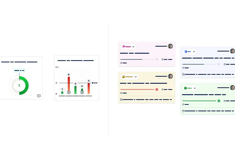
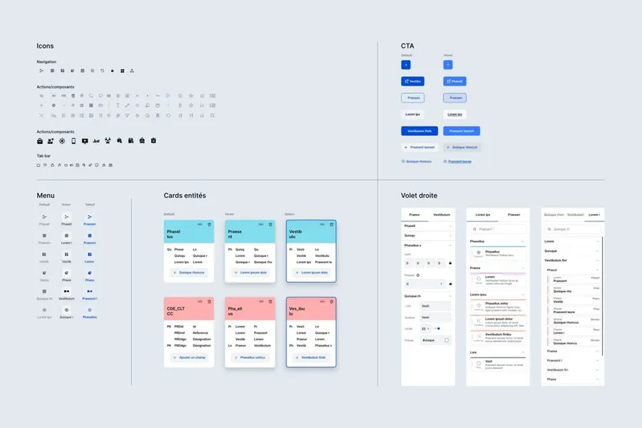
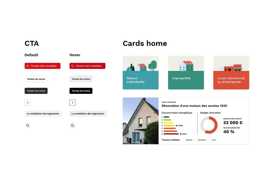


The visual style guide is a document that brings together all the information and graphic elements of a brand. It includes the rules to follow and the uses to avoid. It keeps the brand image coherent and consistent across all touchpoints.
Read more about Visual style guideEveryone talks about user experience, service design, ergonomics...
It's not always clear, and you'd like to find out, or sharpen what you already know.