


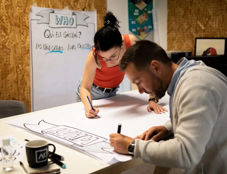


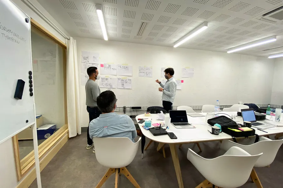
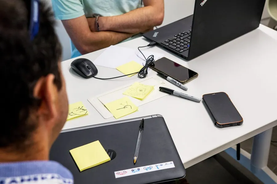
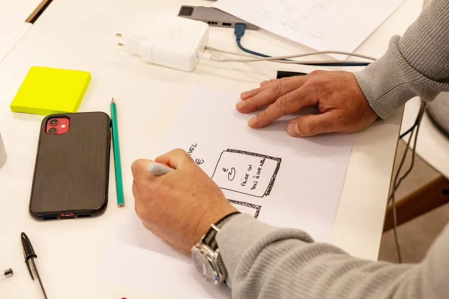
Still rooted in co-design with the various stakeholders (users, project team, tech team, business representatives, and so on), the co-sketching workshop is where the first screens are shaped on paper and structured. To test solutions, think collectively and bring up new ideas, nothing beats the good old paper-and-pencil combo. It's collaborative work, useful for sharing and prioritising ideas, with the big upside of aligning everyone's view before entering the design phase.
01
Pick the setting
A co-sketching workshop can happen in person or remotely thanks to online tools like Miro or Mural. On the participants' side, you can invite different business profiles to compare perspectives during the session and broaden the range of ideas.
02
Set the frame
Time pressure usually means prioritising the screens participants will work on. Like many co-design workshops, the co-sketching session needs adapting to the project, the participants and the conditions, but you'll most often find these phases:
03
Fuel the discussion
The method needs to rest on a shared baseline. That can be a review of the existing platform, an audit, user journeys, a list of identified and prioritised needs. Ideally, it's worth offering a benchmark to participants (or dedicating time to that step).
04
Facilitate the exchanges
Clear instructions are part of what makes the exercise work. You can, for instance, follow a three-step flow: an individual sketching step where each participant draws their ideas on their own; a step to share and discuss the options put on the table; a final vote that lets everyone settle on the best compromise, taking technical constraints, business needs, user feedback and so on into account.
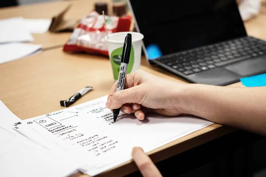
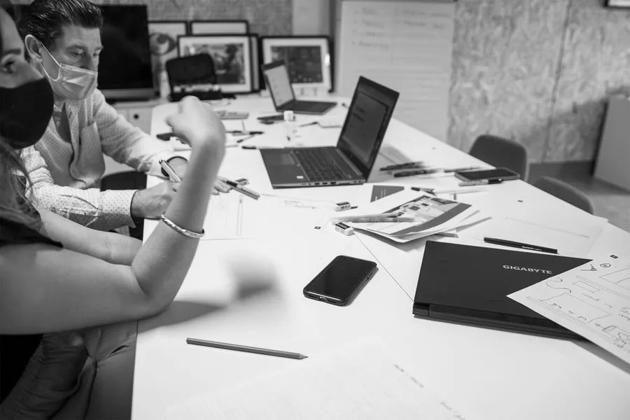
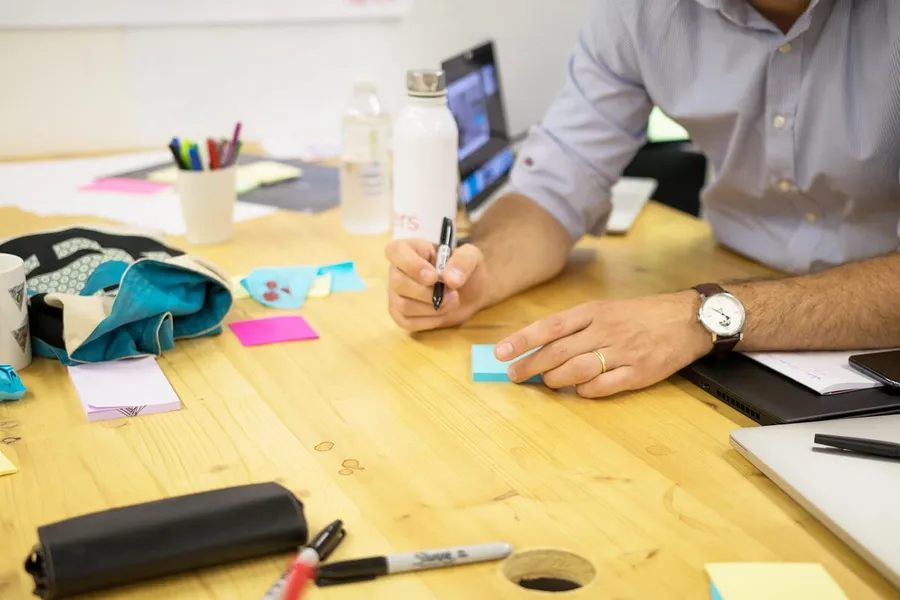
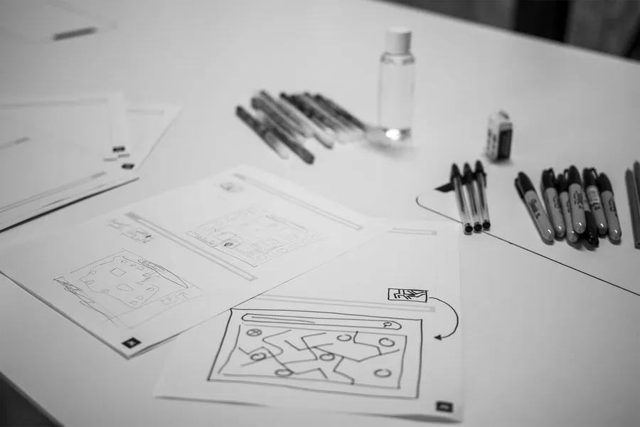


Mockups with no graphic styling, describing the zones and the essential components an interface should hold. They keep the focus on the functional and informational side of the interface.
Read more about WireframesA hierarchical, logical way of organising pages and features. A sound site map categorises content to fit the mental model users already have.
Read more about Site mapA visual representation of the paths users take across the various screens and steps. It surfaces the specific needs of different user profiles along the journey.
Read more about User flowsEveryone talks about user experience, service design, ergonomics...
It's not always clear, and you'd like to find out, or sharpen what you already know.