Changing everything, without changing everything. And in the end, we changed everything
Deciding to change your website is a bit like being a teenager and deciding to completely redo your bedroom. It’s a question of aesthetics, sure, but it’s also telling the world that you’ve changed, that you do different things now. In a way, that you’ve grown up.
That was the starting point of our thinking: a simple urge for change, after 6 years with our previous site. And then the wish to own more openly who we are today, what we’ve become, after 13 years in business.
And on that “what we’ve become” part, there were things we were less and less comfortable with. It’s the old adage, “the cobbler’s children go barefoot”. We weren’t exactly barefoot, but we were no longer showing off our best shoes. And it was all well and good to advise our clients to build sites that are fast, accessible, usable and eco-designed, all with great design… but it was time to follow our own advice and try to lead by example.
So we changed everything, and we took the time to write this short article to tell you a bit about this new art direction, our choices, our ideas, our decisions, our tone. In short, to tell you how we did all this.
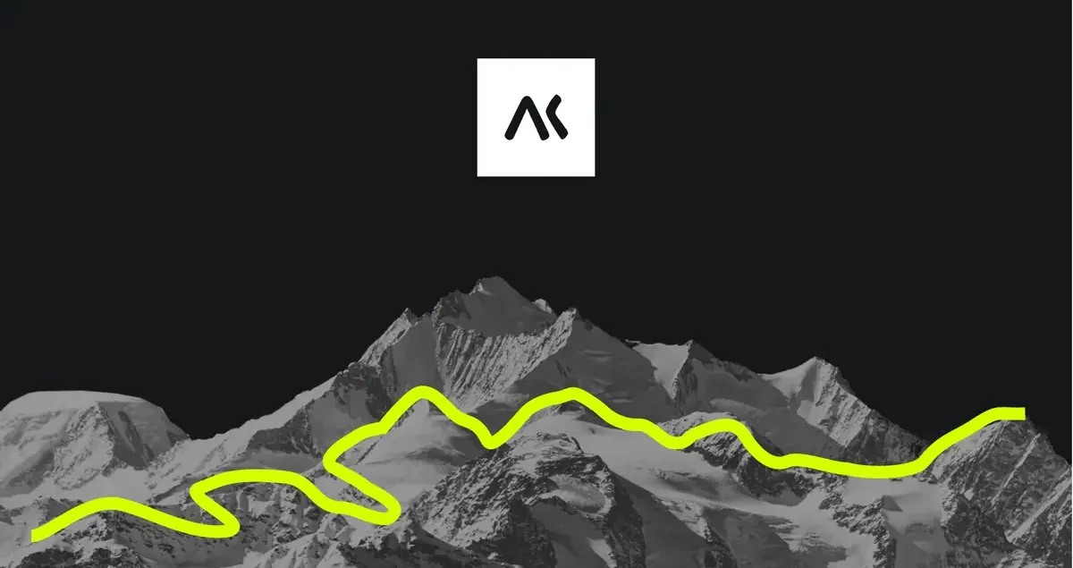
The blue background and the 2020 logo give way to a black background where a hand drawn in lemon yellow walks toward the logo. The 2026 homepage then unfolds: “Simplifying complexity”, our three areas of expertise, then the line “From meaning to use. From use to emotion.” and finally the logo on a white background.
A creative stance: balancing rigor and creativity
The project started last year with a round of conversations with our clients, to understand how they see us. About fifteen one-on-one interviews, to identify what worked on the previous site and what needed improving.
It quickly became clear that something important in our identity, for us as for them, was the ability to bring out a contrast that characterizes us rather well: the balance between the rigor of our approach and the human nature of our stance. The academic and the creative. The scientific and the artistic.
And that balance isn’t so easy to convey through an identity.
To convey the rigor of the academic, we turned first to typography. By choosing a serif typeface for our body text, we wanted to echo the codes of scientific journals, newspapers, the formal. We played the contrast with the creative side by using a sans serif typeface for headings. Much more in the codes of the web and of digital in general, and more impactful too. A clash of styles, in other words.
Letters, numbers, then the full alphabet scroll by in Red Hat Display, then in Source Serif, the serif typeface of our paragraphs, circled in lemon yellow.
The same scroll of letters, numbers and alphabet with Lack, our 2020 heading typeface, then with Figtree, the sans serif typeface of our headings, circled in lemon yellow.
The color range had to express the same balance. We were attached to the colors of our previous brand guidelines, our “slate” and our “pacific”, but on accessibility they fell short. So we started by turning our range of blues into something accessible: a blue bolt, a bubble blue. Together they set up a reassuring universe. What was missing was the small creative touch. So, like adding a bit of spice to a dish you’d like to lift, we added this yellow, electric lime, thinking that this zest of lemon would tickle the retina.
Flat areas of color overlap, then each card of the palette appears with its name, its hexadecimal code and its contrast ratio: blue bolt, blue bubble, white, coal. A final board brings the five colors together, electric lime and cantona included.
Then we had to combine all this. Use simple flat colors, strong lines, solid blocks. An art direction that plays on a rigorous, clean page structure. That slightly formal structure is what makes the touch of humanity and creativity stand out, by contrast.
An overview of our document templates, with placeholder text: covers, tables of contents, serif text pages, numbered dividers, organization chart and calendar. We then zoom in on one page, where a Figtree heading is circled with a lemon-yellow stroke.
The break with the rigor of the shapes comes from the hand-drawn sketches and from the use of lime. The frames, the lines, all those rules that bring out a structure and a path leading to an idea, we break them with these rough, clumsy brushstrokes.
And because a website also means keeping it alive, and user-centered design means asking how it’s used on both sides of the screen: everyone contributes to the site and to the materials we show our clients, and let’s be honest, our team isn’t made up only of artists (as proven by a few unshareable rounds of Gartic Phone). These little drawings, these doodles, let us bring a bit of ourselves into our site, even without knowing how to draw well (even if we admit the UI team goes over them afterwards to fix any overflows…).
Keep putting a bit of ourselves in
Another place where we put a bit of ourselves is the site’s hero, the first part you see. The photos were all taken by the team, on vacation, on weekends, not at work. Photos we found beautiful and wanted to showcase. By hybridizing them with our little drawings, we wanted to bring them onto the ground of our profession: observation, translation, interaction. In our minds, it was an extension of our team page, where we show photos of ourselves as kids, which our clients liked so much that we kept the idea. Because our agency works well through who we are and where we come from, and through what we put of ourselves into it every day.
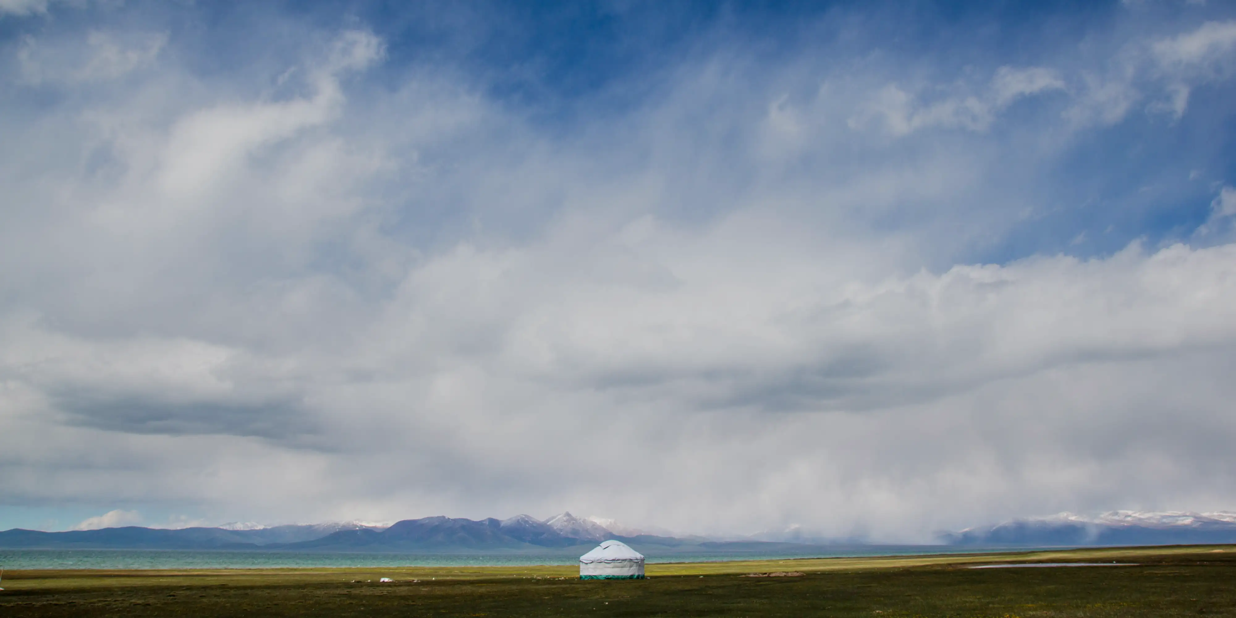
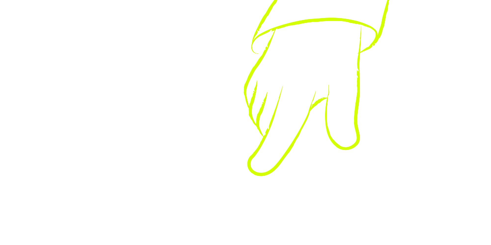
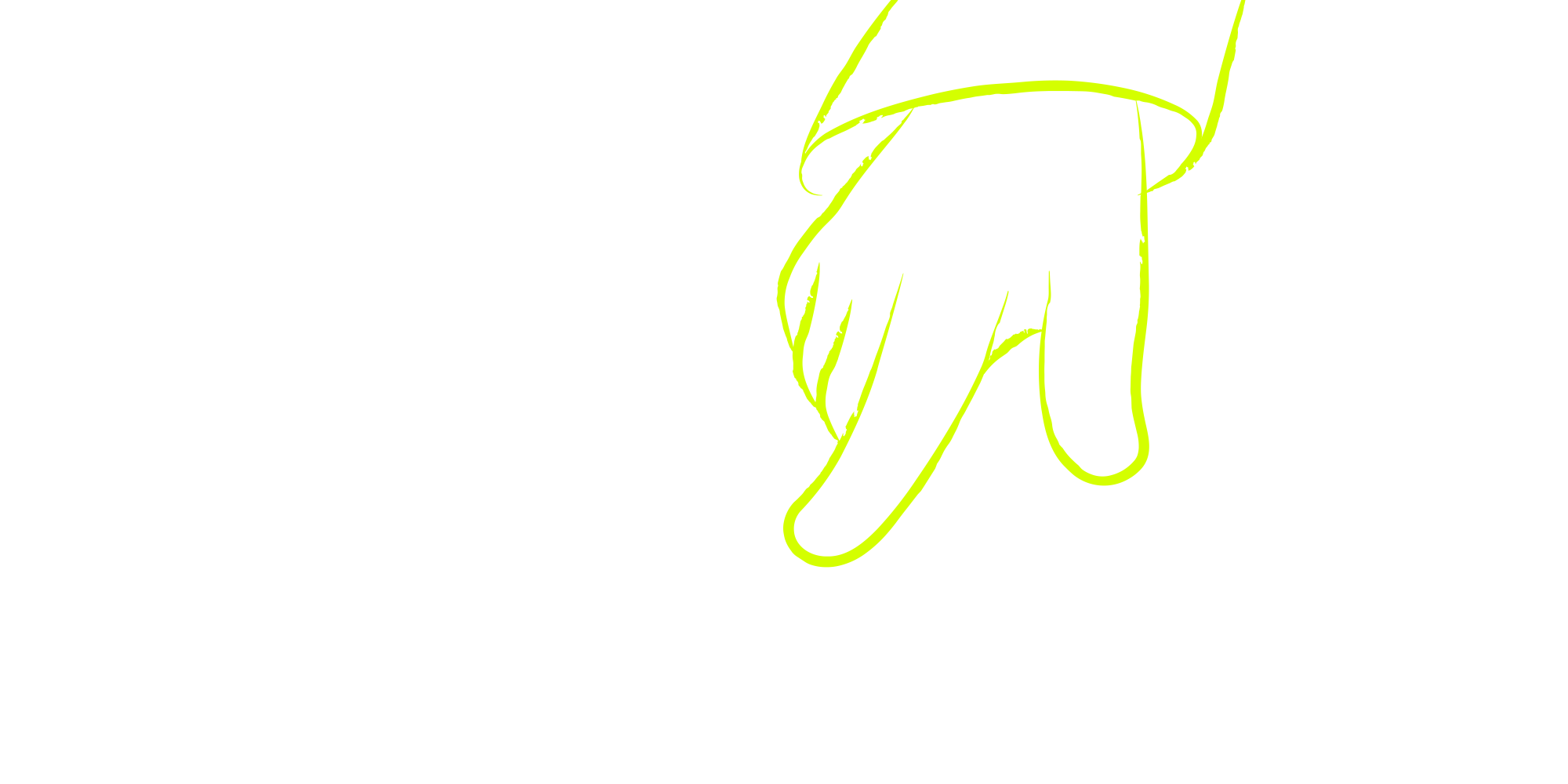
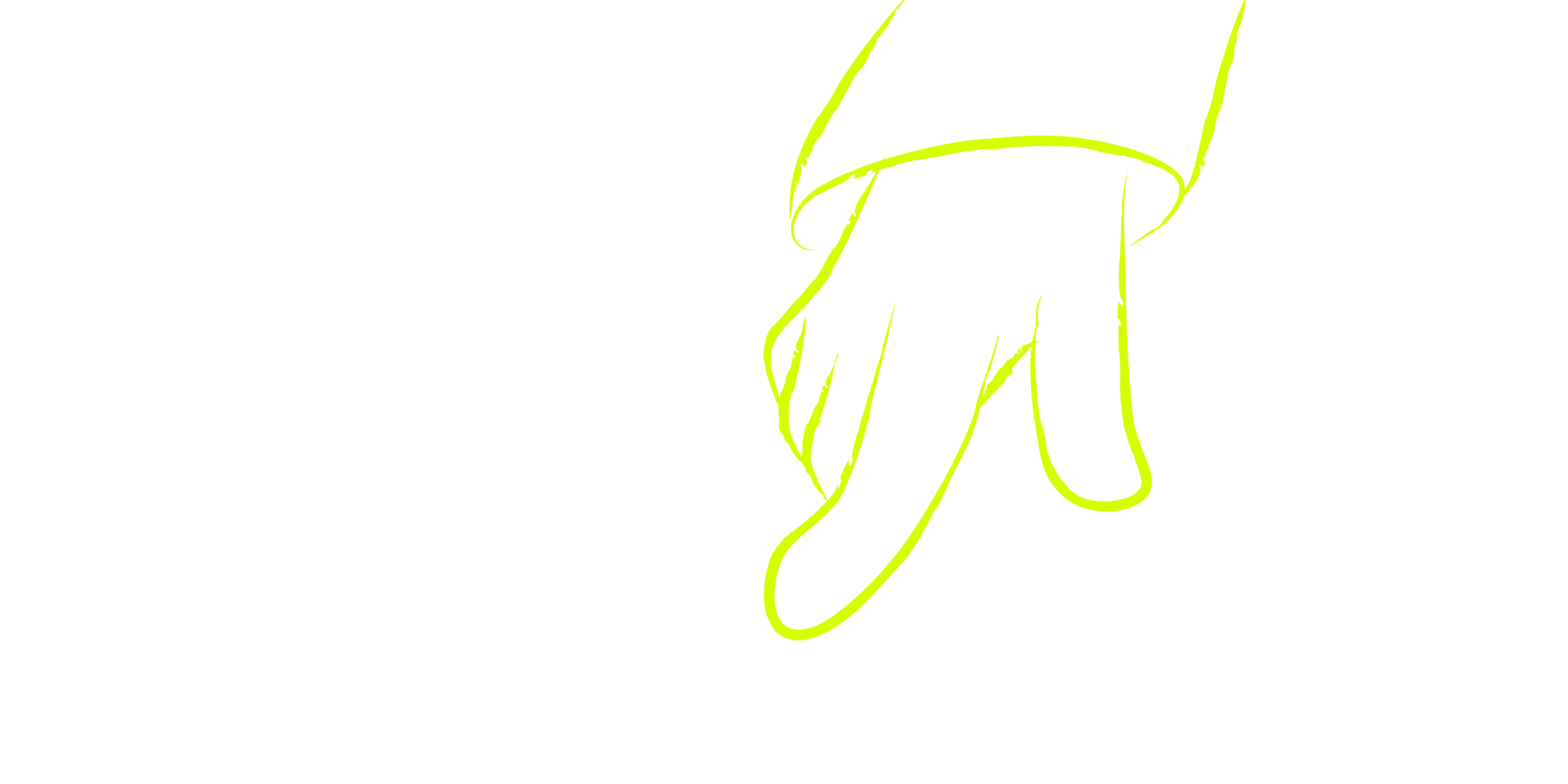
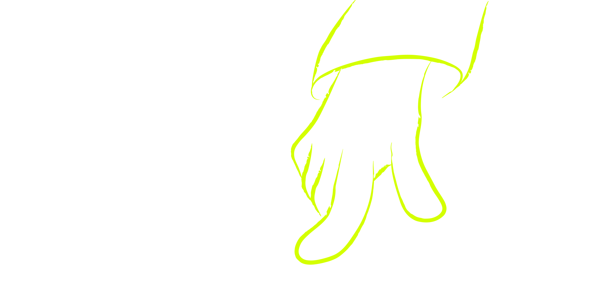
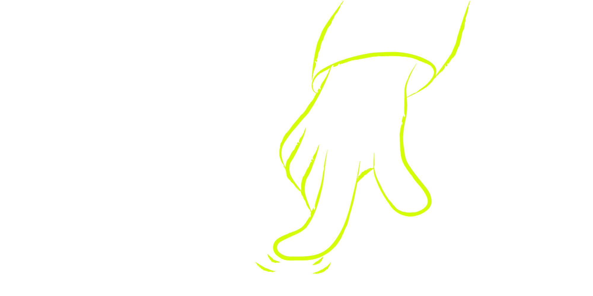
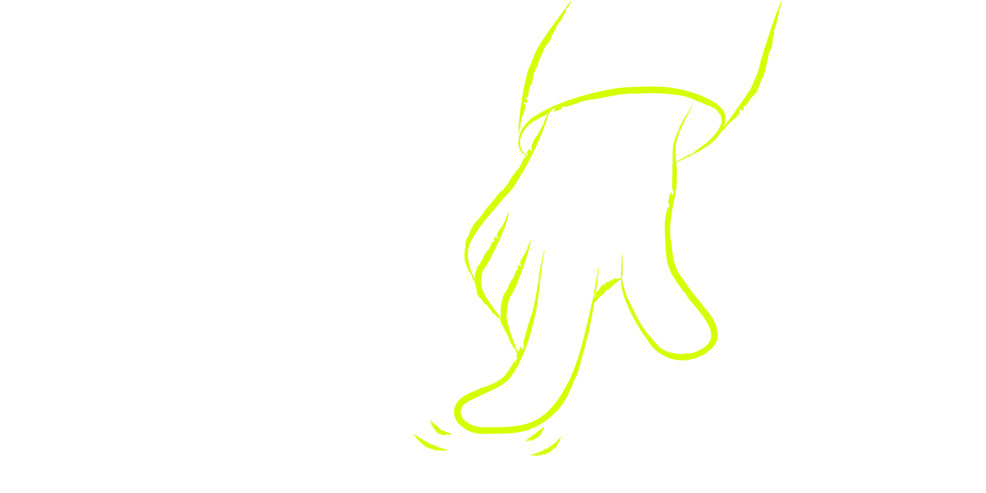
On a photo taken by the team, the hand draws itself frame by frame, as on the homepage.
But also a change in tone
Because change isn’t only about our colors, our typefaces or our little drawings. It’s also about how we express ourselves. We’ve always allowed ourselves complete freedom of tone with our clients. We talk in meetings the way we talk among ourselves. We do consulting, sure, that’s our job, but our way of speaking has never been that of consulting firms or advisory companies.
We say what we think, the way we think it. That was already the case on our social networks. It now is everywhere on our site. We’ll avoid, as much as possible, the trendy verbiage and the consulting-speak that makes everyone cringe. We try to say things simply.
Before: We support our clients in their digital transformation through a holistic, user-centered approach.
After: We help our clients make their services simpler to use.
A sentence of consulting jargon is struck through with a line, and its simple version appears below.
And the watchword on the site as elsewhere: we don’t claim anything that can’t be shown or demonstrated.
Eco-design, accessibility and technical constraints
Finally, because we’ve said and repeated it to our clients over the past few years, we also wanted to prove that you can have an eco-designed, accessible and ergonomic site without sacrificing aesthetics. There are of course animations, a few videos, visuals, we do have to show what we can do. But sparingly, and in line with the standards and good practices we advocate. Everything was designed with the RGAA, the RGESN, performance measurements, Opquast and of course the classic usability criteria of the field (Bastien and Scapin, Nielsen, etc.) in mind.
We’ve published our eco-design and accessibility statements to be as transparent as possible about it (“show, don’t tell”!).
Measured on 24 September 2026, empty cache, 1440 × 900 pixel window, median of 3 loads.
The scene compares the weight and the number of requests of the two homepages, measured on the same day. The old homepage is measured in its last version, which has stayed online since the change of site, in August 2026.
We won’t hide it: it isn’t perfect yet, but this has been our ambition from start to finish.
And to serve that ambition, we made the bet of handling the development of this site ourselves. Staying in charge of our project, from A to Z. But that’s another story, which we’ll tell you in an upcoming article!
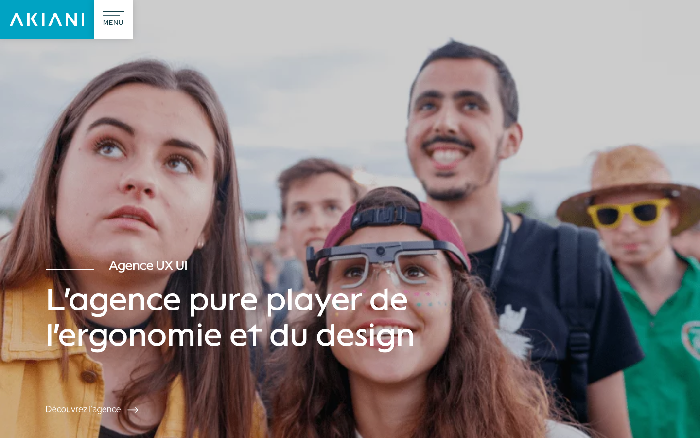
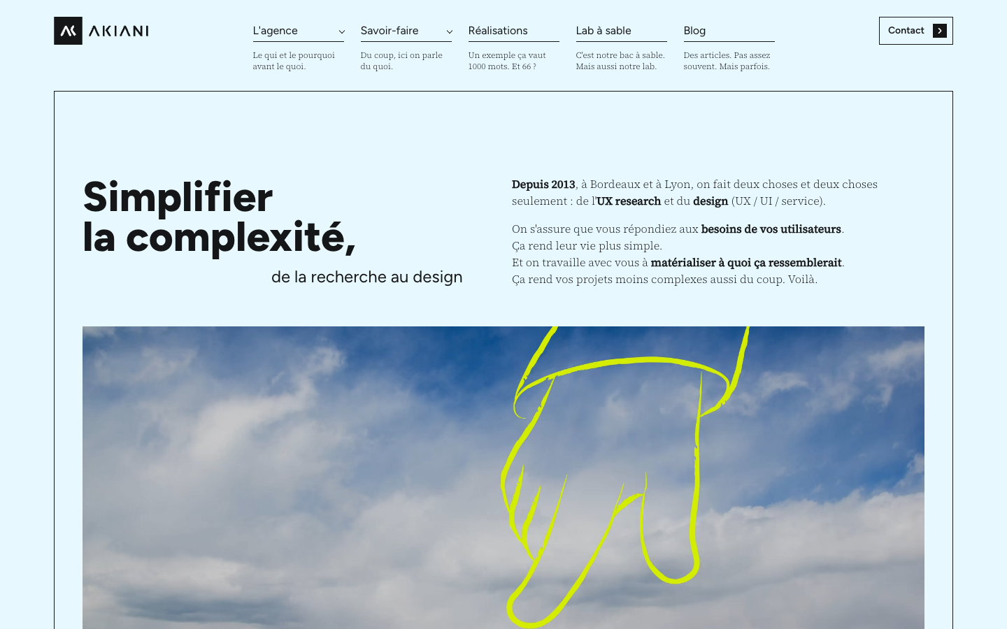
A lemon-yellow brushstroke sweeps across the 2020 homepage and reveals the 2026 one.