Day 1: the UX Days workshops
Design x Improv: how to handle every situation?
Morgane Peng, Vincent Manzoni, Marine Aubert and Kamilia Giedrojc ran a playful improv workshop, letting us observe various situations we have experienced (or could experience) in our work as designers. Participants stepped into the shoes of various roles: Product Owner, Developer, Decision-maker and of course Designer, and improvised from a starting scenario that put the designer in an uncomfortable situation.
Beyond the good laughs we had, it was above all a nice way to listen to first-hand accounts from participants in their own organisations, and to observe the various stances taken in the face of these conflict situations.
What we mostly take away is that being as clear, patient and explanatory as possible is critical, that we have to learn to adapt how we speak to the person we are speaking to, and that we sometimes have to make compromises without necessarily betraying our values and our expertise.
Performance and UX, a good match?
A focus on the question of qualitative data collection and analysis of an experience’s performance through standardised approaches and KPIs, by Mathieu Lombard from the Ferpection agency.
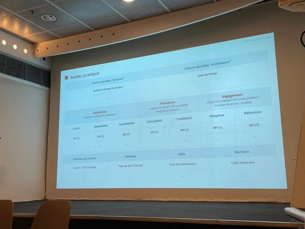
More than the workshop itself, what we found instructive was the presentation of a performance model based on the famous HEART model developed by Google’s research team (Happiness, Engagement, Adoption, Retention, Task success) and the 7 factors of Peter Morville’s Honeycomb tool, all structured into a grid defining the added business and user value through categorised and prioritised KPIs, which in the end lets you measure user satisfaction, brand perception and the engagement generated.
How to measure performance in 5 steps, according to Mathieu Lombard:
- Define the objectives
- Identify the related KPIs and their values
- Collect the data
- Analyse and put the action plan in place
- Repeat
The initial framing process of the analyses, with the definition of business objectives and user expectations, was particularly interesting, because it lets you refine the KPIs by collectively determining their typology, as early as possible.
Empathy Lab: putting yourself in the shoes of users with disabilities
This workshop, co-run by Suzanne Decreme, UX lead at Supralog, and Habib Ragelhassi, Digital Accessibility Project Manager at Amadeus, dives into the notions of accessibility and empathy.
They first remind us that a disability can affect anyone, anytime, since it can be permanent but also temporary or situational. So a disability is a limitation of the possibilities for interaction with the environment. This disability can be hearing-related, motor, cognitive or visual.
We then distinguish between sympathy, compassion and empathy (the intuitive ability to put yourself in someone else’s place and perceive what others feel) to finally arrive at the topic of the Empathy Lab, with the speakers showing us a few examples such as the British government, Facebook, Deque and the Guardian.
We then move to practice, starting with an icebreaker that lets us get into the topic. The two participants in this icebreaker have to carry out an action while being hindered by a heavy cognitive load: instructions that are hard to read and unstructured, a vague goal, loud music, a sense of urgency and other stimuli meant to slow them down in their task.
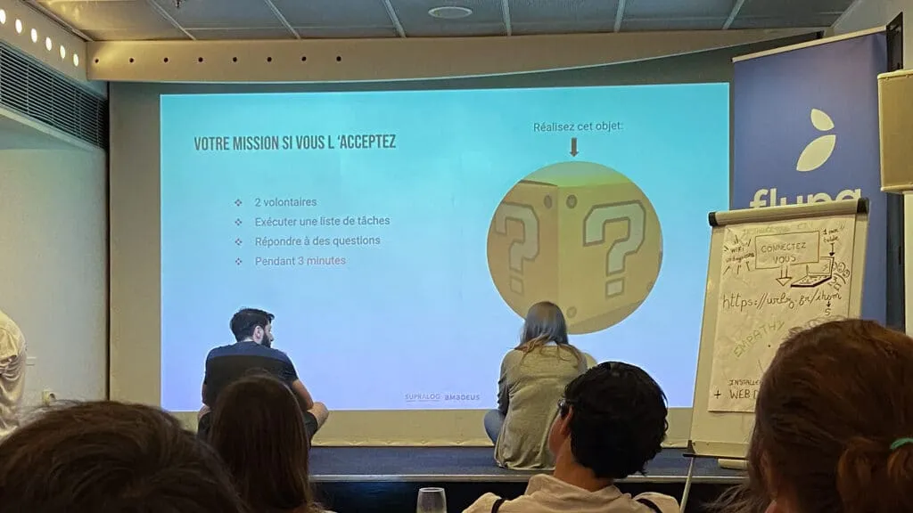
Then, thanks to the Web Disability Simulator tool available here (opens in new window), we test simulation scenarios of users with colour blindness and Parkinson’s disease. A final scenario simulates “tunnel vision”. The stance adopted during the simulation was never to focus on the disability, but on the physical constraint it implies.
The recommendations linked to these situations match the accessibility recommendations we know well:
- Don’t convey information through colour alone
- Respect the contrast ratios defined by the WCAG standards
- Design clickable areas that are large enough
- Keep enough space between the different elements
- Allow keyboard navigation
In conclusion, the facilitators remind us that this type of simulation doesn’t take into account all the constraints tied to disability and remains imperfect; that said, it is a first step towards understanding users’ needs.
Combining systems thinking and design thinking to design products with a positive impact
An “Impact Design” workshop, run by Catherine Smet, senior UX/UI designer, and Garance Delaby, lead UX and service designer at Palo IT, helping us get to grips with methodologies for imagining and creating new products and services with a positive impact.
This exchange starts from strong observations: first, the environmental footprint of design keeps growing. In particular, we can observe four types of problems: “software obesity”; software obsolescence; the presence of zombie servers; inefficient data. To this first observation are added others: 45% of features are not used across all products and websites; web users overall consider 70% of the features present to be non-essential. Several responses have emerged: 75% of CEOs in France invest in digital for sustainable development. On a more global scale, the UN set up, in September 2015, 17 Sustainable Development Goals (SDGs).
The flow of the method presented during this workshop draws on systems thinking, theorised by Donella Meadows, who sees the world as a single system (“there are no separate systems, the world is a continuum”, Donella Meadows, Thinking in Systems), on Design Thinking, but also on the UN’s 17 SDGs.
A fairly rich process unfolding in several key steps:
- Modelling a problem at the systems scale by surfacing the interconnections between the parts
- Identifying the positive and negative impacts
- Defining how these impacts can respond to the UN’s SDGs
The topic given is the exploration of an app that detects people’s food preferences (a “food scan app”), and the participants are split into four groups (two working on a digital format via Miro, two on a 100% analogue format). We first list the positive and negative elements related to the topic on sticky notes. Then, we place these elements on a canvas with three reading lenses (individual, community, global) for each type of impact analysed (economic, social, environmental). We establish the links between the elements and represent them on the canvas. We then pick 3 SDG goals out of the 17 given, and we generate solutions for each of the selected goals.
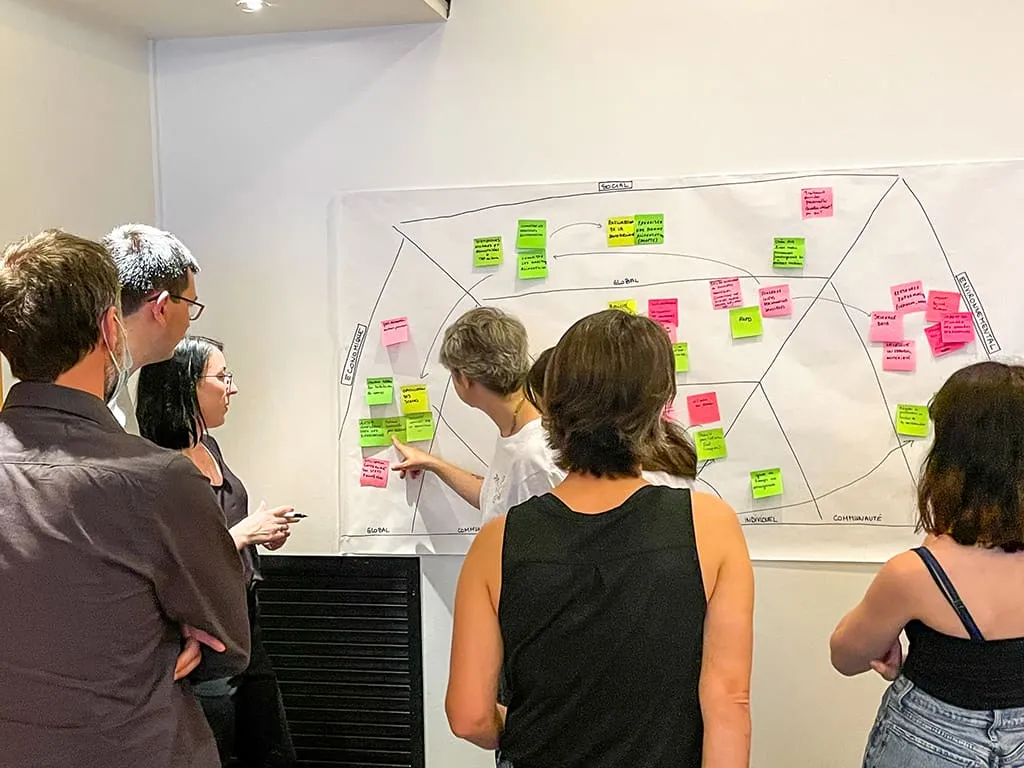
The method is broadly very interesting and raises the question of involving specialists to run the impact assessments.
Draw me… a process
A graphic facilitation workshop run by Viviane Morelle, agile coach and facilitator, helping us model a process at a fairly fine level of granularity by grouping, then categorising, the full set of visuals created by the participants.
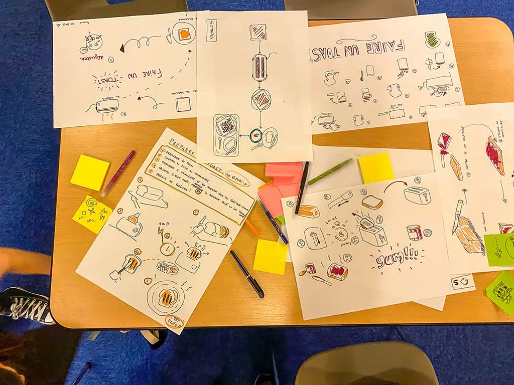
The workshop is inspired by “Draw how to make toast”, a problem-solving method presented by facilitator Tom Wujec. The brief here was to draw the process of preparing a toast for your breakfast, individually, in a few minutes, on an A3 sheet. Then to transfer each step of the process onto a sticky note, without adding words, and finally to bring all the steps and sticky notes together on a canvas on the wall, to create a global process, collaboratively (but without talking). The final result is a canvas very rich in steps and illustrations per step.
A process that surfaces a few tips that can be reused in our future practice:
- Before starting a workshop that requires participants to draw: a reminder of the key principles for drawing simply and effectively in a workshop, while reassuring the participants. Use of the square, circle, triangle, line, dot. Everyone is then on the same level when it comes to the available tools, the technique and the instructions.
- Icebreaker: scribble on a sticky note, give it to the person on your right, take the one from your left and draw a bird based on their drawing; everyone can draw.
- During the production of the process steps: don’t define or categorise the steps directly, to avoid endless discussions around that topic; just focus on creating the content and placing it on the model.
The approach proposed is interesting, and after producing the final result (the canvas full of sticky notes), it’s easy to imagine a final phase of converging and prioritising the steps.
No Borders, No Limits!? - Nudges and Ethics
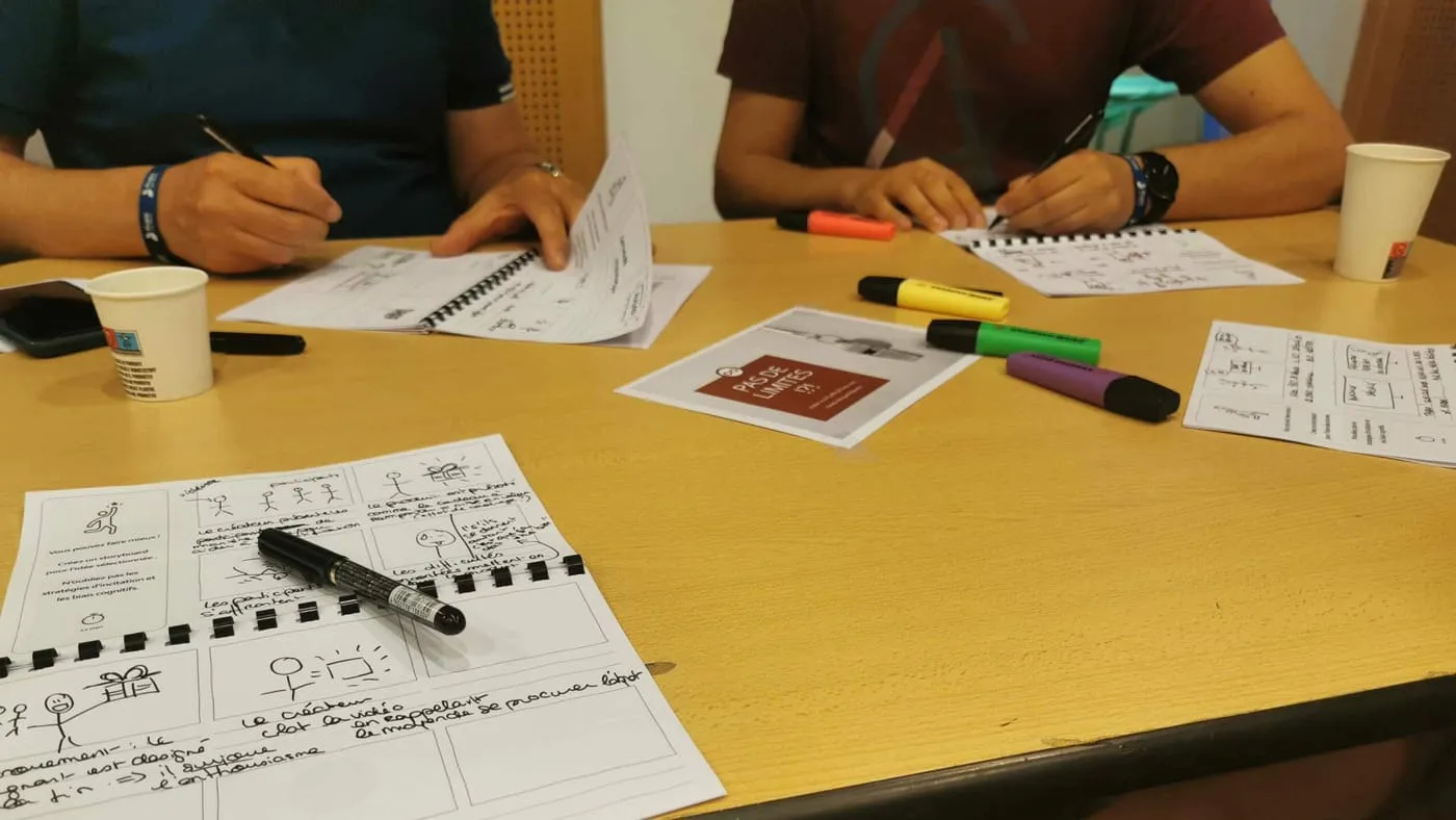
Kerstin Bongard-Blanchy, UX designer and researcher at the University of Luxembourg, runs this workshop, which explores dark patterns as a way of reflecting on ethics.
The idea was to run a six-to-one in order to set up a list of ideas to reach a goal that may be detrimental to the end user. The brief then was to turn one of them into a storyboard, in order to develop the steps of that scenario.
After this exercise, we mention various types of dark patterns that could be used in this context:
- “Nagging”: pushing the user towards a choice that isn’t in their interest
- “Obstruction”: making the path to an action harder than it needs to be in order to discourage the action
- “Sneaking”: trying to hide, disguise or delay the disclosure of information the user needs
- “Interface Interference”: manipulating the user’s interface to favour certain interactions over others
- “Forced Action”: the user has to perform certain actions to access certain features
Finally, on a broader note, we discuss the notions of consequentialism, deontology and virtue ethics, and what questions their definitions raise about a project.
Wrap-up for this first day of UX Days 2022
To wrap up, this first day was once again rich in lessons and useful reminders, on themes a little less specialised than in previous years, but ones that helped broaden the horizons of UX.
A big thank you to all the speakers who ran this first day of workshops. Thanks also to the Flupa association teams, who once again managed to bring together all these design experts and enthusiasts. We can’t wait to come back next year. And in 2023, we hope to find the Thursday evening social event again, sorely missed this year 😊 In the meantime, we will publish the second part, devoted to the Friday talks, soon (promised!).
🎥 To watch the videos of the talks, it’s right here (opens in new window)