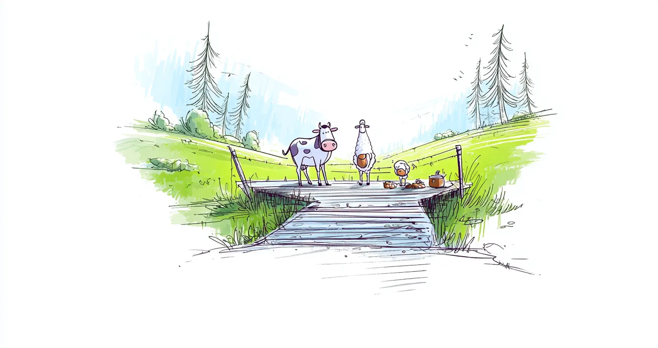
Skeuomorphism: an ugly word and an ingenious idea!
Etymology might give us a clue, but since a picture is worth a thousand words, let’s look at the photograph below. Do you know what the white stripes on the ground are for?
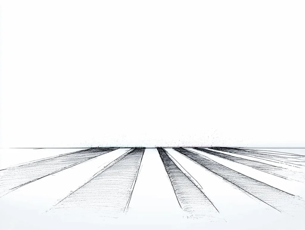
Anyone fond of green Alpine pastures might spot a resemblance to the photograph below:
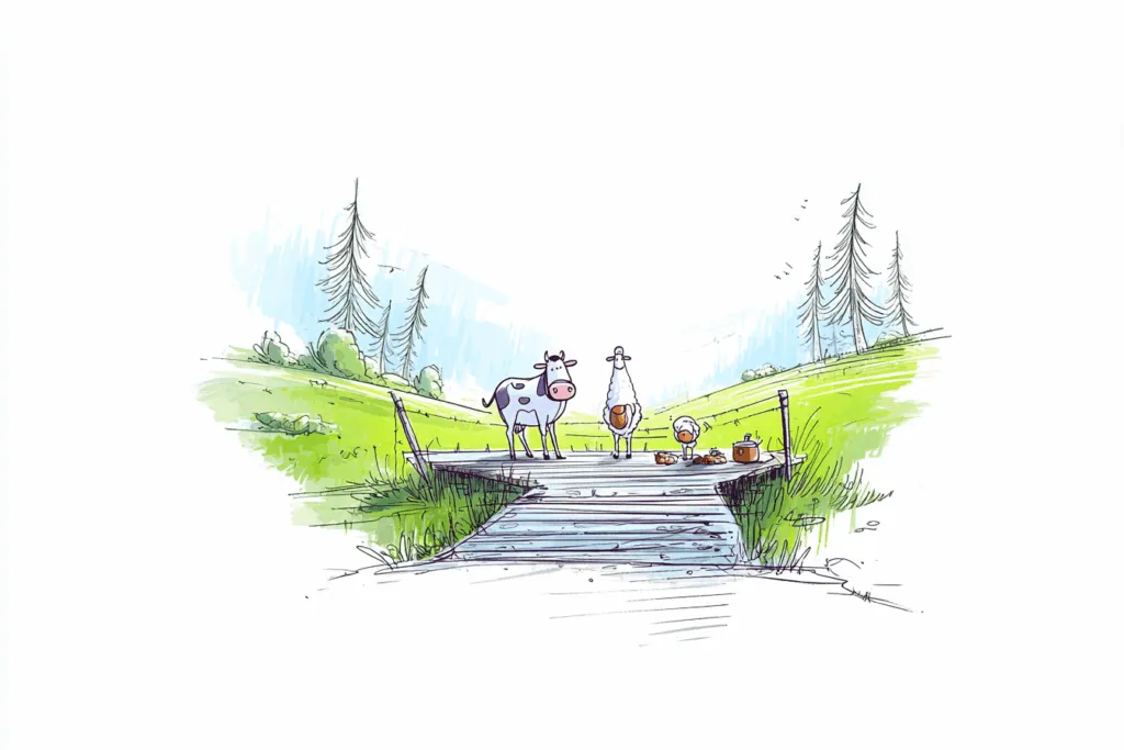
This grid keeps livestock from crossing, without needing a gate, so the way stays clear for vehicles and pedestrians. It works because the animals are afraid of injuring themselves by catching a hoof in one of the gaps.
Seeing how well it worked, some farmers had the idea of painting the grid onto the ground, copying it exactly, dimensions and all. They found that the livestock couldn’t tell it apart from the real grid, and wouldn’t cross that either (Sheldrake, 1988).
What does skeuomorphism look like?
This is what’s called skeuomorphism: an object (paint on the ground) that has nothing to do with the original physical object (a grid) artificially reproduces some of its features (the width of the gaps) to guide how it’s used. It’s an idea closely tied to the concept of affordance (Gibson, 1977), an object’s ability to suggest its own use.
Here are a few classic examples of Applesque skeuomorphism.
Newsstand:

The app’s visuals suggest a bookshelf, so picturing book covers feels perfectly natural.
Or take the Contacts app: it looks like an address book, with the fold of the pages, binding effects and the frame of the cover. These details exist for one reason only, to hint at how to use this virtual address book.
Flat design, a 180° turn
The flat design trend takes the opposite stance to skeuomorphism, as the Messages app shows.

Six years (the first-generation iPhone came out in 2007) of smartphones, tablets and other touch devices going mainstream have finally brought design back to basics: the last of the ten principles of Dieter Rams (opens in new window), the high priest of industrial design.
Good design is as little design as possible, Dieter Rams.
The interface ergonomist, always keen to cut down on information overload, welcomes the push towards minimalism. Only the information that’s useful and necessary to the user gets through. Yet this trend is placing two bets:
- on the expertise of its users, now able to work out the inner workings of an interface that no longer gives itself away as readily as before;
- and on a consistently satisfying user experience, which then hinges on always being able to tell the interactive elements apart from the rest, in a stripped-back layout.
So, skeuomorphism or flat design?
Let’s go back to our painted cattle grid. Studies have shown that the principle works even on animals that have never come across a real grid. Other studies, though, found that if one animal crosses the painted grid by mistake, its peers will follow. The illusion breaks.
When a designer and an ergonomist work on an interface, they face the same challenge: keeping the illusion alive for users. With skeuomorphism, if an object suggests a function, then using it must absolutely deliver on that function. With flat design, where nothing crudely sets objects apart, any of them could be interactive. Once those conditions are met, a successful user experience comes down to a single bet: expertise.
It’s worth noting, though, that when an interface offers enough added value, users get remarkably inventive at working around problems of usability and access to information. In just the same way, sheep in Great Britain learned to roll over the full length of the grid (nearly 3 m, no less!) to cross it and feast in the villagers’ gardens (http://news.bbc.co.uk/2/hi/uk/3938591.stm (opens in new window)). For sheep, the end (and the hunger) justifies the means. Whether that always holds for users of touch interfaces is another matter…
So you can’t make a clean switch from one system to the other without a careful look at the target audience for the product being designed. Ergonomists and designers have no choice but to work hand in hand to make it a success!
And you, are you more of a skeuomorphism or a flat design person? And how did you handle the transition?
References:
Gibson, J. J. (1977). The concept of affordances. Perceiving, acting, and knowing, 67-82.
Sheldrake, R. (1988). Cattle fooled by phoney grids. New Scientist, 11, 65.
Some of the illustrations in this article were generated by AI (see our AI use statement).