The IPAG showcase website gets a makeover

The IPAG showcase website gets a makeover 

Client Brief

Following an unsatisfactory redesign, IPAG want to rethink their showcase website through a user-centered approach, taking into account all their stakeholders: they wish to use a co-design approach to involve their communication and marketing teams, with their own stakes, on the one hand, and the users (students and companies) with their specific needs on the other.

Year

2019

Expertise
    Disciplines
    • Ergonomie
    • UI design
    • UX design
    • UX strategy
    Tools

      01

      Heuristic evaluation and user testing

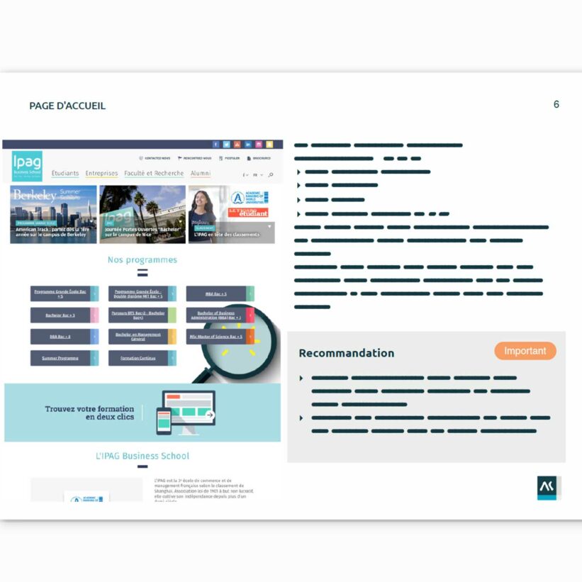
      First step of the redesign, capitalize on the existing website: identify what works and what needs to be improved.

      First, in collaboration with our friends at Pigwii, we conduct an ergonomic evaluation and usability testing of the website, based on usage scenarios. The usability issues identified are prioritized and paired with graphical recommendations based on a benchmark.

      Extract from the expert evaluation
      Extract from the heuristic evaluation
      Target users during a test
      Target users during a test
      Extract from the heuristic evaluation
      Target users during a test
      02

      A co-creation session for the redesign

      The heuristic evaluation and usability tests are the starting point for the improvement.

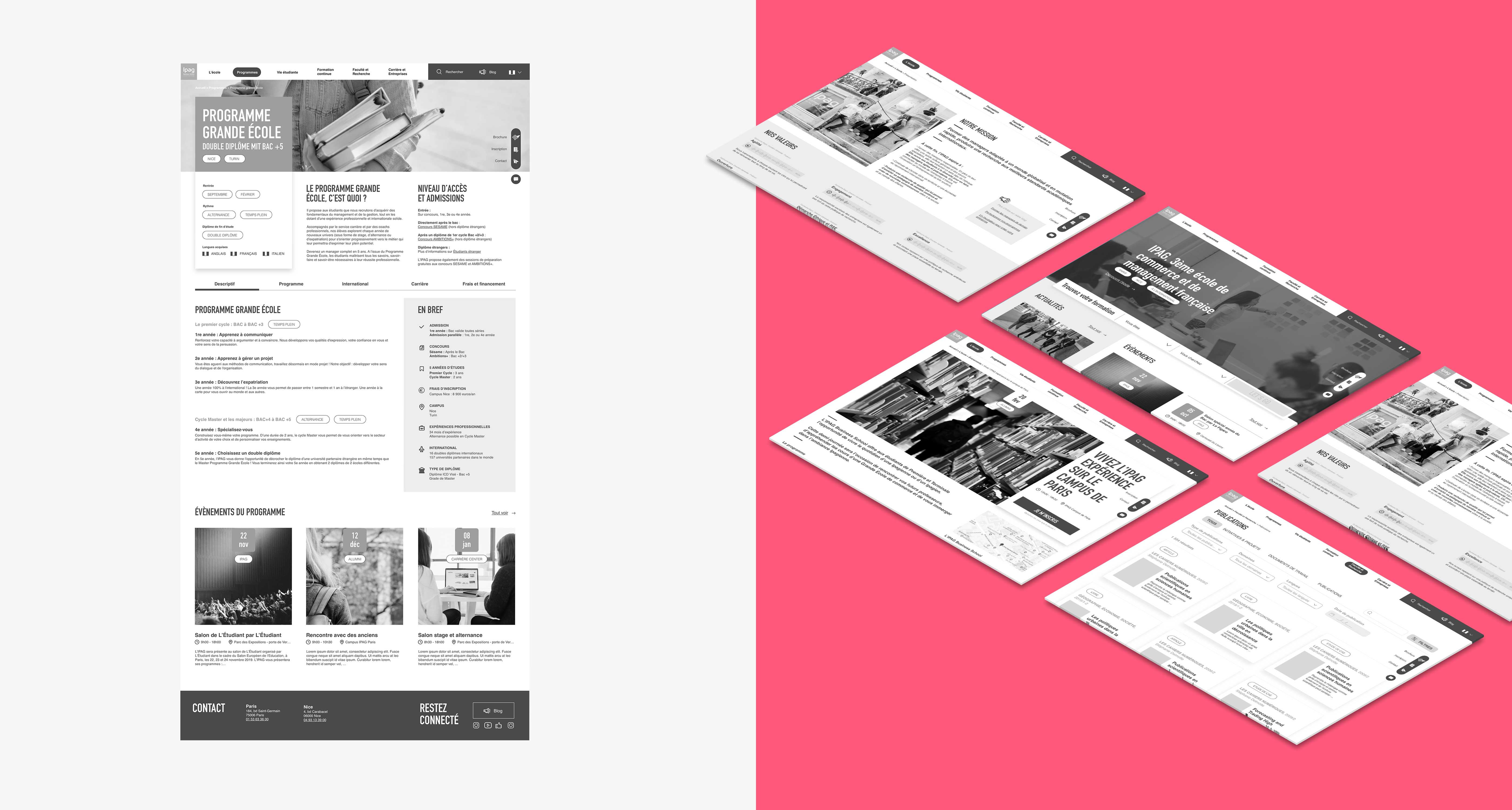
      Based on these elements, we organize a workshop involving all the project stakeholders to redefine the website’s tree structure. We use benchmarking and card sorting at this stage of the co-creation process.

      Ipag - card sorting workshop
      Card sorting workshop
      Co-construction of a tree structure
      Co-construction of a tree structure
      Card sorting workshop
      Co-construction of a tree structure
      Deliverable of the website’s tree structure
      Deliverable of the website’s tree structure

      Once the tree structure has been consolidated, our designers start working on the redesign of each page, both on its structure, and on information prioritization: it’s time for information architecture.

      Presentation of the IPAG website wireframes
      Presentation of the IPAG website wireframes

      33
      wireframes produced in mobile and desktop version

      03

      A modernized visual identity

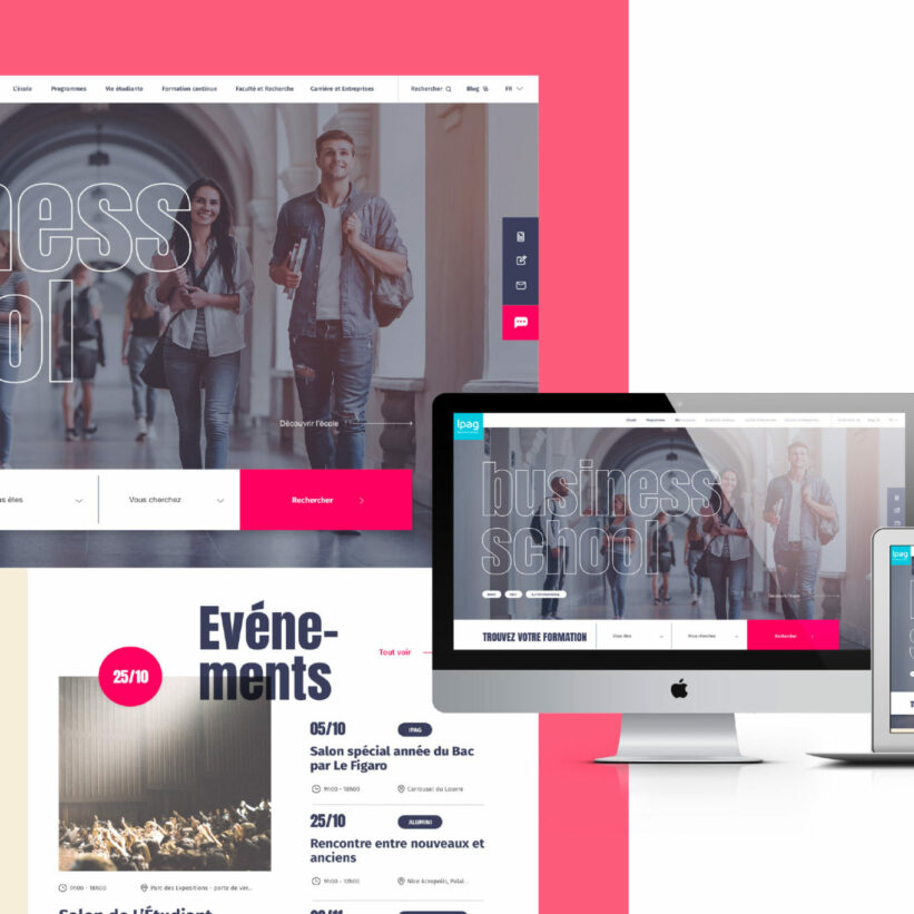
      We take the existing and make it better!

      The objective is not to completely redesign the school’s identity, but rather to update it.
      A mood board is compiled to identify the trends. An artistic direction is defined and responsive visuals are produced on desktop and mobile.

      Visual of the homepage on desktop
      Visual of the homepage on desktop
      Visual of the homepage on mobile
      Visual of the homepage on mobile
      See another project